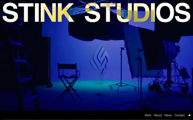
Preview image. Unlock full-res
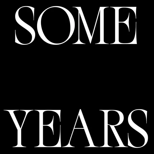
Black canvas, stark typography
Color palette
Neutral form states, badge text, and quiet UI feedback where color should stay understated. Do not promote it to the primary CTA color
Neutral form states, badge text, and quiet UI feedback where color should stay understated. Do not promote it to the primary CTA color
Subtle text accents, very faint borders for ghost buttons against dark backgrounds
Typography
- Weights
- 300, 400, 700
- Sizes
- 16px, 19px, 23px, 52px
- Line height
- 0.9, 1, 1.15, 1.3
- Letter spacing
- -0.04em at 52px, -0.03em at 23px, -0.02em at 19px, normal at 16px
- Fallback
- Arial
Primary UI font for navigation, body text, and some headings. Its clean, sans-serif nature provides legibility against varying backgrounds and maintains a modern, utilitarian feel.
- Weights
- 400
- Sizes
- 60px
- Line height
- 1
- Letter spacing
- -0.05em
- Fallback
- serif
Signature display font for large, impactful headlines. Its serif elegance with negative letter-spacing creates a distinctive, almost art-deco tension against the sans-serif body text.
- Weights
- 400
- Sizes
- 14px
- Line height
- 1.43
- Letter spacing
- 0.10em
- Fallback
- monospace
Used for meta-information, dates, or specific content where a technical, machine-like tone is desired, often with expanded letter-spacing to emphasize its distinct role.
Spacing & shape
Components
Text labels with minimal styling. Default: Midnight Ink text on transparent background, no border. Hover/Active: Paper White text on transparent background, no border. Uses 16px Helvetica 400.
Outline-only interactive element. Text uses Deep Charcoal on transparent background, with a 1px Deep Charcoal border. No padding, 0px border-radius. Uses 16px Helvetica 400.
Transparent background input. Text color is Midnight Ink. Features a 1px Midnight Ink border and 10px border-radius. Padding of 10px vertical and 16px horizontal. Uses 16px Helvetica 400.
Text-only badge with no background or border. Text color is Midnight Ink against a transparent background. No padding or border-radius. Uses 16px Helvetica 400.
Guidelines
- Prioritize Midnight Ink (#000000) for all main backgrounds and Paper White (#ffffff) for foreground text in a dark theme context.
- Use Times New Roman 400 at 60px with -0.05em letter-spacing for prominent page headlines to convey a bold, artistic statement.
- Maintain high typographic contrast: use Helvetica 300-700 for utilitarian text, and Helvetica 400 at 16px as the default body text.
- Keep all interactive elements visually minimal; prefer text-only or outline-only buttons with 0px corner radius.
- Apply 10px border-radius sparingly, primarily for input fields and specific form elements, maintaining an otherwise sharp aesthetic.
- Leverage the Courier New font with 0.10em letter-spacing for date stamps and meta-details to create a clear visual distinction from primary content.
- Employ a base unit of 20px horizontally and 60px vertically for section and element separation to establish a comfortable, open layout.
- Avoid using filled buttons unless explicitly specified for a unique interactive state; ghost buttons are the default.
- Do not introduce shadows or significant elevation, as the design system leans towards a flat, graphic quality.
- Do not use rounded corners universally; reserve 10px radius for specific functional elements like input fields.
- Avoid generic serif fonts for headlines; the distinct Times New Roman with specific letter-spacing is key to the brand's typographic identity.
- Do not use a light theme; the brand aesthetic is built around a dominant dark canvas, with white serving as a high-contrast foreground.
- Do not apply vibrant or highly saturated brand colors as backgrounds or prominent features; color should primarily be functional or an accent for semantic states.
- Avoid tight, dense layouts; provide ample space between sections and elements using the defined spacing tokens.
About this system
ShowHide
Stink Studios projects a bold, artistic, and somewhat stark aesthetic, primarily using a dark canvas with sharp, high-contrast typography. The design emphasizes content through large, impactful headlines and minimal, almost invisible UI elements. A distinct lack of rounded corners or elevation creates a flat, direct visual experience, with interactions often subtly outlined rather than filled. The overall impression is one of confident, unornamented creative expression.
The page primarily uses a full-bleed layout, with content spanning the entire viewport width, particularly evident in hero sections and background videos. The hero features a large, centered text headline over a dynamic background. Subsequent sections often alternate between large, impactful typographic statements and full-width image-based content blocks. A common content arrangement involves prominent headlines, followed by body text, and then visual content like video stills or project imagery. Navigation is a sticky, minimal footer bar, implying content is meant to be scrolled through without top-level distractions.
The site predominantly uses photography and video footage as its imagery. Photography features a mix of conceptual, often blurry or motion-heavy shots (like the red car), and sometimes product/brand advertising imagery (Rippling, Canva billboards). The treatment is full-bleed or large contained elements, integrated into the dark canvas. There are no consistent geometric illustrations or specific icon styles beyond utilitarian, text-based icons (like the copyright symbol). Imagery serves decorative and illustrative purposes, establishing mood and showcasing work examples.
Reminiscent of A24, Apple (older campaigns), Various independent film studio sites, Vercel.
# Stink Studios — Style Reference
> Black canvas, stark typography

**Theme:** dark

**Site:** https://www.stinkstudios.com

Stink Studios projects a bold, artistic, and somewhat stark aesthetic, primarily using a dark canvas with sharp, high-contrast typography. The design emphasizes content through large, impactful headlines and minimal, almost invisible UI elements. A distinct lack of rounded corners or elevation creates a flat, direct visual experience, with interactions often subtly outlined rather than filled. The overall impression is one of confident, unornamented creative expression.

## Tokens — Colors

| Name | Value | Token | Role |
|------|------|------|------|
| Midnight Ink | `#000000` | `--color-midnight-ink` | Neutral form states, badge text, and quiet UI feedback where color should stay understated. Do not promote it to the primary CTA color |
| Paper White | `#ffffff` | `--color-paper-white` | Neutral form states, badge text, and quiet UI feedback where color should stay understated. Do not promote it to the primary CTA color |
| Deep Charcoal | `#050505` | `--color-deep-charcoal` | Subtle text accents, very faint borders for ghost buttons against dark backgrounds |

## Tokens — Typography

### Helvetica
- **Substitute:** Arial
- **Weights:** 300, 400, 700
- **Sizes:** 16px, 19px, 23px, 52px
- **Line height:** 0.9, 1, 1.15, 1.3
- **Letter spacing:** -0.04em at 52px, -0.03em at 23px, -0.02em at 19px, normal at 16px
- **Role:** Primary UI font for navigation, body text, and some headings. Its clean, sans-serif nature provides legibility against varying backgrounds and maintains a modern, utilitarian feel.

### Times New Roman
- **Substitute:** serif
- **Weights:** 400
- **Sizes:** 60px
- **Line height:** 1
- **Letter spacing:** -0.05em
- **Role:** Signature display font for large, impactful headlines. Its serif elegance with negative letter-spacing creates a distinctive, almost art-deco tension against the sans-serif body text.

### Courier New
- **Substitute:** monospace
- **Weights:** 400
- **Sizes:** 14px
- **Line height:** 1.43
- **Letter spacing:** 0.10em
- **Role:** Used for meta-information, dates, or specific content where a technical, machine-like tone is desired, often with expanded letter-spacing to emphasize its distinct role.

## Tokens — Type Scale

Perfect Fourth (1.333) from 16px base.

| Role | Size | Line height | Letter spacing |
|------|------|------|------|
| body-sm | 14px | 1.43 | 1.4px |
| body | 16px | 1.3 | — |
| subheading | 19px | 1.15 | -0.38px |
| heading | 23px | 1.15 | -0.69px |
| heading-lg | 52px | 1 | -2.08px |
| display | 60px | 1 | -3px |

## Tokens — Spacing

- **Section gap:** 60px
- **Card padding:** 16px
- **Element gap:** 20px

## Tokens — Radius

- **Inputs:** 10px
- **formElements:** 10px

## Layout

The page primarily uses a full-bleed layout, with content spanning the entire viewport width, particularly evident in hero sections and background videos. The hero features a large, centered text headline over a dynamic background. Subsequent sections often alternate between large, impactful typographic statements and full-width image-based content blocks. A common content arrangement involves prominent headlines, followed by body text, and then visual content like video stills or project imagery. Navigation is a sticky, minimal footer bar, implying content is meant to be scrolled through without top-level distractions.

## Imagery

The site predominantly uses photography and video footage as its imagery. Photography features a mix of conceptual, often blurry or motion-heavy shots (like the red car), and sometimes product/brand advertising imagery (Rippling, Canva billboards). The treatment is full-bleed or large contained elements, integrated into the dark canvas. There are no consistent geometric illustrations or specific icon styles beyond utilitarian, text-based icons (like the copyright symbol). Imagery serves decorative and illustrative purposes, establishing mood and showcasing work examples.

## Components

### Ghost Button (Text)
*Interactive element, navigation links*

Text labels with minimal styling. Default: Midnight Ink text on transparent background, no border. Hover/Active: Paper White text on transparent background, no border. Uses 16px Helvetica 400.

### Ghost Button (Outlined)
*Interactive element, navigation links*

Outline-only interactive element. Text uses Deep Charcoal on transparent background, with a 1px Deep Charcoal border. No padding, 0px border-radius. Uses 16px Helvetica 400.

### Input Field
*Form input elements*

Transparent background input. Text color is Midnight Ink. Features a 1px Midnight Ink border and 10px border-radius. Padding of 10px vertical and 16px horizontal. Uses 16px Helvetica 400.

### Minimal Badge
*Categorization and tagging*

Text-only badge with no background or border. Text color is Midnight Ink against a transparent background. No padding or border-radius. Uses 16px Helvetica 400.

## Guidelines

### Do

- Prioritize Midnight Ink (#000000) for all main backgrounds and Paper White (#ffffff) for foreground text in a dark theme context.
- Use Times New Roman 400 at 60px with -0.05em letter-spacing for prominent page headlines to convey a bold, artistic statement.
- Maintain high typographic contrast: use Helvetica 300-700 for utilitarian text, and Helvetica 400 at 16px as the default body text.
- Keep all interactive elements visually minimal; prefer text-only or outline-only buttons with 0px corner radius.
- Apply 10px border-radius sparingly, primarily for input fields and specific form elements, maintaining an otherwise sharp aesthetic.
- Leverage the Courier New font with 0.10em letter-spacing for date stamps and meta-details to create a clear visual distinction from primary content.
- Employ a base unit of 20px horizontally and 60px vertically for section and element separation to establish a comfortable, open layout.

### Don't

- Avoid using filled buttons unless explicitly specified for a unique interactive state; ghost buttons are the default.
- Do not introduce shadows or significant elevation, as the design system leans towards a flat, graphic quality.
- Do not use rounded corners universally; reserve 10px radius for specific functional elements like input fields.
- Avoid generic serif fonts for headlines; the distinct Times New Roman with specific letter-spacing is key to the brand's typographic identity.
- Do not use a light theme; the brand aesthetic is built around a dominant dark canvas, with white serving as a high-contrast foreground.
- Do not apply vibrant or highly saturated brand colors as backgrounds or prominent features; color should primarily be functional or an accent for semantic states.
- Avoid tight, dense layouts; provide ample space between sections and elements using the defined spacing tokens.

## Agent Prompt Guide

Quick Color Reference:
text: #ffffff
background: #000000
border: #000000
accent: no distinct accent color
primary action: no distinct CTA color

Example Component Prompts:
1. Create a primary page headline: 'Stink Studios' in Times New Roman 400, 60px, #ffffff, letter-spacing -3px, line-height 1.0. Place it centered on a #000000 background.
2. Create a ghost navigation link: 'Work' in Helvetica 400, 16px, #ffffff. Position as a footer item.
3. Create an input field: Background transparent, text #000000, 1px #000000 border, 10px border-radius, 10px vertical padding, 16px horizontal padding. Include placeholder text 'Enter text'.
4. Create a body text block: A paragraph of text in Helvetica 400, 16px, #ffffff, line-height 1.3. Set against a #000000 background.
More like this




Keep what you find
A free account saves references to boards and can send you a weekly email of picks based on what you save.
To see every result, go Pro.