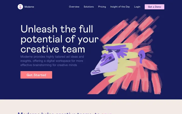
Preview image. Unlock full-res
Art-filled creative canvas
Color palette
Dominant background for hero sections and prominent headlines, setting a deep, authoritative tone
Primary Call-to-Action button background, signalling action with warmth and vibrancy
Decorative accents, button outlines, and key brand elements
Card backgrounds and accents, offering a cool, complementary tone
Headline accents and decorative strokes, adding a vivid, playful touch
Subtle button backgrounds and decorative elements, a softer variant of the brand's pink
Specific card backgrounds, adding visual variety and warmth
Page background, providing a soft, warm base
Primary text, deep and commanding
Card backgrounds, secondary text, and interactive elements where contrast is needed
Subtle text elements, providing a softer contrast than primary text
Muted helper text, input borders, and badge text
Subtle input background fill
Success states, badge text, and content highlights
Badge backgrounds and descriptive highlights
Typography
- Weights
- 400, 500
- Sizes
- 16px, 19px, 20px, 27px, 43px, 52px, 56px, 69px, 83px
- Line height
- 0.93, 0.95, 1, 1.02, 1.06, 1.2
- Letter spacing
- 0.2000em
- Fallback
- Montserrat
Display and prominent headlines. The wide letter-spacing is a signature trait, making text feel expansive and intentional, particularly at larger sizes.
- Weights
- 400, 500, 600, 700
- Sizes
- 14px, 15px, 16px, 18px, 20px, 22px, 26px
- Line height
- 1.07, 1.18, 1.19, 1.2, 1.33, 1.4, 1.56
- Letter spacing
- normal
- Fallback
- Arial
Body text, subheadings, and UI elements. Provides clarity and readability for functional text.
Spacing & shape
Components
Background: Creative Peach (#ff7e85), Text: Surface Snow (#ffffff). Radius: 3px. Padding: 18px vertical, 48px horizontal. The generous padding and vivid color create a prominent, inviting target.
Background: Muted Rose (#f6c8f1), Text: Hero Violet (#060e60). Radius: 3px. Padding: 9px vertical, 24px horizontal. Offers a softer, less assertive call to action.
Background: Surface Snow (#ffffff), Text: Lively Rose (#ff7399). Border: Lively Rose (#ff7399) 1px solid. Radius: 4px. Padding: 19px vertical, 26px horizontal. Combines brand color with a clear interactive state.
Background: Surface Snow (#ffffff). Radius: 4px. Padding: 27px vertical, 28px horizontal. No box shadow, relying on background color for definition.
Background: Accent Orange (#ffb283). Radius: 15px. Padding: 35px vertical, 35px horizontal. The larger radius and distinct color make this card stand out.
Background: Insight Teal (#206871). Radius: 15px. Padding: 33px vertical, 32-38px horizontal. Similar to the orange accent card, for alternative sections.
Background: rgba(62, 60, 67, 0.2) which is a transparent dark tint. Text: Midnight Ink (#000000). Border: Midnight Ink (#000000) 1px solid. Radius: 4px. Padding: 20px vertical, 21px horizontal. A contrasting input for darker backgrounds.
Background: Surface Snow (#ffffff), Text: Midnight Ink (#000000). Border: Stone Whisper (#767676) 1px solid. Radius: 0px. Padding: 1px vertical, 2px horizontal (typical browser default if no explicit padding). This input is very minimal.
Background: Accent Teal (#33abb9). Text: Action Green (#40ac76). Radius: 4px. Padding: 12px vertical, 20px horizontal. Uses two semantic colors for clear indication.
Guidelines
- Use Hero Violet (#0e1889) for primary hero sections and major section headers to establish a strong brand presence.
- Apply Canvas Almond (#f3eae5) as the default page background for most light-mode sections.
- Ensure all primary call-to-action buttons use Creative Peach (#ff7e85) for the background with Surface Snow (#ffffff) text to guide user flow.
- Implement Mabry Pro for headlines, strictly adhering to its characteristic wide letter-spacing of 0.2000em.
- Utilize a 4px `radius` for most interactive elements and cards, with an occasional 15px radius for more expressive cards.
- Maintain maximum content width at 1200px, centering all content for a structured, polished feel.
- Emphasize content blocks with a 20px `cardPadding` and a `default` 4px uniform corner radius for cards.
- Avoid using deep drop shadows; rely on background color differences or subtle fills for element separation.
- Do not deviate from the specified letter-spacing for Mabry Pro; its expansive tracking is a core visual identifier.
- Do not introduce new primary action colors; Creative Peach (#ff7e85) is the singular choice.
- Avoid overly complex gradient backgrounds; stick to solid color backgrounds or expressive illustrations.
- Do not use dark backgrounds for general body text areas outside of designated hero sections to maintain a clear light theme.
- Do not make cards or buttons fully square; always apply at least a 4px border radius for a consistent, softer feel.
- Avoid placing important interactive elements directly on busy illustrative backgrounds, as contrast may be compromised.
About this system
ShowHide
Moderne uses a vibrant, playful light-mode aesthetic characterized by deep, saturated violets and teals meeting warm, vivid reds and oranges. The visual system balances a clean, structured layout with expressive, hand-drawn illustrations. Typography is a confident mix of clear sans-serifs and a distinctive display font with generous letter-spacing for headlines. Components feel plush and inviting, featuring rounded corners and subtle background tints rather than harsh borders or deep shadows.
The page adheres to a max-width of 1200px, with content centered. The hero section is full-bleed, using a deep Hero Violet background with a large, centered headline and a striking illustration. Subsequent sections alternate between the Canvas Almond base and lighter Surface Snow backgrounds, at times featuring large, distinctively colored cards. Content is often presented in a two-column layout with text on one side and a supporting illustration or feature block on the other, creating a dynamic but balanced flow. Vertical spacing between sections is generous, around 120px, providing ample breathing room. Navigation is a simple top bar with a logo, text links, and a primary action button.
The site features highly stylized, hand-drawn vector illustrations with a vibrant, playful, and slightly abstract aesthetic. These illustrations are often full-bleed or large-scale, acting as primary visual anchors. They use a palette closely aligned with the brand's accent colors (pinks, oranges, violets, teals) and are typically contained within sections rather than overlapping. Icons are primarily outlined or subtly filled with brand colors, maintaining a light stroke weight, and serve decorative or explanatory roles to complement text rather than replace it. Imagery is largely decorative atmosphere.
Reminiscent of Figma, Pitch, Canva, Superhuman.
# Home — Style Reference
> Art-filled creative canvas

**Theme:** light

**Site:** https://moderne.st

Moderne uses a vibrant, playful light-mode aesthetic characterized by deep, saturated violets and teals meeting warm, vivid reds and oranges. The visual system balances a clean, structured layout with expressive, hand-drawn illustrations. Typography is a confident mix of clear sans-serifs and a distinctive display font with generous letter-spacing for headlines. Components feel plush and inviting, featuring rounded corners and subtle background tints rather than harsh borders or deep shadows.

## Tokens — Colors

| Name | Value | Token | Role |
|------|------|------|------|
| Hero Violet | `#0e1889` | `--color-hero-violet` | Dominant background for hero sections and prominent headlines, setting a deep, authoritative tone |
| Creative Peach | `#ff7e85` | `--color-creative-peach` | Primary Call-to-Action button background, signalling action with warmth and vibrancy |
| Lively Rose | `#ff7399` | `--color-lively-rose` | Decorative accents, button outlines, and key brand elements |
| Insight Teal | `#206871` | `--color-insight-teal` | Card backgrounds and accents, offering a cool, complementary tone |
| Accent Pink | `#dd59cf` | `--color-accent-pink` | Headline accents and decorative strokes, adding a vivid, playful touch |
| Muted Rose | `#f6c8f1` | `--color-muted-rose` | Subtle button backgrounds and decorative elements, a softer variant of the brand's pink |
| Accent Orange | `#ffb283` | `--color-accent-orange` | Specific card backgrounds, adding visual variety and warmth |
| Canvas Almond | `#f3eae5` | `--color-canvas-almond` | Page background, providing a soft, warm base |
| Midnight Ink | `#000000` | `--color-midnight-ink` | Primary text, deep and commanding |
| Surface Snow | `#ffffff` | `--color-surface-snow` | Card backgrounds, secondary text, and interactive elements where contrast is needed |
| Ash Gray | `#3e3c43` | `--color-ash-gray` | Subtle text elements, providing a softer contrast than primary text |
| Stone Whisper | `#7a7780` | `--color-stone-whisper` | Muted helper text, input borders, and badge text |
| Input Pale | `#cfc7c5` | `--color-input-pale` | Subtle input background fill |
| Action Green | `#40ac76` | `--color-action-green` | Success states, badge text, and content highlights |
| Accent Teal | `#33abb9` | `--color-accent-teal` | Badge backgrounds and descriptive highlights |

## Tokens — Typography

### Mabry Pro
- **Substitute:** Montserrat
- **Weights:** 400, 500
- **Sizes:** 16px, 19px, 20px, 27px, 43px, 52px, 56px, 69px, 83px
- **Line height:** 0.93, 0.95, 1, 1.02, 1.06, 1.2
- **Letter spacing:** 0.2000em
- **Role:** Display and prominent headlines. The wide letter-spacing is a signature trait, making text feel expansive and intentional, particularly at larger sizes.

### Helvetica Neue
- **Substitute:** Arial
- **Weights:** 400, 500, 600, 700
- **Sizes:** 14px, 15px, 16px, 18px, 20px, 22px, 26px
- **Line height:** 1.07, 1.18, 1.19, 1.2, 1.33, 1.4, 1.56
- **Letter spacing:** normal
- **Role:** Body text, subheadings, and UI elements. Provides clarity and readability for functional text.

## Tokens — Type Scale

Minor Third (1.2) from 16px base.

| Role | Size | Line height | Letter spacing |
|------|------|------|------|
| caption | 14px | 1.56 | — |
| body | 16px | 1.33 | — |
| body-lg | 18px | 1.2 | — |
| subheading | 20px | 1.19 | — |
| heading-sm | 22px | 1.07 | — |
| heading-lg | 43px | 1.02 | 8.6px |
| display-sm | 52px | 1 | 10.4px |
| display | 56px | 0.95 | 11.2px |
| display-lg | 69px | 0.93 | 13.8px |
| display-xl | 83px | 0.93 | 16.6px |

## Tokens — Spacing

- **Max width:** 1200px
- **Section gap:** 120px
- **Card padding:** 20px
- **Element gap:** 20px

## Tokens — Radius

- **Default:** 4px
- **badge:** 4px
- **button:** 4px
- **card:** 4px
- **input:** 4px
- **largeCard:** 15px

## Layout

The page adheres to a max-width of 1200px, with content centered. The hero section is full-bleed, using a deep Hero Violet background with a large, centered headline and a striking illustration. Subsequent sections alternate between the Canvas Almond base and lighter Surface Snow backgrounds, at times featuring large, distinctively colored cards. Content is often presented in a two-column layout with text on one side and a supporting illustration or feature block on the other, creating a dynamic but balanced flow. Vertical spacing between sections is generous, around 120px, providing ample breathing room. Navigation is a simple top bar with a logo, text links, and a primary action button.

## Imagery

The site features highly stylized, hand-drawn vector illustrations with a vibrant, playful, and slightly abstract aesthetic. These illustrations are often full-bleed or large-scale, acting as primary visual anchors. They use a palette closely aligned with the brand's accent colors (pinks, oranges, violets, teals) and are typically contained within sections rather than overlapping. Icons are primarily outlined or subtly filled with brand colors, maintaining a light stroke weight, and serve decorative or explanatory roles to complement text rather than replace it. Imagery is largely decorative atmosphere.

## Components

### Primary Action Button
*Filled Call-to-Action button*

Background: Creative Peach (#ff7e85), Text: Surface Snow (#ffffff). Radius: 3px. Padding: 18px vertical, 48px horizontal. The generous padding and vivid color create a prominent, inviting target.

### Secondary Action Button
*Ghost or subtle action button*

Background: Muted Rose (#f6c8f1), Text: Hero Violet (#060e60). Radius: 3px. Padding: 9px vertical, 24px horizontal. Offers a softer, less assertive call to action.

### Outlined Link Button
*Link button with a distinct outline*

Background: Surface Snow (#ffffff), Text: Lively Rose (#ff7399). Border: Lively Rose (#ff7399) 1px solid. Radius: 4px. Padding: 19px vertical, 26px horizontal. Combines brand color with a clear interactive state.

### Standard Card
*Content container for features or information*

Background: Surface Snow (#ffffff). Radius: 4px. Padding: 27px vertical, 28px horizontal. No box shadow, relying on background color for definition.

### Accent Card - Orange
*Prominent content card*

Background: Accent Orange (#ffb283). Radius: 15px. Padding: 35px vertical, 35px horizontal. The larger radius and distinct color make this card stand out.

### Accent Card - Teal
*Prominent content card*

Background: Insight Teal (#206871). Radius: 15px. Padding: 33px vertical, 32-38px horizontal. Similar to the orange accent card, for alternative sections.

### Text Input (Filled)
*User input field*

Background: rgba(62, 60, 67, 0.2) which is a transparent dark tint. Text: Midnight Ink (#000000). Border: Midnight Ink (#000000) 1px solid. Radius: 4px. Padding: 20px vertical, 21px horizontal. A contrasting input for darker backgrounds.

### Text Input (Standard)
*Standard user input field*

Background: Surface Snow (#ffffff), Text: Midnight Ink (#000000). Border: Stone Whisper (#767676) 1px solid. Radius: 0px. Padding: 1px vertical, 2px horizontal (typical browser default if no explicit padding). This input is very minimal.

### Success Badge
*Status or label tag for positive indications*

Background: Accent Teal (#33abb9). Text: Action Green (#40ac76). Radius: 4px. Padding: 12px vertical, 20px horizontal. Uses two semantic colors for clear indication.

## Guidelines

### Do

- Use Hero Violet (#0e1889) for primary hero sections and major section headers to establish a strong brand presence.
- Apply Canvas Almond (#f3eae5) as the default page background for most light-mode sections.
- Ensure all primary call-to-action buttons use Creative Peach (#ff7e85) for the background with Surface Snow (#ffffff) text to guide user flow.
- Implement Mabry Pro for headlines, strictly adhering to its characteristic wide letter-spacing of 0.2000em.
- Utilize a 4px `radius` for most interactive elements and cards, with an occasional 15px radius for more expressive cards.
- Maintain maximum content width at 1200px, centering all content for a structured, polished feel.
- Emphasize content blocks with a 20px `cardPadding` and a `default` 4px uniform corner radius for cards.

### Don't

- Avoid using deep drop shadows; rely on background color differences or subtle fills for element separation.
- Do not deviate from the specified letter-spacing for Mabry Pro; its expansive tracking is a core visual identifier.
- Do not introduce new primary action colors; Creative Peach (#ff7e85) is the singular choice.
- Avoid overly complex gradient backgrounds; stick to solid color backgrounds or expressive illustrations.
- Do not use dark backgrounds for general body text areas outside of designated hero sections to maintain a clear light theme.
- Do not make cards or buttons fully square; always apply at least a 4px border radius for a consistent, softer feel.
- Avoid placing important interactive elements directly on busy illustrative backgrounds, as contrast may be compromised.

## Agent Prompt Guide

### Quick Color Reference
text: #000000
background: #f3eae5
border: #7a7780
accent: #dd59cf
primary action: #ff7e85 (filled action)

### 3-5 Example Component Prompts
1. Create a Primary Action Button: #ff7e85 background, #ffffff text, 9999px radius, compact pill padding. Use this filled treatment for the main CTA.
2. Design a feature card: Use Standard Card variant (Surface Snow background, 4px radius, 27px vertical/28px horizontal padding). Inside, use a small outlined icon in Accent Pink (#dd59cf). Headline 'Deliver more creative ideas' in Mabry Pro, 27px, color Midnight Ink (#000000), letter-spacing 0.2000em. Body text 'Make use of all our creative ideas, trends and consumer and market insights, highly tailored to your specific needs.' in Helvetica Neue, 16px, color Ash Gray (#3e3c43), normal letter-spacing.
3. Build a prominent callout section: Accent Card - Orange (#ffb283) with 15px radius and 35px vertical/horizontal padding. Headline 'Thousands of insights, trends and ideas' in Mabry Pro, 56px, color Midnight Ink (#000000), letter-spacing 0.2000em. Body text 'Moderne collects thousands of trends, innovative ideas and advertising campaigns from all over the world and extracts consumer, market and inspiration insights and then selects them based on your goals & objectives, target audience and data.' in Helvetica Neue, 18px, color Ash Gray (#3e3c43), normal letter-spacing.
4. Produce a set of semantic badges: Use the Success Badge variant (Accent Teal background, Action Green text, 4px radius, 12px vertical/20px horizontal padding). Create three badges: 'Campaign Objectives', 'Target Audience', and 'Marketing Data'. Ensure text is Helvetica Neue, 14px, semibold weight with normal letter-spacing.
More like this
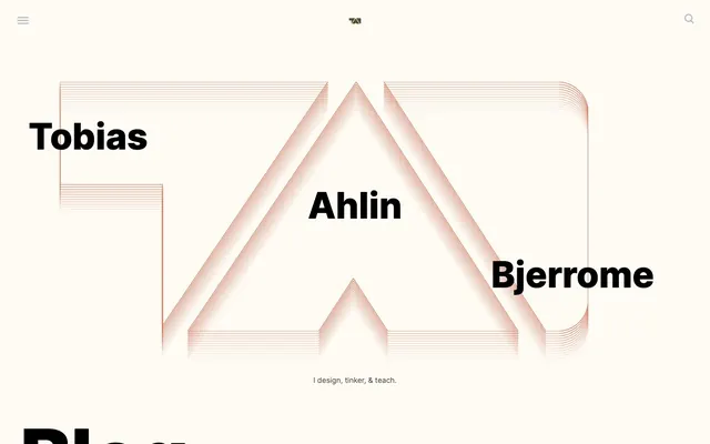









Keep what you find
A free account saves references to boards and can send you a weekly email of picks based on what you save.
To see every result, go Pro.