Preview image. Unlock full-res
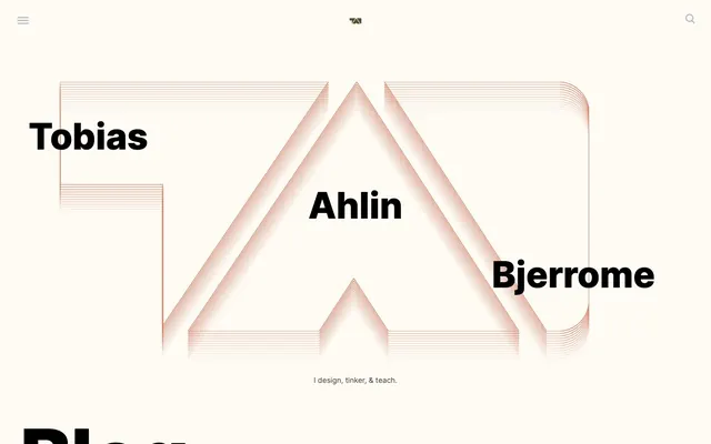
High-contrast typographic canvas
Color palette
Primary action background (filled buttons), distinct content section backgrounds
Alternative action background, background for specific content cards
Green action color for filled buttons, selected navigation states, and focused conversion moments
Decorative line art illustration accent, subtle graphic elements – provides visual zest without overwhelming high-contrast text
Link borders, subtle background tint for specific content blocks – a cool, muted contrast to Warm Clay
Page backgrounds, large inactive surfaces, base canvas for all content
Primary body text, bold headlines, high-contrast UI elements, icons
Hairline borders, dividers, input outlines, and card edges on light surfaces. Do not promote it to the primary CTA color
Subtle background for UI elements, secondary card surfaces
Darker background variations for content sections or interactive states
Typography
- Weights
- 400, 700, 800
- Sizes
- 11px, 13px, 15px, 16px, 40px, 46px, 58px, 73px, 160px
- Line height
- 0.76, 1, 1.3, 1.9, 2.03, 2.34, 2.76
- Letter spacing
- -0.02em at 160px, -0.007em at 73px, -0.005em at 58px, 0.025em at 11px, 0.063em at 13px, 0.26em at 15px, 0.40em at 40px
- Fallback
- system-ui, sans-serif
Primary typeface for all headlines, body text, and UI elements. Its strong presence and varied weight scale form the backbone of the visual hierarchy.
- Weights
- 400
- Sizes
- 13px
- Line height
- 1.2
Arial — detected in extracted data but not described by AI
Spacing & shape
Components
Transparent background, Text Ink color for text and border. No border radius. Padding: 10px.
Background: Cerulean Ink (#1f4954). Text: Surface Frost (#ffffff). No border radius. Padding: 50px horizontal, 90px vertical.
Background: Muted Ash (#9ba5b6). Text: Text Ink (#000000). No border radius. Padding: 40px all sides. No shadow.
Background: transparent. No border radius. Padding: 40px. No shadow.
Background: Purple Haze (#8e5ea2). Text: Surface Frost (#ffffff). No border radius. Padding: 50px horizontal, 90px vertical.
Background: Moss Green (#3bab87). Text: Surface Frost (#ffffff). No border radius. Padding: 50px horizontal, 90px vertical.
Guidelines
- Prioritize bold, black Inter typography with high contrast against light or subtly colored backgrounds.
- Use 0px (sharp corners) for all component edges unless explicitly specified as 2px for small elements.
- Define separation between elements and sections primarily through generous spacing (20px, 60px) and distinct background colors, not borders or shadows.
- Apply Warm Clay (#d67a60) exclusively for decorative, geometric line-art elements or subtle accents, never for functional text or backgrounds.
- Use distinct, saturated background colors (Cerulean Ink, Purple Haze, Moss Green) for primary actions and highlighted content blocks, ensuring white text for legibility.
- Maintain a spacious density across all layouts, utilizing sectionGap (60px) for vertical rhythm and cardPadding (40px) for internal content spacing.
- Favor white (#ffffff) or Canvas Oyster (#fefbf5) as primary surface colors, grounding the design in a light theme.
- Avoid using multiple border radii values; stick to 0px or 2px.
- Do not introduce drop shadows or other elevation cues; the visual system is entirely flat.
- Do not clutter layouts; keep information organized in clear, separate blocks with ample negative space.
- Refrain from using Warm Clay (#d67a60) for text or interactive elements; its role is purely decorative.
- Do not use subtle variations of neutral colors right next to each other. Rely on strong contrast or generous spacing for distinction.
- Do not apply borders to cards or main content blocks; boundaries are defined by background color and spacing.
- Avoid generic system fonts if Inter is available; Inter's distinct weights and condensed tracking are key to the brand's typographic voice.
About this system
ShowHide
The design system for Tobias Ahlin is a stark, high-contrast exploration of typography and structured negative space. It combines large, confident black sans-serif headlines with a minimalist canvas, often featuring a subtle off-white background. The visual identity is strongly tied to line-art graphics and geometric shapes, with a single muted orange hue serving as a delicate accent. Components are borderless and box-shadow-free, relying on distinct background colors and ample padding for definition. The overall feeling is precise, unornamented, and direct.
The page primarily employs a full-bleed layout for sections, but content within these sections often appears to be contained and centered. The hero section features a large, horizontally sprawling typographic logo with an abstract line-art graphic, framed by centered text. Section rhythm is achieved through alternating background colors, moving between Canvas Oyster and various muted-blue or colored blocks. Content blocks frequently feature a two-column layout with text and a visual element, or stacked, wide cards. Layout density is spacious, ensuring significant breathing room around all elements. Navigation is a simple, high-contrast black text menu at the top, along with a 'hamburger' icon for mobile or secondary navigation.
The visual language focuses on geometric line-art illustrations, often in a muted orange hue (Warm Clay), serving a purely decorative and atmospheric role. These graphics are abstract, not metaphorical, creating a sense of precision and structure without literal representation. There is no photography or product photography. Icons are minimal, outlined, and high-contrast, typically Text Ink on light backgrounds. The imagery is sparse, allowing text and strong layouts to dominate, emphasizing content and UI rather than illustrative storytelling.
Reminiscent of Brave Browser, Figma, Linear, Apple (recent marketing sites).
# Tobias Ahlin — Style Reference
> High-contrast typographic canvas

**Theme:** light

**Site:** https://tobiasahlin.com

The design system for Tobias Ahlin is a stark, high-contrast exploration of typography and structured negative space. It combines large, confident black sans-serif headlines with a minimalist canvas, often featuring a subtle off-white background. The visual identity is strongly tied to line-art graphics and geometric shapes, with a single muted orange hue serving as a delicate accent. Components are borderless and box-shadow-free, relying on distinct background colors and ample padding for definition. The overall feeling is precise, unornamented, and direct.

## Tokens — Colors

| Name | Value | Token | Role |
|------|------|------|------|
| Cerulean Ink | `#1f4954` | `--color-cerulean-ink` | Primary action background (filled buttons), distinct content section backgrounds |
| Purple Haze | `#8e5ea2` | `--color-purple-haze` | Alternative action background, background for specific content cards |
| Moss Green | `#3bab87` | `--color-moss-green` | Green action color for filled buttons, selected navigation states, and focused conversion moments |
| Warm Clay | `#d67a60` | `--color-warm-clay` | Decorative line art illustration accent, subtle graphic elements – provides visual zest without overwhelming high-contrast text |
| Ocean Deep | `#26555d` | `--color-ocean-deep` | Link borders, subtle background tint for specific content blocks – a cool, muted contrast to Warm Clay |
| Canvas Oyster | `#fefbf5` | `--color-canvas-oyster` | Page backgrounds, large inactive surfaces, base canvas for all content |
| Text Ink | `#000000` | `--color-text-ink` | Primary body text, bold headlines, high-contrast UI elements, icons |
| Surface Frost | `#ffffff` | `--color-surface-frost` | Hairline borders, dividers, input outlines, and card edges on light surfaces. Do not promote it to the primary CTA color |
| Muted Ash | `#9ba5b6` | `--color-muted-ash` | Subtle background for UI elements, secondary card surfaces |
| Slate Gray | `#2b2f3c` | `--color-slate-gray` | Darker background variations for content sections or interactive states |

## Tokens — Typography

### Inter
- **Substitute:** system-ui, sans-serif
- **Weights:** 400, 700, 800
- **Sizes:** 11px, 13px, 15px, 16px, 40px, 46px, 58px, 73px, 160px
- **Line height:** 0.76, 1, 1.3, 1.9, 2.03, 2.34, 2.76
- **Letter spacing:** -0.02em at 160px, -0.007em at 73px, -0.005em at 58px, 0.025em at 11px, 0.063em at 13px, 0.26em at 15px, 0.40em at 40px
- **Role:** Primary typeface for all headlines, body text, and UI elements. Its strong presence and varied weight scale form the backbone of the visual hierarchy.

### Arial
- **Weights:** 400
- **Sizes:** 13px
- **Line height:** 1.2
- **Role:** Arial — detected in extracted data but not described by AI

## Tokens — Type Scale

Augmented Fourth (1.414) from 15px base.

| Role | Size | Line height | Letter spacing |
|------|------|------|------|
| caption | 11px | 1.9 | — |
| body-sm | 13px | 1.9 | — |
| body | 15px | 1.9 | — |
| body-lg | 16px | 1.9 | — |
| heading-sm | 40px | 1.3 | — |
| heading | 46px | 1.3 | — |
| heading-lg | 58px | 1.3 | — |
| display-sm | 73px | 1.3 | — |
| display | 160px | 1.3 | — |

## Tokens — Spacing

- **Section gap:** 60px
- **Card padding:** 40px
- **Element gap:** 20px

## Tokens — Radius

- **none:** 0px
- **small:** 2px

## Layout

The page primarily employs a full-bleed layout for sections, but content within these sections often appears to be contained and centered. The hero section features a large, horizontally sprawling typographic logo with an abstract line-art graphic, framed by centered text. Section rhythm is achieved through alternating background colors, moving between Canvas Oyster and various muted-blue or colored blocks. Content blocks frequently feature a two-column layout with text and a visual element, or stacked, wide cards. Layout density is spacious, ensuring significant breathing room around all elements. Navigation is a simple, high-contrast black text menu at the top, along with a 'hamburger' icon for mobile or secondary navigation.

## Imagery

The visual language focuses on geometric line-art illustrations, often in a muted orange hue (Warm Clay), serving a purely decorative and atmospheric role. These graphics are abstract, not metaphorical, creating a sense of precision and structure without literal representation. There is no photography or product photography. Icons are minimal, outlined, and high-contrast, typically Text Ink on light backgrounds. The imagery is sparse, allowing text and strong layouts to dominate, emphasizing content and UI rather than illustrative storytelling.

## Components

### Ghost Button
*Outlined button for secondary actions or navigation links*

Transparent background, Text Ink color for text and border. No border radius. Padding: 10px.

### Primary Action CTA
*Filled button for main calls to action*

Background: Cerulean Ink (#1f4954). Text: Surface Frost (#ffffff). No border radius. Padding: 50px horizontal, 90px vertical.

### Monochrome Container Card
*Informational card with a distinct background*

Background: Muted Ash (#9ba5b6). Text: Text Ink (#000000). No border radius. Padding: 40px all sides. No shadow.

### Text Block Card
*Basic content container, often with a subtle background*

Background: transparent. No border radius. Padding: 40px. No shadow.

### Branded Callout Card - Purple
*A distinct, colored card to highlight specific content or actions*

Background: Purple Haze (#8e5ea2). Text: Surface Frost (#ffffff). No border radius. Padding: 50px horizontal, 90px vertical.

### Branded Callout Card - Green
*A distinct, colored card to highlight specific content or actions*

Background: Moss Green (#3bab87). Text: Surface Frost (#ffffff). No border radius. Padding: 50px horizontal, 90px vertical.

## Guidelines

### Do

- Prioritize bold, black Inter typography with high contrast against light or subtly colored backgrounds.
- Use 0px (sharp corners) for all component edges unless explicitly specified as 2px for small elements.
- Define separation between elements and sections primarily through generous spacing (20px, 60px) and distinct background colors, not borders or shadows.
- Apply Warm Clay (#d67a60) exclusively for decorative, geometric line-art elements or subtle accents, never for functional text or backgrounds.
- Use distinct, saturated background colors (Cerulean Ink, Purple Haze, Moss Green) for primary actions and highlighted content blocks, ensuring white text for legibility.
- Maintain a spacious density across all layouts, utilizing sectionGap (60px) for vertical rhythm and cardPadding (40px) for internal content spacing.
- Favor white (#ffffff) or Canvas Oyster (#fefbf5) as primary surface colors, grounding the design in a light theme.

### Don't

- Avoid using multiple border radii values; stick to 0px or 2px.
- Do not introduce drop shadows or other elevation cues; the visual system is entirely flat.
- Do not clutter layouts; keep information organized in clear, separate blocks with ample negative space.
- Refrain from using Warm Clay (#d67a60) for text or interactive elements; its role is purely decorative.
- Do not use subtle variations of neutral colors right next to each other. Rely on strong contrast or generous spacing for distinction.
- Do not apply borders to cards or main content blocks; boundaries are defined by background color and spacing.
- Avoid generic system fonts if Inter is available; Inter's distinct weights and condensed tracking are key to the brand's typographic voice.

## Agent Prompt Guide

Quick Color Reference:
text: #000000
background: #fefbf5
border: #000000 (for ghost buttons), #d67a60 (for decorative lines)
accent: #d67a60
primary action: #2b2f3c (filled action)

Example Component Prompts:
1. Create a ghost button: transparent background, Text Ink (#000000) text and 1px border, 0px radius, 10px padding.
2. Create a Primary Action Button: #2b2f3c background, #ffffff text, 9999px radius, compact pill padding. Use this filled treatment for the main CTA.
3. Create a content card with a muted background: Muted Ash (#9ba5b6) background, Text Ink (#000000) text, 0px radius, 40px all-side padding.
4. Generate a striking headline: Inter font, weight 800, size 160px, line-height 0.76, letter-spacing -0.02em, color Text Ink (#000000).
More like this









Keep what you find
A free account saves references to boards and can send you a weekly email of picks based on what you save.
To see every result, go Pro.