Preview image. Unlock full-res
joyful, high-contrast messaging
Color palette
Dominant page background, creating a vibrant, immersive field for content
Yellow outline accent for tags, dividers, and focused UI edges. Do not promote it to the primary CTA color
Hairline borders, dividers, input outlines, and card edges on light surfaces. Do not promote it to the primary CTA color
Main body text, providing high contrast against lighter surfaces
Used for specific icon fills and strong visual emphasis against white; never as a full background
Typography
- Weights
- 700
- Sizes
- 52px
- Line height
- 1.23
- Letter spacing
- -0.62
- Fallback
- Montserrat
Prominent display headings, imparting a bold and direct message.
- Weights
- 400, 500, 600
- Sizes
- 13px, 14px, 16px, 17px, 19px
- Line height
- 0.7, 1, 1.2, 1.38, 1.47, 1.55
- Letter spacing
- -0.21px at 16px, normal at 14px
- Fallback
- Inter
All general UI text, from body copy to labels, links, and footer information. A versatile, clean sans-serif.
Spacing & shape
Components
Text: Paper White (#ffffff) Honk Sans, variable size/weight; Background: transparent (rgba(0,0,0,0)); Border: Paper White (rgb(255, 255, 255)) 0px; Padding: 0px. Used for 'Read Announcement' link.
Guidelines
- Use Sky Canvas (#008fff) as the foundational background for most sections to maintain a high-energy, immersive feel.
- Apply Sunshine Accent (#ffe400) selectively for major headers and highlight elements to create emphasis against the blue background.
- Ensure all primary text on Sky Canvas uses Paper White (#ffffff) for maximum contrast and legibility.
- Utilize Honk Header font (weight 700) at 52px for all top-level page headings, with a letter-spacing of -0.62px to give a strong, bold identity.
- Implement Honk Sans for all body text, using 14px/400 weight for general paragraphs and 16px/500 weight with -0.42px letter-spacing for subheadings or more prominent paragraphs.
- Maintain minimal border radii where observed: 6px for individual links/buttons and 16px for larger 'other' container elements to introduce soft friendly edges.
- Use 16px as a comfortable base for element spacing where default grid gaps are not explicitly defined, providing adequate breathing room.
- Avoid using multiple chromatic colors beyond Sky Canvas and Sunshine Accent; the system relies on this high-contrast two-tone approach.
- Do not introduce complex shadows or gradients; concentrate on flat, clean design with color providing definition.
- Refrain from using thin light typography for headlines; the system prioritizes bold and impactful messaging.
- Do not place body text directly on Sky Canvas backgrounds in a small size without adequate contrast; if using Charcoal Text (#111111), ensure it's on a Paper White (#ffffff) surface.
- Avoid excessive use of borders; elements should primarily be defined by color blocks or subtle shifts in surface.
About this system
ShowHide
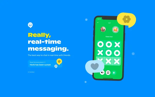
Honk uses a vibrant, high-contrast visual system where bold primary colors make the interface pop. The design relies on a striking blue canvas accented by bright yellow highlights and white text, creating an energetic and direct communication style. Typography is bold and casual, contributing to an approachable, fun atmosphere. Most elements are flat with minimal shadows, emphasizing clarity and quick interaction.
The page primarily uses a full-bleed layout with no discernible maximum width, allowing the vibrant Sky Canvas to fill the entire viewport. The hero section features a large, off-centered headline and subheading on the left, balanced by a significant product visual (smartphone mockup) on the right. Content is arranged with ample negative space around key elements. Navigation appears to be minimal, indicated by a logo in the top left and a footer with a single link. The overall density feels comfortable due to the generous spacing.
The visual language is characterized by abstract graphic elements and product screenshots. The main image features a stylized smartphone with a brightly colored, in-app messaging interface (Tic-Tac-Toe game). This imagery is contained within clearly defined shapes and uses a vibrant green for the app screen, contrasting with the overall blue background. Conversational bubble shapes with playful icons (heart, flower, hand) are used as decorative elements, often in pastel or bright complementary colors (yellow, light blue). Photography is absent; the focus is on a digitally native, illustrative, and UI-centric aesthetic.
Reminiscent of Discord, Snapchat, KakaoTalk, Slack.
# Honk — Style Reference
> joyful, high-contrast messaging

**Theme:** light

**Site:** https://honk.me

Honk uses a vibrant, high-contrast visual system where bold primary colors make the interface pop. The design relies on a striking blue canvas accented by bright yellow highlights and white text, creating an energetic and direct communication style. Typography is bold and casual, contributing to an approachable, fun atmosphere. Most elements are flat with minimal shadows, emphasizing clarity and quick interaction.

## Tokens — Colors

| Name | Value | Token | Role |
|------|------|------|------|
| Sky Canvas | `#008fff` | `--color-sky-canvas` | Dominant page background, creating a vibrant, immersive field for content |
| Sunshine Accent | `#ffe400` | `--color-sunshine-accent` | Yellow outline accent for tags, dividers, and focused UI edges. Do not promote it to the primary CTA color |
| Paper White | `#ffffff` | `--color-paper-white` | Hairline borders, dividers, input outlines, and card edges on light surfaces. Do not promote it to the primary CTA color |
| Charcoal Text | `#111111` | `--color-charcoal-text` | Main body text, providing high contrast against lighter surfaces |
| Deep Space | `#000000` | `--color-deep-space` | Used for specific icon fills and strong visual emphasis against white; never as a full background |

## Tokens — Typography

### Honk Header
- **Substitute:** Montserrat
- **Weights:** 700
- **Sizes:** 52px
- **Line height:** 1.23
- **Letter spacing:** -0.62
- **Role:** Prominent display headings, imparting a bold and direct message.

### Honk Sans
- **Substitute:** Inter
- **Weights:** 400, 500, 600
- **Sizes:** 13px, 14px, 16px, 17px, 19px
- **Line height:** 0.7, 1, 1.2, 1.38, 1.47, 1.55
- **Letter spacing:** -0.21px at 16px, normal at 14px
- **Role:** All general UI text, from body copy to labels, links, and footer information. A versatile, clean sans-serif.

## Tokens — Type Scale

Major Second (1.125) from 16px base.

| Role | Size | Line height | Letter spacing |
|------|------|------|------|
| caption | 13px | 1.38 | — |
| body-sm | 14px | 1.38 | — |
| body | 16px | 1.38 | — |
| body-lg | 17px | 1.38 | — |
| heading-sm | 19px | 1.38 | — |

## Tokens — Spacing

- **Section gap:** 48-64px
- **Card padding:** 24px
- **Element gap:** 16px

## Tokens — Radius

- **links:** 6px
- **other:** 16px

## Layout

The page primarily uses a full-bleed layout with no discernible maximum width, allowing the vibrant Sky Canvas to fill the entire viewport. The hero section features a large, off-centered headline and subheading on the left, balanced by a significant product visual (smartphone mockup) on the right. Content is arranged with ample negative space around key elements. Navigation appears to be minimal, indicated by a logo in the top left and a footer with a single link. The overall density feels comfortable due to the generous spacing.

## Imagery

The visual language is characterized by abstract graphic elements and product screenshots. The main image features a stylized smartphone with a brightly colored, in-app messaging interface (Tic-Tac-Toe game). This imagery is contained within clearly defined shapes and uses a vibrant green for the app screen, contrasting with the overall blue background. Conversational bubble shapes with playful icons (heart, flower, hand) are used as decorative elements, often in pastel or bright complementary colors (yellow, light blue). Photography is absent; the focus is on a digitally native, illustrative, and UI-centric aesthetic.

## Components

### Ghost Link Button
*Minimal interactive element for secondary actions, often paired with an icon.*

Text: Paper White (#ffffff) Honk Sans, variable size/weight; Background: transparent (rgba(0,0,0,0)); Border: Paper White (rgb(255, 255, 255)) 0px; Padding: 0px. Used for 'Read Announcement' link.

## Guidelines

### Do

- Use Sky Canvas (#008fff) as the foundational background for most sections to maintain a high-energy, immersive feel.
- Apply Sunshine Accent (#ffe400) selectively for major headers and highlight elements to create emphasis against the blue background.
- Ensure all primary text on Sky Canvas uses Paper White (#ffffff) for maximum contrast and legibility.
- Utilize Honk Header font (weight 700) at 52px for all top-level page headings, with a letter-spacing of -0.62px to give a strong, bold identity.
- Implement Honk Sans for all body text, using 14px/400 weight for general paragraphs and 16px/500 weight with -0.42px letter-spacing for subheadings or more prominent paragraphs.
- Maintain minimal border radii where observed: 6px for individual links/buttons and 16px for larger 'other' container elements to introduce soft friendly edges.
- Use 16px as a comfortable base for element spacing where default grid gaps are not explicitly defined, providing adequate breathing room.

### Don't

- Avoid using multiple chromatic colors beyond Sky Canvas and Sunshine Accent; the system relies on this high-contrast two-tone approach.
- Do not introduce complex shadows or gradients; concentrate on flat, clean design with color providing definition.
- Refrain from using thin light typography for headlines; the system prioritizes bold and impactful messaging.
- Do not place body text directly on Sky Canvas backgrounds in a small size without adequate contrast; if using Charcoal Text (#111111), ensure it's on a Paper White (#ffffff) surface.
- Avoid excessive use of borders; elements should primarily be defined by color blocks or subtle shifts in surface.

## Agent Prompt Guide

Quick Color Reference:
text: #111111
background: #008fff
border: #ffffff
accent: #ffe400
primary action: no distinct CTA color

Example Component Prompts:
1. Create a hero headline block: Honk Header weight 700, 52px, letter-spacing -0.62px, text color Sunshine Accent (#ffe400); immediately followed by body text using Honk Sans, 19px, weight 400, text color Paper White (#ffffff).
2. Create a footer link: Honk Sans, 14px, weight 400, text color Paper White (#ffffff), no underline, on a Sky Canvas (#008fff) background. It should use a 6px border radius if it were to become a filled button.
More like this







Keep what you find
A free account saves references to boards and can send you a weekly email of picks based on what you save.
To see every result, go Pro.