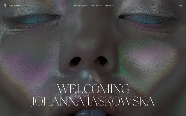
Preview image. Unlock full-res
Gallery Grid on Canvas
Color palette
Neutral form states, badge text, and quiet UI feedback where color should stay understated. Do not promote it to the primary CTA color
Primary text, headings on light backgrounds, element borders. Background for hero sections and image overlays
Decorative borders, secondary text where primary text is Ink Black. Used for subtle emphasis without full black contrast
Muted secondary text, ghost button borders, decorative icon fills. Suggests interaction without high contrast
Subtle background for badges, text on badges with higher contrast background. Low-prominence UI elements
Standard input field borders, providing a clear but not dominant delineation
Typography
- Weights
- 300, 400
- Sizes
- 14px, 16px, 20px, 22px
- Line height
- 1, 1.15, 1.2, 1.4, 1.44, 1.64, 1.8
- Letter spacing
- 0.008em, 0.020em
- Fallback
- system-ui
Primary functional typeface for body text, navigation, links, and buttons. Its versatile weight range supports both compact UI elements and more descriptive content.
- Weights
- 100
- Sizes
- 100px
- Line height
- 0.95
- Letter spacing
- -0.010em
- Fallback
- serif
Signature display typeface for impactful headlines. Its extremely light weight and generous tracking create a sophisticated, almost ethereal presence, emphasizing elegance over shouting.
- Weights
- 400
- Sizes
- 13px
- Line height
- 1.31
- Letter spacing
- normal
- Fallback
- monospace
Monospaced font used for small, functional elements like badges, providing technical precision where needed without disrupting the overall minimal aesthetic.
Spacing & shape
Components
Minimalist button for navigation or secondary actions. Uses `Canvas White` for text and border against dark backgrounds, or `Ink Black` text with subtle border against light backgrounds. No background fill, providing a 'ghost' appearance. No padding.
Pill-shaped badge with `Silver Mist` background (rgba(0,0,0,0.2) against dark) and `Canvas White` text. Rounded to `9999px` radius, 6px top/8px bottom vertical padding, 24px horizontal padding.
Pill-shaped badge with no background and a border color of `Ash Gray` (rgba(0,0,0,0.2) or #cccccc depending on background). Rounded to `9999px` radius, 6px top/8px bottom vertical padding, 24px horizontal padding.
Transparent background input field, `Canvas White` text. `Canvas White` border, 0px radius. Minimal 1px vertical, 2px horizontal padding. Hint text might be `Ash Gray`.
Input field with `Canvas White` background and `Ink Black` text. `Input Border Gray` (or #767676) border, 0px radius. Minimal 1px vertical, 2px horizontal padding.
Guidelines
- Use `Canvas White` (#ffffff) for all main page and card backgrounds to maintain a clean, expansive feel.
- Employ `saol-display` weight 100 at 100px with -10px letter-spacing for primary headlines to create a striking, elegant visual statement.
- Structure content with ample white space, using `sectionGap` of 90px between major content blocks.
- Maintain a monochromatic palette with only `Ink Black`, `Graphite`, `Ash Gray`, `Silver Mist`, and `Input Border Gray` for UI elements.
- Apply `9999px` border-radius to all badges for a consistent pill shape.
- Prioritize text-based interactions; button backgrounds are typically transparent, with text and borders defining interactivity.
- Ensure input fields use explicit borders like `Input Border Gray` and `Canvas White` to define their boundaries distinctly from the minimalistic buttons.
- Avoid using bright or saturated colors for backgrounds, primary text, or interactive elements; reserve accent for content visuals.
- Do not introduce heavy shadows or gradients on UI components, favoring flat surfaces and subtle borders.
- Refrain from using bold or heavy weights for `soehne` when styling headings; its primary use should be for body and navigation.
- Do not add additional padding to ghost buttons; they should remain as minimalist text links with an implied interactive zone.
- Avoid decorative iconography that is colorful or heavily outlined; icons should be monochromatic, using `Ink Black` or `Ash Gray`.
- Do not deviate from the defined `9999px` radius for badges; all interactive tags or status indicators should adopt this pill shape.
About this system
ShowHide
Hugo & Marie operates with a refined, understated aesthetic characterized by stark monochrome typography and a deliberately sparse, almost gallery-like layout. Clean, unadorned surfaces provide a neutral canvas for striking visual content, while subtle hints of interactivity appear as ghost buttons and hairline borders. The system prioritizes clarity and a sense of curated space, allowing the visual work to take center stage.
The page exhibits a max-width contained model post-hero, with content sections having consistent vertical spacing. The hero features a full-bleed background image with a centered, large `saol-display` headline in `Canvas White` text. Subsequent sections primarily utilize a two-column layout, often with text on one side and an image or content block on the other, or a centered stacked arrangement. A consistent grid of four columns is used for displaying image thumbnails. The density is spacious, with significant padding and margin creating ample breathing room around elements. Navigation is a simple top bar, typically fixed or ghosted over the hero, with minimalist text links.
This site predominantly features striking, high-fidelity photography of human subjects or abstract, art-focused compositions. Imagery is often full-bleed or large-scale, acting as a dramatic backdrop or hero element. When not full-bleed, images are typically presented in a clean grid layout with sharp, unrounded edges. The treatment emphasizes the visual impact of the content, often using monochrome or desaturated palettes, with occasional vibrant but confined bursts of color (e.g., iridescent skin tones, abstract art pieces). Icons are outlined and monochromatic, acting as minimal UI elements rather than detailed graphics. The overall role of imagery is decorative atmosphere and product showcase, leaning heavily into a gallery-like presentation.
Reminiscent of AIGA, Made by Google, Chermayeff & Geismar & Haviv, Squarespace.
# Hugo & Marie — Style Reference
> Gallery Grid on Canvas

**Theme:** light

**Site:** https://www.hugoandmarie.com

Hugo & Marie operates with a refined, understated aesthetic characterized by stark monochrome typography and a deliberately sparse, almost gallery-like layout. Clean, unadorned surfaces provide a neutral canvas for striking visual content, while subtle hints of interactivity appear as ghost buttons and hairline borders. The system prioritizes clarity and a sense of curated space, allowing the visual work to take center stage.

## Tokens — Colors

| Name | Value | Token | Role |
|------|------|------|------|
| Canvas White | `#ffffff` | `--color-canvas-white` | Neutral form states, badge text, and quiet UI feedback where color should stay understated. Do not promote it to the primary CTA color |
| Ink Black | `#000000` | `--color-ink-black` | Primary text, headings on light backgrounds, element borders. Background for hero sections and image overlays |
| Graphite | `#0a0a0a` | `--color-graphite` | Decorative borders, secondary text where primary text is Ink Black. Used for subtle emphasis without full black contrast |
| Ash Gray | `#b3b3b3` | `--color-ash-gray` | Muted secondary text, ghost button borders, decorative icon fills. Suggests interaction without high contrast |
| Silver Mist | `#cccccc` | `--color-silver-mist` | Subtle background for badges, text on badges with higher contrast background. Low-prominence UI elements |
| Input Border Gray | `#767676` | `--color-input-border-gray` | Standard input field borders, providing a clear but not dominant delineation |

## Tokens — Typography

### soehne
- **Substitute:** system-ui
- **Weights:** 300, 400
- **Sizes:** 14px, 16px, 20px, 22px
- **Line height:** 1, 1.15, 1.2, 1.4, 1.44, 1.64, 1.8
- **Letter spacing:** 0.008em, 0.020em
- **Role:** Primary functional typeface for body text, navigation, links, and buttons. Its versatile weight range supports both compact UI elements and more descriptive content.

### saol-display
- **Substitute:** serif
- **Weights:** 100
- **Sizes:** 100px
- **Line height:** 0.95
- **Letter spacing:** -0.010em
- **Role:** Signature display typeface for impactful headlines. Its extremely light weight and generous tracking create a sophisticated, almost ethereal presence, emphasizing elegance over shouting.

### soehne-mono
- **Substitute:** monospace
- **Weights:** 400
- **Sizes:** 13px
- **Line height:** 1.31
- **Letter spacing:** normal
- **Role:** Monospaced font used for small, functional elements like badges, providing technical precision where needed without disrupting the overall minimal aesthetic.

## Tokens — Type Scale

| Role | Size | Line height | Letter spacing |
|------|------|------|------|
| caption | 13px | 17px | — |
| body | 16px | 23px | 0.128px |
| subheading | 20px | 23px | 0.16px |
| heading | 22px | 22px | 0.44px |
| display | 100px | 95px | -10px |

## Tokens — Spacing

- **Section gap:** 90px
- **Card padding:** 20px
- **Element gap:** 5px

## Tokens — Radius

- **badges:** 9999px

## Layout

The page exhibits a max-width contained model post-hero, with content sections having consistent vertical spacing. The hero features a full-bleed background image with a centered, large `saol-display` headline in `Canvas White` text. Subsequent sections primarily utilize a two-column layout, often with text on one side and an image or content block on the other, or a centered stacked arrangement. A consistent grid of four columns is used for displaying image thumbnails. The density is spacious, with significant padding and margin creating ample breathing room around elements. Navigation is a simple top bar, typically fixed or ghosted over the hero, with minimalist text links.

## Imagery

This site predominantly features striking, high-fidelity photography of human subjects or abstract, art-focused compositions. Imagery is often full-bleed or large-scale, acting as a dramatic backdrop or hero element. When not full-bleed, images are typically presented in a clean grid layout with sharp, unrounded edges. The treatment emphasizes the visual impact of the content, often using monochrome or desaturated palettes, with occasional vibrant but confined bursts of color (e.g., iridescent skin tones, abstract art pieces). Icons are outlined and monochromatic, acting as minimal UI elements rather than detailed graphics. The overall role of imagery is decorative atmosphere and product showcase, leaning heavily into a gallery-like presentation.

## Components

### Ghost Text Button
*Interactive element, navigation*

Minimalist button for navigation or secondary actions. Uses `Canvas White` for text and border against dark backgrounds, or `Ink Black` text with subtle border against light backgrounds. No background fill, providing a 'ghost' appearance. No padding.

### Pill Badge - Light Text
*Categorization, status indicator*

Pill-shaped badge with `Silver Mist` background (rgba(0,0,0,0.2) against dark) and `Canvas White` text. Rounded to `9999px` radius, 6px top/8px bottom vertical padding, 24px horizontal padding.

### Pill Badge - Gray Border
*Categorization, status indicator*

Pill-shaped badge with no background and a border color of `Ash Gray` (rgba(0,0,0,0.2) or #cccccc depending on background). Rounded to `9999px` radius, 6px top/8px bottom vertical padding, 24px horizontal padding.

### Text Input - Dark
*Data entry*

Transparent background input field, `Canvas White` text. `Canvas White` border, 0px radius. Minimal 1px vertical, 2px horizontal padding. Hint text might be `Ash Gray`.

### Text Input - Light
*Data entry*

Input field with `Canvas White` background and `Ink Black` text. `Input Border Gray` (or #767676) border, 0px radius. Minimal 1px vertical, 2px horizontal padding.

## Guidelines

### Do

- Use `Canvas White` (#ffffff) for all main page and card backgrounds to maintain a clean, expansive feel.
- Employ `saol-display` weight 100 at 100px with -10px letter-spacing for primary headlines to create a striking, elegant visual statement.
- Structure content with ample white space, using `sectionGap` of 90px between major content blocks.
- Maintain a monochromatic palette with only `Ink Black`, `Graphite`, `Ash Gray`, `Silver Mist`, and `Input Border Gray` for UI elements.
- Apply `9999px` border-radius to all badges for a consistent pill shape.
- Prioritize text-based interactions; button backgrounds are typically transparent, with text and borders defining interactivity.
- Ensure input fields use explicit borders like `Input Border Gray` and `Canvas White` to define their boundaries distinctly from the minimalistic buttons.

### Don't

- Avoid using bright or saturated colors for backgrounds, primary text, or interactive elements; reserve accent for content visuals.
- Do not introduce heavy shadows or gradients on UI components, favoring flat surfaces and subtle borders.
- Refrain from using bold or heavy weights for `soehne` when styling headings; its primary use should be for body and navigation.
- Do not add additional padding to ghost buttons; they should remain as minimalist text links with an implied interactive zone.
- Avoid decorative iconography that is colorful or heavily outlined; icons should be monochromatic, using `Ink Black` or `Ash Gray`.
- Do not deviate from the defined `9999px` radius for badges; all interactive tags or status indicators should adopt this pill shape.

## Agent Prompt Guide

Quick Color Reference:
- text: #000000
- background: #ffffff
- border: #0a0a0a
- accent: none observed
- primary action: no distinct CTA color

Example Component Prompts:
- Create a hero section: full-bleed image background. Centered headline 'WELCOMING JOHANNA JASKOWSKA' using `saol-display` weight 100, size 100px, #ffffff, letter-spacing -10px. Ghost navigation links on top bar using `soehne` weight 400, size 16px, #ffffff.
- Create a feature section: `Canvas White` background, 90px section gap. Two-column layout: left column contains subheading 'Creative Agency' using `soehne` weight 400, size 22px, #000000; body text 'Our Creative Agency helps bring brands to life...' using `soehne` weight 400, size 16px, #000000. Right column contains an image of an artwork.
- Create a functional badge: fill background with `Silver Mist` (#cccccc), text 'Latest' using `soehne-mono` weight 400, size 13px, #000000. Apply `9999px` border-radius and 6px top, 8px bottom, 24px horizontal padding.
More like this









Keep what you find
A free account saves references to boards and can send you a weekly email of picks based on what you save.
To see every result, go Pro.