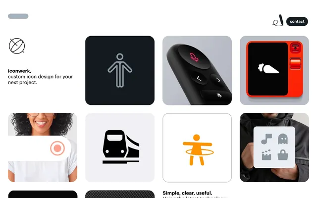
Preview image. Unlock full-res
Color palette
Primary headings, body text, and icon fills on light surfaces. Do not promote it to the primary CTA color
Typography
- Weights
- 400
- Sizes
- 14px
- Line height
- 1.21
- Letter spacing
- normal
- Fallback
- Arial, Helvetica, sans-serif
System fallback for general text, links, and image captions. Provides a clean, unadorned baseline.
- Weights
- 400, 600
- Sizes
- 16px, 21px, 22px, 24px
- Line height
- 1.18, 1.19, 1.21
- Letter spacing
- normal
- Fallback
- Inter, ui-sans-serif, system-ui
Headlines and prominent body text. Graphik's robust modern sans-serif character supports the direct and functional aesthetic.
Spacing & shape
Components
Squared card with a large 28px border-radius, often filled with a #000000 background for contrast or a neutral white, housing a centered icon image or text. Padding varies but often around 18px.
Text-only button with Ink Black text, 28px border-radius applied to an underlying clickable area, with a subtle border for hover states (though not explicitly detected in static data, implied by general design). Padding around text is implied to be minimal to maintain a ghost aesthetic.
Guidelines
- Prioritize extreme visual clarity with #000000 text and borders against white or near-white backgrounds.
- Apply a generous 28px border-radius consistently to all interactive elements, cards, and prominent shapes.
- Maintain ample whitespace; use 45px for vertical section separation and 5px as a base unit for smaller element spacing.
- Use Graphik (or Inter) for all headlines and emphasized text, leveraging weights 400 and 600.
- Employ `"liga"` font feature settings for Graphik to enable ligatures, enhancing typographic refinement.
- Keep chromatic elements to a minimum, using color only for specific icon examples or very deliberate brand accent in content areas.
- Avoid using multiple colors for interface elements; stick to the monochrome palette for UI.
- Do not use sharp corners; the 28px radius is a signature visual element.
- Refrain from dense layouts; maintain a spacious feel with generous padding and margins.
- Do not introduce heavy shadows or complex elevation; the system relies on flat, high-contrast surfaces.
- Avoid decorative gradients for UI elements; their absence reinforces clarity.
About this system
ShowHide
The iconwerk system is a minimalist black and white canvas for showcasing custom icon design. It prioritizes clarity and directness through a largely monochrome palette, sparse text, and a loose, airy layout. Visual interest comes from the high-contrast presentation of icons and the generous use of rounded rectangles, creating a playful, object-focused atmosphere. The overall impression is one of curated simplicity, allowing the icons themselves to be the main protagonists.
The page uses a full-bleed layout for its main content area, with elements often centered or aligned to a relatively subtle grid. The hero section is a simple introductory text block with a logo. The main content is composed of a prominent 2x2 or 3x2 grid of 'Icon Cards' that alternate between dark and light backgrounds, creating a checkerboard-like visual rhythm. Each card is self-contained. Vertical spacing between content blocks is generous, around 45px. Navigation consists of a minimal top-right floating 'contact' button with a subtle logo.
The site's imagery is primarily product-focused, showcasing various icon designs and product integrations. It features tight crops of actual product hardware (like remote controls, ovens) or abstract scenes (landscapes, wood textures) serving as backgrounds for overlaid icons. Icons themselves are presented either as simple outlines (often #000000 or a specific accent color) on solid backgrounds, or integrated into realistic product mockups. The style is detailed and realistic for product depictions, while icons are clean and graphic, often monochromatic. Icon style leans towards outlined with a consistent stroke weight. Imagery is used to contextualize and demonstrate the icons' versatility rather than for decorative atmosphere.
Reminiscent of Linear, Stripe, Figma, Vercel.
# iconwerk — Style Reference
> Gallery of crisp forms

**Theme:** light

**Site:** https://www.iconwerk.com

The iconwerk system is a minimalist black and white canvas for showcasing custom icon design. It prioritizes clarity and directness through a largely monochrome palette, sparse text, and a loose, airy layout. Visual interest comes from the high-contrast presentation of icons and the generous use of rounded rectangles, creating a playful, object-focused atmosphere. The overall impression is one of curated simplicity, allowing the icons themselves to be the main protagonists.

## Tokens — Colors

| Name | Value | Token | Role |
|------|------|------|------|
| Ink Black | `#000000` | `--color-ink-black` | Primary headings, body text, and icon fills on light surfaces. Do not promote it to the primary CTA color |

## Tokens — Typography

### Arial
- **Substitute:** Arial, Helvetica, sans-serif
- **Weights:** 400
- **Sizes:** 14px
- **Line height:** 1.21
- **Letter spacing:** normal
- **Role:** System fallback for general text, links, and image captions. Provides a clean, unadorned baseline.

### Graphik
- **Substitute:** Inter, ui-sans-serif, system-ui
- **Weights:** 400, 600
- **Sizes:** 16px, 21px, 22px, 24px
- **Line height:** 1.18, 1.19, 1.21
- **Letter spacing:** normal
- **Role:** Headlines and prominent body text. Graphik's robust modern sans-serif character supports the direct and functional aesthetic.

## Tokens — Type Scale

Minor Third (1.2) from 14px base.

| Role | Size | Line height | Letter spacing |
|------|------|------|------|
| body | 14px | 1.21 | — |
| body-lg | 16px | 1.21 | — |
| subheading | 21px | 1.18 | — |
| heading-lg | 24px | 1.21 | — |

## Tokens — Spacing

- **Section gap:** 45px
- **Card padding:** 18px
- **Element gap:** 5px

## Tokens — Radius

- **Buttons:** 28px
- **Cards:** 28px
- **tags:** 28px

## Layout

The page uses a full-bleed layout for its main content area, with elements often centered or aligned to a relatively subtle grid. The hero section is a simple introductory text block with a logo. The main content is composed of a prominent 2x2 or 3x2 grid of 'Icon Cards' that alternate between dark and light backgrounds, creating a checkerboard-like visual rhythm. Each card is self-contained. Vertical spacing between content blocks is generous, around 45px. Navigation consists of a minimal top-right floating 'contact' button with a subtle logo.

## Imagery

The site's imagery is primarily product-focused, showcasing various icon designs and product integrations. It features tight crops of actual product hardware (like remote controls, ovens) or abstract scenes (landscapes, wood textures) serving as backgrounds for overlaid icons. Icons themselves are presented either as simple outlines (often #000000 or a specific accent color) on solid backgrounds, or integrated into realistic product mockups. The style is detailed and realistic for product depictions, while icons are clean and graphic, often monochromatic. Icon style leans towards outlined with a consistent stroke weight. Imagery is used to contextualize and demonstrate the icons' versatility rather than for decorative atmosphere.

## Components

### Icon Card
*Container for individual icon examples*

Squared card with a large 28px border-radius, often filled with a #000000 background for contrast or a neutral white, housing a centered icon image or text. Padding varies but often around 18px.

### Contact Button
*Primary call to action.*

Text-only button with Ink Black text, 28px border-radius applied to an underlying clickable area, with a subtle border for hover states (though not explicitly detected in static data, implied by general design). Padding around text is implied to be minimal to maintain a ghost aesthetic.

## Guidelines

### Do

- Prioritize extreme visual clarity with #000000 text and borders against white or near-white backgrounds.
- Apply a generous 28px border-radius consistently to all interactive elements, cards, and prominent shapes.
- Maintain ample whitespace; use 45px for vertical section separation and 5px as a base unit for smaller element spacing.
- Use Graphik (or Inter) for all headlines and emphasized text, leveraging weights 400 and 600.
- Employ `"liga"` font feature settings for Graphik to enable ligatures, enhancing typographic refinement.
- Keep chromatic elements to a minimum, using color only for specific icon examples or very deliberate brand accent in content areas.

### Don't

- Avoid using multiple colors for interface elements; stick to the monochrome palette for UI.
- Do not use sharp corners; the 28px radius is a signature visual element.
- Refrain from dense layouts; maintain a spacious feel with generous padding and margins.
- Do not introduce heavy shadows or complex elevation; the system relies on flat, high-contrast surfaces.
- Avoid decorative gradients for UI elements; their absence reinforces clarity.

## Agent Prompt Guide

Quick Color Reference:
text: #000000
background: #FFFFFF (implied, not explicitly in data)
border: #000000
accent: no distinct accent color
primary action: no distinct CTA color

Example Component Prompts:
1. Create a header: Top-aligned, minimal, containing the site logo (placeholder for now), and a 'contact' link. The link text is 'contact' in Ink Black, using 14px Arial, 28px border-radius on click area, ensuring the entire header remains visually light and unobtrusive.
2. Create an 'Icon Card': A square white surface with 28px border-radius. Center a placeholder icon (e.g., a simple 'X' shape) in Ink Black within this card. For a variant, display a similar card with an Ink Black fill and a white placeholder icon, maintaining the same 28px radius.
More like this









Keep what you find
A free account saves references to boards and can send you a weekly email of picks based on what you save.
To see every result, go Pro.