Preview image. Unlock full-res
Pixel-perfect Monochrome Precision
Color palette
Primary text, icon fill, active button borders, pixel art elements — a grounding dark tone against light surfaces
Page background, primary surface color — a soft, almost white base
Secondary text, link text, subtle borders, inactive elements — a mid-tone gray for supporting information
Decorative icon black, text color on high contrast backgrounds
Typography
- Weights
- 500, 560, 740
- Sizes
- 12px, 14px, 18px
- Line height
- 1, 1.1
- Letter spacing
- -0.0270em at 18px, -0.0230em at 14px, -0.0180em at 12px
- Fallback
- Inter
Primary headings, body text, and navigation items. Its varied weights and negative letter-spacing contribute to a precise, editorial feel. Use 1.0 line height for tight, stacked headers and 1.1 for readable body copy.
- Weights
- 500
- Sizes
- 14px
- Line height
- 1, 1.2
- Letter spacing
- -0.0230em
- Fallback
- IBM Plex Mono
Used for specific functional text like interactive elements and code-like displays. Its monospace nature provides a technical, structured counterpoint to the primary typeface.
Spacing & shape
Components
Text in ABCWalterNeue, 14px, weight 500, color Stormy Ash (#111313), with a 0.5px border-top in Stormy Ash, 2px padding top/bottom and 6px left/right. Negative letter spacing at -0.023em.
Text in ABCWalterNeue, 14px, weight 500, color Muted Steel (#4b5353), with no visible border. 2px padding top/bottom and 6px left/right. Negative letter spacing at -0.023em.
Transparent background with a 1px Stormy Ash (#111313) border. Text in Stormy Ash, InputMono, 14px, weight 500, letter-spacing -0.023em. 2px padding top/bottom and 6px left/right. Radius 0px.
Transparent background, no box shadow, no borders. Content inside is typically 14px ABCWalterNeue, weight 500, color Stormy Ash (#111313). Radius 0px. Padding 0px.
Guidelines
- Prioritize Stormy Ash (#111313) for primary text and interactive elements against Cloud Canvas (#d4d8d8) for maximal contrast and digital sharpness.
- Use ABCWalterNeue for all primary brand communication, varying its weights (500, 560, 740) to establish visual hierarchy without introducing new typefaces.
- Apply specific negative letter-spacing values (-0.0270em, -0.0230em, -0.0180em) to maintain the precise, tight typographic aesthetic.
- Maintain a compact density with element gaps typically at 4px and section gaps at 72px to create clear visual separation.
- Implement interactive states using subtle borders in Stormy Ash (#111313) or color shifts to Muted Steel (#4b5353), avoiding solid background fills for general buttons.
- Use radius 0px for all button-like components to maintain a stark, precise aesthetic, except where 4px is explicitly specified for internal navigation elements or 8px for specific 'other' components.
- Avoid using saturated accent colors; the palette is strictly monochromatic with Stormy Ash, Cloud Canvas, and Muted Steel.
- Do not introduce new fonts; the system relies exclusively on ABCWalterNeue and InputMono.
- Do not use generic padding or margins; adhere to the defined 2px, 4px, 6px, and 72px units for consistent rhythm.
- Do not apply soft shadows, gradients, or rounded corners beyond the specified radii of 0px, 4px, and 8px, as this contradicts the crisp, pixel-perfect feel.
- Avoid large imagery or decorative elements that disrupt the text-dominant, monochromatic, and structured layout.
- Do not use block-style buttons with solid backgrounds for primary actions; prefer ghost buttons with borders or text-based links.
- Never use line heights other than 1.0 or 1.1; they are reserved for specific typographic use cases.
About this system
ShowHide
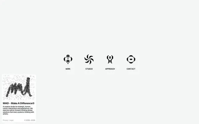
MAD's visual identity is a study in muted intensity, emphasizing a monochromatic, pixel-precise aesthetic. Typography, in custom fonts, defines hierarchy with varied weights and micro-adjusted letter-spacing, providing a crisp, technical yet artistic feel. Interaction elements are ghost-like, relying on subtle borders and color shifts rather than filled states. The overall impression is one of meticulous craft and understated digital elegance.
The page primarily uses a full-bleed layout for the main content area, with a strong implied central axis for navigation elements. The hero section is characterized by centered textual content and prominent pixel-art icons. Sections are visually distinct through consistent vertical spacing (72px section gap) rather than alternating background bands. Content arrangement is typically centered or implicitly aligned, fostering a sense of balance. Navigation is provided via a minimalist top bar with pixel-icon links.
The site uses minimal imagery, focusing on pixel-art style custom icons and a stylized, noisy signature graphic. If photography or richer graphics were introduced, they would need to align with a stark, high-contrast, possibly monochromatic or duotone treatment to maintain the system's austere, digital craft aesthetic. Icons are filled, pixel-based, and black (#000000) or Stormy Ash (#111313) on a light background. Imagery serves a decorative, conceptual role rather than illustrative or product showcase, emphasizing minimalism.
Reminiscent of Are.na, Babel / Design Systems, Certain graphic studios in the 90s.
# MAD — Style Reference
> Pixel-perfect Monochrome Precision

**Theme:** light

**Site:** https://mad.ac

MAD's visual identity is a study in muted intensity, emphasizing a monochromatic, pixel-precise aesthetic. Typography, in custom fonts, defines hierarchy with varied weights and micro-adjusted letter-spacing, providing a crisp, technical yet artistic feel. Interaction elements are ghost-like, relying on subtle borders and color shifts rather than filled states. The overall impression is one of meticulous craft and understated digital elegance.

## Tokens — Colors

| Name | Value | Token | Role |
|------|------|------|------|
| Stormy Ash | `#111313` | `--color-stormy-ash` | Primary text, icon fill, active button borders, pixel art elements — a grounding dark tone against light surfaces |
| Cloud Canvas | `#d4d8d8` | `--color-cloud-canvas` | Page background, primary surface color — a soft, almost white base |
| Muted Steel | `#4b5353` | `--color-muted-steel` | Secondary text, link text, subtle borders, inactive elements — a mid-tone gray for supporting information |
| Deep Space | `#000000` | `--color-deep-space` | Decorative icon black, text color on high contrast backgrounds |

## Tokens — Typography

### ABCWalterNeue
- **Substitute:** Inter
- **Weights:** 500, 560, 740
- **Sizes:** 12px, 14px, 18px
- **Line height:** 1, 1.1
- **Letter spacing:** -0.0270em at 18px, -0.0230em at 14px, -0.0180em at 12px
- **Role:** Primary headings, body text, and navigation items. Its varied weights and negative letter-spacing contribute to a precise, editorial feel. Use 1.0 line height for tight, stacked headers and 1.1 for readable body copy.

### InputMono
- **Substitute:** IBM Plex Mono
- **Weights:** 500
- **Sizes:** 14px
- **Line height:** 1, 1.2
- **Letter spacing:** -0.0230em
- **Role:** Used for specific functional text like interactive elements and code-like displays. Its monospace nature provides a technical, structured counterpoint to the primary typeface.

## Tokens — Type Scale

Minor Third (1.2) from 14px base.

| Role | Size | Line height | Letter spacing |
|------|------|------|------|
| caption | 12px | 1 | -0.216px |
| body | 14px | 1.1 | -0.322px |
| heading | 18px | 1 | -0.486px |

## Tokens — Spacing

- **Section gap:** 72px
- **Card padding:** 0px
- **Element gap:** 4px

## Tokens — Radius

- **nav:** 4px
- **other:** 8px

## Layout

The page primarily uses a full-bleed layout for the main content area, with a strong implied central axis for navigation elements. The hero section is characterized by centered textual content and prominent pixel-art icons. Sections are visually distinct through consistent vertical spacing (72px section gap) rather than alternating background bands. Content arrangement is typically centered or implicitly aligned, fostering a sense of balance. Navigation is provided via a minimalist top bar with pixel-icon links.

## Imagery

The site uses minimal imagery, focusing on pixel-art style custom icons and a stylized, noisy signature graphic. If photography or richer graphics were introduced, they would need to align with a stark, high-contrast, possibly monochromatic or duotone treatment to maintain the system's austere, digital craft aesthetic. Icons are filled, pixel-based, and black (#000000) or Stormy Ash (#111313) on a light background. Imagery serves a decorative, conceptual role rather than illustrative or product showcase, emphasizing minimalism.

## Components

### Navigation Link (Active)
*Interactive text link, primarily for navigation.*

Text in ABCWalterNeue, 14px, weight 500, color Stormy Ash (#111313), with a 0.5px border-top in Stormy Ash, 2px padding top/bottom and 6px left/right. Negative letter spacing at -0.023em.

### Navigation Link (Default)
*Interactive text link, primarily for navigation.*

Text in ABCWalterNeue, 14px, weight 500, color Muted Steel (#4b5353), with no visible border. 2px padding top/bottom and 6px left/right. Negative letter spacing at -0.023em.

### Ghost Button
*Clickable action with minimal visual footprint.*

Transparent background with a 1px Stormy Ash (#111313) border. Text in Stormy Ash, InputMono, 14px, weight 500, letter-spacing -0.023em. 2px padding top/bottom and 6px left/right. Radius 0px.

### Information Card
*Display descriptive content with a distinct visual boundary.*

Transparent background, no box shadow, no borders. Content inside is typically 14px ABCWalterNeue, weight 500, color Stormy Ash (#111313). Radius 0px. Padding 0px.

## Guidelines

### Do

- Prioritize Stormy Ash (#111313) for primary text and interactive elements against Cloud Canvas (#d4d8d8) for maximal contrast and digital sharpness.
- Use ABCWalterNeue for all primary brand communication, varying its weights (500, 560, 740) to establish visual hierarchy without introducing new typefaces.
- Apply specific negative letter-spacing values (-0.0270em, -0.0230em, -0.0180em) to maintain the precise, tight typographic aesthetic.
- Maintain a compact density with element gaps typically at 4px and section gaps at 72px to create clear visual separation.
- Implement interactive states using subtle borders in Stormy Ash (#111313) or color shifts to Muted Steel (#4b5353), avoiding solid background fills for general buttons.
- Use radius 0px for all button-like components to maintain a stark, precise aesthetic, except where 4px is explicitly specified for internal navigation elements or 8px for specific 'other' components.

### Don't

- Avoid using saturated accent colors; the palette is strictly monochromatic with Stormy Ash, Cloud Canvas, and Muted Steel.
- Do not introduce new fonts; the system relies exclusively on ABCWalterNeue and InputMono.
- Do not use generic padding or margins; adhere to the defined 2px, 4px, 6px, and 72px units for consistent rhythm.
- Do not apply soft shadows, gradients, or rounded corners beyond the specified radii of 0px, 4px, and 8px, as this contradicts the crisp, pixel-perfect feel.
- Avoid large imagery or decorative elements that disrupt the text-dominant, monochromatic, and structured layout.
- Do not use block-style buttons with solid backgrounds for primary actions; prefer ghost buttons with borders or text-based links.
- Never use line heights other than 1.0 or 1.1; they are reserved for specific typographic use cases.

## Agent Prompt Guide

### Quick Color Reference
- text: #111313
- background: #d4d8d8
- border: #111313
- accent: no distinct accent color
- primary action: no distinct CTA color

### 3-5 Example Component Prompts
- Create a primary navigation link: ABCWalterNeue, 14px, weight 500, color #111313, letter-spacing -0.023em, line-height 1.0, border-top 0.5px solid #111313, padding 2px 6px.
- Create a ghost button: InputMono, 14px, weight 500, color #111313, letter-spacing -0.023em, line-height 1.0, border 1px solid #111313, background rgba(0,0,0,0), border-radius 0px, padding 2px 6px.
- Create a footer legal link: ABCWalterNeue, 12px, weight 500, color #4b5353, letter-spacing -0.018em, line-height 1.0, no border, no background.
More like this









Keep what you find
A free account saves references to boards and can send you a weekly email of picks based on what you save.
To see every result, go Pro.