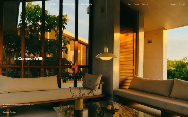
Preview image. Unlock full-res
Sun-drenched architectural permanence.
Color palette
Primary text color, active states, borders for interactive elements, and focused field outlines. Creates a warm, deep contrast against light backgrounds
Primary page background, modal backgrounds, and primary text contrast
Hairline borders, dividers, input outlines, and card edges on light surfaces. Do not promote it to the primary CTA color
Subtle background for UI blocks or sections requiring slight visual separation
Muted text for secondary information or disabled states, providing a soft contrast
Typography
- Weights
- 400
- Sizes
- 13px, 14px, 18px, 26px
- Line height
- 1.2
- Letter spacing
- normal
- Fallback
- Inter
Body text, navigation, buttons, and most informational elements. Its consistent weight across sizes ensures a clear, legible tone.
- Weights
- 400
- Sizes
- 24px
- Line height
- 1.2
- Letter spacing
- normal
- Fallback
- Playfair Display
Headlines and prominent display text. Its classic, serif form adds a touch of heritage and gravitas.
Spacing & shape
Components
Transparent background, text color Clay Brick (#4a0a05) with 1px solid Clay Brick (#4a0a05) border; 0px radius. Padding 20px on all sides for most instances, 0px padding in some navigational contexts. Uses Mier A 400.
Transparent background, Clay Brick (#4a0a05) text and 1px solid Clay Brick (#4a0a05) border; 0px radius. Padding 20px on all sides. Uses Mier A 400.
Transparent background, Clay Brick (#4a0a05) text and 1px solid Clay Brick (#4a0a05) border at the bottom; 0px radius. Padding left/right 12px. Uses Mier A 400.
Image-first, usually square or near-square. No visible border or background color. Text caption is Mier A 400, Clay Brick (#4a0a05), often with a 'Shop' link.
Thin, 1px solid line in Surface Frost (#f8f7f1), extending full width or with controlled margins, creating subtle breaks.
Guidelines
- Prioritize image content. Images should be large and dominant, particularly in product and editorial sections.
- Utilize Clay Brick (#4a0a05) for all primary text, interactive element borders, and accenting lines for a consistent brand presence.
- Maintain sharp, 0px border radii for all primary UI elements like buttons, cards, and input fields to convey a structured aesthetic.
- Use Mier A 400 for all body text, navigation items, and buttons at sizes 13px, 14px, 18px, and 26px.
- Implement consistent 12px inner padding for most interactive elements and as element gaps.
- Apply Canvas Bone (#fafaf9) as the dominant background, using Surface Frost (#f8f7f1) for subtle section breaks.
- Divide content using thin, 1px lines in Surface Frost (#f8f7f1) rather than heavy spacing or shadows.
- Avoid using soft shadows or gradients; rely on defined borders and distinct background colors for separation.
- Do not introduce additional bold weights for text; Mier A 400 and Caslon Ionic 400 are the only weights in use.
- Do not deviate from the 0px border radius for most UI elements; round corners are for specific cases like avatars.
- Avoid busy or colorful UI accents; color should be restrained to Clay Brick (#4a0a05) and used functionally.
- Do not use generic system fonts; Mier A or a close substitute should be used for legibility and brand consistency.
- Do not add heavy borders or background colors to interactive elements unless explicitly an outlined action or input.
About this system
ShowHide
In Common With employs a sun-drenched, architectural aesthetic that highlights product through subtle UI and an earthy, restrained color palette. The design relies on a clean, spacious layout, prioritizing imagery and robust typography to convey luxury and craftsmanship. Visual elements are mostly monolithic, focusing on natural light and texture, with sharp borders and an absence of soft shadows that maintain distinct separation. The overall impression is one of quiet permanence and considered design.
The site predominantly uses high-key, product-focused photography within architectural interior settings, often bathed in natural light. Imagery is presented full-bleed or contained in structured grid layouts. If photography, it's lifestyle-oriented but minimal with muted colors; if product, it’s often contextualized yet clearly highlighting the object. Visuals are usually isolated in their sections with sharp edges, serving both decorative atmosphere and product showcasing roles. Graphical elements are minimal beyond iconography.
Reminiscent of Aēsop, Frama, Hem, Norm Architects, The Future Kept.
# Incommonwith — Style Reference
> Sun-drenched architectural permanence.

**Theme:** light

**Site:** https://www.incommonwith.com

In Common With employs a sun-drenched, architectural aesthetic that highlights product through subtle UI and an earthy, restrained color palette. The design relies on a clean, spacious layout, prioritizing imagery and robust typography to convey luxury and craftsmanship. Visual elements are mostly monolithic, focusing on natural light and texture, with sharp borders and an absence of soft shadows that maintain distinct separation. The overall impression is one of quiet permanence and considered design.

## Tokens — Colors

| Name | Value | Token | Role |
|------|------|------|------|
| Clay Brick | `#4a0a05` | `--color-clay-brick` | Primary text color, active states, borders for interactive elements, and focused field outlines. Creates a warm, deep contrast against light backgrounds |
| Canvas Bone | `#fafaf9` | `--color-canvas-bone` | Primary page background, modal backgrounds, and primary text contrast |
| Surface Frost | `#f8f7f1` | `--color-surface-frost` | Hairline borders, dividers, input outlines, and card edges on light surfaces. Do not promote it to the primary CTA color |
| Clay Stone | `#bcb6a6` | `--color-clay-stone` | Subtle background for UI blocks or sections requiring slight visual separation |
| Muted Clay | `#a2827f` | `--color-muted-clay` | Muted text for secondary information or disabled states, providing a soft contrast |

## Tokens — Typography

### Mier A
- **Substitute:** Inter
- **Weights:** 400
- **Sizes:** 13px, 14px, 18px, 26px
- **Line height:** 1.2
- **Letter spacing:** normal
- **Role:** Body text, navigation, buttons, and most informational elements. Its consistent weight across sizes ensures a clear, legible tone.

### Caslon Ionic
- **Substitute:** Playfair Display
- **Weights:** 400
- **Sizes:** 24px
- **Line height:** 1.2
- **Letter spacing:** normal
- **Role:** Headlines and prominent display text. Its classic, serif form adds a touch of heritage and gravitas.

## Tokens — Type Scale

Major Third (1.25) from 18px base.

| Role | Size | Line height | Letter spacing |
|------|------|------|------|
| caption | 13px | 1.2 | — |
| body | 18px | 1.2 | — |
| subheading | 24px | 1.2 | — |
| heading | 26px | 1.2 | — |

## Tokens — Spacing

- **Max width:** 1392px
- **Section gap:** 40px
- **Card padding:** 12px
- **Element gap:** 12px

## Tokens — Radius

- **Buttons:** 0px
- **Inputs:** 0px
- **Cards:** 0px
- **avatars:** 9999px

## Imagery

The site predominantly uses high-key, product-focused photography within architectural interior settings, often bathed in natural light. Imagery is presented full-bleed or contained in structured grid layouts. If photography, it's lifestyle-oriented but minimal with muted colors; if product, it’s often contextualized yet clearly highlighting the object. Visuals are usually isolated in their sections with sharp edges, serving both decorative atmosphere and product showcasing roles. Graphical elements are minimal beyond iconography.

## Components

### Ghost Navigation Button
*Navigation links and secondary actions in headers and footers.*

Transparent background, text color Clay Brick (#4a0a05) with 1px solid Clay Brick (#4a0a05) border; 0px radius. Padding 20px on all sides for most instances, 0px padding in some navigational contexts. Uses Mier A 400.

### Outlined Call to Action
*Primary calls to action that draw attention without being filled blocks.*

Transparent background, Clay Brick (#4a0a05) text and 1px solid Clay Brick (#4a0a05) border; 0px radius. Padding 20px on all sides. Uses Mier A 400.

### Text Input Field
*Standard input fields for forms and search.*

Transparent background, Clay Brick (#4a0a05) text and 1px solid Clay Brick (#4a0a05) border at the bottom; 0px radius. Padding left/right 12px. Uses Mier A 400.

### Product Thumbnail Card
*Displaying product images in grids.*

Image-first, usually square or near-square. No visible border or background color. Text caption is Mier A 400, Clay Brick (#4a0a05), often with a 'Shop' link.

### Section Divider Line
*Visual separation between content blocks.*

Thin, 1px solid line in Surface Frost (#f8f7f1), extending full width or with controlled margins, creating subtle breaks.

## Guidelines

### Do

- Prioritize image content. Images should be large and dominant, particularly in product and editorial sections.
- Utilize Clay Brick (#4a0a05) for all primary text, interactive element borders, and accenting lines for a consistent brand presence.
- Maintain sharp, 0px border radii for all primary UI elements like buttons, cards, and input fields to convey a structured aesthetic.
- Use Mier A 400 for all body text, navigation items, and buttons at sizes 13px, 14px, 18px, and 26px.
- Implement consistent 12px inner padding for most interactive elements and as element gaps.
- Apply Canvas Bone (#fafaf9) as the dominant background, using Surface Frost (#f8f7f1) for subtle section breaks.
- Divide content using thin, 1px lines in Surface Frost (#f8f7f1) rather than heavy spacing or shadows.

### Don't

- Avoid using soft shadows or gradients; rely on defined borders and distinct background colors for separation.
- Do not introduce additional bold weights for text; Mier A 400 and Caslon Ionic 400 are the only weights in use.
- Do not deviate from the 0px border radius for most UI elements; round corners are for specific cases like avatars.
- Avoid busy or colorful UI accents; color should be restrained to Clay Brick (#4a0a05) and used functionally.
- Do not use generic system fonts; Mier A or a close substitute should be used for legibility and brand consistency.
- Do not add heavy borders or background colors to interactive elements unless explicitly an outlined action or input.

## Agent Prompt Guide

### Quick Color Reference
text: #4a0a05
background: #fafaf9
border: #4a0a05
accent: #4a0a05
primary action: #4a0a05 (outlined action border)

### 3-5 Example Component Prompts
1. Create a primary navigation item: "Shop" in Mier A 400 at 18px, Clay Brick (#4a0a05) text color, no background, 0px padding, no border.
2. Design an Outlined Call to Action button: "Learn More" with Mier A 400 at 18px, Clay Brick (#4a0a05) text, transparent background, 1px solid Clay Brick (#4a0a05) border, 0px radius, 20px padding all sides.
3. Build a Product Thumbnail Card: An image occupying 100% width of its container, followed by text "Floor Lamps" in Mier A 400 at 26px, Clay Brick (#4a0a05) text color, and below that, a "Shop" link in Mier A 400 at 14px, Clay Brick (#4a0a05) text color with 1px solid Clay Brick (#4a0a05) bottom border.
4. Construct a text input field: Placeholder text in Muted Clay (#a2827f), active text in Clay Brick (#4a0a05), transparent background, a 1px solid Clay Brick (#4a0a05) bottom border, 0px radius, 12px horizontal padding.
5. Create a main section heading: "Our Catalog" in Caslon Ionic 400 at 24px, Clay Brick (#4a0a05) text color, followed by a 1px solid Surface Frost (#f8f7f1) line for separation.
More like this









Keep what you find
A free account saves references to boards and can send you a weekly email of picks based on what you save.
To see every result, go Pro.