Preview image. Unlock full-res
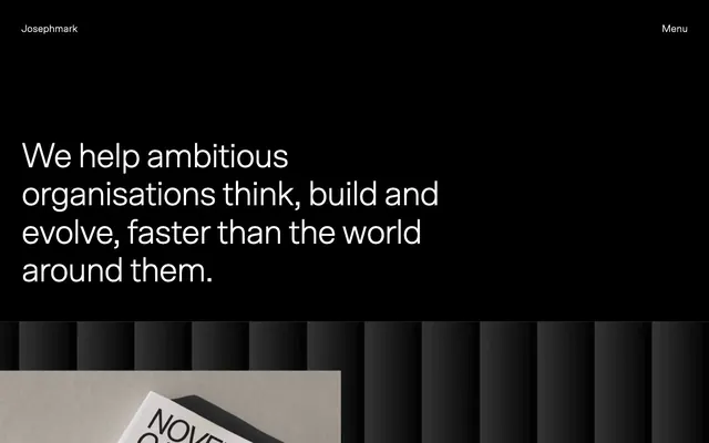
monochromatic gallery space
Color palette
Primary background for hero sections and dark content blocks; primary text color on light surfaces
Dominant page background, card surfaces, and primary text color on dark backgrounds
Subtle borders, dividers, secondary ghost button borders, and subtle list item separators
Secondary background for alternating content sections, providing a soft lift from Canvas White
Secondary text for supportive information and subdued headings
Muted background for specific content sections and tertiary text
Tertiary body text for less prominent details, hinting at a slight warmth in an otherwise cool palette
Typography
- Weights
- 300, 400, 500
- Sizes
- 12px, 14px, 16px, 19px, 20px, 28px, 36px, 70px
- Line height
- 1.1, 1.2, 1.25, 1.38, 1.4, 1.5
- Letter spacing
- -0.0350em at 70px, -0.0300em at 36px, -0.0270em at 28px, -0.0250em at 20px, -0.0200em at 19px, -0.0190em at 16px
- Fallback
- Inter
Primary typeface for all headings, body text, and UI elements. Its custom, meticulously tracked forms are central to the brand's sophisticated, minimalist voice.
Spacing & shape
Components
Background: transparent, Text: Canvas White (#ffffff), Border: 1px solid Canvas White (#ffffff), Padding: 8px vertical, 28px horizontal, Border Radius: 9999px.
Background: transparent, Text: Canvas White (#ffffff), Border: 1px solid Platinum Mist (#e5e7eb), Padding: 20px all sides, Border Radius: 0px.
Background: transparent, Text: Canvas White (#ffffff), Border-bottom: 1px solid Canvas White (#ffffff), Padding: 12px vertical, 0px horizontal, Border Radius: 0px.
Text color: Canvas White (#ffffff) on dark backgrounds, Midnight (#000000) on light backgrounds. No underline on default state. Hover state is implied by motion profile for color and transform effects.
Guidelines
- Prioritize high contrast between text and background, typically Midnight (#000000) on Canvas White (#ffffff) or vice-versa.
- Use Scto Grotesk A typeface with precise letter-spacing as defined by the type scale for all text elements.
- Apply a 9999px border-radius for all primary buttons to achieve a soft, pill-like shape.
- Utilize Platinum Mist (#e5e7eb) for subtle, hairline borders and dividers to maintain visual lightness without stark separation.
- Maintain generous vertical spacing between content sections, using 64px or 96px for `sectionGap` to create ample breathing room.
- Implement `_elementGap` at 16px to ensure a consistent, comfortable distance between adjacent UI elements.
- Design interactive elements as 'ghost' components using borders, favoring transparency in backgrounds to emphasize content.
- Use the predefined motion durations (0.3s) and `ease` timing functions for all UI transitions to create a responsive, fluid feel.
- Avoid using saturated or vivid chromatic colors; the palette is strictly achromatic with subtle gray variations.
- Do not introduce strong drop shadows; the design system avoids elevation through shadows and relies on stark background shifts for depth.
- Do not use generic system fonts; Scto Grotesk A is fundamental to the brand's typographic identity.
- Refrain from tight, cramped layouts; the design system emphasizes spaciousness and clear visual hierarchy through generous padding and margins.
- Do not use square or hard-edged buttons for primary actions; all prominent buttons should use the 9999px radius.
- Avoid using underlines for default link states; interaction should be indicated by hover effects or contextual cues.
- Do not feature imagery with busy backgrounds or conflicting color palettes; all visuals should either be monochromatic or have controlled color palettes that align with the brand's aesthetic.
About this system
ShowHide
Josephmark evokes a commanding, minimalist aesthetic where stark contrasts and purposeful typography convey authority. The design system is built on an achromatic palette, predominantly black and white, creating an expansive canvas that recedes to highlight content. Type is a core visual element, with custom grotesk forms carrying a substantial portion of the brand identity through precise letter-spacing and varying weights. Interaction is subtle, relying on ghost elements and border changes rather than bold color accents.
Reminiscent of Akin, Useberry, Stripe (early versions), Figma (landing pages).
# Josephmark — Style Reference
> monochromatic gallery space

**Theme:** light

**Site:** https://josephmark.studio

Josephmark evokes a commanding, minimalist aesthetic where stark contrasts and purposeful typography convey authority. The design system is built on an achromatic palette, predominantly black and white, creating an expansive canvas that recedes to highlight content. Type is a core visual element, with custom grotesk forms carrying a substantial portion of the brand identity through precise letter-spacing and varying weights. Interaction is subtle, relying on ghost elements and border changes rather than bold color accents.

## Tokens — Colors

| Name | Value | Token | Role |
|------|------|------|------|
| Midnight | `#000000` | `--color-midnight` | Primary background for hero sections and dark content blocks; primary text color on light surfaces |
| Canvas White | `#ffffff` | `--color-canvas-white` | Dominant page background, card surfaces, and primary text color on dark backgrounds |
| Platinum Mist | `#e5e7eb` | `--color-platinum-mist` | Subtle borders, dividers, secondary ghost button borders, and subtle list item separators |
| Cloud Gray | `#f4f5ef` | `--color-cloud-gray` | Secondary background for alternating content sections, providing a soft lift from Canvas White |
| Granite | `#666666` | `--color-granite` | Secondary text for supportive information and subdued headings |
| Stone | `#a9a498` | `--color-stone` | Muted background for specific content sections and tertiary text |
| Carbon | `#4e5449` | `--color-carbon` | Tertiary body text for less prominent details, hinting at a slight warmth in an otherwise cool palette |

## Tokens — Typography

### Scto Grotesk A
- **Substitute:** Inter
- **Weights:** 300, 400, 500
- **Sizes:** 12px, 14px, 16px, 19px, 20px, 28px, 36px, 70px
- **Line height:** 1.1, 1.2, 1.25, 1.38, 1.4, 1.5
- **Letter spacing:** -0.0350em at 70px, -0.0300em at 36px, -0.0270em at 28px, -0.0250em at 20px, -0.0200em at 19px, -0.0190em at 16px
- **Role:** Primary typeface for all headings, body text, and UI elements. Its custom, meticulously tracked forms are central to the brand's sophisticated, minimalist voice.

## Tokens — Type Scale

Perfect Fourth (1.333) from 16px base.

| Role | Size | Line height | Letter spacing |
|------|------|------|------|
| caption | 12px | 1.5 | — |
| body-sm | 14px | 1.4 | — |
| body | 16px | 1.5 | -0.19px |
| subheading | 19px | 1.4 | -0.38px |
| heading | 28px | 1.25 | -0.76px |
| heading-lg | 36px | 1.2 | -1.08px |
| display | 70px | 1.1 | -2.45px |

## Tokens — Spacing

- **Section gap:** 64-96px
- **Card padding:** 20px
- **Element gap:** 16px

## Tokens — Radius

- **Buttons:** 9999px

## Components

### Ghost Primary Button
*Interactive element for main calls to action, appearing as a transparent pill with a white border.*

Background: transparent, Text: Canvas White (#ffffff), Border: 1px solid Canvas White (#ffffff), Padding: 8px vertical, 28px horizontal, Border Radius: 9999px.

### Outlined Card Button
*Secondary action or category filter within content sections, offering structure through a subtle border.*

Background: transparent, Text: Canvas White (#ffffff), Border: 1px solid Platinum Mist (#e5e7eb), Padding: 20px all sides, Border Radius: 0px.

### Text Input (Underlined)
*Form element for user data entry, with a minimal, focus-driven border.*

Background: transparent, Text: Canvas White (#ffffff), Border-bottom: 1px solid Canvas White (#ffffff), Padding: 12px vertical, 0px horizontal, Border Radius: 0px.

### Navigation Link
*Interactive text link for site navigation and inline content, maintaining high contrast on all backgrounds.*

Text color: Canvas White (#ffffff) on dark backgrounds, Midnight (#000000) on light backgrounds. No underline on default state. Hover state is implied by motion profile for color and transform effects.

## Guidelines

### Do

- Prioritize high contrast between text and background, typically Midnight (#000000) on Canvas White (#ffffff) or vice-versa.
- Use Scto Grotesk A typeface with precise letter-spacing as defined by the type scale for all text elements.
- Apply a 9999px border-radius for all primary buttons to achieve a soft, pill-like shape.
- Utilize Platinum Mist (#e5e7eb) for subtle, hairline borders and dividers to maintain visual lightness without stark separation.
- Maintain generous vertical spacing between content sections, using 64px or 96px for `sectionGap` to create ample breathing room.
- Implement `_elementGap` at 16px to ensure a consistent, comfortable distance between adjacent UI elements.
- Design interactive elements as 'ghost' components using borders, favoring transparency in backgrounds to emphasize content.
- Use the predefined motion durations (0.3s) and `ease` timing functions for all UI transitions to create a responsive, fluid feel.

### Don't

- Avoid using saturated or vivid chromatic colors; the palette is strictly achromatic with subtle gray variations.
- Do not introduce strong drop shadows; the design system avoids elevation through shadows and relies on stark background shifts for depth.
- Do not use generic system fonts; Scto Grotesk A is fundamental to the brand's typographic identity.
- Refrain from tight, cramped layouts; the design system emphasizes spaciousness and clear visual hierarchy through generous padding and margins.
- Do not use square or hard-edged buttons for primary actions; all prominent buttons should use the 9999px radius.
- Avoid using underlines for default link states; interaction should be indicated by hover effects or contextual cues.
- Do not feature imagery with busy backgrounds or conflicting color palettes; all visuals should either be monochromatic or have controlled color palettes that align with the brand's aesthetic.

## Agent Prompt Guide

**Quick Color Reference:**
text: #000000
background: #ffffff
border: #e5e7eb
accent: no distinct accent color
primary action: no distinct CTA color

**3-5 Example Component Prompts:**
No distinct primary action color was observed; use the extracted neutral button treatments instead of inventing a filled CTA color.
2. Create a content card for a project: Canvas White (#ffffff) background, 20px padding. Inside, a project image at 1:1 aspect ratio, then a heading (Scto Grotesk A, 28px, weight 500, Midnight #000000, letter-spacing -0.76px), and a secondary text label (Scto Grotesk A, 16px, weight 400, Granite #666666, letter-spacing -0.19px).
3. Create an input field: Background transparent, Text Canvas White (#ffffff), Border-bottom 1px solid Canvas White (#ffffff), Padding 12px vertical, 0px horizontal, Border Radius 0px. Placeholder text in Granite (#666666).

## Motion Philosophy

Motion is subtle yet responsive, primarily expressed through `opacity` and `transform` changes. Transitions should last 0.3s with an `ease` timing function, providing a smooth but not overly soft interaction experience. This reinforces the precise and controlled nature of the brand, ensuring UI elements feel alive without being distracting.
More like this









Keep what you find
A free account saves references to boards and can send you a weekly email of picks based on what you save.
To see every result, go Pro.