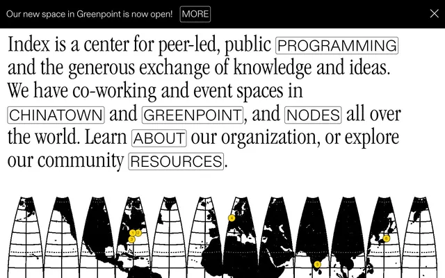
Preview image. Unlock full-res
Color palette
Page backgrounds, card surfaces, ghost button backgrounds, default text for dark surfaces
Primary text, surface backgrounds, button fills, borders, navigation elements. Defines the core high-contrast aesthetic
Typography
- Weights
- 300, 400
- Sizes
- 12px, 16px, 24px, 30px, 50px, 56px, 80px
- Line height
- 0.9, 1.1, 1.2, 1.25
- Letter spacing
- -0.0370em at 80px, -0.0270em at 56px, -0.0150em at 30px, -0.0090em at 24px, 0.0080em at 12px
- Fallback
- Arial
Headings, descriptive sub-text, navigation items, interactive elements. Its light weight adds a contemporary and airy feel, contrasting with the bold visual identity.
- Weights
- 400
- Sizes
- 16px
- Line height
- 1.2
- Letter spacing
- normal
- Fallback
- Times New Roman
Body text, annotations, standard interface labels. Provides a classic, legible base for long-form content.
- Weights
- 300, 400
- Sizes
- 20px, 24px, 40px, 50px, 75px
- Line height
- 1, 1.05, 1.2, 2.1
- Letter spacing
- -0.0220em at 75px, 0.0110em at 20px, 0.0180em at 24px
- Fallback
- Georgia
Prominent headings and section titles. Its condensed nature creates a striking, editorial aesthetic, demanding attention through form rather than size alone.
- Weights
- 300
- Sizes
- 50px
- Line height
- 0.9
- Letter spacing
- normal
- Fallback
- Verdana
Brand logo in navigation. A unique and custom font used sparingly to reinforce brand identity.
Spacing & shape
Components
Solid Ink Black background with White Canvas text. Features 0px border-radius, 20px padding on all sides. Used for prominent, affirmative actions.
Transparent background with Ink Black text and 1px Ink Black border. No padding, designed for inline text-like integration. Appears text-only at specific instances. Rectangular, 0px border-radius.
Ink Black text and 1px Ink Black border on a White Canvas background. Features 100px border-radius, creating a pill shape. Very minimal padding (e.g., 0px vertical, 20px horizontal).
Ink Black text with 0px padding, visually distinct from surrounding content through context and font style rather than explicit styling. Hover state may show border.
Ink Black background with 16px border-radius. No explicit padding inside from data, implying content controls its own spacing.
Transparent background with White Canvas placeholder/text, 1px White Canvas border. 0px border-radius. Features 1px vertical padding and 40px left padding for icon integration.
Guidelines
- Prioritize Ink Black (#000000) and White Canvas (#ffffff) for all background, text, and border elements to maintain high contrast.
- Use ABCDiatypeLight (weight 300, -0.0370em at 80px) for prominent headlines to achieve a modern, airy feel.
- Employ ITCGaramondStdLtCond (weight 300, -0.0220em at 75px) for critical section titles, leveraging its condensed form for visual impact.
- Apply 0px border-radius to all filled buttons to maintain a sharp, deliberate aesthetic.
- Ensure section gaps consistently use 40px vertical spacing for clear content segmentation.
- Center all page content and adhere to a maximum width of 520px to create a focused reading experience.
- Utilize 1px borders with Ink Black (#000000) for interactive elements and content divisions to establish structure without heavy visual weight.
- Avoid using any colors outside of the Ink Black (#000000) and White Canvas (#ffffff) palette for primary UI elements.
- Do not introduce rounded corners for primary buttons or input fields; maintain the strict 0px border-radius.
- Refrain from using shadows or artificial elevation, as the design system relies on stark color contrast and borders for depth.
- Do not deviate from the specified type scales and letter-spacing for ABCDiatypeLight or ITCGaramondStdLtCond; these are critical for brand typography.
- Avoid full-bleed layouts for main content sections; always constrain content to the 520px maximum width.
- Do not apply padding to inline interactive elements unless explicitly defined as a button variant; text links should primarily rely on their typographic styling.
- Never use generic block quotes or colored background for content emphasis; rely on typographic hierarchy and borders.
About this system
ShowHide
Index employs a stark, high-contrast visual identity, reminiscent of avant-garde print media. The design prioritizes typography, using a mix of serif, sans-serif, and condensed styles to convey distinct content hierarchy against a largely achromatic canvas. Interactivity is highlighted through simple border treatments and monochromatic fills, with navigation elements often appearing as outlined or inverted states rather than distinct chromatic accents. Layouts are content-centered, favoring clear segmentation and generous vertical spacing to emphasize textual information.
Reminiscent of Are.na, The Browser Company (Arc), AIGA (early websites), Stripe (documentation).
# Index — Style Reference
> monochrome academic journal

**Theme:** light

**Site:** https://index-space.org

Index employs a stark, high-contrast visual identity, reminiscent of avant-garde print media. The design prioritizes typography, using a mix of serif, sans-serif, and condensed styles to convey distinct content hierarchy against a largely achromatic canvas. Interactivity is highlighted through simple border treatments and monochromatic fills, with navigation elements often appearing as outlined or inverted states rather than distinct chromatic accents. Layouts are content-centered, favoring clear segmentation and generous vertical spacing to emphasize textual information.

## Tokens — Colors

| Name | Value | Token | Role |
|------|------|------|------|
| White Canvas | `#ffffff` | `--color-white-canvas` | Page backgrounds, card surfaces, ghost button backgrounds, default text for dark surfaces |
| Ink Black | `#000000` | `--color-ink-black` | Primary text, surface backgrounds, button fills, borders, navigation elements. Defines the core high-contrast aesthetic |

## Tokens — Typography

### ABCDiatypeLight
- **Substitute:** Arial
- **Weights:** 300, 400
- **Sizes:** 12px, 16px, 24px, 30px, 50px, 56px, 80px
- **Line height:** 0.9, 1.1, 1.2, 1.25
- **Letter spacing:** -0.0370em at 80px, -0.0270em at 56px, -0.0150em at 30px, -0.0090em at 24px, 0.0080em at 12px
- **Role:** Headings, descriptive sub-text, navigation items, interactive elements. Its light weight adds a contemporary and airy feel, contrasting with the bold visual identity.

### Times New Roman
- **Substitute:** Times New Roman
- **Weights:** 400
- **Sizes:** 16px
- **Line height:** 1.2
- **Letter spacing:** normal
- **Role:** Body text, annotations, standard interface labels. Provides a classic, legible base for long-form content.

### ITCGaramondStdLtCond
- **Substitute:** Georgia
- **Weights:** 300, 400
- **Sizes:** 20px, 24px, 40px, 50px, 75px
- **Line height:** 1, 1.05, 1.2, 2.1
- **Letter spacing:** -0.0220em at 75px, 0.0110em at 20px, 0.0180em at 24px
- **Role:** Prominent headings and section titles. Its condensed nature creates a striking, editorial aesthetic, demanding attention through form rather than size alone.

### IndexLogotype
- **Substitute:** Verdana
- **Weights:** 300
- **Sizes:** 50px
- **Line height:** 0.9
- **Letter spacing:** normal
- **Role:** Brand logo in navigation. A unique and custom font used sparingly to reinforce brand identity.

## Tokens — Type Scale

| Role | Size | Line height | Letter spacing |
|------|------|------|------|
| caption | 12px | 1.25 | 0.096em |
| body | 16px | 1.2 | — |
| subheading | 24px | 1.2 | -0.216px |
| heading | 40px | 1 | -0.88px |
| heading-lg | 56px | 1.1 | -1.512px |
| display | 80px | 0.9 | -2.96px |

## Tokens — Spacing

- **Max width:** 520px
- **Section gap:** 40px
- **Card padding:** 20px
- **Element gap:** 8px

## Tokens — Radius

- **Default:** 6px
- **Buttons:** 0px
- **Cards:** 16px
- **pills:** 100px

## Components

### Filled Primary Button
*Call to action, critical navigation.*

Solid Ink Black background with White Canvas text. Features 0px border-radius, 20px padding on all sides. Used for prominent, affirmative actions.

### Ghost Border Button
*Secondary actions, emphasis on linked text.*

Transparent background with Ink Black text and 1px Ink Black border. No padding, designed for inline text-like integration. Appears text-only at specific instances. Rectangular, 0px border-radius.

### Pill Outline Button
*Tagging, category filters.*

Ink Black text and 1px Ink Black border on a White Canvas background. Features 100px border-radius, creating a pill shape. Very minimal padding (e.g., 0px vertical, 20px horizontal).

### Navigation Link
*Top-level navigation and utility links.*

Ink Black text with 0px padding, visually distinct from surrounding content through context and font style rather than explicit styling. Hover state may show border.

### Simple Card (Dark)
*Content grouping, featured sections.*

Ink Black background with 16px border-radius. No explicit padding inside from data, implying content controls its own spacing.

### Search Input (Outlined)
*Site search, form fields.*

Transparent background with White Canvas placeholder/text, 1px White Canvas border. 0px border-radius. Features 1px vertical padding and 40px left padding for icon integration.

## Guidelines

### Do

- Prioritize Ink Black (#000000) and White Canvas (#ffffff) for all background, text, and border elements to maintain high contrast.
- Use ABCDiatypeLight (weight 300, -0.0370em at 80px) for prominent headlines to achieve a modern, airy feel.
- Employ ITCGaramondStdLtCond (weight 300, -0.0220em at 75px) for critical section titles, leveraging its condensed form for visual impact.
- Apply 0px border-radius to all filled buttons to maintain a sharp, deliberate aesthetic.
- Ensure section gaps consistently use 40px vertical spacing for clear content segmentation.
- Center all page content and adhere to a maximum width of 520px to create a focused reading experience.
- Utilize 1px borders with Ink Black (#000000) for interactive elements and content divisions to establish structure without heavy visual weight.

### Don't

- Avoid using any colors outside of the Ink Black (#000000) and White Canvas (#ffffff) palette for primary UI elements.
- Do not introduce rounded corners for primary buttons or input fields; maintain the strict 0px border-radius.
- Refrain from using shadows or artificial elevation, as the design system relies on stark color contrast and borders for depth.
- Do not deviate from the specified type scales and letter-spacing for ABCDiatypeLight or ITCGaramondStdLtCond; these are critical for brand typography.
- Avoid full-bleed layouts for main content sections; always constrain content to the 520px maximum width.
- Do not apply padding to inline interactive elements unless explicitly defined as a button variant; text links should primarily rely on their typographic styling.
- Never use generic block quotes or colored background for content emphasis; rely on typographic hierarchy and borders.

## Agent Prompt Guide

Quick Color Reference:
text: #000000
background: #ffffff
border: #000000
accent: no distinct accent color
primary action: #000000 (filled action)

Example Component Prompts:
1. Create a top navigation bar: Ink Black (#000000) full-bleed background, containing 'Index' logotype (IndexLogotype, 50px, weight 300, #ffffff). Right-aligned '• • •' (ABCDiatypeLight, 16px, weight 300, #ffffff) and '0' (ABCDiatypeLight, 16px, weight 300, #ffffff).
2. Create a Primary Action Button: #000000 background, #ffffff text, 9999px radius, compact pill padding. Use this filled treatment for the main CTA.
3. Generate a Dark Content Card: Ink Black (#000000) background, 16px border-radius. Contains a headline 'Learn at your own pace' (ABCDiatypeLight, 30px, weight 300, #ffffff, letter-spacing -0.45px) and a Ghost Border Button 'LEARN MORE' (1px Ink Black (#000000) border, White Canvas (#ffffff) text, 0px radius).
More like this










Keep what you find
A free account saves references to boards and can send you a weekly email of picks based on what you save.
To see every result, go Pro.