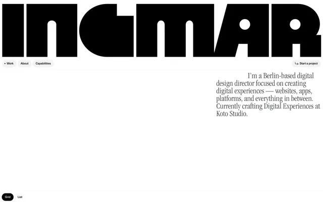
Preview image. Unlock full-res
monochrome typographic canvas
Color palette
Page backgrounds, elevated card surfaces, button backgrounds in ghost state
Primary text, major headlines, default button backgrounds, strong borders — acts as the dominant dark element against white
Secondary button backgrounds, subtle surface delineation
Muted body text, borders for secondary elements, fills for less prominent icons
Helper text, subtle borders
Fine borders, tertiary text
Typography
- Weights
- 400
- Sizes
- 12px
- Line height
- 1.2
- Letter spacing
- normal
- Fallback
- Helvetica Neue
Utility text, navigation items, and button labels — ensures legibility for functional UI elements when custom fonts aren't used.
- Weights
- 400
- Sizes
- 295px
- Line height
- 0.9
- Letter spacing
- normal
- Fallback
- Anton
Over-sized display headlines — this font is treated as a graphic element and main brand identifier. Its scale and unique shape define the visual personality.
- Weights
- 400
- Sizes
- 36px
- Line height
- 0.94
- Letter spacing
- normal
- Fallback
- Garamond Light Condensed
Secondary large headlines and key statements — offers a distinct contrast to the Megazoid, providing a traditional yet condensed voice for significant textual content.
- Weights
- 400
- Sizes
- 12px, 13px
- Line height
- 1.1
- Letter spacing
- -0.02
- Fallback
- Inter
Primary body text and links — its compactness and slightly reduced letter-spacing keep text efficient and integrated within the tight layouts.
- Weights
- 400
- Sizes
- 295px
- Line height
- 0.9
Megazoid Fill — detected in extracted data but not described by AI
Spacing & shape
Components
Background: Subtle Gray (#f2f2f2), Text: Ink Black (#000000). Padding: 9px top, 14px right, 0px bottom, 20px left. Border Radius: 100px for a distinct pill shape.
Background: Canvas White (transparent), Text: Ink Black (#000000). Border: 1px Ink Black (#000000). Padding: 9px top, 14px right, 0px bottom, 20px left. Border Radius: 100px.
Background: Ink Black (#000000), Text: Canvas White (#ffffff). Padding: 9px top, 14px right, 0px bottom, 14px left. Border Radius: 100px.
Background: Canvas White (#ffffff), Text: Ink Black (#000000). Padding: 9px top, 14px right, 0px bottom, 14px left. Border Radius: 100px.
Background: typically Canvas White (#ffffff). Border radius: 12px. No visible border or shadow, relying on spacing for separation.
Guidelines
- Prioritize Ink Black (#000000) for all primary text and dominant graphic elements to maintain high contrast.
- Utilize Canvas White (#ffffff) for all main backgrounds and content surfaces to establish an expansive feel.
- Apply 100px border radius to all buttons for a consistent pill-shaped aesthetic.
- Use Megazoid Regular at 295px size as a graphic display element for prominent page titles, not for standard headlines.
- Maintain a compact elementGap of 10px between interactive elements and textual content.
- Employ Neue Haas Unica Pro Medium at its specified line height and letter spacing for all functional body text and links.
- Use Subtle Gray (#f2f2f2) sparingly for secondary button fills to provide a softer interactive alternative to Ink Black.
- Avoid using chromatic colors for functional UI elements; reserve them strictly for content imagery or specific brand assets if any.
- Do not deviate from the high-contrast black and white palette for core UI elements; color is not used for primary hierarchy.
- Do not introduce shadows or significant elevation; the design relies on flat surfaces and clean borders for depth perception.
- Avoid excessive line spacing for body text; aim for the tight 1.1 line height specified for Neue Haas Unica Pro Medium.
- Do not use generic sans-serif fonts where custom fonts are specified; font uniqueness is a core brand identifier.
- Do not add extra padding around cards or sections beyond the defined cardPadding of 14px and sectionGap of 80px, as density is valued over whitespace.
About this system
ShowHide
Ingmar Coenen's portfolio employs a stark, high-contrast aesthetic, built on a foundation of black and white with minimal chromatic interference. Typography plays a central role, featuring a custom, oversized display font that acts as a primary graphic element. Components are lightweight and interaction-focused, defined by crisp borders and extensive border-radius. The system favors a dense information hierarchy over spaciousness, utilizing tight spacing and a predominantly neutral palette to emphasize content and precise interaction points.
The page maintains a full-width, full-bleed canvas, with content often centered but not rigidly constrained by a max-width container, allowing for expansive typographic treatments like the 'INGMAR' header. The hero section is characterized by large, visually consuming typography that functions as a branding element, accompanied by a concise right-aligned bio. Sections flow seamlessly without distinct visual dividers, relying on shifts in content type or large typographic elements to delineate areas. Content arrangement often features a primary text block or graphic element interacting with a secondary one, sometimes with alternating left/right positioning. Navigation is a minimalist top bar with ghost and pill-shaped buttons, complemented by a persistent 'Start a project' button on the right and a bottom-left 'Grid/List' toggle.
This site predominantly uses embedded product shots and specialized graphic treatments rather than conventional photography or illustrations. Images appear contained, often with rounded corners (12px radius), acting as content within the stark UI. There's also dynamic, text-based visual imagery like the circular 'Haven-1' graphic, which fuses typography with abstract motion, indicating a deliberate integration of text as visual art. Iconography is minimal, primarily functional arrows associated with navigation, appearing outlined or filled in black and white.
Reminiscent of Bruno Porto, Active Theory, Build in Amsterdam, Alinea Invest.
# Ingmar Coenen — Style Reference
> monochrome typographic canvas

**Theme:** light

**Site:** https://ingmarcoenen.com

Ingmar Coenen's portfolio employs a stark, high-contrast aesthetic, built on a foundation of black and white with minimal chromatic interference. Typography plays a central role, featuring a custom, oversized display font that acts as a primary graphic element. Components are lightweight and interaction-focused, defined by crisp borders and extensive border-radius. The system favors a dense information hierarchy over spaciousness, utilizing tight spacing and a predominantly neutral palette to emphasize content and precise interaction points.

## Tokens — Colors

| Name | Value | Token | Role |
|------|------|------|------|
| Canvas White | `#ffffff` | `--color-canvas-white` | Page backgrounds, elevated card surfaces, button backgrounds in ghost state |
| Ink Black | `#000000` | `--color-ink-black` | Primary text, major headlines, default button backgrounds, strong borders — acts as the dominant dark element against white |
| Subtle Gray | `#f2f2f2` | `--color-subtle-gray` | Secondary button backgrounds, subtle surface delineation |
| Dark Charcoal | `#3a4042` | `--color-dark-charcoal` | Muted body text, borders for secondary elements, fills for less prominent icons |
| Medium Gray | `#919191` | `--color-medium-gray` | Helper text, subtle borders |
| Light Gray | `#cccccc` | `--color-light-gray` | Fine borders, tertiary text |

## Tokens — Typography

### sans-serif
- **Substitute:** Helvetica Neue
- **Weights:** 400
- **Sizes:** 12px
- **Line height:** 1.2
- **Letter spacing:** normal
- **Role:** Utility text, navigation items, and button labels — ensures legibility for functional UI elements when custom fonts aren't used.

### Megazoid Regular
- **Substitute:** Anton
- **Weights:** 400
- **Sizes:** 295px
- **Line height:** 0.9
- **Letter spacing:** normal
- **Role:** Over-sized display headlines — this font is treated as a graphic element and main brand identifier. Its scale and unique shape define the visual personality.

### ITC Garamond Std Light Condensed
- **Substitute:** Garamond Light Condensed
- **Weights:** 400
- **Sizes:** 36px
- **Line height:** 0.94
- **Letter spacing:** normal
- **Role:** Secondary large headlines and key statements — offers a distinct contrast to the Megazoid, providing a traditional yet condensed voice for significant textual content.

### Neue Haas Unica Pro Medium
- **Substitute:** Inter
- **Weights:** 400
- **Sizes:** 12px, 13px
- **Line height:** 1.1
- **Letter spacing:** -0.02
- **Role:** Primary body text and links — its compactness and slightly reduced letter-spacing keep text efficient and integrated within the tight layouts.

### Megazoid Fill
- **Weights:** 400
- **Sizes:** 295px
- **Line height:** 0.9
- **Role:** Megazoid Fill — detected in extracted data but not described by AI

## Tokens — Type Scale

| Role | Size | Line height | Letter spacing |
|------|------|------|------|
| caption | 12px | 1.1 | -0.02em |
| subheading | 36px | 0.94 | — |
| display | 295px | 0.9 | — |

## Tokens — Spacing

- **Section gap:** 80px
- **Card padding:** 14px
- **Element gap:** 10px

## Tokens — Radius

- **General:** 12px
- **Buttons:** 100px
- **Cards:** 12px
- **links:** 4px

## Layout

The page maintains a full-width, full-bleed canvas, with content often centered but not rigidly constrained by a max-width container, allowing for expansive typographic treatments like the 'INGMAR' header. The hero section is characterized by large, visually consuming typography that functions as a branding element, accompanied by a concise right-aligned bio. Sections flow seamlessly without distinct visual dividers, relying on shifts in content type or large typographic elements to delineate areas. Content arrangement often features a primary text block or graphic element interacting with a secondary one, sometimes with alternating left/right positioning. Navigation is a minimalist top bar with ghost and pill-shaped buttons, complemented by a persistent 'Start a project' button on the right and a bottom-left 'Grid/List' toggle.

## Imagery

This site predominantly uses embedded product shots and specialized graphic treatments rather than conventional photography or illustrations. Images appear contained, often with rounded corners (12px radius), acting as content within the stark UI. There's also dynamic, text-based visual imagery like the circular 'Haven-1' graphic, which fuses typography with abstract motion, indicating a deliberate integration of text as visual art. Iconography is minimal, primarily functional arrows associated with navigation, appearing outlined or filled in black and white.

## Components

### Pill Navigation Button
*Primary navigation links and interactive controls.*

Background: Subtle Gray (#f2f2f2), Text: Ink Black (#000000). Padding: 9px top, 14px right, 0px bottom, 20px left. Border Radius: 100px for a distinct pill shape.

### Ghost Navigation Button
*Secondary navigation links and interactive controls, visually less prominent than filled buttons.*

Background: Canvas White (transparent), Text: Ink Black (#000000). Border: 1px Ink Black (#000000). Padding: 9px top, 14px right, 0px bottom, 20px left. Border Radius: 100px.

### Start Project Button
*Prominent call to action, visually contrasting with other buttons.*

Background: Ink Black (#000000), Text: Canvas White (#ffffff). Padding: 9px top, 14px right, 0px bottom, 14px left. Border Radius: 100px.

### Text Link Button
*Minimal interactive elements with a default browser link style.*

Background: Canvas White (#ffffff), Text: Ink Black (#000000). Padding: 9px top, 14px right, 0px bottom, 14px left. Border Radius: 100px.

### Portfolio Grid Item
*Card-like containers for portfolio pieces.*

Background: typically Canvas White (#ffffff). Border radius: 12px. No visible border or shadow, relying on spacing for separation.

## Guidelines

### Do

- Prioritize Ink Black (#000000) for all primary text and dominant graphic elements to maintain high contrast.
- Utilize Canvas White (#ffffff) for all main backgrounds and content surfaces to establish an expansive feel.
- Apply 100px border radius to all buttons for a consistent pill-shaped aesthetic.
- Use Megazoid Regular at 295px size as a graphic display element for prominent page titles, not for standard headlines.
- Maintain a compact elementGap of 10px between interactive elements and textual content.
- Employ Neue Haas Unica Pro Medium at its specified line height and letter spacing for all functional body text and links.
- Use Subtle Gray (#f2f2f2) sparingly for secondary button fills to provide a softer interactive alternative to Ink Black.

### Don't

- Avoid using chromatic colors for functional UI elements; reserve them strictly for content imagery or specific brand assets if any.
- Do not deviate from the high-contrast black and white palette for core UI elements; color is not used for primary hierarchy.
- Do not introduce shadows or significant elevation; the design relies on flat surfaces and clean borders for depth perception.
- Avoid excessive line spacing for body text; aim for the tight 1.1 line height specified for Neue Haas Unica Pro Medium.
- Do not use generic sans-serif fonts where custom fonts are specified; font uniqueness is a core brand identifier.
- Do not add extra padding around cards or sections beyond the defined cardPadding of 14px and sectionGap of 80px, as density is valued over whitespace.

## Agent Prompt Guide

Quick Color Reference:
text: #000000
background: #ffffff
border: #000000
accent: no distinct accent color
primary action: #000000 (filled action)

Example Component Prompts:
Create a Pill Navigation Button: background #f2f2f2, text #000000, 100px radius, 9px 14px 0px 20px padding, use sans-serif font size 12.
Create a Start Project Button: background #000000, text #ffffff, 100px radius, 9px 14px 0px 14px padding, use sans-serif font size 12.
Create a body text block: text #3a4042, font Neue Haas Unica Pro Medium, size 13px, line height 1.1, letter spacing -0.02em.
More like this









Keep what you find
A free account saves references to boards and can send you a weekly email of picks based on what you save.
To see every result, go Pro.