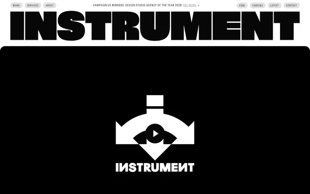
Preview image. Unlock full-res
High-contrast typographic canvas
Color palette
Primary text, surface backgrounds for negative space, strong borders, strong button fills
Page backgrounds, card surfaces, button text on filled backgrounds, ghost button borders
Muted text, secondary navigation, badge borders, subtle iconography
Typography
- Weights
- 400
- Sizes
- 11px, 12px, 14px, 15px, 16px, 18px, 19px, 23px, 28px, 36px, 352px
- Line height
- 0.85, 1, 1.11, 1.14, 1.22, 1.26, 1.33, 1.43, 1.45, 1.56, 1.6
- Letter spacing
- -0.0500em, -0.0250em, -0.0100em, -0.0050em, 0.0050em, 0.0200em, 0.0300em, 0.0500em, 0.0800em, 0.1100em
- Fallback
- Inter
Primary text for body, navigation, buttons, and most informational elements. Its diverse sizes and precise tracking allow it to span from compact utility text to expansive hero statements.
- Weights
- 400
- Sizes
- 64px, 352px
- Line height
- 0.85, 1.13
- Letter spacing
- -0.0500em, -0.0200em
- Fallback
- Playfair Display
For large display headlines and hero text. The serif provides a counterpoint to the sans-serif's modernity, adding an editorial gravitas.
- Weights
- 400
- Sizes
- 352px
- Line height
- 0.85
- Letter spacing
- -0.0500em
- Fallback
- Playfair Display Italic
Used for specific large, stylized headline accents, leveraging its italic form for dramatic effect.
Spacing & shape
Components
Rounded shape with `999px` border radius, translucent white background at `rgba(255, 255, 255, 0.5)`, `Midnight Ink` text. `0px` inner padding. Minimalist and soft.
Text in `Midnight Ink`, no background, with `Midnight Ink` border. Square, `0px` border radius. `0px` inner padding. Emphasizes text over button form.
Solid white background `#ffffff`, `Midnight Ink` text, with a `32px` border radius. `0px` inner padding. Offers a soft, distinct action area.
Solid `Midnight Ink` background `#070708`, `White Canvas` text, `0px` border radius, `20px` horizontal padding. Used for high-contrast actions.
No background color `rgba(0, 0, 0, 0)`, `0px` border radius, no shadow, `0px` padding. Acts as a content wrapper without visual boundaries.
No background color `rgba(0, 0, 0, 0)`, `24px` border radius, no shadow, `0px` padding. Subtly lifts content from the background.
Translucent white background `rgba(255, 255, 255, 0.12)`, `White Canvas` text, `White Canvas` border, `8px` border radius, `12px` vertical and `16px` horizontal padding.
No background, `Midnight Ink` text, `0px` border radius, `0px` padding. Blends seamlessly with surrounding text.
Faded Ink background `rgba(7, 7, 8, 0.12)`, `Midnight Ink` text, `999px` border radius, `4px` vertical and `10px` horizontal padding. Provides a soft, distinguishable label.
Guidelines
- Prioritize `Midnight Ink` text (`#070708`) on `White Canvas` (`#ffffff`) for readability and high contrast.
- Use `Instrument-Sans` for all body text, navigation, and button labels, adjusting sizes and letter-spacing for impact.
- Apply `999px` border-radius to all buttons and badges for a consistent pill-like shape.
- Break up page content with distinct blocks of `Midnight Ink` background for dramatic negative space and visual hierarchy.
- Employ `24px` for internal card padding and image corner rounding to maintain soft block definition.
- Utilize the `Instrument-Serif` typeface sparingly for large, editorial headlines to introduce a layer of sophisticated tension.
- Maintain a compact spacing density, generally utilizing multiples of `4px` with an `8px` base unit for element gaps.
- Avoid generic border radii; stick to `0px`, `8px`, `24px`, `32px`, or `999px` as defined.
- Do not introduce strong accent colors; the palette is strictly monochrome with subtle translucent effects.
- Refrain from using shadows or heavy elevation styles; surfaces should remain flat or use minimal transparency.
- Do not deviate from the specified typefaces and their distinct letter-spacing values to preserve the brand's typographic identity.
- Avoid excessive padding or large gaps between elements; maintain a compact, information-dense layout where appropriate.
- Do not use generic system fonts; `Instrument-Sans` and `Instrument-Serif` are central to the brand.
- Do not dilute the high-contrast ethos with mid-tone backgrounds or multiple shades of gray for primary content areas.
About this system
ShowHide
Instrument's visual system evokes a stark, high-contrast, minimalist agency aesthetic. Dominated by a monochrome palette of deep nearly-black gray and pure white, it leverages strong typography as its primary visual identity. Typography is both commanding and refined, with distinctive custom typefaces varying dramatically in size and tracking. Components are lightweight and functional, often using ghosting or subtle background tints against large, open white canvases, emphasizing content and a clean, editorial layout.
The page primarily uses a full-bleed layout, allowing sections to stretch edge-to-edge. Content within these sections often appears to be contained within an implicit maximum width, centrally aligned. The hero section features large, centered typography over a full-bleed black background. Section rhythm alternates between large, open white canvas areas and immersive, full-bleed black blocks. Content is arranged in alternating text-and-image two-column layouts, often with the text on the left and visual on the right, or in multi-column card grids for portfolio and articles. Navigation is a minimalist top bar, with sticky header behavior. Vertical spacing between sections is consistent, typically using `24px` as a base unit for vertical rhythm.
This system primarily uses product screenshots and abstract graphic artwork in a contained, card-like format. Photography is largely absent, focusing instead on digital renders and stylized brand visuals. Imagery is either contained within clean, rounded or sharp-edged card structures, or used as full-bleed background for hero sections. Icons are minimal, featuring outlined, mono-color designs that align with the stark aesthetic. The visual density is image-heavy in portfolio grids, alternating with text-dominant editorial blocks, where images serve as key content indicators rather than decorative elements.
Reminiscent of Huge Inc., Basic Agency, Work & Co, Fantasy.
# Instrument — Style Reference
> High-contrast typographic canvas

**Theme:** light

**Site:** https://www.instrument.com

Instrument's visual system evokes a stark, high-contrast, minimalist agency aesthetic. Dominated by a monochrome palette of deep nearly-black gray and pure white, it leverages strong typography as its primary visual identity. Typography is both commanding and refined, with distinctive custom typefaces varying dramatically in size and tracking. Components are lightweight and functional, often using ghosting or subtle background tints against large, open white canvases, emphasizing content and a clean, editorial layout.

## Tokens — Colors

| Name | Value | Token | Role |
|------|------|------|------|
| Midnight Ink | `#070708` | `--color-midnight-ink` | Primary text, surface backgrounds for negative space, strong borders, strong button fills |
| White Canvas | `#ffffff` | `--color-white-canvas` | Page backgrounds, card surfaces, button text on filled backgrounds, ghost button borders |
| Midtone Gray | `#808080` | `--color-midtone-gray` | Muted text, secondary navigation, badge borders, subtle iconography |

## Tokens — Typography

### Instrument-Sans
- **Substitute:** Inter
- **Weights:** 400
- **Sizes:** 11px, 12px, 14px, 15px, 16px, 18px, 19px, 23px, 28px, 36px, 352px
- **Line height:** 0.85, 1, 1.11, 1.14, 1.22, 1.26, 1.33, 1.43, 1.45, 1.56, 1.6
- **Letter spacing:** -0.0500em, -0.0250em, -0.0100em, -0.0050em, 0.0050em, 0.0200em, 0.0300em, 0.0500em, 0.0800em, 0.1100em
- **Role:** Primary text for body, navigation, buttons, and most informational elements. Its diverse sizes and precise tracking allow it to span from compact utility text to expansive hero statements.

### Instrument-Serif
- **Substitute:** Playfair Display
- **Weights:** 400
- **Sizes:** 64px, 352px
- **Line height:** 0.85, 1.13
- **Letter spacing:** -0.0500em, -0.0200em
- **Role:** For large display headlines and hero text. The serif provides a counterpoint to the sans-serif's modernity, adding an editorial gravitas.

### Instrument-Serif-Italic
- **Substitute:** Playfair Display Italic
- **Weights:** 400
- **Sizes:** 352px
- **Line height:** 0.85
- **Letter spacing:** -0.0500em
- **Role:** Used for specific large, stylized headline accents, leveraging its italic form for dramatic effect.

## Tokens — Type Scale

Golden Ratio (1.618) from 14px base.

| Role | Size | Line height | Letter spacing |
|------|------|------|------|
| caption | 11px | 1.45 | 0.44px |
| body | 14px | 1.33 | 0.056em |
| subheading | 18px | 1.22 | -0.09em |
| heading-sm | 23px | 1.26 | -0.23px |
| heading | 28px | 1.14 | -0.28px |
| heading-lg | 36px | 1.11 | -0.36px |
| display | 64px | 1.13 | -1.28px |
| display-xl | 352px | 0.85 | -17.6px |

## Tokens — Spacing

- **Section gap:** 24px
- **Card padding:** 24px
- **Element gap:** 8px

## Tokens — Radius

- **Buttons:** 999px
- **Inputs:** 8px
- **Cards:** 24px
- **minimal:** 0px
- **tags:** 999px

## Layout

The page primarily uses a full-bleed layout, allowing sections to stretch edge-to-edge. Content within these sections often appears to be contained within an implicit maximum width, centrally aligned. The hero section features large, centered typography over a full-bleed black background. Section rhythm alternates between large, open white canvas areas and immersive, full-bleed black blocks. Content is arranged in alternating text-and-image two-column layouts, often with the text on the left and visual on the right, or in multi-column card grids for portfolio and articles. Navigation is a minimalist top bar, with sticky header behavior. Vertical spacing between sections is consistent, typically using `24px` as a base unit for vertical rhythm.

## Imagery

This system primarily uses product screenshots and abstract graphic artwork in a contained, card-like format. Photography is largely absent, focusing instead on digital renders and stylized brand visuals. Imagery is either contained within clean, rounded or sharp-edged card structures, or used as full-bleed background for hero sections. Icons are minimal, featuring outlined, mono-color designs that align with the stark aesthetic. The visual density is image-heavy in portfolio grids, alternating with text-dominant editorial blocks, where images serve as key content indicators rather than decorative elements.

## Components

### Pill Ghost Button
*Primary navigation and filter controls.*

Rounded shape with `999px` border radius, translucent white background at `rgba(255, 255, 255, 0.5)`, `Midnight Ink` text. `0px` inner padding. Minimalist and soft.

### Outline Text Button
*Secondary actions and category filters.*

Text in `Midnight Ink`, no background, with `Midnight Ink` border. Square, `0px` border radius. `0px` inner padding. Emphasizes text over button form.

### Soft Rectangular Button
*Filter controls on darker backgrounds or for a slightly more defined appearance.*

Solid white background `#ffffff`, `Midnight Ink` text, with a `32px` border radius. `0px` inner padding. Offers a soft, distinct action area.

### Filled Square Button
*Interactive elements requiring strong visual presence on white backgrounds.*

Solid `Midnight Ink` background `#070708`, `White Canvas` text, `0px` border radius, `20px` horizontal padding. Used for high-contrast actions.

### Transparent Card
*Content presentation where the background provides context.*

No background color `rgba(0, 0, 0, 0)`, `0px` border radius, no shadow, `0px` padding. Acts as a content wrapper without visual boundaries.

### Rounded Card
*Visual highlights for individual content blocks.*

No background color `rgba(0, 0, 0, 0)`, `24px` border radius, no shadow, `0px` padding. Subtly lifts content from the background.

### Input Field
*Data entry forms.*

Translucent white background `rgba(255, 255, 255, 0.12)`, `White Canvas` text, `White Canvas` border, `8px` border radius, `12px` vertical and `16px` horizontal padding.

### Transparent Badge
*Minimalist labels and tags.*

No background, `Midnight Ink` text, `0px` border radius, `0px` padding. Blends seamlessly with surrounding text.

### Pill Badge
*Category tags and filters.*

Faded Ink background `rgba(7, 7, 8, 0.12)`, `Midnight Ink` text, `999px` border radius, `4px` vertical and `10px` horizontal padding. Provides a soft, distinguishable label.

## Guidelines

### Do

- Prioritize `Midnight Ink` text (`#070708`) on `White Canvas` (`#ffffff`) for readability and high contrast.
- Use `Instrument-Sans` for all body text, navigation, and button labels, adjusting sizes and letter-spacing for impact.
- Apply `999px` border-radius to all buttons and badges for a consistent pill-like shape.
- Break up page content with distinct blocks of `Midnight Ink` background for dramatic negative space and visual hierarchy.
- Employ `24px` for internal card padding and image corner rounding to maintain soft block definition.
- Utilize the `Instrument-Serif` typeface sparingly for large, editorial headlines to introduce a layer of sophisticated tension.
- Maintain a compact spacing density, generally utilizing multiples of `4px` with an `8px` base unit for element gaps.

### Don't

- Avoid generic border radii; stick to `0px`, `8px`, `24px`, `32px`, or `999px` as defined.
- Do not introduce strong accent colors; the palette is strictly monochrome with subtle translucent effects.
- Refrain from using shadows or heavy elevation styles; surfaces should remain flat or use minimal transparency.
- Do not deviate from the specified typefaces and their distinct letter-spacing values to preserve the brand's typographic identity.
- Avoid excessive padding or large gaps between elements; maintain a compact, information-dense layout where appropriate.
- Do not use generic system fonts; `Instrument-Sans` and `Instrument-Serif` are central to the brand.
- Do not dilute the high-contrast ethos with mid-tone backgrounds or multiple shades of gray for primary content areas.

## Agent Prompt Guide

Quick Color Reference:
text: #070708
background: #ffffff
border: #070708 (for ghost buttons, inputs)
accent: no distinct accent color
primary action: no distinct CTA color

Example Component Prompts:
1. Create a large display hero section: full-width Midnight Ink background. Headline 'We’re a digital-first design agency where' with 'Instrument-Serif' at 64px, negative letter-spacing, color White Canvas. Subtext 'creativity' with 'Instrument-Serif-Italic' at 352px, color White Canvas, negative letter-spacing and line-height.
2. Create a 'Pill Ghost Button': text 'Discover More' in Instrument-Sans, weight 400, size 14px, color #070708. Background rgba(255, 255, 255, 0.5), border-radius 999px. No internal padding.
3. Create a 'Rounded Card' for a work entry: no background, 24px border radius. Inside, an image (replace with placeholder) followed by text 'Project Title' in Instrument-Sans, weight 400, size 18px, color #070708, with 24px bottom margin.
4. Create an 'Input Field' for an email address: background rgba(255, 255, 255, 0.12), border 1px solid #ffffff, 8px border radius. Placeholder text 'Email address' in Instrument-Sans, weight 400, size 16px, color #ffffff. Padding 12px vertical, 16px horizontal.
More like this









Keep what you find
A free account saves references to boards and can send you a weekly email of picks based on what you save.
To see every result, go Pro.