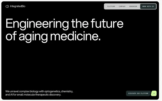
Preview image. Unlock full-res
Dark Academia Laboratory: A meticulously organized workbench under a cool, precise spotlight.
Color palette
Green wash for highlight backgrounds, decorative bands, and soft emphasis behind content
Decorative fills, subtle background accents
Page backgrounds, footer backgrounds, primary text on light surfaces
Dark borders and separators for elevated surfaces and inverted UI. Do not promote it to the primary CTA color
Muted body text, subtle borders
Subtle headlines, decorative borders – imparts a soft, weathered quality to dark backgrounds
Card backgrounds, secondary surface backgrounds – a slightly warm off-white
Card backgrounds, elevated surface backgrounds – a cool, pale gray for contrast
Dominant page background in light sections, hero background – a clean, nearly canvas-like base
Hairline borders, dividers, input outlines, and card edges on light surfaces. Do not promote it to the primary CTA color
Typography
- Weights
- 400
- Sizes
- 16px, 18px, 19px, 22px, 24px, 36px, 42px, 58px, 75px, 89px, 111px, 158px
- Line height
- 1, 1.1, 1.2, 1.3
- Letter spacing
- -0.001, -0.001, -0.001, -0.006, -0.006, -0.02, -0.02, -0.02, -0.03, -0.03, -0.03, -0.03
- Fallback
- Inter
Headline, body text, navigation — the primary typeface, used across all major text elements. The custom font provides a distinctive, modern-without-being-trendy character.
- Weights
- 400
- Sizes
- 13px, 14px, 15px
- Line height
- 1, 1.23
- Letter spacing
- -0.007, -0.008, -0.02
- Fallback
- IBM Plex Mono
Small labels, code snippets, metadata — used sparingly to provide a technical, structured counterpoint to Aspekta.
Spacing & shape
Components
Ghost button with an 8px border-radius, 4px padding on all sides, 1px border in Carbon (#222f30) or Polar White (#ffffff), with text in Aspekta weight 400.
Solid Carbon (#222f30) button with Polar White (#ffffff) text (Aspekta weight 400), 8px border-radius, and 4px padding.
Text link on dark background, Aspekta weight 400, Polar White (#ffffff) color. Accompanied by a square Bio-Green (#cef79e) arrow icon.
A card with Off-White (#f7f7f5) background, 40px border-radius, and 40px internal padding. Content includes small-size Roboto Mono labels and Aspekta headlines, with a 1px Polar White border for definition. Image is full-bleed within the card's width atop the padding.
An input field with a 1px Polar White (#ffffff) border, 8px border-radius, and generous internal padding (17px left/right, 4px top/bottom).
Small text elements using Roboto Mono, such as '01 / 02' pagination or 'WHAT WE DO' labels. Text color is Carbon (#222f30) or Polar White (#ffffff), with a subtle rectangular background of Bio-Green (#cef79e) for emphasis.
Guidelines
- Prioritize Aspekta weight 400 for all primary text, adjusting size to establish hierarchy—large headlines (75-158px) use tight tracking (-0.03em), body text (16-19px) uses minimal tracking (-0.001em).
- Employ the Midnight Ink (#000000) or Carbon (#222f30) for dark backgrounds, contrasting with Polar White (#ffffff) for primary text where readability is paramount.
- Use Off-White (#f7f7f5) or Cloud Canvas (#e7e8e1) as secondary backgrounds for content sections and cards in lighter contexts, framed by 1px Polar White (#ffffff) borders.
- Define interactive elements and sections with subtle 1px borders using Carbon (#222f30) or Polar White (#ffffff), or Sage Mist (#c9cbbe) for a softer presence on dark interfaces.
- Apply Bio-Green (#cef79e) sparingly as an accent for functional indicators, small decorative elements, or subtle background highlights, ensuring it acts as a precise punctuation mark.
- Maintain a comfortable density with 40px section gaps and card padding, with smaller 8px element gaps for details, creating clear content separation.
- Ensure all buttons and navigational elements utilize an 8px border-radius, while cards and larger containers feature a more generous 40px radius, providing a distinct shape language.
- Avoid generic drop shadows or heavy elevation; surface differentiation primarily occurs through background color changes (#f7f7f5, #e7e8e1, #eeeeee) and subtle borders.
- Do not introduce additional vibrant colors; adhere strictly to the established Bio-Green (#cef79e) and Deep Sea (#445e5f) accents for chromatic emphasis.
- Refrain from using excessively open letter-spacing for headlines or body text; the system relies on a tightly tracked, confident typographic voice.
- Do not neglect the 1px border for interactive elements; it is crucial for defining clickable areas and maintaining the system's precise aesthetic.
- Avoid using Bio-Green (#cef79e) as a primary action background; it functions as an accent, not a call-to-action fill.
- Do not use high-fidelity, busy photography; prefer scientific or abstract imagery that complements the academic tone, or product-focused clean graphics.
- Avoid dense, unbroken blocks of text; break content into digestible sections with clear headings and sufficient inter-element spacing.
About this system
ShowHide
Integrated Bio's design system presents a serious, academic aesthetic with a striking dark canvas and intentionally muted chromatic accents. Typography is the primary visual communicator, featuring a custom sans-serif with generous scaling and tight tracking that commands attention without overpowering. Surfaces are predominantly dark or off-white, acting as clean backdrops for content, with borders serving to define interactive elements or subtle divisions. The overall impression is one of modern scientific rigor, where visual flourish is minimal, and focus remains on data and information.
The page primarily uses a full-bleed layout, allowing sections to fill the viewport width. The hero section features a dark background with a large, centered headline and a secondary text block at the bottom left. Content sections alternate between dark and light backgrounds, creating a clear vertical rhythm. Inner content is often constrained, with text-heavy sections using a single column or a broad central column for readability. Card grids, like the 'Newsroom' section, use a multi-column layout with generous spacing. Navigation is a simple top bar, with elements flushed to the right, maintaining a minimal and unobtrusive presence.
This system primarily uses scientific and abstract imagery. Visuals are typically product-focused or show magnified biological structures, often with internal glow effects or stylized connections. Photography is minimal, if present, and tends to be clinical or abstract rather than lifestyle. Illustrations are geometric and clean, often outlined or using filled shapes that hint at molecular or data structures. Icons are minimal, outlined, and monochromatic, usually in Polar White on dark backgrounds or Carbon on light. Imagery serves to explain complex concepts or showcase scientific processes, rather than purely decorative purposes. Density is moderate, with images often contained within cards or as full-width elements in alternating sections.
Reminiscent of Stripe, Linear, Vercel, Figma.
# Integrated Biosciences — Style Reference
> Dark Academia Laboratory: A meticulously organized workbench under a cool, precise spotlight.

**Theme:** mixed

**Site:** https://integratedbiosciences.com

Integrated Bio's design system presents a serious, academic aesthetic with a striking dark canvas and intentionally muted chromatic accents. Typography is the primary visual communicator, featuring a custom sans-serif with generous scaling and tight tracking that commands attention without overpowering. Surfaces are predominantly dark or off-white, acting as clean backdrops for content, with borders serving to define interactive elements or subtle divisions. The overall impression is one of modern scientific rigor, where visual flourish is minimal, and focus remains on data and information.

## Tokens — Colors

| Name | Value | Token | Role |
|------|------|------|------|
| Bio-Green | `#cef79e` | `--color-bio-green` | Green wash for highlight backgrounds, decorative bands, and soft emphasis behind content |
| Deep Sea | `#445e5f` | `--color-deep-sea` | Decorative fills, subtle background accents |
| Midnight Ink | `#000000` | `--color-midnight-ink` | Page backgrounds, footer backgrounds, primary text on light surfaces |
| Carbon | `#222f30` | `--color-carbon` | Dark borders and separators for elevated surfaces and inverted UI. Do not promote it to the primary CTA color |
| Fog | `#4d5757` | `--color-fog` | Muted body text, subtle borders |
| Sage Mist | `#c9cbbe` | `--color-sage-mist` | Subtle headlines, decorative borders – imparts a soft, weathered quality to dark backgrounds |
| Cloud Canvas | `#e7e8e1` | `--color-cloud-canvas` | Card backgrounds, secondary surface backgrounds – a slightly warm off-white |
| Light Gray | `#eeeeee` | `--color-light-gray` | Card backgrounds, elevated surface backgrounds – a cool, pale gray for contrast |
| Off-White | `#f7f7f5` | `--color-off-white` | Dominant page background in light sections, hero background – a clean, nearly canvas-like base |
| Polar White | `#ffffff` | `--color-polar-white` | Hairline borders, dividers, input outlines, and card edges on light surfaces. Do not promote it to the primary CTA color |

## Tokens — Typography

### Aspekta
- **Substitute:** Inter
- **Weights:** 400
- **Sizes:** 16px, 18px, 19px, 22px, 24px, 36px, 42px, 58px, 75px, 89px, 111px, 158px
- **Line height:** 1, 1.1, 1.2, 1.3
- **Letter spacing:** -0.001, -0.001, -0.001, -0.006, -0.006, -0.02, -0.02, -0.02, -0.03, -0.03, -0.03, -0.03
- **Role:** Headline, body text, navigation — the primary typeface, used across all major text elements. The custom font provides a distinctive, modern-without-being-trendy character.

### Roboto Mono
- **Substitute:** IBM Plex Mono
- **Weights:** 400
- **Sizes:** 13px, 14px, 15px
- **Line height:** 1, 1.23
- **Letter spacing:** -0.007, -0.008, -0.02
- **Role:** Small labels, code snippets, metadata — used sparingly to provide a technical, structured counterpoint to Aspekta.

## Tokens — Type Scale

Perfect Fourth (1.333) from 22px base.

| Role | Size | Line height | Letter spacing |
|------|------|------|------|
| caption | 16px | 1.2 | — |
| body-sm | 18px | 1.2 | — |
| body | 22px | 1.2 | — |
| body-lg | 24px | 1.2 | — |
| heading-sm | 42px | 1.2 | — |
| heading | 58px | 1.2 | — |
| heading-lg | 75px | 1.2 | — |
| display-sm | 111px | 1.2 | — |
| display | 158px | 1.2 | — |

## Tokens — Spacing

- **Section gap:** 40px
- **Card padding:** 40px
- **Element gap:** 8px

## Tokens — Radius

- **Default:** 8px
- **Buttons:** 8px
- **Cards:** 40px
- **tags:** 20px

## Layout

The page primarily uses a full-bleed layout, allowing sections to fill the viewport width. The hero section features a dark background with a large, centered headline and a secondary text block at the bottom left. Content sections alternate between dark and light backgrounds, creating a clear vertical rhythm. Inner content is often constrained, with text-heavy sections using a single column or a broad central column for readability. Card grids, like the 'Newsroom' section, use a multi-column layout with generous spacing. Navigation is a simple top bar, with elements flushed to the right, maintaining a minimal and unobtrusive presence.

## Imagery

This system primarily uses scientific and abstract imagery. Visuals are typically product-focused or show magnified biological structures, often with internal glow effects or stylized connections. Photography is minimal, if present, and tends to be clinical or abstract rather than lifestyle. Illustrations are geometric and clean, often outlined or using filled shapes that hint at molecular or data structures. Icons are minimal, outlined, and monochromatic, usually in Polar White on dark backgrounds or Carbon on light. Imagery serves to explain complex concepts or showcase scientific processes, rather than purely decorative purposes. Density is moderate, with images often contained within cards or as full-width elements in alternating sections.

## Components

### Navigation Button
*Outlined Button*

Ghost button with an 8px border-radius, 4px padding on all sides, 1px border in Carbon (#222f30) or Polar White (#ffffff), with text in Aspekta weight 400.

### Header Action Button
*Filled Button*

Solid Carbon (#222f30) button with Polar White (#ffffff) text (Aspekta weight 400), 8px border-radius, and 4px padding.

### Primary Action CTA Button (Text-only)
*Text Button*

Text link on dark background, Aspekta weight 400, Polar White (#ffffff) color. Accompanied by a square Bio-Green (#cef79e) arrow icon.

### News Article Card
*Content Grid Item*

A card with Off-White (#f7f7f5) background, 40px border-radius, and 40px internal padding. Content includes small-size Roboto Mono labels and Aspekta headlines, with a 1px Polar White border for definition. Image is full-bleed within the card's width atop the padding.

### Text Input
*Form Element*

An input field with a 1px Polar White (#ffffff) border, 8px border-radius, and generous internal padding (17px left/right, 4px top/bottom).

### Monospace Data Tag
*Informational Label*

Small text elements using Roboto Mono, such as '01 / 02' pagination or 'WHAT WE DO' labels. Text color is Carbon (#222f30) or Polar White (#ffffff), with a subtle rectangular background of Bio-Green (#cef79e) for emphasis.

## Guidelines

### Do

- Prioritize Aspekta weight 400 for all primary text, adjusting size to establish hierarchy—large headlines (75-158px) use tight tracking (-0.03em), body text (16-19px) uses minimal tracking (-0.001em).
- Employ the Midnight Ink (#000000) or Carbon (#222f30) for dark backgrounds, contrasting with Polar White (#ffffff) for primary text where readability is paramount.
- Use Off-White (#f7f7f5) or Cloud Canvas (#e7e8e1) as secondary backgrounds for content sections and cards in lighter contexts, framed by 1px Polar White (#ffffff) borders.
- Define interactive elements and sections with subtle 1px borders using Carbon (#222f30) or Polar White (#ffffff), or Sage Mist (#c9cbbe) for a softer presence on dark interfaces.
- Apply Bio-Green (#cef79e) sparingly as an accent for functional indicators, small decorative elements, or subtle background highlights, ensuring it acts as a precise punctuation mark.
- Maintain a comfortable density with 40px section gaps and card padding, with smaller 8px element gaps for details, creating clear content separation.
- Ensure all buttons and navigational elements utilize an 8px border-radius, while cards and larger containers feature a more generous 40px radius, providing a distinct shape language.

### Don't

- Avoid generic drop shadows or heavy elevation; surface differentiation primarily occurs through background color changes (#f7f7f5, #e7e8e1, #eeeeee) and subtle borders.
- Do not introduce additional vibrant colors; adhere strictly to the established Bio-Green (#cef79e) and Deep Sea (#445e5f) accents for chromatic emphasis.
- Refrain from using excessively open letter-spacing for headlines or body text; the system relies on a tightly tracked, confident typographic voice.
- Do not neglect the 1px border for interactive elements; it is crucial for defining clickable areas and maintaining the system's precise aesthetic.
- Avoid using Bio-Green (#cef79e) as a primary action background; it functions as an accent, not a call-to-action fill.
- Do not use high-fidelity, busy photography; prefer scientific or abstract imagery that complements the academic tone, or product-focused clean graphics.
- Avoid dense, unbroken blocks of text; break content into digestible sections with clear headings and sufficient inter-element spacing.

## Agent Prompt Guide

Quick Color Reference:
text: #222f30 (on light), #ffffff (on dark)
background: #000000 (dark mode), #f7f7f5 (light mode)
border: #222f30 (dark interactive), #ffffff (light interactive)
accent: #cef79e
primary action: no distinct CTA color

Example Component Prompts:
No distinct primary action color was observed; use the extracted neutral button treatments instead of inventing a filled CTA color.
2. Design a 'What We Do' section with an Off-White (#f7f7f5) background. Include a title at 58px Aspekta weight 400, Carbon (#222f30), letter-spacing -0.02em. Below, add a Monospace Data Tag: 'WHAT WE DO' in Roboto Mono weight 400, 14px, Carbon (#222f30), with a Bio-Green (#cef79e) rectangular background.
3. Create a News Article Card on a Light Gray (#eeeeee) background with a 40px border-radius. Inside, use 40px padding. Place a small label, 'Publications', at 13px Roboto Mono weight 400, Carbon (#222f30). Below, a headline at 42px Aspekta weight 400, Carbon (#222f30), letter-spacing -0.02em. The card will contain a full-width image and a 'Read Article' link.
More like this








Keep what you find
A free account saves references to boards and can send you a weekly email of picks based on what you save.
To see every result, go Pro.