Preview image. Unlock full-res
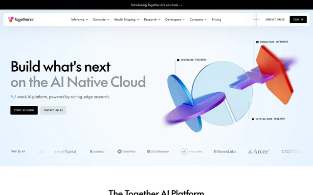
Shifting geometric planes under a deep indigo sky. Bold textual headlines punctuate against a canvas of near-black and clinical white, punctuated by soft, almost pastel blocks of color.
Color palette
Page background (dark sections), primary button background, navigation background — establishes the core dark ambiance, suggesting depth and technical sophistication.
Small interactive iconography, decorative fills — a vibrant, high-chroma accent appearing sparingly.
Small interactive iconography, decorative fills — a sharp, vivid pink for specific energetic accents.
Informational card background, content blocks — provides a light, approachable surface for data points.
Informational card background, content blocks — adds a contrasting, soft chromatic element.
Informational card background, content blocks — warms up data presentation without being visually aggressive.
Callout backgrounds, subtle accent fills — a very light, almost ethereal touch of color.
Accent elements, interactive indicators, underlines — a sophisticated, slightly desaturated violet for emphasis.
Backgrounds for specific programmatic blocks — a cool, technical cyan.
Page background (light sections), text on dark, interactive element text, primary surface for content — provides expansive contrast and visual breathing room.
Primary text color on light backgrounds, button text, icon default — provides maximum contrast against Canvas White and light pastels.
Secondary body text, subtle borders — softens informational text without losing legibility against light backgrounds.
Subtle borders, dividers, disabled states — offers a minimal visual separation.
Typography
- Weights
- 400, 500
- Sizes
- 14px, 16px, 18px, 22px, 28px, 40px, 64px
- Line height
- 1, 1.1, 1.15, 1.2, 1.25, 1.3, 1.4
- Letter spacing
- -0.0300em at 64px, -0.0200em at 40px, -0.0150em at 28px, -0.0100em at 22px
- Fallback
- Montserrat, Inter
Primary typeface for all headings, body text, navigation, and general UI. The custom, almost futuristic aesthetic in varying weights maintains a consistent modern and intelligent tone without being overtly decorative. The tight letter-spacing at larger sizes gives headlines a crisp, intentional feel, preventing them from feeling loose despite the generous line heights.
- Weights
- 400, 500
- Sizes
- 10px, 11px, 13px, 16px
- Line height
- 1, 1.4
- Letter spacing
- 0.0070em at 16px, 0.0050em at 13px
- Fallback
- IBM Plex Mono, Space Mono
Used for code snippets, secondary labels, and small annotations. Its monospace nature provides a technical, data-driven counterpoint to 'The Future', reinforcing the AI platform's underlying complexity and precision.
Spacing & shape
Elevation
Components
backgroundColor: #000000, color: #FFFFFF, borderRadius: 4px, padding: 16px. Used for main actions against light backgrounds.
backgroundColor: rgba(255, 255, 255, 0.12), color: #FFFFFF, borderRadius: 4px, padding: 16px. Provides a subtle action against dark backgrounds without competing with primary CTAs.
backgroundColor: rgba(0, 0, 0, 0.08), color: #000000, borderRadius: 4px, padding: 16px. A subdued action on light backgrounds.
backgroundColor: rgba(255, 255, 255, 0.12), color: #FFFFFF, borderRadius: 4px, padding: 2px 8px. Applied to elements on dark surfaces.
backgroundColor: rgba(0, 0, 0, 0.04), color: #000000, borderRadius: 4px, padding: 2px 8px. Applied to elements on light surfaces.
backgroundColor: rgba(255, 255, 255, 0.08), borderRadius: 4px, padding: 20px 40px. Used for content blocks on dark backgrounds.
backgroundColor: #C1DFF9, borderRadius: 0px, padding: 20px. Used for specific data points or feature blocks, like the 2x faster card.
backgroundColor: #FDE3F6, borderRadius: 0px, padding: 20px. Used for specific data points or feature blocks.
backgroundColor: #FFDCCD, borderRadius: 0px, padding: 20px. Used for specific data points or feature blocks.
backgroundColor: rgba(255, 255, 255, 0.08) within a primary background of #010120, backdrop-filter: blur(10px), boxShadow: rgba(1, 1, 32, 0.1) -10px 0px 75px 0px. Features a subtle frosted glass effect on a dark background.
Guidelines
- Use 'The Future' font for all primary textual content to maintain a consistent high-tech, yet approachable, brand voice.
- Apply a 4px `borderRadius` to all buttons and badges for subtle modern rounding.
- Prioritize `Midnight Ink` (#010120) and `Canvas White` (#FFFFFF) for primary background and text combinations, achieving high contrast.
- Utilize `Regal Violet` (#BDBBFF) as the primary accent color for active navigation states and subtle interactive highlights.
- Frame informational cards with `20px 40px` padding when on dark backgrounds, using `rgba(255, 255, 255, 0.08)` as background.
- Employ `PP Neue Montreal Mono` for all technical annotations, code blocks, or data-specific text to differentiate programmatic content.
- Ensure large headlines (64px) apply `-0.0300em` letter-spacing for visual tightness.
- Do not introduce new border radii beyond 4px, 8px, or 16px; prefer the consistent 4px default for interactive elements.
- Avoid using highly saturated, vivid colors for large background blocks; reserve them only for small, pointed iconography or specific branding elements.
- Do not use generic system fonts; 'The Future' and 'PP Neue Montreal Mono' are integral to the brand's unique character.
- Do not deviate from the established padding scale; consistent spacing reinforces information hierarchy.
- Avoid applying shadows directly to most content cards; depth is achieved primarily through background shifts and subtle layering of semi-transparent surfaces.
- Do not place body copy in colors other than `Void Black` or `Canvas White` on their respective contrasting backgrounds, or `Smoke Gray` for secondary text.
- Avoid overly playful or organic shapes; the aesthetic is sharp, precise, and tech-focused.
About this system
ShowHide
This system evokes a sense of advanced analytical capability, balancing deep, technical backgrounds with moments of soft-hued clarity. The predominant use of near-black and white creates a high-contrast, data-centric atmosphere. Subtle, pastel-like card colorations provide distinct 'data blocks' against the stark background. Hard-edged rectilinear forms dominate, with soft corner radii only appearing on interactive elements, grounding the digital sophistication with approachable interaction points. Large, whispering headlines in a custom AI-inspired typeface set a tone of quiet authority.
The site employs a mixed layout model, primarily adopting a full-bleed dark hero section with a centered, split text and abstract visual. Subsequent sections alternate between full-width dark backgrounds and standard content-width, centered light sections. Vertical spacing between sections is generous, leading to a spacious, comfortable density. Content arrangement often utilizes a centered stack for headlines and subtext, followed by feature blocks in a 3-column grid, or alternating text-left/visual-right patterns. The navigation is a sticky top bar, often subtly transparent/frosted over the dark hero, then opaque on light backgrounds.
The visual language is split between abstract 3D renders and subtle iconography, with an absence of traditional photography. Large, abstract 3D graphics in the hero section feature overlapping, translucent geometric forms with soft gradients and blurred edges, suggesting complexity and interconnectedness. These are rendered to appear ethereal yet structured, against a dark backdrop. Elsewhere, icons are simple, often monochromatic, and directly support the accompanying text, serving an explanatory role. The overall density of imagery is moderate, strategically placed to illustrate concepts or provide visual breaks without dominating the content.
Reminiscent of Linear, Anthropic, Vercel, Supabase.
# Together AI — Style Reference
> Shifting geometric planes under a deep indigo sky. Bold textual headlines punctuate against a canvas of near-black and clinical white, punctuated by soft, almost pastel blocks of color.

**Theme:** mixed

**Site:** https://together.ai

This system evokes a sense of advanced analytical capability, balancing deep, technical backgrounds with moments of soft-hued clarity. The predominant use of near-black and white creates a high-contrast, data-centric atmosphere. Subtle, pastel-like card colorations provide distinct 'data blocks' against the stark background. Hard-edged rectilinear forms dominate, with soft corner radii only appearing on interactive elements, grounding the digital sophistication with approachable interaction points. Large, whispering headlines in a custom AI-inspired typeface set a tone of quiet authority.

## Tokens — Colors

| Name | Value | Token | Role |
|------|------|------|------|
| Midnight Ink | `#010120` | `--color-midnight-ink` | Page background (dark sections), primary button background, navigation background — establishes the core dark ambiance, suggesting depth and technical sophistication. |
| Electric Orange | `#FC4C02` | `--color-electric-orange` | Small interactive iconography, decorative fills — a vibrant, high-chroma accent appearing sparingly. |
| Magenta Flash | `#EF2CC1` | `--color-magenta-flash` | Small interactive iconography, decorative fills — a sharp, vivid pink for specific energetic accents. |
| Sky Blue Block | `#C1DFF9` | `--color-sky-blue-block` | Informational card background, content blocks — provides a light, approachable surface for data points. |
| Cosmic Pink Block | `#FDE3F6` | `--color-cosmic-pink-block` | Informational card background, content blocks — adds a contrasting, soft chromatic element. |
| Dawn Orange Block | `#FFDCCD` | `--color-dawn-orange-block` | Informational card background, content blocks — warms up data presentation without being visually aggressive. |
| Cyan Whisper | `#C8F6F9` | `--color-cyan-whisper` | Callout backgrounds, subtle accent fills — a very light, almost ethereal touch of color. |
| Regal Violet | `#BDBBFF` | `--color-regal-violet` | Accent elements, interactive indicators, underlines — a sophisticated, slightly desaturated violet for emphasis. |
| Cyan Glow | `#70E9F0` | `--color-cyan-glow` | Backgrounds for specific programmatic blocks — a cool, technical cyan. |
| Canvas White | `#FFFFFF` | `--color-canvas-white` | Page background (light sections), text on dark, interactive element text, primary surface for content — provides expansive contrast and visual breathing room. |
| Void Black | `#000000` | `--color-void-black` | Primary text color on light backgrounds, button text, icon default — provides maximum contrast against Canvas White and light pastels. |
| Smoke Gray | `#4D4D4D` | `--color-smoke-gray` | Secondary body text, subtle borders — softens informational text without losing legibility against light backgrounds. |
| Frost Gray | `#D6D6D6` | `--color-frost-gray` | Subtle borders, dividers, disabled states — offers a minimal visual separation. |

## Tokens — Typography

### The Future
- **Substitute:** Montserrat, Inter
- **Weights:** 400, 500
- **Sizes:** 14px, 16px, 18px, 22px, 28px, 40px, 64px
- **Line height:** 1, 1.1, 1.15, 1.2, 1.25, 1.3, 1.4
- **Letter spacing:** -0.0300em at 64px, -0.0200em at 40px, -0.0150em at 28px, -0.0100em at 22px
- **Role:** Primary typeface for all headings, body text, navigation, and general UI. The custom, almost futuristic aesthetic in varying weights maintains a consistent modern and intelligent tone without being overtly decorative. The tight letter-spacing at larger sizes gives headlines a crisp, intentional feel, preventing them from feeling loose despite the generous line heights.

### PP Neue Montreal Mono
- **Substitute:** IBM Plex Mono, Space Mono
- **Weights:** 400, 500
- **Sizes:** 10px, 11px, 13px, 16px
- **Line height:** 1, 1.4
- **Letter spacing:** 0.0070em at 16px, 0.0050em at 13px
- **Role:** Used for code snippets, secondary labels, and small annotations. Its monospace nature provides a technical, data-driven counterpoint to 'The Future', reinforcing the AI platform's underlying complexity and precision.

## Tokens — Type Scale

Perfect Fourth (1.333) from 16px base.

| Role | Size | Line height | Letter spacing |
|------|------|------|------|
| caption | 10px | 1.4 | 0.007em |
| body-sm | 14px | 1.4 | — |
| body | 16px | 1.4 | — |
| subheading | 22px | 1.3 | -0.44px |
| heading | 28px | 1.25 | -0.42px |
| heading-lg | 40px | 1.15 | -0.8px |
| display | 64px | 1.1 | -1.92px |

## Tokens — Radius

- **Default:** 4px
- **large:** 16px
- **medium:** 8px

## Tokens — Elevation

- **Navigation Bar:** `rgba(1, 1, 32, 0.1) -10px 0px 75px 0px`

## Layout

The site employs a mixed layout model, primarily adopting a full-bleed dark hero section with a centered, split text and abstract visual. Subsequent sections alternate between full-width dark backgrounds and standard content-width, centered light sections. Vertical spacing between sections is generous, leading to a spacious, comfortable density. Content arrangement often utilizes a centered stack for headlines and subtext, followed by feature blocks in a 3-column grid, or alternating text-left/visual-right patterns. The navigation is a sticky top bar, often subtly transparent/frosted over the dark hero, then opaque on light backgrounds.

## Imagery

The visual language is split between abstract 3D renders and subtle iconography, with an absence of traditional photography. Large, abstract 3D graphics in the hero section feature overlapping, translucent geometric forms with soft gradients and blurred edges, suggesting complexity and interconnectedness. These are rendered to appear ethereal yet structured, against a dark backdrop. Elsewhere, icons are simple, often monochromatic, and directly support the accompanying text, serving an explanatory role. The overall density of imagery is moderate, strategically placed to illustrate concepts or provide visual breaks without dominating the content.

## Components

### Stat Metric Cards

### Research Cards (Dark)

### Button Group & Announcement Banner

### Primary Dark Button
*Call to Action*

backgroundColor: #000000, color: #FFFFFF, borderRadius: 4px, padding: 16px. Used for main actions against light backgrounds.

### Secondary Ghost Button
*Secondary Action*

backgroundColor: rgba(255, 255, 255, 0.12), color: #FFFFFF, borderRadius: 4px, padding: 16px. Provides a subtle action against dark backgrounds without competing with primary CTAs.

### Light Ghost Button
*Secondary Action on Light Background*

backgroundColor: rgba(0, 0, 0, 0.08), color: #000000, borderRadius: 4px, padding: 16px. A subdued action on light backgrounds.

### Badge (Dark Background)
*Categorization, Status*

backgroundColor: rgba(255, 255, 255, 0.12), color: #FFFFFF, borderRadius: 4px, padding: 2px 8px. Applied to elements on dark surfaces.

### Badge (Light Background)
*Categorization, Status*

backgroundColor: rgba(0, 0, 0, 0.04), color: #000000, borderRadius: 4px, padding: 2px 8px. Applied to elements on light surfaces.

### Light Information Card
*Content Display, Feature Highlight*

backgroundColor: rgba(255, 255, 255, 0.08), borderRadius: 4px, padding: 20px 40px. Used for content blocks on dark backgrounds.

### Colored Information Card (Blue)
*Statistical Highlight*

backgroundColor: #C1DFF9, borderRadius: 0px, padding: 20px. Used for specific data points or feature blocks, like the 2x faster card.

### Colored Information Card (Pink)
*Statistical Highlight*

backgroundColor: #FDE3F6, borderRadius: 0px, padding: 20px. Used for specific data points or feature blocks.

### Colored Information Card (Orange)
*Statistical Highlight*

backgroundColor: #FFDCCD, borderRadius: 0px, padding: 20px. Used for specific data points or feature blocks.

### Navigation Bar
*Global Navigation*

backgroundColor: rgba(255, 255, 255, 0.08) within a primary background of #010120, backdrop-filter: blur(10px), boxShadow: rgba(1, 1, 32, 0.1) -10px 0px 75px 0px. Features a subtle frosted glass effect on a dark background.

## Guidelines

### Do

- Use 'The Future' font for all primary textual content to maintain a consistent high-tech, yet approachable, brand voice.
- Apply a 4px `borderRadius` to all buttons and badges for subtle modern rounding.
- Prioritize `Midnight Ink` (#010120) and `Canvas White` (#FFFFFF) for primary background and text combinations, achieving high contrast.
- Utilize `Regal Violet` (#BDBBFF) as the primary accent color for active navigation states and subtle interactive highlights.
- Frame informational cards with `20px 40px` padding when on dark backgrounds, using `rgba(255, 255, 255, 0.08)` as background.
- Employ `PP Neue Montreal Mono` for all technical annotations, code blocks, or data-specific text to differentiate programmatic content.
- Ensure large headlines (64px) apply `-0.0300em` letter-spacing for visual tightness.

### Don't

- Do not introduce new border radii beyond 4px, 8px, or 16px; prefer the consistent 4px default for interactive elements.
- Avoid using highly saturated, vivid colors for large background blocks; reserve them only for small, pointed iconography or specific branding elements.
- Do not use generic system fonts; 'The Future' and 'PP Neue Montreal Mono' are integral to the brand's unique character.
- Do not deviate from the established padding scale; consistent spacing reinforces information hierarchy.
- Avoid applying shadows directly to most content cards; depth is achieved primarily through background shifts and subtle layering of semi-transparent surfaces.
- Do not place body copy in colors other than `Void Black` or `Canvas White` on their respective contrasting backgrounds, or `Smoke Gray` for secondary text.
- Avoid overly playful or organic shapes; the aesthetic is sharp, precise, and tech-focused.

## Agent Prompt Guide

### Quick Color Reference
- Text (dark bg): #FFFFFF
- Text (light bg): #000000
- Background (dark): #010120
- Background (light): #FFFFFF
- CTA Button BG (dark): #000000
- CTA Button BG (ghost): rgba(255, 255, 255, 0.12)
- Accent: #BDBBFF

### Example Component Prompts
1. Create a Hero Headline: 'Build what's next on the AI Native Cloud'. Use 'The Future' font, weight 500, size 64px, line-height 1.1, letter-spacing -1.92px, color #FFFFFF. Place it on a #010120 background.
2. Design a Primary Dark Action Button: 'Start building'. Use 'The Future' font, weight 400, size 16px, line-height 1.4, color #FFFFFF. Background #000000, borderRadius 4px, padding 16px.
3. Construct a Light Information Card: '2x Faster Inference'. Use 'The Future' font for body, weight 400, size 16px, line-height 1.4, color #000000. Background #C1DFF9, no border, borderRadius 0px, padding 20px.
4. Produce a Badge for Dark Background: 'Developers'. Use 'The Future' font, weight 400, size 14px, line-height 1.4, color #FFFFFF. Background rgba(255, 255, 255, 0.12), borderRadius 4px, padding 2px 8px.
5. Generate a Footer Link: 'About Us'. Use 'The Future' font, weight 400, size 14px, line-height 1.4, color #FFFFFF. No explicit background, standard hover will be a mild opacity shift, such as on rgba(255,255,255,0.08).
More like this







Keep what you find
A free account saves references to boards and can send you a weekly email of picks based on what you save.
To see every result, go Pro.