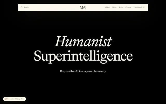
Preview image. Unlock full-res
Warm academic parchment
Color palette
Section backgrounds, creating a soft, inviting transition between content blocks.
Decorative elements, subtle background accents, adding a warm, almost edible visual texture.
Background for specific content blocks, providing a muted, sophisticated accent.
Background for specific content blocks, offering a deep, natural contrast.
Subtle accent for icons or minor decorative elements, evoking vintage quality.
Interactive element highlights, used sparingly for specific icons, creating a vivid point of interest against the subdued palette.
Hero background, dark sections – a deep, almost velvet black that serves as a high-contrast canvas for header text.
Page background, light sections, card surfaces – a warm, creamy off-white providing soft contrast with text.
Secondary background, badges – a slightly cooler off-white, offering subtle differentiation from the main background.
Primary text, borders, icons, input text – a brownish-gray that suggests an earthy, natural tone.
Typography
- Weights
- 400, 450
- Sizes
- 15px, 20px, 25px, 35px, 40px, 45px, 100px, 125px
- Line height
- 1, 1.13, 1.2, 1.25, 1.4
- Letter spacing
- -0.0400em, -0.0300em, -0.0200em, -0.0130em, -0.0100em
- Fallback
- Playfair Display
Display headlines and sub-headlines, body text in larger contexts (like hero sections). The fine serifs and dramatic letter-spacing at large sizes create an elegant, almost calligraphic presence, lending an air of intellectual authority without being austere.
- Weights
- 400, 450, 500
- Sizes
- 12px, 13px, 15px, 20px
- Line height
- 1, 1.2, 1.25, 1.6
- Letter spacing
- -0.0170em, -0.0150em, -0.0130em, -0.0100em, 0.0500em, 0.1000em
- Fallback
- IBM Plex Mono
Functional text: inputs, buttons, badges, navigation, and detailed body copy. Its monospaced nature provides clear, unambiguous readability for data and interactive labels, contrasting with the humanist headings.
- Weights
- 400
- Sizes
- 16px
- Line height
- 1.25
- Letter spacing
- -0.0130em
- Fallback
- Segoe MDL2 Assets
System icons for search and accessibility. This provides consistent, clear iconography aligned with Microsoft's design language for functional elements.
Spacing & shape
Components
Bradford LL, weight 400, size 15px, color Warm Clay (#5d524b). No explicit padding or background, using natural text spacing.
Monospaced Red Hat Mono text at 15px, Warm Clay (#5d524b). Background is transparent, with a 50px border-radius, border-color Warm Clay (#5d524b).
Bradford LL, weight 450, sizes 100px or 125px with line-height 1.0 and significant negative letter-spacing (-4.0px or -5.0px). Color is Greated Parchment (#fef9ed) against Midnight Estate (#000000) background.
Background transparent, text Warm Clay (#5d524b), border-top Warm Clay (#5d524b), border-radius 85.8333px. No padding, relying on surrounding layout for spacing.
Background Greated Parchment (#fef9ed), text Warm Clay (#5d524b), border-color Warm Clay (#5d524b), border-radius 85.8333px. No explicit padding.
Background Faded Linen (#f5f0e4), text Warm Clay (#5d524b), border-radius 2.5px. Padding 3.33333px vertical, 16.6667px horizontal. Uses Red Hat Mono for clarity.
Small toggle with 'Off' and 'Accessibility Mode' text. Uses Red Hat Mono, color Warm Clay (#5d524b), likely against a Greated Parchment (#fef9ed) or Faded Linen (#f5f0e4) background.
Guidelines
- Prioritize Bradford LL (Playfair Display) for all headlines and impactful textual displays, using its 450 weight and generous letter-spacing for elegance.
- Use Red Hat Mono (IBM Plex Mono) exclusively for all functional text: buttons, navigation, inputs, and supplementary information at weights 400-500.
- Apply rounded corners consistently: 85.8333px for interactive pill-shaped buttons, 50px for form inputs, and 2.5px for small badges for a warm, organic feel.
- Utilize Greated Parchment (#fef9ed) as the primary light background and Midnight Estate (#000000) for high-contrast hero sections.
- For text on light backgrounds, always use Warm Clay (#5d524b) to maintain a soft, readable contrast (contrast ratio 7.2:1).
- Employ the Dusty Rose Gradient (linear-gradient(rgb(251, 211, 190) 50%, rgb(254, 249, 237) 100%)) as a subtle, inviting background element for content sections.
- Maintain comfortable element spacing with an elementGap of '8-20px' and a base unit of 4px for all padding and margins.
- Avoid using highly saturated, vibrant colors outside of the specified accent colors, to preserve the system's muted, academic aesthetic.
- Do not use generic system fonts for body text or headlines; adhere strictly to Bradford LL (Playfair Display) and Red Hat Mono (IBM Plex Mono) for brand consistency.
- Refrain from sharp, angular corners on UI elements exceeding a 12px radius, as this contradicts the softer, organic shape language.
- Do not introduce heavy drop shadows or aggressive elevation; the system relies on color and spacing for depth.
- Avoid tight line heights or negative letter-spacing on body text to ensure readability, especially with the serif font.
- Do not use Warm Clay (#5d524b) as a background color, it's reserved for text and borders to maintain its visual role as detail.
- Never combine Bradford LL with Red Hat Mono within the same short phrase or button label; maintain clear separation of their roles.
About this system
ShowHide
This design evokes a sense of antique academic rigor meeting soft, optimistic warmth. The primary color palette transitions from deep black to creamy off-white with occasional muted pastel gradients, creating distinct atmospheric shifts. Delicate humanist typography in Bradford LL, characterized by its fine serifs and generous letter-spacing for large headlines, gives an authoritative yet approachable feel. Conversely, more utilitarian Red Hat Mono maintains informational clarity on smaller elements. Strong visual personality arises from the interplay of a classic serif font for display with a modern, technical mono font for UI elements, all grounded by expansive spacing and subtly rounded, organic shapes.
Reminiscent of The Browser Company (Arc Browser), Anthropic, Stripe (older versions), Apple (editorial sections).
# Microsoft AI — Style Reference
> Warm academic parchment

**Theme:** mixed

**Site:** https://microsoft.ai

This design evokes a sense of antique academic rigor meeting soft, optimistic warmth. The primary color palette transitions from deep black to creamy off-white with occasional muted pastel gradients, creating distinct atmospheric shifts. Delicate humanist typography in Bradford LL, characterized by its fine serifs and generous letter-spacing for large headlines, gives an authoritative yet approachable feel. Conversely, more utilitarian Red Hat Mono maintains informational clarity on smaller elements. Strong visual personality arises from the interplay of a classic serif font for display with a modern, technical mono font for UI elements, all grounded by expansive spacing and subtly rounded, organic shapes.

## Tokens — Colors

| Name | Value | Token | Role |
|------|------|------|------|
| Dusty Rose Gradient | `#fbd3be` | `--color-dusty-rose-gradient` | Section backgrounds, creating a soft, inviting transition between content blocks. |
| Sunset Glaze Gradient | `#e7b191` | `--color-sunset-glaze-gradient` | Decorative elements, subtle background accents, adding a warm, almost edible visual texture. |
| Worn Velvet | `#8c5462` | `--color-worn-velvet` | Background for specific content blocks, providing a muted, sophisticated accent. |
| Forest Shade | `#2e4d4d` | `--color-forest-shade` | Background for specific content blocks, offering a deep, natural contrast. |
| Antique Brass | `#a67c52` | `--color-antique-brass` | Subtle accent for icons or minor decorative elements, evoking vintage quality. |
| Cerulean Link | `#0066ff` | `--color-cerulean-link` | Interactive element highlights, used sparingly for specific icons, creating a vivid point of interest against the subdued palette. |
| Midnight Estate | `#000000` | `--color-midnight-estate` | Hero background, dark sections – a deep, almost velvet black that serves as a high-contrast canvas for header text. |
| Greated Parchment | `#fef9ed` | `--color-greated-parchment` | Page background, light sections, card surfaces – a warm, creamy off-white providing soft contrast with text. |
| Faded Linen | `#f5f0e4` | `--color-faded-linen` | Secondary background, badges – a slightly cooler off-white, offering subtle differentiation from the main background. |
| Warm Clay | `#5d524b` | `--color-warm-clay` | Primary text, borders, icons, input text – a brownish-gray that suggests an earthy, natural tone. |

## Tokens — Typography

### Bradford LL
- **Substitute:** Playfair Display
- **Weights:** 400, 450
- **Sizes:** 15px, 20px, 25px, 35px, 40px, 45px, 100px, 125px
- **Line height:** 1, 1.13, 1.2, 1.25, 1.4
- **Letter spacing:** -0.0400em, -0.0300em, -0.0200em, -0.0130em, -0.0100em
- **Role:** Display headlines and sub-headlines, body text in larger contexts (like hero sections). The fine serifs and dramatic letter-spacing at large sizes create an elegant, almost calligraphic presence, lending an air of intellectual authority without being austere.

### Red Hat Mono
- **Substitute:** IBM Plex Mono
- **Weights:** 400, 450, 500
- **Sizes:** 12px, 13px, 15px, 20px
- **Line height:** 1, 1.2, 1.25, 1.6
- **Letter spacing:** -0.0170em, -0.0150em, -0.0130em, -0.0100em, 0.0500em, 0.1000em
- **Role:** Functional text: inputs, buttons, badges, navigation, and detailed body copy. Its monospaced nature provides clear, unambiguous readability for data and interactive labels, contrasting with the humanist headings.

### MWF-MDL2
- **Substitute:** Segoe MDL2 Assets
- **Weights:** 400
- **Sizes:** 16px
- **Line height:** 1.25
- **Letter spacing:** -0.0130em
- **Role:** System icons for search and accessibility. This provides consistent, clear iconography aligned with Microsoft's design language for functional elements.

## Tokens — Type Scale

Perfect Fifth (1.5) from 15px base.

| Role | Size | Line height | Letter spacing |
|------|------|------|------|
| caption | 12px | 1.6 | 0.6px |
| body | 15px | 1.6 | -0.21px |
| subheading | 20px | 1.4 | -0.26px |
| heading | 25px | 1.25 | -0.32px |
| heading-lg | 35px | 1.25 | -0.7px |
| display | 100px | 1 | -4px |
| display-lg | 125px | 1 | -5px |

## Tokens — Spacing

- **Section gap:** 48-80px
- **Card padding:** 17px
- **Element gap:** 8-20px

## Tokens — Radius

- **Buttons:** 85.8333px
- **Inputs:** 50px
- **Images:** 25px
- **lg:** 6.66667px
- **md:** 4.16667px
- **pills:** 65px
- **sm:** 2.5px

## Components

### Accessibility Toggle

### Product Tab Selector

### Mission Statement Banner

### Primary Navigation Link
*Main site navigation*

Bradford LL, weight 400, size 15px, color Warm Clay (#5d524b). No explicit padding or background, using natural text spacing.

### Pill Search Input
*Global search functionality*

Monospaced Red Hat Mono text at 15px, Warm Clay (#5d524b). Background is transparent, with a 50px border-radius, border-color Warm Clay (#5d524b).

### Hero Headline
*Primary heading for the hero section*

Bradford LL, weight 450, sizes 100px or 125px with line-height 1.0 and significant negative letter-spacing (-4.0px or -5.0px). Color is Greated Parchment (#fef9ed) against Midnight Estate (#000000) background.

### Text Only Button
*Interactive elements with minimal visual weight*

Background transparent, text Warm Clay (#5d524b), border-top Warm Clay (#5d524b), border-radius 85.8333px. No padding, relying on surrounding layout for spacing.

### Filled Pill Button
*Interactive elements with a subtle background*

Background Greated Parchment (#fef9ed), text Warm Clay (#5d524b), border-color Warm Clay (#5d524b), border-radius 85.8333px. No explicit padding.

### Product Category Badge
*Categorization of content or products*

Background Faded Linen (#f5f0e4), text Warm Clay (#5d524b), border-radius 2.5px. Padding 3.33333px vertical, 16.6667px horizontal. Uses Red Hat Mono for clarity.

### Accessibility Toggle
*UI control for accessibility mode*

Small toggle with 'Off' and 'Accessibility Mode' text. Uses Red Hat Mono, color Warm Clay (#5d524b), likely against a Greated Parchment (#fef9ed) or Faded Linen (#f5f0e4) background.

## Guidelines

### Do

- Prioritize Bradford LL (Playfair Display) for all headlines and impactful textual displays, using its 450 weight and generous letter-spacing for elegance.
- Use Red Hat Mono (IBM Plex Mono) exclusively for all functional text: buttons, navigation, inputs, and supplementary information at weights 400-500.
- Apply rounded corners consistently: 85.8333px for interactive pill-shaped buttons, 50px for form inputs, and 2.5px for small badges for a warm, organic feel.
- Utilize Greated Parchment (#fef9ed) as the primary light background and Midnight Estate (#000000) for high-contrast hero sections.
- For text on light backgrounds, always use Warm Clay (#5d524b) to maintain a soft, readable contrast (contrast ratio 7.2:1).
- Employ the Dusty Rose Gradient (linear-gradient(rgb(251, 211, 190) 50%, rgb(254, 249, 237) 100%)) as a subtle, inviting background element for content sections.
- Maintain comfortable element spacing with an elementGap of '8-20px' and a base unit of 4px for all padding and margins.

### Don't

- Avoid using highly saturated, vibrant colors outside of the specified accent colors, to preserve the system's muted, academic aesthetic.
- Do not use generic system fonts for body text or headlines; adhere strictly to Bradford LL (Playfair Display) and Red Hat Mono (IBM Plex Mono) for brand consistency.
- Refrain from sharp, angular corners on UI elements exceeding a 12px radius, as this contradicts the softer, organic shape language.
- Do not introduce heavy drop shadows or aggressive elevation; the system relies on color and spacing for depth.
- Avoid tight line heights or negative letter-spacing on body text to ensure readability, especially with the serif font.
- Do not use Warm Clay (#5d524b) as a background color, it's reserved for text and borders to maintain its visual role as detail.
- Never combine Bradford LL with Red Hat Mono within the same short phrase or button label; maintain clear separation of their roles.

## Agent Prompt Guide

### Quick Color Reference
- Text: Warm Clay (#5d524b)
- Page Background: Greated Parchment (#fef9ed)
- Hero Background: Midnight Estate (#000000)
- Accent Gradient: Dusty Rose Gradient (linear-gradient(rgb(251, 211, 190) 50%, rgb(254, 249, 237) 100%))
- Button Fill: Greated Parchment (#fef9ed)
- Button Border/Text: Warm Clay (#5d524b)

### 3-5 Example Component Prompts
1. Create a hero section: Midnight Estate (#000000) background. Main headline 'Humanist Superintelligence' (Bradford LL weight 450, 125px size, 1.0 lineHeight, -5.0px letter-spacing, Greated Parchment #fef9ed). Subtext 'Responsible AI to empower humanity' (Red Hat Mono weight 400, 20px size, 1.6 lineHeight, -0.26px letter-spacing, Greated Parchment #fef9ed).
2. Generate a product category badge: Faded Linen (#f5f0e4) background, Warm Clay (#5d524b) text 'Copilot' (Red Hat Mono weight 400, 15px size), border-radius 2.5px, padding 3.33333px vertical, 16.6667px horizontal.
3. Design a pill-shaped search input field: 50px border-radius, Warm Clay (#5d524b) border and placeholder text ('Search') (Red Hat Mono weight 400, 15px size), transparent background. Include a MWF-MDL2 icon for the search symbol.
4. Build an introductory text block: Background is Dusty Rose Gradient. Heading 'At MAI, we’re building...' (Bradford LL weight 400, 35px size, 1.25 lineHeight, -0.7px letter-spacing, Warm Clay #5d524b). Body text 'We are building the world's most capable AI systems...' (Bradford LL weight 400, 20px size, 1.4 lineHeight, -0.39px letter-spacing, Warm Clay #5d524b).
5. Create a text-only navigation item: 'Playground' link text (Bradford LL weight 400, 15px size, 1.4 lineHeight, Warm Clay #5d524b). On hover, change text color to Cerulean Link (#0066ff).
More like this







Keep what you find
A free account saves references to boards and can send you a weekly email of picks based on what you save.
To see every result, go Pro.