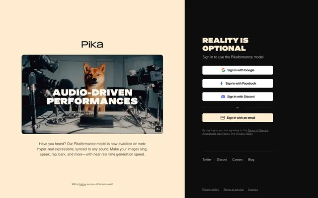
Preview image. Unlock full-res
Dual-pane studio and control room. One side warm, inviting; the other dark, efficient.
Color palette
Background for descriptive content, brand accents, selected interactive states.
Iconography for Facebook sign-in.
Iconography for Discord sign-in.
Iconography for Google sign-in.
Primary text across both light and dark backgrounds. This deep black provides substantial contrast for readability.
Background for the interactive login panel, establishing a command-center aesthetic.
Background for standard buttons and as a primary text color on the dark panel.
Subtle borders and separators, ensuring elements are defined without harsh lines.
Typography
- Weights
- 300, 400, 450
- Sizes
- 12px, 14px, 16px
- Line height
- 1.33, 1.43, 1.5
- Letter spacing
- -0.28, 0.16
- Fallback
- Inter
Foundational typeface for body text, links, and buttons. Its range of weights from 300 to 450 supports a subtle hierarchy without resorting to bold, maintaining an understated confidence across informational and interactive elements. The slight negative letter-spacing at smaller sizes (–0.02em at 14px) brings a sense of precision.
- Weights
- 900
- Sizes
- 32px
- Line height
- 1.13
- Letter spacing
- 0.32
- Fallback
- Inter Black
Reserved exclusively for prominent headings, its 900 weight and slightly positive letter-spacing (0.01em) make it declarative without being aggressive, asserting its presence through density rather than sheer size, crucial for the 'Reality is Optional' headline.
Spacing & shape
Components
Background: Buttermilk Base (#ffedd2), text: Inkwell Deep (#0d0d0d), border: Chrome Edges (#e5e7eb) 1px, border radius: 6px, padding: 10px 16px. Font: telka, 16px, weight 400.
Background: Paper White (#ffffff), text: Inkwell Deep (#0d0d0d), border: Chrome Edges (#e5e7eb) 1px, border radius: 6px, padding: 10px 16px. Font: telka, 16px, weight 400. Includes an icon.
Background: Carbon Panel (#1f1f1f), text: Paper White (#ffffff), border: Chrome Edges (#e5e7eb) 1px, border radius: 6px, padding: 6px 6px. Font: telka, 16px, weight 400. Includes an icon.
Border radius: 10px. Image treatment: contained, slightly rounded corners.
Guidelines
- Always use Buttermilk Base (#ffedd2) for the left content pane background and Carbon Panel (#1f1f1f) for the right interactive pane background to maintain the split layout identity.
- Apply a 6px border radius to all interactive buttons and 10px to larger media containers like video players.
- Use telkaExtended, weight 900, size 32px, lineHeight 1.13, letterSpacing 0.32px for all primary section headings.
- Ensure all primary text on Buttermilk Base background uses Inkwell Deep (#0d0d0d) for maximum readability.
- Maintain 10px top/bottom padding and 16px left/right padding for standard-height buttons.
- Use Chrome Edges (#e5e7eb) for subtle borders on buttons and input fields where a delineation is needed without high contrast.
- Do not deviate from the two-tone split layout structure; avoid full-bleed backgrounds that span both content and interactive areas.
- Do not introduce strong chromatic colors beyond the specific brand/social icons; the palette is intentionally restrained.
- Avoid large, aggressive letter-spacing on body text; telka uses subtle negative or minimal positive spacing.
- Do not use box-shadows for elevation; the design relies on color contrast and subtle borders for depth.
- Do not use font weights above 450 for body text or links; reserve 900 for headings only.
About this system
ShowHide
The site presents a striking split personality, juxtaposing a relaxed, warm-toned left panel with a deep, authoritative black right panel. This creates a functional and conceptual division, visually separating descriptive content from interactive login forms. Text on both sides prioritizes legibility with high contrast, while subtle border radii soften interactive elements without sacrificing a clean, modern edge. It feels like a laid-back, creative studio space meeting a behind-the-scenes control panel.
The page employs a strong two-column, split-screen layout where the left column (approx 67% width) is the content area with a Buttermilk Base background and the right column (approx 33% width) is a dark interactive login panel. The content area is left-aligned and centrally stacked, featuring a video player followed by descriptive text. The right panel is also centrally stacked with a prominent heading and a series of vertically stacked social and email login buttons. Horizontal padding (67px) on the content side maintains significant negative space. Sections are separated vertically by a consistent 56px gap for visual breathing room. Navigation is minimal, consisting of a simple footer with text links.
Imagery primarily consists of contained video content and social media icons. The video content (e.g., a dog in a recording studio) is presented with sharp, defined edges, enclosed within a frame with a 10px border radius. This suggests a focus on showcasing the output or process of the AI tool with direct, unstylized media. Icons are flat, filled, and leverage their brand's specific color, appearing within buttons. The overall style is functional rather than decorative, with imagery serving an explicit role in content or interaction.
Reminiscent of Anthropic AI, Midjourney, Linear.
# Pika — Style Reference
> Dual-pane studio and control room. One side warm, inviting; the other dark, efficient.

**Theme:** mixed

**Site:** https://pika.art

The site presents a striking split personality, juxtaposing a relaxed, warm-toned left panel with a deep, authoritative black right panel. This creates a functional and conceptual division, visually separating descriptive content from interactive login forms. Text on both sides prioritizes legibility with high contrast, while subtle border radii soften interactive elements without sacrificing a clean, modern edge. It feels like a laid-back, creative studio space meeting a behind-the-scenes control panel.

## Tokens — Colors

| Name | Value | Token | Role |
|------|------|------|------|
| Buttermilk Base | `#ffedd2` | `--color-buttermilk-base` | Background for descriptive content, brand accents, selected interactive states. |
| Facebook Blue | `#4267b2` | `--color-facebook-blue` | Iconography for Facebook sign-in. |
| Discord Purple | `#5865f2` | `--color-discord-purple` | Iconography for Discord sign-in. |
| Google Yellow | `#ffc107` | `--color-google-yellow` | Iconography for Google sign-in. |
| Inkwell Deep | `#0d0d0d` | `--color-inkwell-deep` | Primary text across both light and dark backgrounds. This deep black provides substantial contrast for readability. |
| Carbon Panel | `#1f1f1f` | `--color-carbon-panel` | Background for the interactive login panel, establishing a command-center aesthetic. |
| Paper White | `#ffffff` | `--color-paper-white` | Background for standard buttons and as a primary text color on the dark panel. |
| Chrome Edges | `#e5e7eb` | `--color-chrome-edges` | Subtle borders and separators, ensuring elements are defined without harsh lines. |

## Tokens — Typography

### telka
- **Substitute:** Inter
- **Weights:** 300, 400, 450
- **Sizes:** 12px, 14px, 16px
- **Line height:** 1.33, 1.43, 1.5
- **Letter spacing:** -0.28, 0.16
- **Role:** Foundational typeface for body text, links, and buttons. Its range of weights from 300 to 450 supports a subtle hierarchy without resorting to bold, maintaining an understated confidence across informational and interactive elements. The slight negative letter-spacing at smaller sizes (–0.02em at 14px) brings a sense of precision.

### telkaExtended
- **Substitute:** Inter Black
- **Weights:** 900
- **Sizes:** 32px
- **Line height:** 1.13
- **Letter spacing:** 0.32
- **Role:** Reserved exclusively for prominent headings, its 900 weight and slightly positive letter-spacing (0.01em) make it declarative without being aggressive, asserting its presence through density rather than sheer size, crucial for the 'Reality is Optional' headline.

## Tokens — Type Scale

Perfect Fifth (1.5) from 14px base.

| Role | Size | Line height | Letter spacing |
|------|------|------|------|
| body-sm | 14px | 1.43 | -0.28px |
| body-lg | 16px | 1.5 | 0.16px |
| display | 32px | 1.13 | 0.32px |

## Tokens — Spacing

- **Section gap:** 56px
- **Element gap:** 8px

## Tokens — Radius

- **Buttons:** 6px
- **videoPlayer:** 10px

## Layout

The page employs a strong two-column, split-screen layout where the left column (approx 67% width) is the content area with a Buttermilk Base background and the right column (approx 33% width) is a dark interactive login panel. The content area is left-aligned and centrally stacked, featuring a video player followed by descriptive text. The right panel is also centrally stacked with a prominent heading and a series of vertically stacked social and email login buttons. Horizontal padding (67px) on the content side maintains significant negative space. Sections are separated vertically by a consistent 56px gap for visual breathing room. Navigation is minimal, consisting of a simple footer with text links.

## Imagery

Imagery primarily consists of contained video content and social media icons. The video content (e.g., a dog in a recording studio) is presented with sharp, defined edges, enclosed within a frame with a 10px border radius. This suggests a focus on showcasing the output or process of the AI tool with direct, unstylized media. Icons are flat, filled, and leverage their brand's specific color, appearing within buttons. The overall style is functional rather than decorative, with imagery serving an explicit role in content or interaction.

## Components

### Sign-in Panel

### Feature Promo Card

### Footer Links Bar

### Primary Sign-in Button
*Main call to action for email sign-in.*

Background: Buttermilk Base (#ffedd2), text: Inkwell Deep (#0d0d0d), border: Chrome Edges (#e5e7eb) 1px, border radius: 6px, padding: 10px 16px. Font: telka, 16px, weight 400.

### Social Sign-in Button
*Alternative sign-in options via social platforms.*

Background: Paper White (#ffffff), text: Inkwell Deep (#0d0d0d), border: Chrome Edges (#e5e7eb) 1px, border radius: 6px, padding: 10px 16px. Font: telka, 16px, weight 400. Includes an icon.

### Social Sign-in Button (Compact)
*Social sign-in with reduced padding and dark background (not explicitly shown in screenshot but available in variants).*

Background: Carbon Panel (#1f1f1f), text: Paper White (#ffffff), border: Chrome Edges (#e5e7eb) 1px, border radius: 6px, padding: 6px 6px. Font: telka, 16px, weight 400. Includes an icon.

### Video Player Frame
*Container for embedded video content.*

Border radius: 10px. Image treatment: contained, slightly rounded corners.

## Guidelines

### Do

- Always use Buttermilk Base (#ffedd2) for the left content pane background and Carbon Panel (#1f1f1f) for the right interactive pane background to maintain the split layout identity.
- Apply a 6px border radius to all interactive buttons and 10px to larger media containers like video players.
- Use telkaExtended, weight 900, size 32px, lineHeight 1.13, letterSpacing 0.32px for all primary section headings.
- Ensure all primary text on Buttermilk Base background uses Inkwell Deep (#0d0d0d) for maximum readability.
- Maintain 10px top/bottom padding and 16px left/right padding for standard-height buttons.
- Use Chrome Edges (#e5e7eb) for subtle borders on buttons and input fields where a delineation is needed without high contrast.

### Don't

- Do not deviate from the two-tone split layout structure; avoid full-bleed backgrounds that span both content and interactive areas.
- Do not introduce strong chromatic colors beyond the specific brand/social icons; the palette is intentionally restrained.
- Avoid large, aggressive letter-spacing on body text; telka uses subtle negative or minimal positive spacing.
- Do not use box-shadows for elevation; the design relies on color contrast and subtle borders for depth.
- Do not use font weights above 450 for body text or links; reserve 900 for headings only.

## Agent Prompt Guide

### Quick Color Reference
- Text (Inkwell Deep): #0d0d0d
- Background (Buttermilk Base): #ffedd2
- Background (Carbon Panel): #1f1f1f
- CTA Background (Email): #ffedd2
- CTA Text (Email): #0d0d0d
- Border (Chrome Edges): #e5e7eb

### 3-5 Example Component Prompts
1. Create a primary headline for the login panel: 'REALITY IS OPTIONAL'. Use telkaExtended font, weight 900, size 32px, lineHeight 1.13, letterSpacing 0.32px, color Inkwell Deep (#0d0d0d) if on Buttermilk Base or Paper White (#ffffff) if on Carbon Panel.
2. Design an 'Sign in with an email' button: Background Buttermilk Base (#ffedd2), text Inkwell Deep (#0d0d0d), 1px border Chrome Edges (#e5e7eb), 6px border-radius, 10px 16px padding. Text should use telka, weight 400, 16px. Include an email icon.
3. Create a social login button for Google: Background Paper White (#ffffff), text Inkwell Deep (#0d0d0d), 1px border Chrome Edges (#e5e7eb), 6px border-radius, 10px 16px padding. Text should use telka, weight 400, 16px. Include the Google icon with its brand color if available.
4. Generate general body text: 'Have you heard? Our Pikaformance model is now available on web: hyper-real expressions, synced to any sound.' Use telka font, weight 400, 16px, lineHeight 1.5, letterSpacing normal, color Inkwell Deep (#0d0d0d).
5. Create a video player container: Apply a 10px border-radius. The video title 'AUDIO-DRIVEN PERFORMANCES' should overlay in white, telkaExtended, weight 900, 32px, lineHeight 1.13, letterSpacing 0.32px.
More like this





Keep what you find
A free account saves references to boards and can send you a weekly email of picks based on what you save.
To see every result, go Pro.