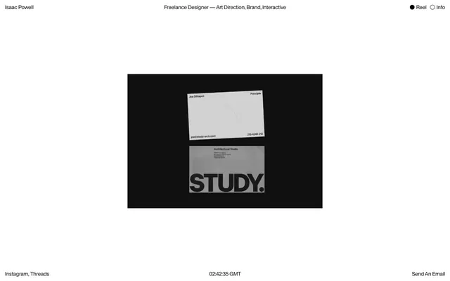
Preview image. Unlock full-res
Color palette
Page backgrounds, subtle borders, inactive elements
Primary headings, body text, and icon fills on light surfaces. Do not promote it to the primary CTA color
Typography
- Weights
- 400
- Sizes
- 17px
- Line height
- 1.25
- Letter spacing
- -0.0250em
- Fallback
- Times New Roman
All textual content, embodying a precise, almost engraved quality.
- Weights
- 400
- Sizes
- 17px
- Line height
- 1.25
- Letter spacing
- -0.025
Times — detected in extracted data but not described by AI
Spacing & shape
Components
Text link with `Ink Black` text. Inactive state: `Canvas White` background, no border. Active state: uses a small round `Ink Black` dot to indicate selection. Padding is minimal.
Plain text link in `Ink Black` on `Canvas White` background, with no additional styling beyond underline on hover (not specified, but common for text links).
Images are displayed without padding, borders, or shadows, directly on an `Ink Black` panel, creating a stark contrast and graphic separation from the `Canvas White` page background.
Guidelines
- Prioritize stark black-on-white contrast across all UI elements.
- Apply Antique Legacy (or Times New Roman substitute) at 17px with -0.0250em letter-spacing for all text roles.
- Use 9999px border-radius for all interactive navigation elements and similar tags.
- Maintain a comfortable density with 12px for small element gaps and 48px for general section padding.
- Present content images flush within an `Ink Black` background, without borders or padding.
- Do not introduce overt colors; restrict the palette to `Ink Black` and `Canvas White`.
- Avoid shadows or complex elevation; maintain a flat, two-dimensional aesthetic.
- Do not vary font sizes or weights for hierarchy; rely on layout and context.
- Refrain from using gradients or decorative backgrounds.
- Do not add extra padding or borders to content images; they should sit precisely on their `Ink Black` panel.
About this system
ShowHide
The Isaac Powell system conveys a stark, almost monastic minimalism, using an extreme black-on-white polarity. Typography is consistently small and tracked tightly. The design is devoid of significant color or elevation, directing focus entirely onto content framed by sharp, unornamented boundaries. Interaction elements are subtle ghost outlines or simple text links, maintaining a subdued aesthetic.
The page follows a centered, max-width layout with substantial whitespace. The header features minimalist, horizontally aligned navigation elements. Content sections are composed of large `Ink Black` rectangular blocks, each housing an image or graphic, contrasting sharply with the dominant `Canvas White` background. The footer is minimal, mirroring the header's text-based links. Vertical rhythm is established by significant visual separation between the header, image gallery section, and footer.
This site features product photography and graphic design mockups presented as content. The imagery is primarily monochromatic or desaturated, aligning with the minimal color palette. Images are treated as flat, rectangular blocks, often displayed against `Ink Black` panels that project them forward from the `Canvas White` page. There is no usage of rounded corners, abstract graphics, or decorative illustrations; the imagery is functional and directly showcases portfolio work.
Reminiscent of AIGA, Dieter Rams' design principles documentation, Are.na.
# Interaction — Style Reference
> Minimalist digital folio

**Theme:** light

**Site:** https://www.ijpowell.co.uk

The Isaac Powell system conveys a stark, almost monastic minimalism, using an extreme black-on-white polarity. Typography is consistently small and tracked tightly. The design is devoid of significant color or elevation, directing focus entirely onto content framed by sharp, unornamented boundaries. Interaction elements are subtle ghost outlines or simple text links, maintaining a subdued aesthetic.

## Tokens — Colors

| Name | Value | Token | Role |
|------|------|------|------|
| Canvas White | `#e5e7eb` | `--color-canvas-white` | Page backgrounds, subtle borders, inactive elements |
| Ink Black | `#000000` | `--color-ink-black` | Primary headings, body text, and icon fills on light surfaces. Do not promote it to the primary CTA color |

## Tokens — Typography

### Antique Legacy
- **Substitute:** Times New Roman
- **Weights:** 400
- **Sizes:** 17px
- **Line height:** 1.25
- **Letter spacing:** -0.0250em
- **Role:** All textual content, embodying a precise, almost engraved quality.

### Times
- **Weights:** 400
- **Sizes:** 17px
- **Line height:** 1.25
- **Letter spacing:** -0.025
- **Role:** Times — detected in extracted data but not described by AI

## Tokens — Spacing

- **Section gap:** 48px
- **Card padding:** 0px
- **Element gap:** 12px

## Tokens — Radius

- **Buttons:** 9999px
- **navItems:** 9999px

## Layout

The page follows a centered, max-width layout with substantial whitespace. The header features minimalist, horizontally aligned navigation elements. Content sections are composed of large `Ink Black` rectangular blocks, each housing an image or graphic, contrasting sharply with the dominant `Canvas White` background. The footer is minimal, mirroring the header's text-based links. Vertical rhythm is established by significant visual separation between the header, image gallery section, and footer.

## Imagery

This site features product photography and graphic design mockups presented as content. The imagery is primarily monochromatic or desaturated, aligning with the minimal color palette. Images are treated as flat, rectangular blocks, often displayed against `Ink Black` panels that project them forward from the `Canvas White` page. There is no usage of rounded corners, abstract graphics, or decorative illustrations; the imagery is functional and directly showcases portfolio work.

## Components

### Ghost Navigation Item
*Navigation links (e.g., 'Reel', 'Info')*

Text link with `Ink Black` text. Inactive state: `Canvas White` background, no border. Active state: uses a small round `Ink Black` dot to indicate selection. Padding is minimal.

### Footer Text Link
*Informational links in the footer*

Plain text link in `Ink Black` on `Canvas White` background, with no additional styling beyond underline on hover (not specified, but common for text links).

### Content Image Card
*Visual content display*

Images are displayed without padding, borders, or shadows, directly on an `Ink Black` panel, creating a stark contrast and graphic separation from the `Canvas White` page background.

## Guidelines

### Do

- Prioritize stark black-on-white contrast across all UI elements.
- Apply Antique Legacy (or Times New Roman substitute) at 17px with -0.0250em letter-spacing for all text roles.
- Use 9999px border-radius for all interactive navigation elements and similar tags.
- Maintain a comfortable density with 12px for small element gaps and 48px for general section padding.
- Present content images flush within an `Ink Black` background, without borders or padding.

### Don't

- Do not introduce overt colors; restrict the palette to `Ink Black` and `Canvas White`.
- Avoid shadows or complex elevation; maintain a flat, two-dimensional aesthetic.
- Do not vary font sizes or weights for hierarchy; rely on layout and context.
- Refrain from using gradients or decorative backgrounds.
- Do not add extra padding or borders to content images; they should sit precisely on their `Ink Black` panel.

## Agent Prompt Guide

Quick Color Reference:
text: #000000
background: #e5e7eb
border: #e5e7eb
accent: no distinct accent color
primary action: no distinct CTA color

Example Component Prompts:
1. Create a primary navigation link titled 'Reel': use 'Antique Legacy' (or 'Times New Roman') at 17px, weight 400, color #000000, letter-spacing -0.0250em. Include a border on hover using #e5e7eb (1px solid) and a 9999px border-radius.
2. Design a footer information link 'Send An Email': use 'Antique Legacy' (or 'Times New Roman') at 17px, weight 400, color #000000, letter-spacing -0.0250em.
3. Build an image content block: set background to #000000. Place an image flush within, no padding or border, ensuring it is grayscale(1).
More like this









Keep what you find
A free account saves references to boards and can send you a weekly email of picks based on what you save.
To see every result, go Pro.