Preview image. Unlock full-res
Architectural blueprint on white marble
Color palette
Primary interactive elements, call-to-action buttons, active indicators — a vivid modern accent against the neutral palette.
Highlighting specific words or small interactive elements, used sparingly for emphasis.
Page backgrounds, primary surfaces, overlay base.
Subtle background for sections or softer UI elements.
Slightly elevated surface, subtle background differentiation.
Delicate borders for subtle UI separation, active tab indicators.
More pronounced background for distinct content blocks, light dividers.
Background for secondary content areas or muted sections.
Primary heading text, strong impactful body copy.
General body text, links, primary UI elements, icons.
Muted text for less prominent information, secondary links.
Secondary text, descriptive elements with slightly less emphasis than body text.
Tertiary text, footer links, less critical information.
Icons and very subtle UI elements.
Text for secondary buttons, disabled states.
Placeholder text in input fields, further muted text elements.
Icons in inactive or secondary states.
Typography
- Weights
- 300, 400
- Sizes
- 14px, 16px, 20px, 24px, 32px, 40px, 54px, 80px
- Line height
- 0.95, 1, 1.25, 1.4, 1.43, 1.5
- Letter spacing
- -2.4, -1.62, -0.8, -0.16
- Fallback
- system-ui, sans-serif
The primary typeface for headings, body text, and general UI. Weight 300 for display sizes provides a refined, non-aggressive presence.
- Weights
- 300, 400, 500
- Sizes
- 12px, 14px
- Line height
- 1, 1.3, 1.4
- Letter spacing
- 1.2, 0.7
- Fallback
- SFMono-Regular, monospace
Used for technical information, code snippets, or any content requiring monospace presentation. The increased letter-spacing distinguishes it.
- Weights
- 300
- Sizes
- 16px
- Line height
- 1.4
- Letter spacing
- -0.16
- Fallback
- serif
A decorative serif font used sparingly, likely for emphasis within body text or specific callouts. Its light weight keeps it subtle.
- Weights
- 400
- Sizes
- 14px, 16px
- Line height
- 0.94, 1, 1.29
- Letter spacing
- -0.4, -0.35, 0.56
- Fallback
- system-ui, sans-serif
Used for navigation elements and specific UI labels, characterized by tight letter-spacing for concise presentation.
Spacing & shape
Components
Solid black background (#111111), white text (#ffffff), 4px border-radius, 14px horizontal padding, 0px vertical padding. Focus and hover states use Accent Violet (#0007cb) for the background.
Transparent background, Headline Black (#111111) text, Border Sand (#dedbd6) border, 4px border-radius, 14px horizontal padding, 0px vertical padding. Text color matches Body Text Black (#111111). Hover state uses Border Sand (#dedbd6) for border.
Transparent background, Body Text Black (#000000) text (color #111111 for main nav, #000000 for sub nav), no border, no radius. Tight padding; active state indicated by underline or Border Sand (#dedbd6) hover effect.
Transparent background, muted gray text (oklab(0.177637 / 0.5) for default, #111111 for active), Border Sand (#dedbd6) bottom border for active state only, 16px padding on all sides. No border-radius.
Text in Headline Black (#111111), Saans weight 400 at 16px, line-height 1.25. Has a 4px border-radius on hover/active states with Background Off-White (#faf9f6) as background color.
Background #e7e3db. Text in Headline Black (#111111), Saans weight 400 at 14px. Padding of 8px vertically and 16px horizontally.
Logo typically in Inactive Icon Gray (#b8b8b8) or Body Text Black (#000000). Displayed on page Canvas White (#ffffff) or Background Off-White (#faf9f6) background within a grid, often with no explicit padding on logo itself, relying on grid spacing.
Assumed white background with a subtle border in Border Sand (#dedbd6) or a similar muted neutral. Placeholder text in Placeholder Gray (#a0a0a0). Focus ring would likely be Accent Violet (#0007cb) or a darker neutral.
Guidelines
- Use Headline Black (#111111) for all major headings and impactful statements to maintain strong contrast.
- Apply Saans font with a weight of 300 for display-sized headlines (54px, 80px) to achieve an authoritative yet understated feel.
- Implement 4px border-radius for all interactive buttons and navigation items, creating a subtle visual softness.
- Reserve Accent Violet (#0007cb) strictly for primary interactive elements, such as CTA buttons and active state indicators.
- Differentiate sections using the neutral background progression: Canvas White (#ffffff) > Background Off-White (#faf9f6) > Surface Cream (#f1eee9) for subtle visual hierarchy.
- Maintain standard element spacing of 16px for comfortable content flow, adjusting vertically with multiples of 8px as needed.
- Utilize SaansMono for any technical or explicit code-like content, with its distinctive increased letter-spacing.
- Avoid using saturated colors other than Accent Violet (#0007cb) and Accent Orange (#ff5600) to preserve the clean, neutral aesthetic.
- Do not introduce sharp, unrounded corners on interactive elements, as this contradicts the established 4px radius pattern.
- Refrain from heavy drop shadows or complex gradients; the system relies on subtle background shifts and crisp lines for depth.
- Do not deviate from the specified Saans, SaansMono, or MediumLL typefaces; ensure consistency in typographic personality.
- Avoid dense, information-heavy blocks without adequate spacing; prioritize comfortable content density and readability.
- Do not use Body Text Black (#000000) for large, prominent headlines; Headline Black (#111111) should be preferred for impact.
- Do not use highly saturated photography; imagery should align with the muted or monochromatic style.
About this system
ShowHide
Intercom's design system evokes a sense of understated innovation, like an architectural blueprint on white marble. Lightness and clarity are established through an expansive white canvas contrasted by fine-lined black typography and minimal, precise UI elements. The tension between the nearly achromatic palette and a single vibrant violet accent for primary calls to action creates a focused, forward-thinking feel without visual clutter. Custom typography with subtle letter-spacing variations adds a layer of quiet sophistication, preventing the sparse aesthetic from feeling sterile.
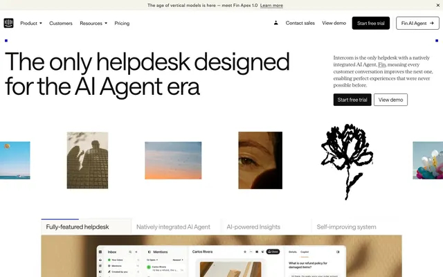
The page primarily uses a max-width contained layout, though the hero section spans full-bleed to establish a grander scale. The hero features a centered oversized headline (Saans 80px, weight 300) with a secondary text block right-aligned. Sections often alternate between full-width content blocks and contained layouts. Content arrangement frequently uses a split-screen pattern (text column left, visual/product screenshot right, or vice versa) with consistent vertical spacing between sections. There's a minimal use of explicit grids for feature showcasing, but logo sections use a fluid, adaptive grid. The layout prioritizes spaciousness, using ample whitespace around elements and between sections to keep information digestible. The navigation is a sticky header with primary links on the left and action buttons (Start free trial, Fin AI Agent) on the right.
The visual language focuses on a mix of product screenshots, abstract and illustrative graphics, and subtly treated photography. Product screenshots are clean, showcasing the UI in action, often on a slight perspective. Abstract illustrations feature monochromatic human-like figures or organic shapes (like the flower graphic) in black against the dominant white background, serving as decorative atmosphere rather than direct content. Photography is minimal, often cropped tightly or treated with filters/desaturation, focusing on human elements (eyes, silhouettes) without being overtly vibrant or lifestyle-oriented. Iconography is primarily outlined and monochromatic, aligning with the refined, clean aesthetic. The role is a blend of product showcase, conceptual atmosphere, and light visual breaks, with a strong emphasis on maintaining a text-dominant layout.
Reminiscent of Linear, Stripe, Figma, Vercel.
# Intercom — Style Reference
> Architectural blueprint on white marble

**Theme:** light

**Site:** https://intercom.com

Intercom's design system evokes a sense of understated innovation, like an architectural blueprint on white marble.  Lightness and clarity are established through an expansive white canvas contrasted by fine-lined black typography and minimal, precise UI elements. The tension between the nearly achromatic palette and a single vibrant violet accent for primary calls to action creates a focused, forward-thinking feel without visual clutter. Custom typography with subtle letter-spacing variations adds a layer of quiet sophistication, preventing the sparse aesthetic from feeling sterile.

## Tokens — Colors

| Name | Value | Token | Role |
|------|------|------|------|
| Accent Violet | `#0007cb` | `--color-accent-violet` | Primary interactive elements, call-to-action buttons, active indicators — a vivid modern accent against the neutral palette. |
| Accent Orange | `#ff5600` | `--color-accent-orange` | Highlighting specific words or small interactive elements, used sparingly for emphasis. |
| Canvas White | `#ffffff` | `--color-canvas-white` | Page backgrounds, primary surfaces, overlay base. |
| Background Off-White | `#faf9f6` | `--color-background-off-white` | Subtle background for sections or softer UI elements. |
| Surface Cream | `#f1eee9` | `--color-surface-cream` | Slightly elevated surface, subtle background differentiation. |
| Border Sand | `#dedbd6` | `--color-border-sand` | Delicate borders for subtle UI separation, active tab indicators. |
| Subtle Gray | `#e7e3db` | `--color-subtle-gray` | More pronounced background for distinct content blocks, light dividers. |
| Canvas Beige | `#d3cec6` | `--color-canvas-beige` | Background for secondary content areas or muted sections. |
| Headline Black | `#111111` | `--color-headline-black` | Primary heading text, strong impactful body copy. |
| Body Text Black | `#000000` | `--color-body-text-black` | General body text, links, primary UI elements, icons. |
| Subtle Graphite | `#414141` | `--color-subtle-graphite` | Muted text for less prominent information, secondary links. |
| Mid Gray | `#585858` | `--color-mid-gray` | Secondary text, descriptive elements with slightly less emphasis than body text. |
| Footer Gray | `#666666` | `--color-footer-gray` | Tertiary text, footer links, less critical information. |
| Icon Gray | `#707070` | `--color-icon-gray` | Icons and very subtle UI elements. |
| Button Text Gray | `#888888` | `--color-button-text-gray` | Text for secondary buttons, disabled states. |
| Placeholder Gray | `#a0a0a0` | `--color-placeholder-gray` | Placeholder text in input fields, further muted text elements. |
| Inactive Icon Gray | `#b8b8b8` | `--color-inactive-icon-gray` | Icons in inactive or secondary states. |

## Tokens — Typography

### Saans
- **Substitute:** system-ui, sans-serif
- **Weights:** 300, 400
- **Sizes:** 14px, 16px, 20px, 24px, 32px, 40px, 54px, 80px
- **Line height:** 0.95, 1, 1.25, 1.4, 1.43, 1.5
- **Letter spacing:** -2.4, -1.62, -0.8, -0.16
- **Role:** The primary typeface for headings, body text, and general UI. Weight 300 for display sizes provides a refined, non-aggressive presence.

### SaansMono
- **Substitute:** SFMono-Regular, monospace
- **Weights:** 300, 400, 500
- **Sizes:** 12px, 14px
- **Line height:** 1, 1.3, 1.4
- **Letter spacing:** 1.2, 0.7
- **Role:** Used for technical information, code snippets, or any content requiring monospace presentation. The increased letter-spacing distinguishes it.

### Serrif
- **Substitute:** serif
- **Weights:** 300
- **Sizes:** 16px
- **Line height:** 1.4
- **Letter spacing:** -0.16
- **Role:** A decorative serif font used sparingly, likely for emphasis within body text or specific callouts. Its light weight keeps it subtle.

### MediumLL
- **Substitute:** system-ui, sans-serif
- **Weights:** 400
- **Sizes:** 14px, 16px
- **Line height:** 0.94, 1, 1.29
- **Letter spacing:** -0.4, -0.35, 0.56
- **Role:** Used for navigation elements and specific UI labels, characterized by tight letter-spacing for concise presentation.

## Tokens — Type Scale

Major Third (1.25) from 16px base.

| Role | Size | Line height | Letter spacing |
|------|------|------|------|
| caption | 12px | 1.4 | 0.7px |
| body-sm | 14px | 1.5 | -0.16px |
| body | 16px | 1.5 | -0.16px |
| subheading | 20px | 1.4 | -0.4px |
| heading-sm | 24px | 1.25 | -0.48px |
| heading | 32px | 1.25 | -0.8px |
| heading-lg | 40px | 1 | -0.8px |
| display | 54px | 1 | -1.62px |
| display-lg | 80px | 0.95 | -2.4px |

## Tokens — Spacing

- **Section gap:** 48px
- **Card padding:** 16px
- **Element gap:** 16px

## Tokens — Radius

- **Buttons:** 4px
- **navItems:** 4px

## Layout

The page primarily uses a max-width contained layout, though the hero section spans full-bleed to establish a grander scale. The hero features a centered oversized headline (Saans 80px, weight 300) with a secondary text block right-aligned. Sections often alternate between full-width content blocks and contained layouts. Content arrangement frequently uses a split-screen pattern (text column left, visual/product screenshot right, or vice versa) with consistent vertical spacing between sections. There's a minimal use of explicit grids for feature showcasing, but logo sections use a fluid, adaptive grid. The layout prioritizes spaciousness, using ample whitespace around elements and between sections to keep information digestible. The navigation is a sticky header with primary links on the left and action buttons (Start free trial, Fin AI Agent) on the right.

## Imagery

The visual language focuses on a mix of product screenshots, abstract and illustrative graphics, and subtly treated photography. Product screenshots are clean, showcasing the UI in action, often on a slight perspective. Abstract illustrations feature monochromatic human-like figures or organic shapes (like the flower graphic) in black against the dominant white background, serving as decorative atmosphere rather than direct content. Photography is minimal, often cropped tightly or treated with filters/desaturation, focusing on human elements (eyes, silhouettes) without being overtly vibrant or lifestyle-oriented. Iconography is primarily outlined and monochromatic, aligning with the refined, clean aesthetic. The role is a blend of product showcase, conceptual atmosphere, and light visual breaks, with a strong emphasis on maintaining a text-dominant layout.

## Components

### Alert Banner

### Tab Bar

### Button Group

### Primary Action Button
*Call to action*

Solid black background (#111111), white text (#ffffff), 4px border-radius, 14px horizontal padding, 0px vertical padding. Focus and hover states use Accent Violet (#0007cb) for the background.

### Secondary Outline Button
*Secondary action*

Transparent background, Headline Black (#111111) text, Border Sand (#dedbd6) border, 4px border-radius, 14px horizontal padding, 0px vertical padding. Text color matches Body Text Black (#111111). Hover state uses Border Sand (#dedbd6) for border.

### Ghost Navigation Button
*Navigation link*

Transparent background, Body Text Black (#000000) text (color #111111 for main nav, #000000 for sub nav), no border, no radius. Tight padding; active state indicated by underline or Border Sand (#dedbd6) hover effect.

### Tab Button
*Tab selection*

Transparent background, muted gray text (oklab(0.177637 / 0.5) for default, #111111 for active), Border Sand (#dedbd6) bottom border for active state only, 16px padding on all sides. No border-radius.

### Primary Navigation Item
*Main navigation*

Text in Headline Black (#111111), Saans weight 400 at 16px, line-height 1.25. Has a 4px border-radius on hover/active states with Background Off-White (#faf9f6) as background color.

### Header Alert Banner
*Informational banner*

Background #e7e3db. Text in Headline Black (#111111), Saans weight 400 at 14px. Padding of 8px vertically and 16px horizontally.

### Logo Grid Item
*Client/partner logo display*

Logo typically in Inactive Icon Gray (#b8b8b8) or Body Text Black (#000000). Displayed on page Canvas White (#ffffff) or Background Off-White (#faf9f6) background within a grid, often with no explicit padding on logo itself, relying on grid spacing.

### Input Field
*Data entry*

Assumed white background with a subtle border in Border Sand (#dedbd6) or a similar muted neutral. Placeholder text in Placeholder Gray (#a0a0a0). Focus ring would likely be Accent Violet (#0007cb) or a darker neutral.

## Guidelines

### Do

- Use Headline Black (#111111) for all major headings and impactful statements to maintain strong contrast.
- Apply Saans font with a weight of 300 for display-sized headlines (54px, 80px) to achieve an authoritative yet understated feel.
- Implement 4px border-radius for all interactive buttons and navigation items, creating a subtle visual softness.
- Reserve Accent Violet (#0007cb) strictly for primary interactive elements, such as CTA buttons and active state indicators.
- Differentiate sections using the neutral background progression: Canvas White (#ffffff) > Background Off-White (#faf9f6) > Surface Cream (#f1eee9) for subtle visual hierarchy.
- Maintain standard element spacing of 16px for comfortable content flow, adjusting vertically with multiples of 8px as needed.
- Utilize SaansMono for any technical or explicit code-like content, with its distinctive increased letter-spacing.

### Don't

- Avoid using saturated colors other than Accent Violet (#0007cb) and Accent Orange (#ff5600) to preserve the clean, neutral aesthetic.
- Do not introduce sharp, unrounded corners on interactive elements, as this contradicts the established 4px radius pattern.
- Refrain from heavy drop shadows or complex gradients; the system relies on subtle background shifts and crisp lines for depth.
- Do not deviate from the specified Saans, SaansMono, or MediumLL typefaces; ensure consistency in typographic personality.
- Avoid dense, information-heavy blocks without adequate spacing; prioritize comfortable content density and readability.
- Do not use Body Text Black (#000000) for large, prominent headlines; Headline Black (#111111) should be preferred for impact.
- Do not use highly saturated photography; imagery should align with the muted or monochromatic style.

## Agent Prompt Guide

**Quick Color Reference:**
- `text-primary`: #111111
- `bg-canvas`: #ffffff
- `bg-card`: #faf9f6
- `cta-primary`: #0007cb
- `border-subtle`: #dedbd6

**3-5 Example Component Prompts:**
1. Create a hero section: Canvas White (#ffffff) background. Headline 'The only helpdesk designed for the AI Agent era' using Saans weight 300, 80px size, line-height 0.95, letter-spacing -2.4px, color Headline Black (#111111). Subtext 'Intercom is the only helpdesk with a natively integrated AI Agent.' using Saans weight 400, 16px size, line-height 1.5, color Body Text Black (#000000). Include a Primary Action Button 'Start free trial' and a Secondary Outline Button 'View demo', both with 4px radius and 14px horizontal padding.
2. Design a feature card: Background Off-White (#faf9f6) background. Heading 'AI-powered Insights' in Saans weight 400, 24px size, line-height 1.25, letter-spacing -0.48px, color Headline Black (#111111). Body text in Saans weight 400, 16px size, line-height 1.5, color Body Text Black (#000000). Pad content with 16px on all sides.
3. Construct a navigation bar: Canvas White (#ffffff) background. Logo on left. Navigation items 'Product', 'Customers', 'Resources', 'Pricing' using MediumLL weight 400, 16px size, color Headline Black (#111111), letter-spacing -0.4px. Right side has 'Contact sales' (Ghost Navigation Button), 'View demo' (Secondary Outline Button), and 'Start free trial' (Primary Action Button). All elements should have 8px horizontal gap.
More like this








Keep what you find
A free account saves references to boards and can send you a weekly email of picks based on what you save.
To see every result, go Pro.