Preview image. Unlock full-res
AI Blueprint on White Canvas
Color palette
Primary Call-to-Action buttons and interactive elements, representing activation and core functionality
Accent for badges, status indicators, and subtle highlights — a burst of energy to draw attention to key information
Red outline accent for tags, dividers, and focused UI edges. Use as a supporting accent, not as a status color
A deeper, more saturated blue used sparingly for large background fills, providing a dramatic accent
Primary heading text and critical information, providing strong contrast on light backgrounds
Secondary text, dark backgrounds for subtle distinctions, and focused elements like secondary buttons
Muted text, borders, and dividers where a softer presence is desired than Deep Graphite
Body copy and standard informational text, ensuring readability without being overly stark
Helper text, subtle borders, and placeholder content. Creates a whisper of presence
Hairline borders, disabled states, and very subtle UI elements, offering minimum contrast; Background for transparent UI elements, providing a frosted effect
Light borders, inactive states, and structural dividers that define content regions without drawing focus
Primary page backgrounds, card surfaces, and text on dark backgrounds, providing a clean default surface
Subtle background for UI elements or sections to provide a minimal visual break from Canvas White
Alternate background for sections or secondary surface treatments, providing a slightly darker canvas than Whisper White
Default borders and subtle separators for cards and input fields. Clearly defines boundaries
Typography
- Weights
- 300
- Sizes
- 20px, 36px, 40px, 48px, 56px, 64px
- Line height
- 1, 1.13, 1.14, 1.16, 1.2, 1.3
- Letter spacing
- -0.0400em for larger sizes like 56px, tapering to -0.0170em at 20px
- Fallback
- Playfair Display
Primary display and section headings. The light weight (300) conveys authority through restraint, preferring elegance over shouting. Used for the prominent product name and key messages.
- Weights
- 400, 500
- Sizes
- 8px, 13px, 14px, 15px, 16px, 18px
- Line height
- 0.8, 1, 1.16, 1.38, 1.44, 1.47, 1.5, 1.55, 1.75
- Letter spacing
- Ranges from 0.0400em at 8px to 0.0180em at 18px
- Fallback
- Inter
Body copy, UI labels, buttons, navigation, and detailed information. Its slightly condensed forms maintain a compact yet readable presence across the interface.
Spacing & shape
Components
Filled button with Skybound Blue (#397dff) background, Canvas White (#ffffff) text, and a 999px border-radius for a soft, pill-like shape. Padding is generous: 10px vertical, 20px horizontal.
Ghost button with transparent background, Quiet Stone (#737373) text and border, featuring a 999px border-radius. Padding is 10px vertical, 20px horizontal, matching the primary action for size parity but reduced visual weight.
Used for quick labels, with Deep Graphite (#262626) background and Canvas White (#ffffff) text. Features minimal 2px vertical, 4px horizontal padding, and a 999px border-radius.
Background is Canvas White (#ffffff) with 20px border-radius. Features 24px internal padding for comfortable content separation. No default shadow for a light aesthetic.
Transparent background with a distinct 14px border-radius (top-right corner), sometimes featuring a subtle blur effect on its backdrop. Used for displaying product UI snippets.
Transparent background with Amber Pop (#f55c15) text, no padding. Used for concise, high-visibility labels like 'Omnichannel Support'.
Guidelines
- Prioritize Canvas White (#ffffff) for primary backgrounds and Content Card surfaces, maintaining a bright and open feel.
- Use Skybound Blue (#397dff) exclusively for primary interactive elements, ensuring all core actions are distinctly colored.
- Apply a 999px border-radius to all buttons and tags, creating a consistent, friendly pill shape.
- Employ Tiempos Headline (weight 300) for all major headings to convey quiet authority and elegance.
- Use 24px as the primary value for `elementGap` and `cardPadding` to ensure a consistent, comfortable density.
- Define UI borders and dividers using Platinum Mist (#d4d4d4) for soft separation, or Quiet Stone (#737373) for slightly more emphasis.
- Allow imagery, especially product mockups, to feature transparent or semi-transparent backgrounds to integrate seamlessly with the light canvas.
- Avoid using saturated colors in large blocks unless specifically for brand accents like Ultramarine (#1956f3).
- Do not introduce heavy shadows or gradients; maintain the light and airy surface treatment.
- Refrain from using Tiempos Headline for body text or small labels; reserve it for large display typography.
- Do not deviate from the established border-radius values (999px, 20px, 14px) for interactive elements and cards.
- Avoid tightly packed content where `elementGap` is less than 8px; ensure generous breathing room.
- Do not use multiple chromatic colors for primary calls to action; Skybound Blue (#397dff) is the sole accent for interactive elements.
- Never use generic system fonts; always specify 'Selecta' for body and UI, and 'Tiempos Headline' for headings.
About this system
ShowHide
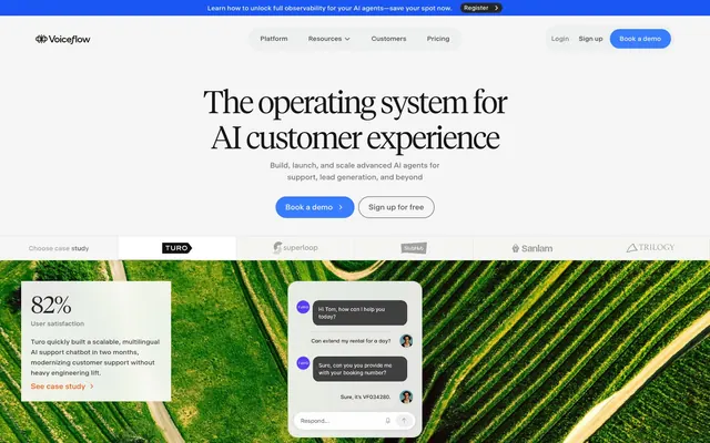
Voiceflow presents a light and airy interface, built on a spacious canvas of off-white and crisp backgrounds, punctuated by a single vibrant blue for primary actions. Typography is precise and clear, with a preference for slightly condensed sans-serifs for body text and a light, elegant serif for dramatic headlines. Cards and elements feature large, comfortable padding and rounded corners, creating a friendly yet professional feel. The overall impression is one of confident, approachable AI technology, with visual complexity reserved for product demonstrations.
The page uses a maximum-width contained layout, likely around 1200px, centered on a Canvas White background. The hero section features a centered, visually strong headline on a white canvas above a subtle full-width gradient or image background, followed by prominent calls-to-action. Content sections alternate between single-column centered text blocks, two-column text-left/image-right or image-left/text-right arrangements. There is a distinct three-column card grid used for features and testimonials. Vertical spacing between sections is generous and consistent, creating comfortable reading rhythm. The navigation is a sticky top bar, providing persistent access to key links and calls to action.
The visual language predominantly features product screenshots and UI mockups, often presented on transparent or semi-transparent backgrounds. These are used to explain functionality and showcase the product directly, rather than relying on abstract concepts or lifestyle photography. When photography is used, it's typically environmental (e.g., aerial views of landscapes) as a background for text or product displays, or professional headshots for social proof. Icons are minimal, outlined, and mostly monochrome, reinforcing a focus on UI clarity. The density of imagery is balanced, with product shots interspersed with text-heavy sections to explain features.
Reminiscent of Stripe, Linear, Figma.
# Voiceflow — Style Reference
> AI Blueprint on White Canvas

**Theme:** light

**Site:** https://www.voiceflow.com

Voiceflow presents a light and airy interface, built on a spacious canvas of off-white and crisp backgrounds, punctuated by a single vibrant blue for primary actions. Typography is precise and clear, with a preference for slightly condensed sans-serifs for body text and a light, elegant serif for dramatic headlines. Cards and elements feature large, comfortable padding and rounded corners, creating a friendly yet professional feel. The overall impression is one of confident, approachable AI technology, with visual complexity reserved for product demonstrations.

## Tokens — Colors

| Name | Value | Token | Role |
|------|------|------|------|
| Skybound Blue | `#397dff` | `--color-skybound-blue` | Primary Call-to-Action buttons and interactive elements, representing activation and core functionality |
| Amber Pop | `#f55c15` | `--color-amber-pop` | Accent for badges, status indicators, and subtle highlights — a burst of energy to draw attention to key information |
| Impact Red | `#ff0000` | `--color-impact-red` | Red outline accent for tags, dividers, and focused UI edges. Use as a supporting accent, not as a status color |
| Ultramarine | `#1956f3` | `--color-ultramarine` | A deeper, more saturated blue used sparingly for large background fills, providing a dramatic accent |
| Inkwell | `#171717` | `--color-inkwell` | Primary heading text and critical information, providing strong contrast on light backgrounds |
| Deep Graphite | `#262626` | `--color-deep-graphite` | Secondary text, dark backgrounds for subtle distinctions, and focused elements like secondary buttons |
| Anchor Gray | `#333333` | `--color-anchor-gray` | Muted text, borders, and dividers where a softer presence is desired than Deep Graphite |
| Slate Text | `#525252` | `--color-slate-text` | Body copy and standard informational text, ensuring readability without being overly stark |
| Quiet Stone | `#737373` | `--color-quiet-stone` | Helper text, subtle borders, and placeholder content. Creates a whisper of presence |
| Silver Thread | `#a1a1a1` | `--color-silver-thread` | Hairline borders, disabled states, and very subtle UI elements, offering minimum contrast; Background for transparent UI elements, providing a frosted effect |
| Platinum Mist | `#d4d4d4` | `--color-platinum-mist` | Light borders, inactive states, and structural dividers that define content regions without drawing focus |
| Canvas White | `#ffffff` | `--color-canvas-white` | Primary page backgrounds, card surfaces, and text on dark backgrounds, providing a clean default surface |
| Whisper White | `#f5f5f4` | `--color-whisper-white` | Subtle background for UI elements or sections to provide a minimal visual break from Canvas White |
| Light Cloud | `#edeeee` | `--color-light-cloud` | Alternate background for sections or secondary surface treatments, providing a slightly darker canvas than Whisper White |
| Border Ash | `#e5e5e5` | `--color-border-ash` | Default borders and subtle separators for cards and input fields. Clearly defines boundaries |

## Tokens — Typography

### Tiempos Headline
- **Substitute:** Playfair Display
- **Weights:** 300
- **Sizes:** 20px, 36px, 40px, 48px, 56px, 64px
- **Line height:** 1, 1.13, 1.14, 1.16, 1.2, 1.3
- **Letter spacing:** -0.0400em for larger sizes like 56px, tapering to -0.0170em at 20px
- **Role:** Primary display and section headings. The light weight (300) conveys authority through restraint, preferring elegance over shouting. Used for the prominent product name and key messages.

### Selecta
- **Substitute:** Inter
- **Weights:** 400, 500
- **Sizes:** 8px, 13px, 14px, 15px, 16px, 18px
- **Line height:** 0.8, 1, 1.16, 1.38, 1.44, 1.47, 1.5, 1.55, 1.75
- **Letter spacing:** Ranges from 0.0400em at 8px to 0.0180em at 18px
- **Role:** Body copy, UI labels, buttons, navigation, and detailed information. Its slightly condensed forms maintain a compact yet readable presence across the interface.

## Tokens — Type Scale

| Role | Size | Line height | Letter spacing |
|------|------|------|------|
| body-lg | 16px | 1.47 | 0.25px |
| subheading | 20px | 1.3 | -0.34px |
| heading | 36px | 1.14 | -0.72px |
| heading-lg | 48px | 1.13 | -0.96px |
| display | 56px | 1.16 | -1.68px |

## Tokens — Spacing

- **Section gap:** 40px
- **Card padding:** 24px
- **Element gap:** 24px

## Tokens — Radius

- **Buttons:** 999px
- **Cards:** 20px
- **productImageCard:** 14px
- **tags:** 100px

## Layout

The page uses a maximum-width contained layout, likely around 1200px, centered on a Canvas White background. The hero section features a centered, visually strong headline on a white canvas above a subtle full-width gradient or image background, followed by prominent calls-to-action. Content sections alternate between single-column centered text blocks, two-column text-left/image-right or image-left/text-right arrangements. There is a distinct three-column card grid used for features and testimonials. Vertical spacing between sections is generous and consistent, creating comfortable reading rhythm. The navigation is a sticky top bar, providing persistent access to key links and calls to action.

## Imagery

The visual language predominantly features product screenshots and UI mockups, often presented on transparent or semi-transparent backgrounds. These are used to explain functionality and showcase the product directly, rather than relying on abstract concepts or lifestyle photography. When photography is used, it's typically environmental (e.g., aerial views of landscapes) as a background for text or product displays, or professional headshots for social proof. Icons are minimal, outlined, and mostly monochrome, reinforcing a focus on UI clarity. The density of imagery is balanced, with product shots interspersed with text-heavy sections to explain features.

## Components

### Primary Action Button
*Main call to action*

Filled button with Skybound Blue (#397dff) background, Canvas White (#ffffff) text, and a 999px border-radius for a soft, pill-like shape. Padding is generous: 10px vertical, 20px horizontal.

### Secondary Ghost Button
*Alternative action*

Ghost button with transparent background, Quiet Stone (#737373) text and border, featuring a 999px border-radius. Padding is 10px vertical, 20px horizontal, matching the primary action for size parity but reduced visual weight.

### Small Dark Tag
*Informational tag*

Used for quick labels, with Deep Graphite (#262626) background and Canvas White (#ffffff) text. Features minimal 2px vertical, 4px horizontal padding, and a 999px border-radius.

### Content Card
*Container for information*

Background is Canvas White (#ffffff) with 20px border-radius. Features 24px internal padding for comfortable content separation. No default shadow for a light aesthetic.

### Product Feature Card
*Showcasing product screens*

Transparent background with a distinct 14px border-radius (top-right corner), sometimes featuring a subtle blur effect on its backdrop. Used for displaying product UI snippets.

### Informational Badge
*Highlighting keywords or categories*

Transparent background with Amber Pop (#f55c15) text, no padding. Used for concise, high-visibility labels like 'Omnichannel Support'.

## Guidelines

### Do

- Prioritize Canvas White (#ffffff) for primary backgrounds and Content Card surfaces, maintaining a bright and open feel.
- Use Skybound Blue (#397dff) exclusively for primary interactive elements, ensuring all core actions are distinctly colored.
- Apply a 999px border-radius to all buttons and tags, creating a consistent, friendly pill shape.
- Employ Tiempos Headline (weight 300) for all major headings to convey quiet authority and elegance.
- Use 24px as the primary value for `elementGap` and `cardPadding` to ensure a consistent, comfortable density.
- Define UI borders and dividers using Platinum Mist (#d4d4d4) for soft separation, or Quiet Stone (#737373) for slightly more emphasis.
- Allow imagery, especially product mockups, to feature transparent or semi-transparent backgrounds to integrate seamlessly with the light canvas.

### Don't

- Avoid using saturated colors in large blocks unless specifically for brand accents like Ultramarine (#1956f3).
- Do not introduce heavy shadows or gradients; maintain the light and airy surface treatment.
- Refrain from using Tiempos Headline for body text or small labels; reserve it for large display typography.
- Do not deviate from the established border-radius values (999px, 20px, 14px) for interactive elements and cards.
- Avoid tightly packed content where `elementGap` is less than 8px; ensure generous breathing room.
- Do not use multiple chromatic colors for primary calls to action; Skybound Blue (#397dff) is the sole accent for interactive elements.
- Never use generic system fonts; always specify 'Selecta' for body and UI, and 'Tiempos Headline' for headings.

## Agent Prompt Guide

### Quick Color Reference
- text: #171717 (Inkwell)
- background: #ffffff (Canvas White)
- border: #e5e5e5 (Border Ash)
- accent: #f55c15 (Amber Pop)
- primary action: #397dff (filled action)

### 3-5 Example Component Prompts
1. Create a Primary Action Button: #397dff background, #ffffff text, 9999px radius, compact pill padding. Use this filled treatment for the main CTA.
2. Create a `content card`: Canvas White (#ffffff) background, 20px border-radius, with 24px internal padding. Display body text at 14px Selecta weight 400, Slate Text (#525252). Highlight a keyword using an Informational Badge with transparent background, Amber Pop (#f55c15) text, no padding.
3. Create a `product feature section`: Light Cloud (#edeeee) background. Two columns: left is a heading at 36px Tiempos Headline weight 300, Inkwell (#171717), letter-spacing -0.72px. Right is an image contained within a Product Feature Card with a 14px top-right border-radius, transparent background, and backdrop-filter blur(24px).
More like this





Keep what you find
A free account saves references to boards and can send you a weekly email of picks based on what you save.
To see every result, go Pro.