Preview image. Unlock full-res
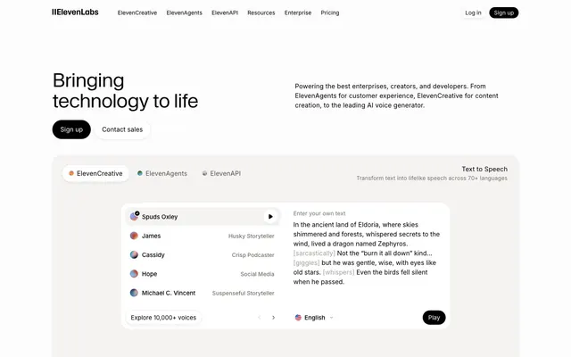
Architect's blueprint on warm vellum — Waldenburg weight-300 headlines at 48px with -0.02em tracking anchored against an eggshell ground, pure black pill buttons as the only punctuation.
Color palette
Logo mark conic gradient — the spinning blue-cyan wheel that is the ElevenLabs logomark
ElevenAgents product dot / brand avatar accent — appears only in small circular UI elements, not in text or buttons
ElevenCreative product dot / brand avatar accent — small circular UI indicator only
Page background and primary surface — the near-white warmth distinguishes this from pure #ffffff, landing type with extra weight
Secondary surface, hover states, subtle section backgrounds
All borders, dividers, card outlines, button outlines — the single border color used universally
Disabled states, placeholder elements, logo grid grayscale treatment
Secondary body text, nav items, subheadings, captions — warm stone undertone separates it from a cold gray
Tertiary text, icon strokes, deemphasized labels
Primary text, filled CTA buttons (background), logo mark — the absolute black against eggshell creates 20.5:1 contrast
Typography
- Weights
- 300
- Sizes
- 32px, 36px, 48px
- Line height
- 1.08
- Letter spacing
- -0.64px at 32px, -0.72px at 36px, -0.96px at 48px
- Fallback
- Cormorant Garamond 300, or Libre Baskerville 300
All display and section headlines. Weight 300 is the signature move — a light-weight custom serif for an AI platform inverts every SaaS convention of bold grotesque headlines. At 48px with -0.02em tracking the letters breathe and lean slightly classical. No substitute fully captures it.
- Weights
- 700
- Sizes
- 14px
- Line height
- 1.1
- Letter spacing
- 0.7px at 14px
- Fallback
- Inter 700 with letter-spacing 0.7px
Navigation product labels (ElevenCreative, ElevenAgents, ElevenAPI) and icon badges. The 0.05em wide tracking at weight 700 creates a compressed, stamp-like label style — tight caps energy in a small footprint.
- Weights
- 400, 500
- Sizes
- 10px, 12px, 13px, 14px, 15px, 16px, 18px, 20px
- Line height
- 1
- Letter spacing
- 0.1px–0.2px across all sizes
- Fallback
- Inter (Google Fonts)
All body copy, UI labels, navigation, buttons, captions, footer. Weight 400 for body and descriptive text; weight 500 for interactive labels and emphasis. The 0.01em letter-spacing is a subtle open tracking that keeps small sizes legible on eggshell.
- Weights
- 400
- Sizes
- 13px
- Line height
- 1.69
- Fallback
- JetBrains Mono 400, or IBM Plex Mono 400
Code snippets, technical annotations, voice-text preview inline markers like [sarcastic] and [whispers]. Monospace signals machine-generated or technical content within prose.
Spacing & shape
Components
Background #000000, text #fdfcfc, border-radius 9999px, padding 0px 16px (height driven by line-height), border 1px solid #e5e5e5. Shadow: rgba(0,0,0,0.06) 0px 0px 0px 1px, rgba(0,0,0,0.04) 0px 1px 2px, rgba(0,0,0,0.04) 0px 2px 4px. WaldenburgFH 700 14px 0.05em tracking for product-label buttons; Inter 500 14px for general CTAs.
Background #ffffff, text #000000, border-radius 9999px, padding 0px 12px, border 1px solid #e5e5e5. Same shadow system as filled button. The white fill over eggshell background gives a subtle float-off-page effect.
Background transparent, text #000000, border-radius 18px, padding 8px 12px, border 1px solid #e5e5e5. WaldenburgFH 700 14px for product name labels. Active state upgrades to filled pill.
Background transparent, text #000000, border-radius 12px, padding 0px 8px left / 12px right, border 1px solid #e5e5e5. Smaller footprint for secondary UI controls inside cards.
Background #ffffff, border-radius 16px, box-shadow rgba(0,0,0,0.4) 0px 0px 1.143px 0px, rgba(0,0,0,0.04) 0px 2px 4px. Contains a voice list (Inter 14px #000000 names, Inter 13px #777169 descriptors), a text input area, and a Play pill button. Inner elements use 4px and 12px radii for sub-controls.
Full-width row with 32px circular avatar (colored gradient or flat color), voice name in Inter 500 14px #000000, voice descriptor in Inter 400 13px #777169. Active/selected row gets background #f5f3f1 with 4px radius highlight. Row height ~40px, horizontal padding 12px.
Background #fdfcfc, height 36px, max-width 1200px centered. Logo left-aligned. Nav links in Inter 400 14px #000000. Product sub-items in WaldenburgFH 700 14px 0.05em tracking. 'Log in' as Ghost Pill, 'Sign up' as Filled Pill. Border-bottom 1px solid #e5e5e5 on scroll.
Inter 400 14px #777169 (Gravel), no background, no border. Placed 8-12px above the Waldenburg heading. Communicates category without visual decoration.
Background transparent, border-radius 0px, border-bottom 1px solid #000000, padding 12px 20px, text Inter 400 14px #000000, placeholder Inter 400 14px #a59f97. No box shadow. Stripped-back, editorial-form input style.
Background #ffffff, border 1px solid #e5e5e5, border-radius 0px, padding 12px 20px, text Inter 400 14px #000000. Inner shadow rgba(0,0,0,0.075) 0px 0px 0px 0.5px inset for depth on white surface.
Background transparent, border 0, radius 0px, padding 0. Heading in Inter 500 16px #000000, body in Inter 400 14px #777169. No elevation — these are pure typographic blocks on the eggshell ground, differentiated only by the colored dot prefix (Ember #ff4704 or Signal Blue #0447ff).
Guidelines
- Use Waldenburg 300 with -0.02em letter-spacing for all headings at 32px and above — never substitute a heavier weight.
- Apply 9999px border-radius to every button and pill tag; use 16-20px for cards and panels; use 0px for bare input fields.
- Keep the entire color palette at near-zero saturation: #000000 text, #fdfcfc background, #e5e5e5 borders, #777169 secondary text. Reserve #ff4704 and #0447ff for product avatar dots only.
- Use the inset shadow rgba(0,0,0,0.075) 0px 0px 0px 0.5px inset on white UI surfaces that sit on eggshell — it replaces border outlines on cards without adding visual weight.
- Use Geist Mono 400 13px only for machine-generated or technical inline annotations (e.g. [whispers], [sarcastic]) and code snippets.
- Render all third-party logos in the social proof grid at #b1b0b0 (Fog) with no hover color change — chromatic logos break the achromatic discipline.
- Size section gaps at 80-120px vertical spacing between major content blocks; use 8-12px for element-level gaps within components.
- Never use a weight above 300 for Waldenburg display headlines — weight 700 belongs only to WaldenburgFH product-label contexts at 14px.
- Never introduce saturated color for text, background fills, or buttons — the Signal Blue #0447ff and Ember #ff4704 are reserved exclusively for 8-16px avatar/dot indicators.
- Never apply box-shadow elevation larger than rgba(0,0,0,0.4) 0px 0px 1.143px — ElevenLabs cards float by 1px shadow, not by depth layering.
- Never use a pure white #ffffff background for page surfaces — use #fdfcfc (Eggshell) for all base surfaces to preserve the warm papery ground.
- Never place Inter body text below 13px in product UI contexts or below 14px in marketing prose — the 0.01em tracking needs minimum size to work.
- Never use more than two button variants in the same visual cluster — one filled black pill (primary) + one white ghost pill (secondary) is the maximum combination.
- Never apply border-radius to input fields — inputs use 0px radius, creating an editorial underline-or-box distinction from the rounded interactive elements.
About this system
ShowHide
ElevenLabs feels like a museum label next to a working instrument — type-first, almost severe, yet alive with subtle warmth in the off-white surfaces. The page background #fdfcfc (named 'Eggshell' in the CSS tokens) is barely-not-white, giving the layout a slight papery warmth that black text lands on with extraordinary weight. Headlines use Waldenburg at weight 300 with -0.02em tracking, a custom serif that whispers where competitors shout — the counter-intuitive choice of a light-weight, slightly classical typeface for an AI voice platform creates authority through restraint. The entire chromatic palette is suppressed to near-zero saturation: #e5e5e5 borders, #777169 secondary text (a warm stone gray), and #fdfcfc surfaces — the only true color breaks come from pill-shaped black CTA buttons and the small colored avatar dots on voice profiles. The product UI card floats on a hairline shadow (0px 0px 1px rgba(0,0,0,0.4)) rather than elevation depth, keeping everything in the same visual plane.
Max-width ~1200px centered on eggshell ground. Hero is a two-column asymmetric split: large Waldenburg headline left (60% width) with body text right, followed by two pill buttons. Below the fold, a full-width white product card (border-radius 16px) acts as a live demo embed spanning the full content column. Logo grid is a 6-column × 3-row flat array on white, centered, with generous 24-32px row gaps. Feature descriptions use a 2-column text block layout (no images, purely typographic). Navigation is a slim 36px top bar, likely sticky on scroll, with logo left and auth CTAs right. Section rhythm is seamless — no alternating dark/light bands; the entire page is the same eggshell ground broken only by the white card surfaces and the #f5f3f1 subtle hover zones.
Product screenshots are the dominant visual — specifically, the interactive voice-player UI shown as a white card with structured list and text area. No lifestyle photography is present. Illustration is absent. The only 'graphic' element is the conic-gradient logomark, a spinning blue-to-cyan color wheel suggesting audio waveforms or voice spectra, contained within a ~24px icon footprint. Voice avatars use small 28-32px circular gradient fills (multicolor mini-spheres) as person-indicators — these are the only chromatic imagery in the UI. Social proof section uses SVG wordmark logos uniformly desaturated to #b1b0b0 Fog. The design is text-dominant: imagery occupies roughly 30% of visual space with the product card; 70% is typographic.
Reminiscent of Linear, Notion, Vercel, Anthropic, Perplexity.
# ElevenLabs — Style Reference
> Architect's blueprint on warm vellum — Waldenburg weight-300 headlines at 48px with -0.02em tracking anchored against an eggshell ground, pure black pill buttons as the only punctuation.

**Theme:** light

**Site:** https://elevenlabs.io

ElevenLabs feels like a museum label next to a working instrument — type-first, almost severe, yet alive with subtle warmth in the off-white surfaces. The page background #fdfcfc (named 'Eggshell' in the CSS tokens) is barely-not-white, giving the layout a slight papery warmth that black text lands on with extraordinary weight. Headlines use Waldenburg at weight 300 with -0.02em tracking, a custom serif that whispers where competitors shout — the counter-intuitive choice of a light-weight, slightly classical typeface for an AI voice platform creates authority through restraint. The entire chromatic palette is suppressed to near-zero saturation: #e5e5e5 borders, #777169 secondary text (a warm stone gray), and #fdfcfc surfaces — the only true color breaks come from pill-shaped black CTA buttons and the small colored avatar dots on voice profiles. The product UI card floats on a hairline shadow (0px 0px 1px rgba(0,0,0,0.4)) rather than elevation depth, keeping everything in the same visual plane.

## Tokens — Colors

| Name | Value | Token | Role |
|------|------|------|------|
| Voice Spectrum | `#3d75d8` | `--color-voice-spectrum` | Logo mark conic gradient — the spinning blue-cyan wheel that is the ElevenLabs logomark |
| Signal Blue | `#0447ff` | `--color-signal-blue` | ElevenAgents product dot / brand avatar accent — appears only in small circular UI elements, not in text or buttons |
| Ember | `#ff4704` | `--color-ember` | ElevenCreative product dot / brand avatar accent — small circular UI indicator only |
| Eggshell | `#fdfcfc` | `--color-eggshell` | Page background and primary surface — the near-white warmth distinguishes this from pure #ffffff, landing type with extra weight |
| Powder | `#f5f3f1` | `--color-powder` | Secondary surface, hover states, subtle section backgrounds |
| Chalk | `#e5e5e5` | `--color-chalk` | All borders, dividers, card outlines, button outlines — the single border color used universally |
| Fog | `#b1b0b0` | `--color-fog` | Disabled states, placeholder elements, logo grid grayscale treatment |
| Gravel | `#777169` | `--color-gravel` | Secondary body text, nav items, subheadings, captions — warm stone undertone separates it from a cold gray |
| Slate | `#a59f97` | `--color-slate` | Tertiary text, icon strokes, deemphasized labels |
| Obsidian | `#000000` | `--color-obsidian` | Primary text, filled CTA buttons (background), logo mark — the absolute black against eggshell creates 20.5:1 contrast |

## Tokens — Typography

### Waldenburg
- **Substitute:** Cormorant Garamond 300, or Libre Baskerville 300
- **Weights:** 300
- **Sizes:** 32px, 36px, 48px
- **Line height:** 1.08
- **Letter spacing:** -0.64px at 32px, -0.72px at 36px, -0.96px at 48px
- **Role:** All display and section headlines. Weight 300 is the signature move — a light-weight custom serif for an AI platform inverts every SaaS convention of bold grotesque headlines. At 48px with -0.02em tracking the letters breathe and lean slightly classical. No substitute fully captures it.

### WaldenburgFH
- **Substitute:** Inter 700 with letter-spacing 0.7px
- **Weights:** 700
- **Sizes:** 14px
- **Line height:** 1.1
- **Letter spacing:** 0.7px at 14px
- **Role:** Navigation product labels (ElevenCreative, ElevenAgents, ElevenAPI) and icon badges. The 0.05em wide tracking at weight 700 creates a compressed, stamp-like label style — tight caps energy in a small footprint.

### Inter
- **Substitute:** Inter (Google Fonts)
- **Weights:** 400, 500
- **Sizes:** 10px, 12px, 13px, 14px, 15px, 16px, 18px, 20px
- **Line height:** 1
- **Letter spacing:** 0.1px–0.2px across all sizes
- **Role:** All body copy, UI labels, navigation, buttons, captions, footer. Weight 400 for body and descriptive text; weight 500 for interactive labels and emphasis. The 0.01em letter-spacing is a subtle open tracking that keeps small sizes legible on eggshell.

### Geist Mono
- **Substitute:** JetBrains Mono 400, or IBM Plex Mono 400
- **Weights:** 400
- **Sizes:** 13px
- **Line height:** 1.69
- **Role:** Code snippets, technical annotations, voice-text preview inline markers like [sarcastic] and [whispers]. Monospace signals machine-generated or technical content within prose.

## Tokens — Type Scale

Major Third (1.25) from 14px base.

| Role | Size | Line height | Letter spacing |
|------|------|------|------|
| caption | 10px | 1.2 | — |
| body | 14px | 1.43 | — |
| body-lg | 16px | 1.5 | — |
| subheading | 18px | 1.44 | — |
| heading-sm | 20px | 1.4 | — |
| heading | 32px | 1.17 | -0.64px |
| heading-lg | 36px | 1.13 | -0.72px |
| display | 48px | 1.08 | -0.96px |

## Tokens — Spacing

- **Max width:** 1200px
- **Section gap:** 80-120px
- **Card padding:** 16-24px
- **Element gap:** 8-12px

## Tokens — Radius

- **Buttons:** 9999px
- **Inputs:** 4px
- **Cards:** 16px
- **badges:** 12px
- **modals:** 24px
- **panels:** 20px
- **tags:** 9999px

## Layout

Max-width ~1200px centered on eggshell ground. Hero is a two-column asymmetric split: large Waldenburg headline left (60% width) with body text right, followed by two pill buttons. Below the fold, a full-width white product card (border-radius 16px) acts as a live demo embed spanning the full content column. Logo grid is a 6-column × 3-row flat array on white, centered, with generous 24-32px row gaps. Feature descriptions use a 2-column text block layout (no images, purely typographic). Navigation is a slim 36px top bar, likely sticky on scroll, with logo left and auth CTAs right. Section rhythm is seamless — no alternating dark/light bands; the entire page is the same eggshell ground broken only by the white card surfaces and the #f5f3f1 subtle hover zones.

## Imagery

Product screenshots are the dominant visual — specifically, the interactive voice-player UI shown as a white card with structured list and text area. No lifestyle photography is present. Illustration is absent. The only 'graphic' element is the conic-gradient logomark, a spinning blue-to-cyan color wheel suggesting audio waveforms or voice spectra, contained within a ~24px icon footprint. Voice avatars use small 28-32px circular gradient fills (multicolor mini-spheres) as person-indicators — these are the only chromatic imagery in the UI. Social proof section uses SVG wordmark logos uniformly desaturated to #b1b0b0 Fog. The design is text-dominant: imagery occupies roughly 30% of visual space with the product card; 70% is typographic.

## Components

### CTA Button Group

### Product Demo Card — Voice List

### Social Proof Logo Grid

### Primary Pill Button (Filled)
*Primary CTA — Sign up, Play, Submit*

Background #000000, text #fdfcfc, border-radius 9999px, padding 0px 16px (height driven by line-height), border 1px solid #e5e5e5. Shadow: rgba(0,0,0,0.06) 0px 0px 0px 1px, rgba(0,0,0,0.04) 0px 1px 2px, rgba(0,0,0,0.04) 0px 2px 4px. WaldenburgFH 700 14px 0.05em tracking for product-label buttons; Inter 500 14px for general CTAs.

### Ghost Pill Button (Outline)
*Secondary actions — Contact sales, Log in, Read all stories*

Background #ffffff, text #000000, border-radius 9999px, padding 0px 12px, border 1px solid #e5e5e5. Same shadow system as filled button. The white fill over eggshell background gives a subtle float-off-page effect.

### Rounded Outline Button (Tab/Toggle)
*Segmented control tabs — ElevenCreative, ElevenAgents, ElevenAPI selector*

Background transparent, text #000000, border-radius 18px, padding 8px 12px, border 1px solid #e5e5e5. WaldenburgFH 700 14px for product name labels. Active state upgrades to filled pill.

### Compact Action Button
*Inline UI actions — pagination arrows, expand/collapse controls*

Background transparent, text #000000, border-radius 12px, padding 0px 8px left / 12px right, border 1px solid #e5e5e5. Smaller footprint for secondary UI controls inside cards.

### Product Demo Card
*Interactive voice-player UI card embedded in hero section*

Background #ffffff, border-radius 16px, box-shadow rgba(0,0,0,0.4) 0px 0px 1.143px 0px, rgba(0,0,0,0.04) 0px 2px 4px. Contains a voice list (Inter 14px #000000 names, Inter 13px #777169 descriptors), a text input area, and a Play pill button. Inner elements use 4px and 12px radii for sub-controls.

### Voice List Item
*Individual voice selection row inside demo card*

Full-width row with 32px circular avatar (colored gradient or flat color), voice name in Inter 500 14px #000000, voice descriptor in Inter 400 13px #777169. Active/selected row gets background #f5f3f1 with 4px radius highlight. Row height ~40px, horizontal padding 12px.

### Navigation Bar
*Top global navigation*

Background #fdfcfc, height 36px, max-width 1200px centered. Logo left-aligned. Nav links in Inter 400 14px #000000. Product sub-items in WaldenburgFH 700 14px 0.05em tracking. 'Log in' as Ghost Pill, 'Sign up' as Filled Pill. Border-bottom 1px solid #e5e5e5 on scroll.

### Section Divider Label
*Eyebrow text above section headings*

Inter 400 14px #777169 (Gravel), no background, no border. Placed 8-12px above the Waldenburg heading. Communicates category without visual decoration.

### Text Input (Transparent)
*Inline text editors and search fields*

Background transparent, border-radius 0px, border-bottom 1px solid #000000, padding 12px 20px, text Inter 400 14px #000000, placeholder Inter 400 14px #a59f97. No box shadow. Stripped-back, editorial-form input style.

### Text Input (Contained)
*Form inputs with white background*

Background #ffffff, border 1px solid #e5e5e5, border-radius 0px, padding 12px 20px, text Inter 400 14px #000000. Inner shadow rgba(0,0,0,0.075) 0px 0px 0px 0.5px inset for depth on white surface.

### Feature Platform Card (Ghost)
*Two-column product description cards — ElevenCreative / ElevenAgents*

Background transparent, border 0, radius 0px, padding 0. Heading in Inter 500 16px #000000, body in Inter 400 14px #777169. No elevation — these are pure typographic blocks on the eggshell ground, differentiated only by the colored dot prefix (Ember #ff4704 or Signal Blue #0447ff).

## Guidelines

### Do

- Use Waldenburg 300 with -0.02em letter-spacing for all headings at 32px and above — never substitute a heavier weight.
- Apply 9999px border-radius to every button and pill tag; use 16-20px for cards and panels; use 0px for bare input fields.
- Keep the entire color palette at near-zero saturation: #000000 text, #fdfcfc background, #e5e5e5 borders, #777169 secondary text. Reserve #ff4704 and #0447ff for product avatar dots only.
- Use the inset shadow rgba(0,0,0,0.075) 0px 0px 0px 0.5px inset on white UI surfaces that sit on eggshell — it replaces border outlines on cards without adding visual weight.
- Use Geist Mono 400 13px only for machine-generated or technical inline annotations (e.g. [whispers], [sarcastic]) and code snippets.
- Render all third-party logos in the social proof grid at #b1b0b0 (Fog) with no hover color change — chromatic logos break the achromatic discipline.
- Size section gaps at 80-120px vertical spacing between major content blocks; use 8-12px for element-level gaps within components.

### Don't

- Never use a weight above 300 for Waldenburg display headlines — weight 700 belongs only to WaldenburgFH product-label contexts at 14px.
- Never introduce saturated color for text, background fills, or buttons — the Signal Blue #0447ff and Ember #ff4704 are reserved exclusively for 8-16px avatar/dot indicators.
- Never apply box-shadow elevation larger than rgba(0,0,0,0.4) 0px 0px 1.143px — ElevenLabs cards float by 1px shadow, not by depth layering.
- Never use a pure white #ffffff background for page surfaces — use #fdfcfc (Eggshell) for all base surfaces to preserve the warm papery ground.
- Never place Inter body text below 13px in product UI contexts or below 14px in marketing prose — the 0.01em tracking needs minimum size to work.
- Never use more than two button variants in the same visual cluster — one filled black pill (primary) + one white ghost pill (secondary) is the maximum combination.
- Never apply border-radius to input fields — inputs use 0px radius, creating an editorial underline-or-box distinction from the rounded interactive elements.

## Agent Prompt Guide

**Quick Color Reference**
- Text (primary): #000000
- Text (secondary): #777169
- Text (tertiary): #a59f97
- Background (page): #fdfcfc
- Background (surface): #f5f3f1
- Card background: #ffffff
- Border (universal): #e5e5e5
- CTA fill: #000000 with #fdfcfc text
- Product dot (Creative): #ff4704
- Product dot (Agents): #0447ff

**Example Component Prompts**

1. **Hero Section**: Eggshell (#fdfcfc) background, max-width 1200px centered, 120px top padding. Two-column layout: left 60% has Waldenburg 300 48px headline #000000 letter-spacing -0.96px line-height 1.08, then 16px gap, then Inter 400 16px #777169 body text, then 24px gap, then row of two buttons. Right 40% empty or decorative. First button: filled pill #000000 bg, #fdfcfc text, 9999px radius, 0px 16px padding, Inter 500 14px. Second button: ghost pill #ffffff bg, #000000 text, 9999px radius, 0px 12px padding, 1px solid #e5e5e5 border.

2. **Product Demo Card**: Background #ffffff, border-radius 16px, box-shadow rgba(0,0,0,0.4) 0px 0px 1.143px, rgba(0,0,0,0.04) 0px 2px 4px. Left panel: tab row of three ghost pills (18px radius, 8px 12px padding, WaldenburgFH 700 14px 0.05em tracking) for ElevenCreative/ElevenAgents/ElevenAPI. Below: voice list rows — 12px padding, 40px height each, circular 28px avatar + Inter 500 14px #000000 name + Inter 400 13px #777169 descriptor. Right panel: text area Inter 400 14px #000000 on white with transparent border, Geist Mono 400 13px for inline [direction] annotations in #777169.

3. **Social Proof Logo Band**: #fdfcfc or #ffffff background, 80px vertical padding. Header row: Inter 400 14px #777169 left label + Ghost Pill Button right ('Read all stories', 9999px, 0px 12px padding, 1px #e5e5e5 border). Logo grid: 6 columns, SVG logos all at #b1b0b0, no hover color, 24px row gap, 40px column gap, logos max-height 28px.

4. **Navigation Bar**: Height 36px, #fdfcfc background, border-bottom 1px solid #e5e5e5. Left: ElevenLabs logomark (conic gradient wheel icon + WaldenburgFH 700 14px wordmark). Center: Inter 400 14px #000000 nav links with 16px gap. Product labels (ElevenCreative, ElevenAgents, ElevenAPI) in WaldenburgFH 700 14px 0.05em tracking. Right: 'Log in' ghost pill (0px 12px padding) + 'Sign up' filled black pill (0px 16px padding).

5. **Two-Column Feature Block**: #fdfcfc background, 80px vertical padding, max-width 1200px. Waldenburg 300 36px headline #000000 letter-spacing -0.72px spanning full width. Below: 2-column equal grid, 32px gap. Each column: 8px colored dot (Ember #ff4704 or Signal Blue #0447ff) + Inter 500 16px #000000 product name + 8px gap + Inter 400 14px #777169 description body.

## WaldenburgFH Label System

WaldenburgFH 700 at 14px with 0.05em letter-spacing (0.7px) is used exclusively for product-family labels: ElevenCreative, ElevenAgents, ElevenAPI. This weight/tracking combination creates a compact stamp identity within navigation tabs and feature pills. Never use WaldenburgFH for body copy or large headings — it exists only at 14px as a labeling system. The 0.05em wide-tracking at a small size creates a monogram-like compressed authority that contrasts with the open, whisper-weight Waldenburg 300 headlines.
More like this







Keep what you find
A free account saves references to boards and can send you a weekly email of picks based on what you save.
To see every result, go Pro.