Preview image. Unlock full-res
monolithic concrete gallery
Color palette
Decorative card backgrounds, accent for list items
Decorative card backgrounds, accent for list items
Decorative card backgrounds, accent for list items
Decorative card backgrounds, accent for list items
Page background, subtle borders, muted text
Primary text, major headlines, dark card backgrounds
Text on dark backgrounds, active states, outlines for ghost buttons
Button text, borders for ghost buttons, decorative fills
Typography
- Weights
- 400
- Sizes
- 16px, 18px, 20px, 95px
- Line height
- 1, 1.5
- Fallback
- Arial
Primary brand typeface for headings and emphasis. Its robust, compact form at 95px commands vertical space, contributing to the site's blocky structure. Used for link and body text at smaller sizes to maintain brand consistency.
- Weights
- 400
- Sizes
- 16px, 20px
- Line height
- 1.5
- Fallback
- system-ui
Standard system font for paragraph text and descriptive elements. Its neutral appearance provides readability without distracting from the primary Whyte typeset.
Spacing & shape
Components
Transparent background with 0px border-radius. Text color is #000000, border color is #000000. Padding is 1px top/bottom and 6px left/right. Provides a minimal interactive element that merges with the stark aesthetic.
Solid background like #f78da7 or #fcb900 with a 0px border-radius and no box shadow. Padding is 0px directly within the card, but content is often nested with a 15px internal padding. Text is typically #ffffff.
Background is #e4e4e4 for main content or #212529 for reversed blocks. Text is #212529 or #ffffff respectively. No border or border-radius, maintaining a sharp, blocky composition. Significant internal padding (e.g., 50px horizontal, 40px vertical) for liberal whitespace.
Guidelines
- Prioritize high contrast between text and background, especially for #212529 on #e4e4e4 and #ffffff on #212529.
- Use Whyte font at 95px for primary headlines to create a bold, blocky statement.
- Apply 0px border-radius to all buttons and cards, enforcing a sharp, geometric aesthetic.
- Maintain a clear visual hierarchy by limiting color primarily to the neutral palette and using accent colors only for product features or decorative card backgrounds.
- Employ consistent 10px element gaps for inline items and 40px section gaps for vertical rhythm.
- Utilize ghost buttons with #000000 text and 0px border for all interactive elements to preserve the monochromatic, utility-focused style.
- Do not introduce rounded corners on primary UI elements such as cards or buttons.
- Avoid gradients or soft shadows that would dilute the stark, high-contrast visual identity.
- Do not use subtle color variations for backgrounds; stick to the defined #e4e4e4 and #212529 surfaces.
- Refrain from using lightweight fonts for anything other than body text to preserve the brand's bold typographic presence.
- Do not use imagery in a way that breaks out of the rigid grid or introduces irregular shapes.
- Avoid decorative icons; keep visual elements strictly photographic or abstract geometric shapes.
About this system
ShowHide
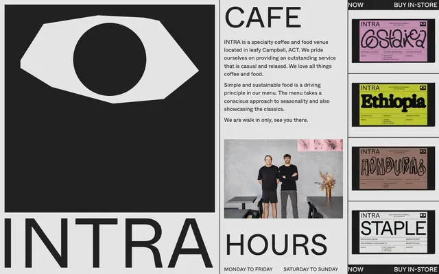
Intra's design system evokes a stark, utilitarian aesthetic, heavily reliant on bold monochromatic contrasts and raw typographic statements. The visual language is defined by a primary background of industrial gray, offset by sharp white and black elements. Cards and key visuals use a reversed dark theme that feels integrated rather than an overlay, maintaining a consistent high-contrast, blocky presence. Typography is the primary decorative element, with large, unembellished sans-serifs commanding attention.
The site employs a max-width layout (approximately 900px, derived from inner content blocks) for primary content, which is then centered. The hero section is full-bleed, often featuring a large graphic or logo against a contrasting background. Throughout the page, content is arranged in clear, distinct blocks, often in two-column layouts where text and imagery (or another content block) sit side-by-side. Vertical spacing between sections is generous and consistent, creating a breathable yet structured feel. Navigation is minimalist, typically featuring discrete text links that integrate visually with the blocky design.
Imagery follows a stark, functional treatment. Product images appear against solid accent colored backgrounds or are tightly cropped within a blocky system. Photography, when present (e.g., people), is embedded directly into the layout without frames or overlays, adopting the inherent rectangularity of the content block. Iconography is absent, favoring a text-and-block dominant approach. Overall, imagery plays a supportive, content-rich role rather than a decorative one, fitting seamlessly into the rigid grid.
Reminiscent of B&R, A.P.C., Our Legacy.
# Intra — Style Reference
> monolithic concrete gallery

**Theme:** light

**Site:** https://intracbr.com.au

Intra's design system evokes a stark, utilitarian aesthetic, heavily reliant on bold monochromatic contrasts and raw typographic statements. The visual language is defined by a primary background of industrial gray, offset by sharp white and black elements. Cards and key visuals use a reversed dark theme that feels integrated rather than an overlay, maintaining a consistent high-contrast, blocky presence. Typography is the primary decorative element, with large, unembellished sans-serifs commanding attention.

## Tokens — Colors

| Name | Value | Token | Role |
|------|------|------|------|
| Vivid Pink | `#f78da7` | `--color-vivid-pink` | Decorative card backgrounds, accent for list items |
| Vivid Amber | `#fcb900` | `--color-vivid-amber` | Decorative card backgrounds, accent for list items |
| Vivid Clay | `#dc3545` | `--color-vivid-clay` | Decorative card backgrounds, accent for list items |
| Vivid Green Cyan | `#00d084` | `--color-vivid-green-cyan` | Decorative card backgrounds, accent for list items |
| Canvas Gray | `#e4e4e4` | `--color-canvas-gray` | Page background, subtle borders, muted text |
| Ink Black | `#212529` | `--color-ink-black` | Primary text, major headlines, dark card backgrounds |
| Paper White | `#ffffff` | `--color-paper-white` | Text on dark backgrounds, active states, outlines for ghost buttons |
| Absolute Black | `#000000` | `--color-absolute-black` | Button text, borders for ghost buttons, decorative fills |

## Tokens — Typography

### Whyte
- **Substitute:** Arial
- **Weights:** 400
- **Sizes:** 16px, 18px, 20px, 95px
- **Line height:** 1, 1.5
- **Role:** Primary brand typeface for headings and emphasis. Its robust, compact form at 95px commands vertical space, contributing to the site's blocky structure. Used for link and body text at smaller sizes to maintain brand consistency.

### -apple-system
- **Substitute:** system-ui
- **Weights:** 400
- **Sizes:** 16px, 20px
- **Line height:** 1.5
- **Role:** Standard system font for paragraph text and descriptive elements. Its neutral appearance provides readability without distracting from the primary Whyte typeset.

## Tokens — Type Scale

| Role | Size | Line height | Letter spacing |
|------|------|------|------|
| body | 16px | 1.5 | — |
| body-lg | 18px | 1.5 | — |
| subheading | 20px | 1.5 | — |
| display | 95px | 1 | — |

## Tokens — Spacing

- **Section gap:** 40px
- **Card padding:** 0px
- **Element gap:** 10px

## Tokens — Radius

- **Buttons:** 0px
- **Cards:** 0px
- **badges:** 100%

## Layout

The site employs a max-width layout (approximately 900px, derived from inner content blocks) for primary content, which is then centered. The hero section is full-bleed, often featuring a large graphic or logo against a contrasting background. Throughout the page, content is arranged in clear, distinct blocks, often in two-column layouts where text and imagery (or another content block) sit side-by-side. Vertical spacing between sections is generous and consistent, creating a breathable yet structured feel. Navigation is minimalist, typically featuring discrete text links that integrate visually with the blocky design.

## Imagery

Imagery follows a stark, functional treatment. Product images appear against solid accent colored backgrounds or are tightly cropped within a blocky system. Photography, when present (e.g., people), is embedded directly into the layout without frames or overlays, adopting the inherent rectangularity of the content block. Iconography is absent, favoring a text-and-block dominant approach. Overall, imagery plays a supportive, content-rich role rather than a decorative one, fitting seamlessly into the rigid grid.

## Components

### Ghost Button
*Navigation and secondary actions*

Transparent background with 0px border-radius. Text color is #000000, border color is #000000. Padding is 1px top/bottom and 6px left/right. Provides a minimal interactive element that merges with the stark aesthetic.

### Product Display Card
*Showcasing individual product items with strong branding*

Solid background like #f78da7 or #fcb900 with a 0px border-radius and no box shadow. Padding is 0px directly within the card, but content is often nested with a 15px internal padding. Text is typically #ffffff.

### Callout Section Card
*Highlighting specific information like cafe description or hours*

Background is #e4e4e4 for main content or #212529 for reversed blocks. Text is #212529 or #ffffff respectively. No border or border-radius, maintaining a sharp, blocky composition. Significant internal padding (e.g., 50px horizontal, 40px vertical) for liberal whitespace.

## Guidelines

### Do

- Prioritize high contrast between text and background, especially for #212529 on #e4e4e4 and #ffffff on #212529.
- Use Whyte font at 95px for primary headlines to create a bold, blocky statement.
- Apply 0px border-radius to all buttons and cards, enforcing a sharp, geometric aesthetic.
- Maintain a clear visual hierarchy by limiting color primarily to the neutral palette and using accent colors only for product features or decorative card backgrounds.
- Employ consistent 10px element gaps for inline items and 40px section gaps for vertical rhythm.
- Utilize ghost buttons with #000000 text and 0px border for all interactive elements to preserve the monochromatic, utility-focused style.

### Don't

- Do not introduce rounded corners on primary UI elements such as cards or buttons.
- Avoid gradients or soft shadows that would dilute the stark, high-contrast visual identity.
- Do not use subtle color variations for backgrounds; stick to the defined #e4e4e4 and #212529 surfaces.
- Refrain from using lightweight fonts for anything other than body text to preserve the brand's bold typographic presence.
- Do not use imagery in a way that breaks out of the rigid grid or introduces irregular shapes.
- Avoid decorative icons; keep visual elements strictly photographic or abstract geometric shapes.

## Agent Prompt Guide

Quick Color Reference:
text: #212529
background: #e4e4e4
border: #000000
accent: #f78da7
primary action: no distinct CTA color

Example Component Prompts:
1. Create a large display title: 'INTRA' in Whyte, 95px, #212529, lineHeight 1.0. Place it centered within a #e4e4e4 background block with 40px vertical padding.
2. Build a ghost button: Text 'BUY IN-STORE' in Whyte, 16px, #000000. Add a 0px border-radius, background-color transparent, and a 2px solid #000000 border. Apply 1px vertical and 6px horizontal padding.
3. Design a product card: Background is #f78da7 with 0px border-radius. Inner text 'Costa Rica' in Whyte, 20px, #ffffff. The card should have no padding directly on the card itself, but content inside should respect a 15px internal content padding.
More like this






Keep what you find
A free account saves references to boards and can send you a weekly email of picks based on what you save.
To see every result, go Pro.