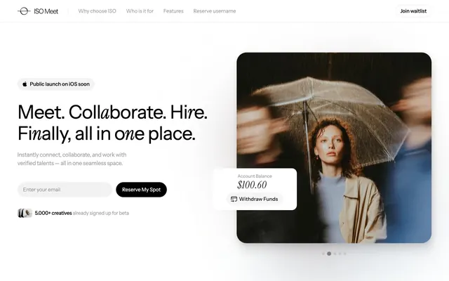
Preview image. Unlock full-res
White canvas, crisp black ink
Color palette
Decorative background for featured sections or special content cards, adding a soft, ethereal touch
Decorative background for callouts or illustrative sections, providing a gentle organic feel
Primary page background, elevated card surfaces, clean default background for many components
Primary text, headers, and essential structural borders. This color anchors the monochrome palette
Secondary background for cards, input fields, and badge backgrounds. Provides subtle surface distinction from the main canvas
Secondary text (e.g., helper text), muted links, and subtle borders. Offers softer contrast for less prominent information
Hairline borders and separators, creating division without visual weight
Button text and borders with slightly softer contrast than Ink Black
Placeholder text in input fields
Typography
- Weights
- 400, 500, 700
- Sizes
- 12px, 16px, 18px, 20px, 28px, 48px, 60px
- Line height
- 1, 1.12, 1.2, 1.5, 1.67
- Letter spacing
- -0.010em at 12px, -0.013em at 16px, -0.016em at 18px
- Fallback
- Inter
The primary typeface for all UI elements, body text, and some headings. Its clean, geometric forms maintain a professional yet approachable tone. Sizes 12-28px are used for body content and smaller headings, while larger sizes are for impactful headlines.
- Weights
- 400
- Sizes
- 48px, 60px
- Line height
- 1.12, 1.2
- Letter spacing
- -0.020em at 48px, -0.010em at 60px
- Fallback
- Playfair Display
Used for distinctive, large headlines to add a touch of classic sophistication against the modern sans-serif body. The serif provides visual contrast and a hint of gravitas without being heavy.
Spacing & shape
Elevation
Components
Text-only button with Ink Black text, Instrument Sans 400, 16px. No background or borders by default, but reveals a subtle underline or different text color on hover/active states.
A very rounded button with Subtle Black text (#222222), on a transparent background, with a 1px solid border of Subtle Black. Padding is 10px vertically and 16px horizontally. Uses Instrument Sans 400, 16px.
Solid black background (#000000) with white text (#ffffff), extremely rounded corners at 160px. Uses Instrument Sans 400, 16px. Padding is 10px vertically and 16px horizontally.
Ghost Gray background, 24px border radius. Padding of 40px on all sides. No visible border or shadow by default, relying on background contrast for definition.
Ghost Gray background, 80px border-radius, giving it a pill-like shape. Black text and placeholder text using Placeholder Dusky. Padding of 8px vertical, 18px horizontal. Inherits Instrument Sans.
Ghost Gray background with Ink Black text. Very rounded, 50px border-radius. Padding 10px vertical, 16px horizontal.
Canvas White background (#ffffff) with a soft shadow for subtle elevation: rgba(13, 32, 47, 0.04) 0px 0px 14px 0px. Rounded corners (12px radius, but specific cards use 24px and 32px based on context).
Guidelines
- Prioritize Canvas White (#ffffff) for all main backgrounds to maintain a clean, open feel.
- Use Ink Black (#000000) for primary text, headings, and interactive elements to ensure strong contrast and visual hierarchy.
- Apply Ghost Gray (#f2f2f2) consistently for secondary backgrounds such as input fields, badges, and background cards.
- Employ the Instrument Sans family for all general UI text and body content, reserving Instrument Serif for larger, impactful headlines (48px and 60px) only.
- Round all interactive elements and content containers generously. Use 80px for inputs, 160px for full-bleed buttons, 50px for badges, and 24px for cards.
- Maintain comfortable visual breathing room with 'elementGap' at 18px and 'cardPadding' at 40px to ensure a spacious layout.
- Use soft, subtle shadows like `rgba(13, 32, 47, 0.04) 0px 0px 14px 0px` for elevation, avoiding harsh or opaque shadow effects.
- Ensure letter-spacing is applied per the typography specification, particularly for headlines, to achieve the intended precision and feel.
- Avoid using highly saturated colors. The palette is intentionally monochrome with accent gradients reserved for decorative or atmospheric purposes.
- Do not use heavy, dark shadows. Elevation should be subtle, created with low-opacity, diffused shadows.
- Do not mix Instrument Sans and Instrument Serif at similar font sizes or within the same paragraph; maintain clear roles for each typeface.
- Avoid tight spacing. Respect the generous 'elementGap' and 'cardPadding' to prevent a cramped or dense appearance.
- Do not introduce strong, visible borders or dividers. Borders should be hairline, transparent, or rely on background contrast.
- Refrain from using color to indicate states unless explicitly defined (e.g., success/error shades are not part of this system). Rely on opacity or border changes instead.
- Never override the letter-spacing values specified in the typography section, as they are crucial for the distinct feel of the headlines.
About this system
ShowHide
ISO Meet establishes a focused, minimalist aesthetic with a canvas of crisp whites and soft grays, punctuated by precise black typography. The layout emphasizes breathing room and clear functional separation, using soft card shadows for subtle hierarchy. Components lean towards understated, adaptive forms with generous padding, making the interface feel spacious and inviting. The visual system supports a 'work-focused yet approachable' atmosphere, with hints of gentle gradient accents as stylistic touches rather than dominant features.
The page adheres to a max-width 1328px centered container, providing a structured and spacious canvas. Hero sections often feature a split-screen or centered headline over an evocative background image. Content typically arranges in alternating text and visual sections, creating a dynamic yet balanced rhythm. Feature displays regularly use card grids (e.g., 3-column) with consistent vertical spacing between sections (sectionGap: 48px). The navigation is a minimalist top bar with ghost links, maintaining a light header footprint. The overall density feels comfortable and open, prioritizing clear information delivery over cramped layouts.
The site predominantly uses photography, with a focus on abstract or artfully composed shots featuring creative professionals in motion or thoughtful poses. Imagery often has a desaturated, slightly moody quality with soft lighting, avoiding overly vibrant colors. Images are typically contained within rounded containers or serve as atmospheric backgrounds rather than raw, full-bleed elements. Icons are minimal, outlined, and monochromatic, with a thin stroke weight that aligns with the overall refined aesthetic. The imagery serves to create an atmosphere of modern creativity and quiet professionalism.
Reminiscent of Superhuman, Linear.app, Figma, Notion.
# ISO Meet — Style Reference
> White canvas, crisp black ink

**Theme:** light

**Site:** https://www.isomeet.com

ISO Meet establishes a focused, minimalist aesthetic with a canvas of crisp whites and soft grays, punctuated by precise black typography. The layout emphasizes breathing room and clear functional separation, using soft card shadows for subtle hierarchy. Components lean towards understated, adaptive forms with generous padding, making the interface feel spacious and inviting. The visual system supports a 'work-focused yet approachable' atmosphere, with hints of gentle gradient accents as stylistic touches rather than dominant features.

## Tokens — Colors

| Name | Value | Token | Role |
|------|------|------|------|
| Lavender Mist Gradient | `#e5d7ff` | `--color-lavender-mist-gradient` | Decorative background for featured sections or special content cards, adding a soft, ethereal touch |
| Mint Whisper Gradient | `#b3e2cf` | `--color-mint-whisper-gradient` | Decorative background for callouts or illustrative sections, providing a gentle organic feel |
| Canvas White | `#ffffff` | `--color-canvas-white` | Primary page background, elevated card surfaces, clean default background for many components |
| Ink Black | `#000000` | `--color-ink-black` | Primary text, headers, and essential structural borders. This color anchors the monochrome palette |
| Ghost Gray | `#f2f2f2` | `--color-ghost-gray` | Secondary background for cards, input fields, and badge backgrounds. Provides subtle surface distinction from the main canvas |
| Muted Stone | `#999999` | `--color-muted-stone` | Secondary text (e.g., helper text), muted links, and subtle borders. Offers softer contrast for less prominent information |
| Outline Gray | `#cccccc` | `--color-outline-gray` | Hairline borders and separators, creating division without visual weight |
| Subtle Black | `#222222` | `--color-subtle-black` | Button text and borders with slightly softer contrast than Ink Black |
| Placeholder Dusky | `#808080` | `--color-placeholder-dusky` | Placeholder text in input fields |

## Tokens — Typography

### Instrument Sans
- **Substitute:** Inter
- **Weights:** 400, 500, 700
- **Sizes:** 12px, 16px, 18px, 20px, 28px, 48px, 60px
- **Line height:** 1, 1.12, 1.2, 1.5, 1.67
- **Letter spacing:** -0.010em at 12px, -0.013em at 16px, -0.016em at 18px
- **Role:** The primary typeface for all UI elements, body text, and some headings. Its clean, geometric forms maintain a professional yet approachable tone. Sizes 12-28px are used for body content and smaller headings, while larger sizes are for impactful headlines.

### Instrument Serif
- **Substitute:** Playfair Display
- **Weights:** 400
- **Sizes:** 48px, 60px
- **Line height:** 1.12, 1.2
- **Letter spacing:** -0.020em at 48px, -0.010em at 60px
- **Role:** Used for distinctive, large headlines to add a touch of classic sophistication against the modern sans-serif body. The serif provides visual contrast and a hint of gravitas without being heavy.

## Tokens — Type Scale

Perfect Fourth (1.333) from 18px base.

| Role | Size | Line height | Letter spacing |
|------|------|------|------|
| caption | 12px | 1.5 | -0.12px |
| body-sm | 16px | 1.5 | -0.21px |
| body | 18px | 1.67 | -0.29px |
| subheading | 20px | 1.2 | -0.26px |
| heading | 28px | 1.2 | -0.36px |
| heading-lg | 48px | 1.12 | -0.96px |
| display | 60px | 1.12 | -1.2px |

## Tokens — Spacing

- **Max width:** 1328px
- **Section gap:** 48px
- **Card padding:** 40px
- **Element gap:** 18px

## Tokens — Radius

- **Buttons:** 160px
- **Inputs:** 80px
- **Cards:** 24px
- **badges:** 50px
- **small:** 8px

## Tokens — Elevation

- **Elevated Content Card:** `rgba(13, 32, 47, 0.04) 0px 0px 14px 0px`
- **Hover/Active States:** `rgba(0, 0, 0, 0.09) 4px 12px 12px 0px, rgba(0, 0, 0, 0.1) 1px 3px 7px 0px`
- **Highlight/Focus State:** `rgba(0, 0, 0, 0.1) 2px 7px 15px 0px, rgba(0, 0, 0, 0.09) 8px 27px 28px 0px`
- **Button Focus:** `rgba(0, 0, 0, 0.08) 0px 1px 1px 0px, rgba(0, 0, 0, 0.12) 0px 2px 4px 0px, rgba(0, 0, 0, 0.04) 0px 0px 0px 0.5px`

## Layout

The page adheres to a max-width 1328px centered container, providing a structured and spacious canvas. Hero sections often feature a split-screen or centered headline over an evocative background image. Content typically arranges in alternating text and visual sections, creating a dynamic yet balanced rhythm. Feature displays regularly use card grids (e.g., 3-column) with consistent vertical spacing between sections (sectionGap: 48px). The navigation is a minimalist top bar with ghost links, maintaining a light header footprint. The overall density feels comfortable and open, prioritizing clear information delivery over cramped layouts.

## Imagery

The site predominantly uses photography, with a focus on abstract or artfully composed shots featuring creative professionals in motion or thoughtful poses. Imagery often has a desaturated, slightly moody quality with soft lighting, avoiding overly vibrant colors. Images are typically contained within rounded containers or serve as atmospheric backgrounds rather than raw, full-bleed elements. Icons are minimal, outlined, and monochromatic, with a thin stroke weight that aligns with the overall refined aesthetic. The imagery serves to create an atmosphere of modern creativity and quiet professionalism.

## Components

### Ghost Navigation Button
*Primary navigation links and secondary actions*

Text-only button with Ink Black text, Instrument Sans 400, 16px. No background or borders by default, but reveals a subtle underline or different text color on hover/active states.

### Pill Button
*Call-to-action button for primary actions*

A very rounded button with Subtle Black text (#222222), on a transparent background, with a 1px solid border of Subtle Black. Padding is 10px vertically and 16px horizontally. Uses Instrument Sans 400, 16px.

### Monochrome Filled Button
*Important secondary actions or form submissions*

Solid black background (#000000) with white text (#ffffff), extremely rounded corners at 160px. Uses Instrument Sans 400, 16px. Padding is 10px vertically and 16px horizontally.

### Feature Card
*Grouping related information or showcasing features*

Ghost Gray background, 24px border radius. Padding of 40px on all sides. No visible border or shadow by default, relying on background contrast for definition.

### Input Field
*Standard input for text or data entry*

Ghost Gray background, 80px border-radius, giving it a pill-like shape. Black text and placeholder text using Placeholder Dusky. Padding of 8px vertical, 18px horizontal. Inherits Instrument Sans.

### Information Badge
*Categorization or short status labels*

Ghost Gray background with Ink Black text. Very rounded, 50px border-radius. Padding 10px vertical, 16px horizontal.

### Elevated Content Card
*Highlighting key information or interactive elements, like a tooltip or special offer.*

Canvas White background (#ffffff) with a soft shadow for subtle elevation: rgba(13, 32, 47, 0.04) 0px 0px 14px 0px. Rounded corners (12px radius, but specific cards use 24px and 32px based on context).

## Guidelines

### Do

- Prioritize Canvas White (#ffffff) for all main backgrounds to maintain a clean, open feel.
- Use Ink Black (#000000) for primary text, headings, and interactive elements to ensure strong contrast and visual hierarchy.
- Apply Ghost Gray (#f2f2f2) consistently for secondary backgrounds such as input fields, badges, and background cards.
- Employ the Instrument Sans family for all general UI text and body content, reserving Instrument Serif for larger, impactful headlines (48px and 60px) only.
- Round all interactive elements and content containers generously. Use 80px for inputs, 160px for full-bleed buttons, 50px for badges, and 24px for cards.
- Maintain comfortable visual breathing room with 'elementGap' at 18px and 'cardPadding' at 40px to ensure a spacious layout.
- Use soft, subtle shadows like `rgba(13, 32, 47, 0.04) 0px 0px 14px 0px` for elevation, avoiding harsh or opaque shadow effects.
- Ensure letter-spacing is applied per the typography specification, particularly for headlines, to achieve the intended precision and feel.

### Don't

- Avoid using highly saturated colors. The palette is intentionally monochrome with accent gradients reserved for decorative or atmospheric purposes.
- Do not use heavy, dark shadows. Elevation should be subtle, created with low-opacity, diffused shadows.
- Do not mix Instrument Sans and Instrument Serif at similar font sizes or within the same paragraph; maintain clear roles for each typeface.
- Avoid tight spacing. Respect the generous 'elementGap' and 'cardPadding' to prevent a cramped or dense appearance.
- Do not introduce strong, visible borders or dividers. Borders should be hairline, transparent, or rely on background contrast.
- Refrain from using color to indicate states unless explicitly defined (e.g., success/error shades are not part of this system). Rely on opacity or border changes instead.
- Never override the letter-spacing values specified in the typography section, as they are crucial for the distinct feel of the headlines.

## Agent Prompt Guide

Quick Color Reference:
text: #000000
background: #ffffff
border: #cccccc
accent: #e5d7ff (Lavender Mist Gradient)
primary action: no distinct CTA color

Example Component Prompts:
Create a hero headline: 'Meet. Collaborate. Hire.' using Instrument Serif 60px, weight 400, Ink Black, with letter-spacing -1.2px.
Create an input field: Ghost Gray background, 80px radius, 8px vertical and 18px horizontal padding, with Placeholder Dusky text. Use Instrument Sans 400, 16px.
Create a Feature Card: Ghost Gray background, 24px radius, 40px padding on all sides. Use Instrument Sans 400, 18px for body text and Ink Black, Instrument Sans 500, 28px for titles.
Create a Pill Button: Transparent background, 1px Subtle Black border, 160px radius. Text is Subtle Black, Instrument Sans 400, 16px. Padding 10px vertical, 16px horizontal.
Create an Elevated Content Card for a special offer: Canvas White background, 12px radius, with a shadow of `rgba(13, 32, 47, 0.04) 0px 0px 14px 0px`.
More like this









Keep what you find
A free account saves references to boards and can send you a weekly email of picks based on what you save.
To see every result, go Pro.