Preview image. Unlock full-res
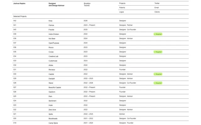
Rigorous data ledger
Color palette
Background for status badges, indicating affirmative or active states, acts as the singular brand accent
Page backgrounds, default surface color
Primary text, strong borders
Subtle borders, secondary text in contexts like navigation and link text
Neutral form states, badge text, and quiet UI feedback where color should stay understated.
Fine structural borders, dividing lines within complex components
Typography
- Weights
- 400, 500, 700
- Sizes
- 10px, 12px, 16px
- Line height
- 1.06, 1.17, 1.25, 1.4
- Letter spacing
- normal
- Fallback
- Helvetica Neue, sans-serif
All textual content, from primary data rows to navigation links and badges. Its pervasive use at various weights and sizes maintains a consistent, no-fuss informational tone.
Spacing & shape
Components
Rounded pill shape with `Status Acquired` (#cdff8b) background and `Data Ink` (#000000) text (0.8 opacity). Uses a `20px` border-radius and `4px` vertical, `8px` right, `4px` left padding. `Arial` font, 12px.
Each row uses `Canvas White` (#ffffff) background. Text is `Row Text` (#333333) for primary content. Separated by `1px` `Field Border` (#404040).
Text is `Field Border` (#404040) with `Arial` font. `1px` `Data Ink` (#000000) bottom border for active or hover states.
Guidelines
- Prioritize information density and readability within a table-like structure.
- Use `Canvas White` (#ffffff) as the default background for all primary content areas.
- Employ `Data Ink` (#000000) for all primary text and critical structural borders.
- Utilize `Status Acquired` (#cdff8b) exclusively for positive status indicators like badges, and never for primary actions or decorative elements.
- Maintain a clear visual hierarchy using `1px` borders, preferring `Data Ink` (#000000) for strong dividers and `Field Border` (#404040) for subtler separations.
- Apply a `20px` radius only to badges; all other elements should maintain sharp, rectilinear corners.
- Avoid decorative images, illustrations, or complex graphical elements; imagery is secondary to data.
- Do not introduce additional color accents; `Status Acquired` (#cdff8b) is the only allowed chromatic color.
- Refrain from using shadows or gradients; rely on borders and background colors for depth and separation.
- Do not deviate from the `Arial` typeface; its consistent use is key to the system's aesthetic.
- Avoid large, editorial typography; text should remain compact and functional.
- Do not use radius values other than `20px` (for badges) or `0px` (for most elements).
About this system
ShowHide
The Joshuakaplan site presents information with the stark clarity of a spreadsheet, prioritizing scannable data visualization over decorative elements. A monochromatic palette defines the structure, with thin borders carving out fields and text-heavy data dominant. The only chromatic accent, a bright green, acts as a functional marker, drawing immediate attention to 'acquired' or 'active' statuses, injecting a singular note of vibrant confirmation into an otherwise rigorous grid.
The site uses a full-bleed, max-width layout, centered with no strong page margins. The hero section is simply a continuation of the data table, presenting personal information in a similar grid. Sections are defined by dense data tables, separated by `73px` vertical spacing. Content is arranged in columns, creating a dense, scannable data grid with clear `1px` borders. Global navigation is a minimalist top bar, integrating seamlessly into the grid structure.
This design system uses no imagery beyond functional icons or small status indicators. Product presentation is handled entirely through structured data and text. The aesthetic is purely UI-driven, focusing on a minimalist, spreadsheet-like display of information.
Reminiscent of Airtable, Linear, Superhuman, Notion.
# Joshuakaplan — Style Reference
> Rigorous data ledger

**Theme:** light

**Site:** https://www.joshuakaplan.com

The Joshuakaplan site presents information with the stark clarity of a spreadsheet, prioritizing scannable data visualization over decorative elements. A monochromatic palette defines the structure, with thin borders carving out fields and text-heavy data dominant. The only chromatic accent, a bright green, acts as a functional marker, drawing immediate attention to 'acquired' or 'active' statuses, injecting a singular note of vibrant confirmation into an otherwise rigorous grid.

## Tokens — Colors

| Name | Value | Token | Role |
|------|------|------|------|
| Status Acquired | `#cdff8b` | `--color-status-acquired` | Background for status badges, indicating affirmative or active states, acts as the singular brand accent |
| Canvas White | `#ffffff` | `--color-canvas-white` | Page backgrounds, default surface color |
| Data Ink | `#000000` | `--color-data-ink` | Primary text, strong borders |
| Field Border | `#404040` | `--color-field-border` | Subtle borders, secondary text in contexts like navigation and link text |
| Row Text | `#333333` | `--color-row-text` | Neutral form states, badge text, and quiet UI feedback where color should stay understated. |
| Subtle Line | `#4d4d4d` | `--color-subtle-line` | Fine structural borders, dividing lines within complex components |

## Tokens — Typography

### Arial
- **Substitute:** Helvetica Neue, sans-serif
- **Weights:** 400, 500, 700
- **Sizes:** 10px, 12px, 16px
- **Line height:** 1.06, 1.17, 1.25, 1.4
- **Letter spacing:** normal
- **Role:** All textual content, from primary data rows to navigation links and badges. Its pervasive use at various weights and sizes maintains a consistent, no-fuss informational tone.

## Tokens — Type Scale

Major Third (1.25) from 16px base.

| Role | Size | Line height | Letter spacing |
|------|------|------|------|
| caption | 10px | 1.25 | — |
| body-sm | 12px | 1.25 | — |
| body | 16px | 1.25 | — |

## Tokens — Spacing

- **Section gap:** 73px
- **Card padding:** 8px
- **Element gap:** 8px

## Tokens — Radius

- **badges:** 20px

## Layout

The site uses a full-bleed, max-width layout, centered with no strong page margins. The hero section is simply a continuation of the data table, presenting personal information in a similar grid. Sections are defined by dense data tables, separated by `73px` vertical spacing. Content is arranged in columns, creating a dense, scannable data grid with clear `1px` borders. Global navigation is a minimalist top bar, integrating seamlessly into the grid structure.

## Imagery

This design system uses no imagery beyond functional icons or small status indicators. Product presentation is handled entirely through structured data and text. The aesthetic is purely UI-driven, focusing on a minimalist, spreadsheet-like display of information.

## Components

### Status Badge Acquired
*Functional indicator, highlighting active or acquired status*

Rounded pill shape with `Status Acquired` (#cdff8b) background and `Data Ink` (#000000) text (0.8 opacity). Uses a `20px` border-radius and `4px` vertical, `8px` right, `4px` left padding. `Arial` font, 12px.

### Data Table Row
*Displays structured information in a list or table format*

Each row uses `Canvas White` (#ffffff) background. Text is `Row Text` (#333333) for primary content. Separated by `1px` `Field Border` (#404040).

### Header Navigation Link
*Top-level navigation within the page*

Text is `Field Border` (#404040) with `Arial` font. `1px` `Data Ink` (#000000) bottom border for active or hover states.

## Guidelines

### Do

- Prioritize information density and readability within a table-like structure.
- Use `Canvas White` (#ffffff) as the default background for all primary content areas.
- Employ `Data Ink` (#000000) for all primary text and critical structural borders.
- Utilize `Status Acquired` (#cdff8b) exclusively for positive status indicators like badges, and never for primary actions or decorative elements.
- Maintain a clear visual hierarchy using `1px` borders, preferring `Data Ink` (#000000) for strong dividers and `Field Border` (#404040) for subtler separations.
- Apply a `20px` radius only to badges; all other elements should maintain sharp, rectilinear corners.

### Don't

- Avoid decorative images, illustrations, or complex graphical elements; imagery is secondary to data.
- Do not introduce additional color accents; `Status Acquired` (#cdff8b) is the only allowed chromatic color.
- Refrain from using shadows or gradients; rely on borders and background colors for depth and separation.
- Do not deviate from the `Arial` typeface; its consistent use is key to the system's aesthetic.
- Avoid large, editorial typography; text should remain compact and functional.
- Do not use radius values other than `20px` (for badges) or `0px` (for most elements).

## Agent Prompt Guide

Quick Color Reference:
- text: #000000 (Data Ink)
- background: #ffffff (Canvas White)
- border: #404040 (Field Border)
- accent: #cdff8b (Status Acquired)
- primary action: no distinct CTA color

Example Component Prompts:
- Create a table row with the label '042 Krea 2026 Designer': uses `Row Text` (#333333) at `Arial` 16px, `1px` `Data Ink` (#000000) bottom border, `8px` padding.
- Create a Status Badge for 'Acquired': `Status Acquired` (#cdff8b) background, `Data Ink` (#000000) text (0.8 opacity), `Arial` 12px, `20px` border-radius, `4px` vertical and `8px` horizontal pseudo-padding.
- Create a header navigation link titled 'Projects': `Field Border` (#404040) text at `Arial` 16px, center-aligned, with a `1px` `Data Ink` (#000000) bottom border for active state.
More like this









Keep what you find
A free account saves references to boards and can send you a weekly email of picks based on what you save.
To see every result, go Pro.