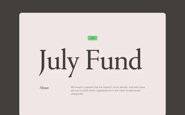
Preview image. Unlock full-res
Warm parchment in a dark library
Color palette
Accent color for specific cards, badges, and textual highlights — implies depth and focus
Subtle accent for card elements and text; part of the brand's earthy palette
Background for certain dark cards, contributing to a rich, tonal depth
Background gradient for hero sections or prominent dark elements, creating a subtle dimensional effect
Accent for certain badges and interface elements, paired with Deep Plum
Accent color for badges and text within certain themed cards
Page background, primary dark surface for cards and sections
Light surface for cards, body text in dark mode, and outlined button text
Primary text color on light backgrounds, such as card body text and button text
Primary text color on dark backgrounds, secondary card elements
Accent text and borders, particularly for ghost buttons and subtle card outlines
Muted text, secondary information, and borders on light cards
Success and highlight badge backgrounds, adds a vibrant, healthy accent
Error or warning badge background. Used sparingly
Typography
- Weights
- 400
- Sizes
- 18px, 30px, 34px, 35px, 40px
- Line height
- 1.2, 1.3
- Fallback
- Playfair Display
Primary headings and display text, providing a distinctive, authoritative voice with its classic serif style. The generous line heights maintain legibility despite the decorative nature.
- Weights
- 400, 700
- Sizes
- 8px, 10px, 15px, 16px, 18px
- Line height
- 1.15, 1.2, 1.3
- Letter spacing
- 0.2em at 8px and 0.25em at 10px, normal for others
- Fallback
- Arial
Body text, labels, and secondary information, offering a clean and modern contrast to the serif headings. The high letter-spacing at smaller sizes enhances readability in uppercase contexts like badges.
Spacing & shape
Components
Ghost button with 24px border-radius. Text: Text Dark (#433e3c), 15px Helvetica Neue, weight 400. Border: 1px solid Text Dark (#433e3c). Padding: 0px vertical, 22px horizontal.
Ghost button with 24px border-radius. Text: Paper White (#f0e7e4), 15px Helvetica Neue, weight 400. Border: 1px solid Paper White (#f0e7e4). Padding: 0px vertical, 22px horizontal.
Text: Paper White (#f0e7e4), 15px Helvetica Neue, weight 400. No background or border. Padding: 0.
Background: Paper White (#f0e7e4). Border-radius: 12px. Padding: 0px for content, with internal elements using 20px spacing.
Background: Background Charcoal (#221f1e). Border-radius: 12px. Padding: 0px for content.
Background: Deep Plum (#322b66). Border-radius: 12px. Text color and internal content spacing adjusted for contrast.
Background: Vivid Green (#56d270). Text: Shadow Ink (#000000), 10px Helvetica Neue, weight 700, letter-spacing 0.25em. Border-radius: 8px. Padding: 12px vertical, 22px horizontal.
Background: Lavender Mist (#c6bffa). Text: Deep Plum (#322b66), 10px Helvetica Neue, weight 700, letter-spacing 0.25em. Border-radius: 8px. Padding: 9px vertical, 16px horizontal.
Guidelines
- Always use Portrait for headlines (18px and above) and Helvetica Neue for body text, ensuring distinction.
- Apply a 12px border-radius to all general cards, reserving 20px for larger feature cards or sections.
- Use Vivid Green (#56d270) only for positive status indicators or 'news' badges, never for primary actions.
- Ensure letter-spacing is applied to Helvetica Neue at smaller sizes: 0.2em for 8px, 0.25em for 10px.
- Prioritize tonal shifts for surface differentiation, utilizing Background Charcoal (#221f1e) and Paper White (#f0e7e4) as primary background surfaces.
- Maintain comfortable visual density using 20px for element gaps and 40px for section gaps.
- Employ ghost buttons with 24px radius, using Text Dark (#433e3c) on light backgrounds and Paper White (#f0e7e4) on dark backgrounds for text and border.
- Do not use saturated colors for large background areas or primary text; restrict them to small accents like badges.
- Avoid mixing more than two distinct font families on a single page.
- Do not introduce new border-radius values; adhere strictly to 8px for badges, 24px for buttons, and 12px/20px for cards.
- Never use Vivid Green (#56d270) as a primary action color; it is reserved for semantic success/news indicators.
- Do not use drop shadows for elevation; rely on color contrast and subtle borders for perceived depth.
- Do not vary line-height based on individual preference; use the established 1.2 or 1.3 for Portrait and 1.15-1.3 for Helvetica Neue based on context.
- Avoid decorative gradients outside of the Deep Night Gradient on large, singular hero sections.
About this system
ShowHide
July Fund presents a grounded digital experience, blending rich, dark backgrounds with soft, off-white content surfaces. Typography marries traditional serif headlines with modern sans-serif body text, creating a subtle tension between heritage and forward-thinking. Accent colors are primarily deep, muted tones and vivid greens, used sparingly to highlight key information or status, giving the interface a considered, almost academic feel.
The page uses a contained layout with no explicit max-width, suggesting a responsive design that adapts fluidly. The hero section features a centered headline over a dark, full-bleed gradient background, establishing an immersive tone. Subsequent sections follow an alternating pattern of dark and light surfaces, with content arranged in a dynamic, sometimes asymmetric grid. There's a prominent use of 2-column and 3-column card grids for features and articles, which break from strict linear flow to create visual interest. Vertical spacing is consistent and comfortable, promoting readability without feeling cramped. A minimal sticky top bar provides subtle navigation.
The imagery on July Fund is sparse and highly curated, focusing on abstract graphics, subtle 3D renders, and occasional product-adjacent photography. When present, images are often contained within cards, sometimes featuring masked or soft-edged compositions. Photography consists of tight crops or distant, atmospheric shots (e.g., Earth from space), lacking lifestyle context and focusing on the essence of the subject. Icons, when visible, are minimal, often outlined, and primarily monochromatic, serving explanatory or decorative atmospheric roles. The overall density is text-dominant, with imagery serving as visual punctuation rather than extensive content.
Reminiscent of Founders Fund, Andreessen Horowitz, Kleiner Perkins, Sequoia Capital.
# July Fund — Style Reference
> Warm parchment in a dark library

**Theme:** dark

**Site:** https://july.fund

July Fund presents a grounded digital experience, blending rich, dark backgrounds with soft, off-white content surfaces. Typography marries traditional serif headlines with modern sans-serif body text, creating a subtle tension between heritage and forward-thinking. Accent colors are primarily deep, muted tones and vivid greens, used sparingly to highlight key information or status, giving the interface a considered, almost academic feel.

## Tokens — Colors

| Name | Value | Token | Role |
|------|------|------|------|
| Deep Plum | `#322b66` | `--color-deep-plum` | Accent color for specific cards, badges, and textual highlights — implies depth and focus |
| Forest Green | `#113619` | `--color-forest-green` | Subtle accent for card elements and text; part of the brand's earthy palette |
| Muted Espresso | `#2e2909` | `--color-muted-espresso` | Background for certain dark cards, contributing to a rich, tonal depth |
| Deep Night Gradient | `#131415` | `--color-deep-night-gradient` | Background gradient for hero sections or prominent dark elements, creating a subtle dimensional effect |
| Lavender Mist | `#c6bffa` | `--color-lavender-mist` | Accent for certain badges and interface elements, paired with Deep Plum |
| Sunbeam Yellow | `#fde440` | `--color-sunbeam-yellow` | Accent color for badges and text within certain themed cards |
| Background Charcoal | `#221f1e` | `--color-background-charcoal` | Page background, primary dark surface for cards and sections |
| Paper White | `#f0e7e4` | `--color-paper-white` | Light surface for cards, body text in dark mode, and outlined button text |
| Text Dark | `#433e3c` | `--color-text-dark` | Primary text color on light backgrounds, such as card body text and button text |
| Text Light | `#ffffff` | `--color-text-light` | Primary text color on dark backgrounds, secondary card elements |
| Shadow Ink | `#000000` | `--color-shadow-ink` | Accent text and borders, particularly for ghost buttons and subtle card outlines |
| Midtone Gray | `#898989` | `--color-midtone-gray` | Muted text, secondary information, and borders on light cards |
| Vivid Green | `#56d270` | `--color-vivid-green` | Success and highlight badge backgrounds, adds a vibrant, healthy accent |
| Terra Cotta | `#b9534a` | `--color-terra-cotta` | Error or warning badge background. Used sparingly |

## Tokens — Typography

### Portrait
- **Substitute:** Playfair Display
- **Weights:** 400
- **Sizes:** 18px, 30px, 34px, 35px, 40px
- **Line height:** 1.2, 1.3
- **Role:** Primary headings and display text, providing a distinctive, authoritative voice with its classic serif style. The generous line heights maintain legibility despite the decorative nature.

### Helvetica Neue
- **Substitute:** Arial
- **Weights:** 400, 700
- **Sizes:** 8px, 10px, 15px, 16px, 18px
- **Line height:** 1.15, 1.2, 1.3
- **Letter spacing:** 0.2em at 8px and 0.25em at 10px, normal for others
- **Role:** Body text, labels, and secondary information, offering a clean and modern contrast to the serif headings. The high letter-spacing at smaller sizes enhances readability in uppercase contexts like badges.

## Tokens — Type Scale

Perfect Fourth (1.333) from 18px base.

| Role | Size | Line height | Letter spacing |
|------|------|------|------|
| heading-sm | 18px | 1.2 | — |
| heading | 30px | 1.2 | — |
| heading-lg | 34px | 1.3 | — |
| display | 40px | 1.3 | — |

## Tokens — Spacing

- **Section gap:** 40px
- **Card padding:** 20px
- **Element gap:** 20px

## Tokens — Radius

- **Buttons:** 24px
- **Cards:** 12px
- **badges:** 8px
- **largeCards:** 20px

## Layout

The page uses a contained layout with no explicit max-width, suggesting a responsive design that adapts fluidly. The hero section features a centered headline over a dark, full-bleed gradient background, establishing an immersive tone. Subsequent sections follow an alternating pattern of dark and light surfaces, with content arranged in a dynamic, sometimes asymmetric grid. There's a prominent use of 2-column and 3-column card grids for features and articles, which break from strict linear flow to create visual interest. Vertical spacing is consistent and comfortable, promoting readability without feeling cramped. A minimal sticky top bar provides subtle navigation.

## Imagery

The imagery on July Fund is sparse and highly curated, focusing on abstract graphics, subtle 3D renders, and occasional product-adjacent photography. When present, images are often contained within cards, sometimes featuring masked or soft-edged compositions. Photography consists of tight crops or distant, atmospheric shots (e.g., Earth from space), lacking lifestyle context and focusing on the essence of the subject. Icons, when visible, are minimal, often outlined, and primarily monochromatic, serving explanatory or decorative atmospheric roles. The overall density is text-dominant, with imagery serving as visual punctuation rather than extensive content.

## Components

### Outline Button (Dark)
*Secondary action button for general use on light backgrounds.*

Ghost button with 24px border-radius. Text: Text Dark (#433e3c), 15px Helvetica Neue, weight 400. Border: 1px solid Text Dark (#433e3c). Padding: 0px vertical, 22px horizontal.

### Outline Button (Light)
*Secondary action button for general use on dark backgrounds.*

Ghost button with 24px border-radius. Text: Paper White (#f0e7e4), 15px Helvetica Neue, weight 400. Border: 1px solid Paper White (#f0e7e4). Padding: 0px vertical, 22px horizontal.

### Minimal Link Button
*Tertiary action or navigational link with minimal styling.*

Text: Paper White (#f0e7e4), 15px Helvetica Neue, weight 400. No background or border. Padding: 0.

### Content Card (Paper White)
*Standard information card for displaying content sections.*

Background: Paper White (#f0e7e4). Border-radius: 12px. Padding: 0px for content, with internal elements using 20px spacing.

### Content Card (Charcoal)
*Standard information card for displaying content sections on dark backgrounds.*

Background: Background Charcoal (#221f1e). Border-radius: 12px. Padding: 0px for content.

### Callout Card (Deep Plum)
*Themed card for highlighting specific categories or insights.*

Background: Deep Plum (#322b66). Border-radius: 12px. Text color and internal content spacing adjusted for contrast.

### News Badge
*Informational tag for categorizing content, particularly news items.*

Background: Vivid Green (#56d270). Text: Shadow Ink (#000000), 10px Helvetica Neue, weight 700, letter-spacing 0.25em. Border-radius: 8px. Padding: 12px vertical, 22px horizontal.

### Category Badge (Lavender Mist)
*Secondary thematic badge for categorizing content.*

Background: Lavender Mist (#c6bffa). Text: Deep Plum (#322b66), 10px Helvetica Neue, weight 700, letter-spacing 0.25em. Border-radius: 8px. Padding: 9px vertical, 16px horizontal.

## Guidelines

### Do

- Always use Portrait for headlines (18px and above) and Helvetica Neue for body text, ensuring distinction.
- Apply a 12px border-radius to all general cards, reserving 20px for larger feature cards or sections.
- Use Vivid Green (#56d270) only for positive status indicators or 'news' badges, never for primary actions.
- Ensure letter-spacing is applied to Helvetica Neue at smaller sizes: 0.2em for 8px, 0.25em for 10px.
- Prioritize tonal shifts for surface differentiation, utilizing Background Charcoal (#221f1e) and Paper White (#f0e7e4) as primary background surfaces.
- Maintain comfortable visual density using 20px for element gaps and 40px for section gaps.
- Employ ghost buttons with 24px radius, using Text Dark (#433e3c) on light backgrounds and Paper White (#f0e7e4) on dark backgrounds for text and border.

### Don't

- Do not use saturated colors for large background areas or primary text; restrict them to small accents like badges.
- Avoid mixing more than two distinct font families on a single page.
- Do not introduce new border-radius values; adhere strictly to 8px for badges, 24px for buttons, and 12px/20px for cards.
- Never use Vivid Green (#56d270) as a primary action color; it is reserved for semantic success/news indicators.
- Do not use drop shadows for elevation; rely on color contrast and subtle borders for perceived depth.
- Do not vary line-height based on individual preference; use the established 1.2 or 1.3 for Portrait and 1.15-1.3 for Helvetica Neue based on context.
- Avoid decorative gradients outside of the Deep Night Gradient on large, singular hero sections.

## Agent Prompt Guide

Quick Color Reference:
- text: #ffffff (on dark) / #433e3c (on light)
- background: #221f1e
- border: #433e3c (on light) / #f0e7e4 (on dark)
- accent: #322b66
- primary action: no distinct CTA color

Example Component Prompts:
- Create a headline card: Background Charcoal (#221f1e) with 12px border-radius, 40px Portrait font, weight 400, Text Light (#ffffff), centered. Add a 'News Badge' (Vivid Green background, Shadow Ink text) above the headline padding 15px below.
- Create a 'Read More' ghost button: Text Dark (#433e3c), Helvetica Neue 15px, weight 400. Border: 1px solid Text Dark (#433e3c). Radius: 24px. Padding: 0px vertical, 22px horizontal.
- Create a news article card: Paper White (#f0e7e4) background, 12px border-radius. Headline (18px Portrait, Text Dark #433e3c). Body text (15px Helvetica Neue, Text Dark #433e3c), Muted Gray (#898989) for date/meta info. Include a 'News Badge' (Vivid Green background, Shadow Ink text) at the top, padding 20px below it.
More like this





Keep what you find
A free account saves references to boards and can send you a weekly email of picks based on what you save.
To see every result, go Pro.