Preview image. Unlock full-res
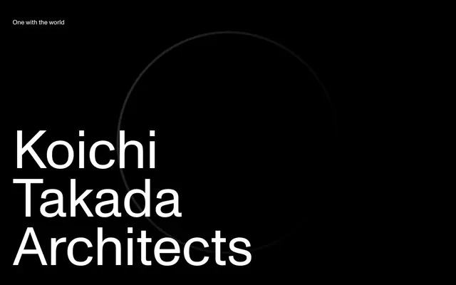
Minimalist architectural blueprint. High contrast and precise typography on a stark black canvas define this elevated brand.
Color palette
Outlined action borders, decorative accents, specific link states. The sole chromatic accent color against a monochromatic palette, suggesting nature
Page backgrounds, primary text, prominent borders, icon fills. Provides a high-contrast canvas
Content surfaces, secondary text, input text, reversed foreground elements
Muted text, subtle icon accents, secondary borders. Creates softened hierarchy
Tertiary text, subtle link hover states. Provides a delicate boundary
Informational text, ghost button borders. A slightly warmer gray for less emphasis
Typography
- Weights
- 400, 600
- Sizes
- 12px, 16px, 18px, 20px, 22px, 30px, 35px, 40px, 170px
- Line height
- 0.9, 1, 1.1, 1.13, 1.2, 1.33, 1.38, 1.41, 1.5
- Letter spacing
- normal
- Fallback
- Inter
The primary typeface for all content from hero headlines to body text. Its clean, geometric form reinforces the architectural theme, often used at extreme sizes for visual impact. Weight 600 establishes strong hierarchy, while weight 400 maintains readability.
Spacing & shape
Components
Transparent background, text color typically Ash Gray (#888888) or Midnight (#000000), no border, 0px border-radius, 0px padding. Hover states subtly shift text color or introduce a hairline border. For example, '→ Submit' text is Ash Gray (#888888).
Transparent background, text color typically Midnight (#000000), with a 1px border in Midnight (#000000) or Forest Whisper (#7c8d66), 0px border-radius. Example: a button with text 'See more' might use Forest Whisper (#7c8d66) for the border.
Transparent background, text color Canvas White (#ffffff). A 1px border is present only along the bottom edge in Canvas White (#ffffff). Padding is minimal at 1px top/bottom and 2px left/right. 0px border-radius.
Monument Grotesk at extremely large sizes (e.g., 170px), weight 600, color Canvas White (#ffffff) on a Midnight (#000000) background, with tight line height (0.9) to reduce vertical space.
Monument Grotesk at 16-20px, weight 400, color Midnight (#000000) or Canvas White (#ffffff) depending on background. Underlined/bordered on hover/active state with a subtle gray (#888888) or Forest Whisper (#7c8d66).
Guidelines
- Prioritize high contrast using Midnight (#000000) backgrounds with Canvas White (#ffffff) text, or vice versa, as the primary color pairing.
- Use Monument Grotesk at exaggerated sizes (e.g., 170px for display, 40px for headlines) with tight line heights (e.g., 0.9 for display) to create strong visual impact.
- Incorporate Forest Whisper (#7c8d66) sparingly as an accent for outline buttons, specific links, or subtle decorative elements.
- Apply 0px border-radius to all components, maintaining a sharp, angular aesthetic throughout the design.
- Maintain generous spacing between sections (40px) and elements (20px) to enhance the feeling of spaciousness and minimal clutter.
- Utilize ghost or outlined button styles without background fills to preserve the minimalist aesthetic; use color for borders to convey interaction or brand accent.
- Avoid using saturated or multiple chromatic colors; the visual system is almost exclusively monochromatic with one brand accent.
- Do not introduce rounded corners or soft edges; all design elements should be sharp and rectilinear.
- Refrain from using drop shadows or heavy box-shadows on components, as the system relies on flat surfaces and high contrast for definition.
- Do not deviate from the Monument Grotesk typeface; it defines the brand's typographic identity.
- Avoid dense blocks of text or crowded layouts; prioritize significant negative space and clear hierarchy over information density.
- Do not use dark backgrounds with dark text or light backgrounds with light text; always ensure strong contrast (AAA wherever possible) for readability.
About this system
ShowHide
Koichi Takada Architects employs an architectural blueprint aesthetic: stark black and white canvases for maximum contrast, punctuated by a singular muted green accent. Typography is a central design element, utilized heroically with oversized, unadorned type to create strong visual statements. Grids and precise negative space define the layout, favoring an open, contemplative feel over dense information displays. Components are reduced to their minimalist essence, often appearing as subtle borders or ghost elements.
The page primarily uses a full-bleed layout for background elements, but content within these sections adheres to a max-width of 1440px and is centered. The hero section features a full-viewport, dark background with oversized, centered typography and a subtle animated graphic. Sections maintain a consistent vertical rhythm with 40px gaps, creating a spacious feel. Content arrangement often utilizes two-column layouts, with text and visual elements aligned precisely. Navigation is a minimalist top bar, likely sticky, with subtle text links. The overall density is spacious, emphasizing large typography and negative space.
This design system relies heavily on stark UI elements and typography rather than extensive imagery. When visuals are present, they are either abstract graphic elements (like the rotating circle in the hero) or tightly cropped product imagery. Photography is minimal, focusing on architectural structures in a clean, often monochromatic, context. Icons are outlined, simple, and typically monochromatic, using primary text or muted gray colors with a thin stroke weight. Imagery serves more as a decorative atmosphere or product showcase, often integrated seamlessly into the high-contrast layout, rather than being a primary content driver.
Reminiscent of Dyson, Stripe, Herzog & de Meuron.
# Koichi Takada Architects — Style Reference
> Minimalist architectural blueprint. High contrast and precise typography on a stark black canvas define this elevated brand.

**Theme:** light

**Site:** https://koichitakada.com

Koichi Takada Architects employs an architectural blueprint aesthetic: stark black and white canvases for maximum contrast, punctuated by a singular muted green accent. Typography is a central design element, utilized heroically with oversized, unadorned type to create strong visual statements. Grids and precise negative space define the layout, favoring an open, contemplative feel over dense information displays. Components are reduced to their minimalist essence, often appearing as subtle borders or ghost elements.

## Tokens — Colors

| Name | Value | Token | Role |
|------|------|------|------|
| Forest Whisper | `#7c8d66` | `--color-forest-whisper` | Outlined action borders, decorative accents, specific link states. The sole chromatic accent color against a monochromatic palette, suggesting nature |
| Midnight | `#000000` | `--color-midnight` | Page backgrounds, primary text, prominent borders, icon fills. Provides a high-contrast canvas |
| Canvas White | `#ffffff` | `--color-canvas-white` | Content surfaces, secondary text, input text, reversed foreground elements |
| Cloud Gray | `#595b60` | `--color-cloud-gray` | Muted text, subtle icon accents, secondary borders. Creates softened hierarchy |
| Ash Gray | `#888888` | `--color-ash-gray` | Tertiary text, subtle link hover states. Provides a delicate boundary |
| Stone Slate | `#808080` | `--color-stone-slate` | Informational text, ghost button borders. A slightly warmer gray for less emphasis |

## Tokens — Typography

### Monument Grotesk
- **Substitute:** Inter
- **Weights:** 400, 600
- **Sizes:** 12px, 16px, 18px, 20px, 22px, 30px, 35px, 40px, 170px
- **Line height:** 0.9, 1, 1.1, 1.13, 1.2, 1.33, 1.38, 1.41, 1.5
- **Letter spacing:** normal
- **Role:** The primary typeface for all content from hero headlines to body text. Its clean, geometric form reinforces the architectural theme, often used at extreme sizes for visual impact. Weight 600 establishes strong hierarchy, while weight 400 maintains readability.

## Tokens — Type Scale

| Role | Size | Line height | Letter spacing |
|------|------|------|------|
| caption | 12px | 1.5 | — |
| body | 16px | 1.33 | — |
| subheading | 20px | 1.2 | — |
| heading-sm | 22px | 1.13 | — |
| heading | 35px | 1.1 | — |
| heading-lg | 40px | 1.1 | — |
| display | 170px | 0.9 | — |

## Tokens — Spacing

- **Max width:** 1440px
- **Section gap:** 40px
- **Card padding:** 20px
- **Element gap:** 20px

## Tokens — Radius

- **all:** 0px

## Layout

The page primarily uses a full-bleed layout for background elements, but content within these sections adheres to a max-width of 1440px and is centered. The hero section features a full-viewport, dark background with oversized, centered typography and a subtle animated graphic. Sections maintain a consistent vertical rhythm with 40px gaps, creating a spacious feel. Content arrangement often utilizes two-column layouts, with text and visual elements aligned precisely. Navigation is a minimalist top bar, likely sticky, with subtle text links. The overall density is spacious, emphasizing large typography and negative space.

## Imagery

This design system relies heavily on stark UI elements and typography rather than extensive imagery. When visuals are present, they are either abstract graphic elements (like the rotating circle in the hero) or tightly cropped product imagery. Photography is minimal, focusing on architectural structures in a clean, often monochromatic, context. Icons are outlined, simple, and typically monochromatic, using primary text or muted gray colors with a thin stroke weight. Imagery serves more as a decorative atmosphere or product showcase, often integrated seamlessly into the high-contrast layout, rather than being a primary content driver.

## Components

### Ghost Text Button
*Minimalist navigation and action buttons.*

Transparent background, text color typically Ash Gray (#888888) or Midnight (#000000), no border, 0px border-radius, 0px padding. Hover states subtly shift text color or introduce a hairline border. For example, '→ Submit' text is Ash Gray (#888888).

### Outlined Text Button
*Decorative or secondary calls to action.*

Transparent background, text color typically Midnight (#000000), with a 1px border in Midnight (#000000) or Forest Whisper (#7c8d66), 0px border-radius. Example: a button with text 'See more' might use Forest Whisper (#7c8d66) for the border.

### Text Input
*Form fields for data entry.*

Transparent background, text color Canvas White (#ffffff). A 1px border is present only along the bottom edge in Canvas White (#ffffff). Padding is minimal at 1px top/bottom and 2px left/right. 0px border-radius.

### Hero Headline
*Dominant textual elements for page sections.*

Monument Grotesk at extremely large sizes (e.g., 170px), weight 600, color Canvas White (#ffffff) on a Midnight (#000000) background, with tight line height (0.9) to reduce vertical space.

### Nav Link
*Primary navigation items.*

Monument Grotesk at 16-20px, weight 400, color Midnight (#000000) or Canvas White (#ffffff) depending on background. Underlined/bordered on hover/active state with a subtle gray (#888888) or Forest Whisper (#7c8d66).

## Guidelines

### Do

- Prioritize high contrast using Midnight (#000000) backgrounds with Canvas White (#ffffff) text, or vice versa, as the primary color pairing.
- Use Monument Grotesk at exaggerated sizes (e.g., 170px for display, 40px for headlines) with tight line heights (e.g., 0.9 for display) to create strong visual impact.
- Incorporate Forest Whisper (#7c8d66) sparingly as an accent for outline buttons, specific links, or subtle decorative elements.
- Apply 0px border-radius to all components, maintaining a sharp, angular aesthetic throughout the design.
- Maintain generous spacing between sections (40px) and elements (20px) to enhance the feeling of spaciousness and minimal clutter.
- Utilize ghost or outlined button styles without background fills to preserve the minimalist aesthetic; use color for borders to convey interaction or brand accent.

### Don't

- Avoid using saturated or multiple chromatic colors; the visual system is almost exclusively monochromatic with one brand accent.
- Do not introduce rounded corners or soft edges; all design elements should be sharp and rectilinear.
- Refrain from using drop shadows or heavy box-shadows on components, as the system relies on flat surfaces and high contrast for definition.
- Do not deviate from the Monument Grotesk typeface; it defines the brand's typographic identity.
- Avoid dense blocks of text or crowded layouts; prioritize significant negative space and clear hierarchy over information density.
- Do not use dark backgrounds with dark text or light backgrounds with light text; always ensure strong contrast (AAA wherever possible) for readability.

## Agent Prompt Guide

Quick Color Reference:
text: #000000
background: #ffffff
border: #000000
accent: #7c8d66
primary action: #7c8d66 (outlined action border)

Example Component Prompts:
1. Create a hero section: Midnight (#000000) background. Headline 'Koichi Takada Architects' Monument Grotesk 170px weight 600, Canvas White (#ffffff), line height 0.9. Subtext 'One with the world' Monument Grotesk 16px weight 400, Canvas White (#ffffff), line height 1.33.
2. Create a subtly outlined action link: Text '→ Learn more' Monument Grotesk 16px weight 400, Forest Whisper (#7c8d66). Border 1px solid Forest Whisper (#7c8d66), 0px radius. No background color, 0px padding.
3. Create a secondary ghost button: Text 'Close' Monument Grotesk 16px weight 400, Ash Gray (#888888). No background, no border, 0px radius, 0px padding.
4. Create a text input field: Background transparent. Placeholder text Monument Grotesk 16px weight 400, Canvas White (#ffffff). Border bottom 1px solid Canvas White (#ffffff). Padding top/bottom 1px, left/right 2px, 0px radius.
More like this









Keep what you find
A free account saves references to boards and can send you a weekly email of picks based on what you save.
To see every result, go Pro.