Preview image. Unlock full-res
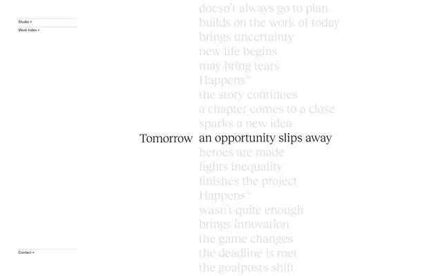
typographic whisper on white space
Color palette
Page backgrounds, large empty spaces – providing a clean, expansive canvas
Dark borders and separators for elevated surfaces and inverted UI. Do not promote it to the primary CTA color
Subtle borders and dividers for navigation items, creating a delicate visual structure without harshness
Typography
- Weights
- 200
- Sizes
- 39px
- Line height
- 1, 1.2, 1.5
- Fallback
- Source Serif Pro
Headlines and prominent text – its light 200 weight provides an airy, almost whispered presence that is distinct from typical bold headings.
- Weights
- 400, 500
- Sizes
- 9px, 12px
- Line height
- 1, 1.5
- Fallback
- Inter
Body text, navigation labels, and interface elements – its compact nature allows for dense information delivery without feeling crowded.
Spacing & shape
Components
Ghost button with Ink Black text, a 0px border-radius, and a subtle Muted Ash top border on hover. Padding is 4px top, 0px right, 11px bottom, 0px left. Uses ABC Diatype font.
Ghost button with Ink Black text and a solid Ink Black bottom border. No border-radius or padding. Uses ABC Diatype font.
Guidelines
- Prioritize text content and negative space over graphic elements.
- Use Ink Black (#000000) for all primary text and critical borders to maintain high contrast.
- Deploy Reckless Neue at weight 200 for headings to convey a delicate, considered tone.
- Structure interactive elements with subtle borders like Muted Ash (#808080) for visual hierarchy without visual weight.
- Maintain a compact information density for body and navigation text using ABC Diatype, leveraging its tight line heights.
- Employ `0px` border-radius universally for a sharp, angular aesthetic.
- Ensure generous `60px` vertical spacing between major sections for breathability.
- Avoid using bold or heavy font weights for headlines; the 200 weight of Reckless Neue is a signature.
- Do not introduce strong accent colors for interactive elements; stick to the monochromatic palette for primary actions.
- Refrain from applying soft shadows or any elevation that disrupts the flat, two-dimensional aesthetic.
- Do not use rounded corners on any component; `0px` radius is central to the visual character.
- Never overcrowd content; allow ample negative space, adhering to the expansive white canvas principle.
- Avoid decorative imagery that competes with the textual focus, maintaining an 'icons-only' approach where necessary.
- Do not use any of the predefined `--wp--preset--color` values, as they are not part of the active brand palette.
About this system
ShowHide
Tomorrow Happens employs a stark, editorial white-space aesthetic, prioritizing text and subtle visual cues over heavy graphical elements. The system emphasizes a high-contrast monochromatic palette with light, breathable typography. Interaction is hinted through understated borders and minimal sizing, creating a sense of quiet authority and focus on content.
The page primarily uses a max-width contained model where the main content is centered. The hero pattern features a centered headline with secondary text cascading around it, creating a text-based, editorial focus over a full-bleed white background. Section rhythm is dictated by clear vertical spacing of `60px` between potential content blocks. Content arrangement is primarily centered stacks for large text, and implicit two-column layouts for navigation. The navigation is minimal, appearing as a vertical list of ghost links on the left side, indicating a sidebar or sticky menu approach rather than a traditional top navigation bar. Density is extremely spacious, with ample breathing room between elements and sections.
The visual language is essentially 'no imagery, pure UI' with text-dominant screens. Icons, when present, are minimal (e.g., a simple '+' sign), outlined, and monochromatic, serving purely functional, navigational roles. There are no photographs, illustrations, product screenshots, or 3D renders. The density is extremely text-dominant, with generous white space around minimal text elements.
Reminiscent of AIGA Journal, The New York Times (digital), Various design portfolios (minimalist), Future Fonts.
# Tomorrow Happens — Style Reference
> typographic whisper on white space

**Theme:** light

**Site:** https://tomorrow-happens.studio

Tomorrow Happens employs a stark, editorial white-space aesthetic, prioritizing text and subtle visual cues over heavy graphical elements. The system emphasizes a high-contrast monochromatic palette with light, breathable typography. Interaction is hinted through understated borders and minimal sizing, creating a sense of quiet authority and focus on content.

## Tokens — Colors

| Name | Value | Token | Role |
|------|------|------|------|
| Canvas White | `#ffffff` | `--color-canvas-white` | Page backgrounds, large empty spaces – providing a clean, expansive canvas |
| Ink Black | `#000000` | `--color-ink-black` | Dark borders and separators for elevated surfaces and inverted UI. Do not promote it to the primary CTA color |
| Muted Ash | `#808080` | `--color-muted-ash` | Subtle borders and dividers for navigation items, creating a delicate visual structure without harshness |

## Tokens — Typography

### Reckless Neue
- **Substitute:** Source Serif Pro
- **Weights:** 200
- **Sizes:** 39px
- **Line height:** 1, 1.2, 1.5
- **Role:** Headlines and prominent text – its light 200 weight provides an airy, almost whispered presence that is distinct from typical bold headings.

### ABC Diatype
- **Substitute:** Inter
- **Weights:** 400, 500
- **Sizes:** 9px, 12px
- **Line height:** 1, 1.5
- **Role:** Body text, navigation labels, and interface elements – its compact nature allows for dense information delivery without feeling crowded.

## Tokens — Type Scale

| Role | Size | Line height | Letter spacing |
|------|------|------|------|
| display | 39px | 1 | — |

## Tokens — Spacing

- **Section gap:** 60px
- **Card padding:** 0px
- **Element gap:** 4px

## Tokens — Radius

- **Buttons:** 0px

## Layout

The page primarily uses a max-width contained model where the main content is centered. The hero pattern features a centered headline with secondary text cascading around it, creating a text-based, editorial focus over a full-bleed white background. Section rhythm is dictated by clear vertical spacing of `60px` between potential content blocks. Content arrangement is primarily centered stacks for large text, and implicit two-column layouts for navigation. The navigation is minimal, appearing as a vertical list of ghost links on the left side, indicating a sidebar or sticky menu approach rather than a traditional top navigation bar. Density is extremely spacious, with ample breathing room between elements and sections.

## Imagery

The visual language is essentially 'no imagery, pure UI' with text-dominant screens. Icons, when present, are minimal (e.g., a simple '+' sign), outlined, and monochromatic, serving purely functional, navigational roles. There are no photographs, illustrations, product screenshots, or 3D renders. The density is extremely text-dominant, with generous white space around minimal text elements.

## Components

### Ghost Navigation Link
*Main navigation links*

Ghost button with Ink Black text, a 0px border-radius, and a subtle Muted Ash top border on hover. Padding is 4px top, 0px right, 11px bottom, 0px left. Uses ABC Diatype font.

### Underlined Navigation Link
*Active or highlighted navigation item*

Ghost button with Ink Black text and a solid Ink Black bottom border. No border-radius or padding. Uses ABC Diatype font.

## Guidelines

### Do

- Prioritize text content and negative space over graphic elements.
- Use Ink Black (#000000) for all primary text and critical borders to maintain high contrast.
- Deploy Reckless Neue at weight 200 for headings to convey a delicate, considered tone.
- Structure interactive elements with subtle borders like Muted Ash (#808080) for visual hierarchy without visual weight.
- Maintain a compact information density for body and navigation text using ABC Diatype, leveraging its tight line heights.
- Employ `0px` border-radius universally for a sharp, angular aesthetic.
- Ensure generous `60px` vertical spacing between major sections for breathability.

### Don't

- Avoid using bold or heavy font weights for headlines; the 200 weight of Reckless Neue is a signature.
- Do not introduce strong accent colors for interactive elements; stick to the monochromatic palette for primary actions.
- Refrain from applying soft shadows or any elevation that disrupts the flat, two-dimensional aesthetic.
- Do not use rounded corners on any component; `0px` radius is central to the visual character.
- Never overcrowd content; allow ample negative space, adhering to the expansive white canvas principle.
- Avoid decorative imagery that competes with the textual focus, maintaining an 'icons-only' approach where necessary.
- Do not use any of the predefined `--wp--preset--color` values, as they are not part of the active brand palette.

## Agent Prompt Guide

Quick Color Reference:
text: #000000
background: #ffffff
border: #808080
accent: no distinct accent color
primary action: no distinct CTA color

Example Component Prompts:
1. Create a navigational list item: ABC Diatype, weight 400, size 12px, Ink Black text, a 0.5px solid Muted Ash top border (on hover), and 0px padding left, 0px right, 4px top, 11px bottom.
2. Design a central expressive headline: 'Tomorrow an opportunity slips away' using Reckless Neue, weight 200, size 39px, Ink Black text, centered on a Canvas White background.
3. Create a secondary text block: 'builds on the work of today' using ABC Diatype, weight 400, size 12px, Ink Black text, with a line height of 1.5, slightly lighter color than primary text.
More like this









Keep what you find
A free account saves references to boards and can send you a weekly email of picks based on what you save.
To see every result, go Pro.