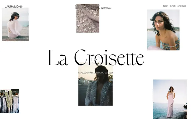
Preview image. Unlock full-res
Color palette
Hairline borders, dividers, input outlines, and card edges on light surfaces. Do not promote it to the primary CTA color
Primary text, headings, navigational links, and subtle borders around imagery
Typography
- Weights
- 400
- Sizes
- 12px, 14px, 18px, 22px
- Line height
- 1.15, 1.2
- Letter spacing
- normal
- Fallback
- Helvetica Neue
General body text, navigation elements, image captions, and descriptive labels. Its clean, narrow form maintains clarity in a design focused on imagery.
- Weights
- 400
- Sizes
- 58px, 158px
- Line height
- 1.2
- Letter spacing
- -0.0180em
- Fallback
- Playfair Display
Prominent display headings and artistic titles. The negative letter spacing enhances its elegant, curated feel, giving a bespoke editorial touch.
Spacing & shape
Components
Uses neue-haas-grotesk-display at 12px weight 400, color #000000. Underlined on hover (not explicitly shown but common interaction). Spacing between items is 16px.
Utilizes the 'title' font at 158px weight 400, color #000000, with -0.0180em letter-spacing. Centered on the page, serving as a large, impactful visual anchor.
Formatted with neue-haas-grotesk-display at 12px weight 400, color #000000. Often appears directly above or below an image, using a 7px bottom margin (if it's a list item).
neue-haas-grotesk-display at 12px weight 400, color #000000. Often appears in close proximity to a larger visual element or as secondary navigation.
Images are displayed with sharp 0px corners, often bordered with a thin #000000 stroke on hover or interaction (implied by color role evidence). Text captions are placed in close vertical proximity.
Guidelines
- Prioritize Canvas White (#ffffff) for all backgrounds and primary containers to achieve a bright, expansive feel.
- Use Text Black (#000000) for all text elements to maintain high contrast and an editorial aesthetic.
- Reserve the 'title' font for large display headlines, applying its specific -0.0180em letter-spacing for an elegant, bespoke look.
- Apply neue-haas-grotesk-display for all body copy, navigation, and supplementary text roles, strictly at weight 400.
- Maintain generous vertical spacing between sections, using values such as 255px (sectionGap) to create a sense of calm and visual breathing room.
- Frame images with no border-radius (0px) to enhance the gallery-like, art-focused presentation.
- Utilize a minimal element gap of 7px to imply close association between elements like image and caption lists.
- Avoid using any saturated colors for UI elements; stick to the dominant #ffffff and #000000 palette.
- Do not introduce rounded corners (e.g., 4px, 8px) on any image containers or cards; all visuals should retain sharp, rectilinear edges.
- Refrain from using heavily bolded text across the interface; the system relies on weight 400 for both primary fonts.
- Do not overcrowd sections; maintain generous negative space consistent with the 255px sectionGap.
- Avoid adding unnecessary shadows or complex visual effects; the design emphasizes flatness and clarity.
- Do not deviate from the specified font families; their distinct characteristics are central to the brand's identity.
- Do not introduce additional padding or margins that disrupt the established spacing rhythm defined by 7px element gaps and 255px section margins.
About this system
ShowHide
Laura Monin's design system evokes an editorial, gallery-like experience with a distinct focus on imagery and classic typography. The minimal, high-contrast monochrome palette ensures visual content takes center stage, while elegant serifs for headlines and classic sans-serifs for body text provide a timeless, refined touch. It prioritizes breathable negative space and structured, but flexible, arrangements of visual elements, creating an atmosphere of understated luxury and artistic presentation.
The page primarily employs a full-bleed layout for the canvas, but content, especially imagery, is centrally anchored and surrounded by significant negative space. The hero element is a large, centered, serif headline. Images are arranged in an asymmetrical, editorial grid, often floating with generous whitespace. Sections appear to flow seamlessly without strong visual dividers, relying on spacious vertical gaps (approx. 255px). Navigation is minimal, located at the top-right.
The site relies primarily on high-quality, product-focused photography and lifestyle fashion shots. Images are treated with sharp, non-rounded edges, appearing as self-contained 'cards' on a vast white canvas. They serve as the main content, often paired with minimal text overlays or adjacent captions. The aesthetic is often bright, airy, and reflective of fashion photography, giving a sophisticated, magazine-like feel. Icons are not a prominent feature, and illustrations are absent, emphasizing photographic realism.
Reminiscent of The Row, Acne Studios, Vogue.com, Frank Ocean's Homer.
# Laura Monin — Style Reference
> Gallery Grid Serenity

**Theme:** light

**Site:** https://lauramonin.com

Laura Monin's design system evokes an editorial, gallery-like experience with a distinct focus on imagery and classic typography. The minimal, high-contrast monochrome palette ensures visual content takes center stage, while elegant serifs for headlines and classic sans-serifs for body text provide a timeless, refined touch. It prioritizes breathable negative space and structured, but flexible, arrangements of visual elements, creating an atmosphere of understated luxury and artistic presentation.

## Tokens — Colors

| Name | Value | Token | Role |
|------|------|------|------|
| Canvas White | `#ffffff` | `--color-canvas-white` | Hairline borders, dividers, input outlines, and card edges on light surfaces. Do not promote it to the primary CTA color |
| Text Black | `#000000` | `--color-text-black` | Primary text, headings, navigational links, and subtle borders around imagery |

## Tokens — Typography

### neue-haas-grotesk-display
- **Substitute:** Helvetica Neue
- **Weights:** 400
- **Sizes:** 12px, 14px, 18px, 22px
- **Line height:** 1.15, 1.2
- **Letter spacing:** normal
- **Role:** General body text, navigation elements, image captions, and descriptive labels. Its clean, narrow form maintains clarity in a design focused on imagery.

### title
- **Substitute:** Playfair Display
- **Weights:** 400
- **Sizes:** 58px, 158px
- **Line height:** 1.2
- **Letter spacing:** -0.0180em
- **Role:** Prominent display headings and artistic titles. The negative letter spacing enhances its elegant, curated feel, giving a bespoke editorial touch.

## Tokens — Type Scale

| Role | Size | Line height | Letter spacing |
|------|------|------|------|
| caption | 12px | 1.15 | — |
| body | 14px | 1.15 | — |
| subheading | 18px | 1.15 | — |
| heading | 22px | 1.15 | — |
| display-sm | 58px | 1.2 | -0.63px |
| display | 158px | 1.2 | -2.84px |

## Tokens — Spacing

- **Card padding:** 9px
- **Element gap:** 7px

## Tokens — Radius

- **Cards:** 0px
- **Images:** 0px

## Layout

The page primarily employs a full-bleed layout for the canvas, but content, especially imagery, is centrally anchored and surrounded by significant negative space. The hero element is a large, centered, serif headline. Images are arranged in an asymmetrical, editorial grid, often floating with generous whitespace. Sections appear to flow seamlessly without strong visual dividers, relying on spacious vertical gaps (approx. 255px). Navigation is minimal, located at the top-right.

## Imagery

The site relies primarily on high-quality, product-focused photography and lifestyle fashion shots. Images are treated with sharp, non-rounded edges, appearing as self-contained 'cards' on a vast white canvas. They serve as the main content, often paired with minimal text overlays or adjacent captions. The aesthetic is often bright, airy, and reflective of fashion photography, giving a sophisticated, magazine-like feel. Icons are not a prominent feature, and illustrations are absent, emphasizing photographic realism.

## Components

### Navigation Link
*Top-right global navigation items.*

Uses neue-haas-grotesk-display at 12px weight 400, color #000000. Underlined on hover (not explicitly shown but common interaction). Spacing between items is 16px.

### Hero Title
*Main page headline / artistic statement.*

Utilizes the 'title' font at 158px weight 400, color #000000, with -0.0180em letter-spacing. Centered on the page, serving as a large, impactful visual anchor.

### Image Caption
*Descriptive text accompanying visual content.*

Formatted with neue-haas-grotesk-display at 12px weight 400, color #000000. Often appears directly above or below an image, using a 7px bottom margin (if it's a list item).

### Info/Contact Link
*Small, functional links for contact or additional information.*

neue-haas-grotesk-display at 12px weight 400, color #000000. Often appears in close proximity to a larger visual element or as secondary navigation.

### Gallery Image Card
*Primary content display for portfolio images.*

Images are displayed with sharp 0px corners, often bordered with a thin #000000 stroke on hover or interaction (implied by color role evidence). Text captions are placed in close vertical proximity.

## Guidelines

### Do

- Prioritize Canvas White (#ffffff) for all backgrounds and primary containers to achieve a bright, expansive feel.
- Use Text Black (#000000) for all text elements to maintain high contrast and an editorial aesthetic.
- Reserve the 'title' font for large display headlines, applying its specific -0.0180em letter-spacing for an elegant, bespoke look.
- Apply neue-haas-grotesk-display for all body copy, navigation, and supplementary text roles, strictly at weight 400.
- Maintain generous vertical spacing between sections, using values such as 255px (sectionGap) to create a sense of calm and visual breathing room.
- Frame images with no border-radius (0px) to enhance the gallery-like, art-focused presentation.
- Utilize a minimal element gap of 7px to imply close association between elements like image and caption lists.

### Don't

- Avoid using any saturated colors for UI elements; stick to the dominant #ffffff and #000000 palette.
- Do not introduce rounded corners (e.g., 4px, 8px) on any image containers or cards; all visuals should retain sharp, rectilinear edges.
- Refrain from using heavily bolded text across the interface; the system relies on weight 400 for both primary fonts.
- Do not overcrowd sections; maintain generous negative space consistent with the 255px sectionGap.
- Avoid adding unnecessary shadows or complex visual effects; the design emphasizes flatness and clarity.
- Do not deviate from the specified font families; their distinct characteristics are central to the brand's identity.
- Do not introduce additional padding or margins that disrupt the established spacing rhythm defined by 7px element gaps and 255px section margins.

## Agent Prompt Guide

Quick Color Reference:
text: #000000
background: #ffffff
border: #000000 (implied for image outlines/interactive states)
accent: no distinct accent color
primary action: no distinct CTA color

Example Component Prompts:
1. Create a page header: background #ffffff. Top-level navigation 'Index', 'Infos', 'Archives' using neue-haas-grotesk-display at 12px weight 400, color #000000, with 16px right margin between items. Place navigation at the top-right.
2. Design a central Hero section: centered 'La Croisette' title using 'title' font at 158px weight 400, color #000000, with letter-spacing -0.0180em. Follow with a text description 'Fashion & Textile Designer' using neue-haas-grotesk-display at 18px weight 400, color #000000, centered, directly below the title.
3. Implement a gallery item: display an image with 0px radius. Below it, a caption like 'LAURA MONIN' using neue-haas-grotesk-display at 12px weight 400, color #000000. Ensure 7px vertical spacing between the image and the caption.
More like this









Keep what you find
A free account saves references to boards and can send you a weekly email of picks based on what you save.
To see every result, go Pro.