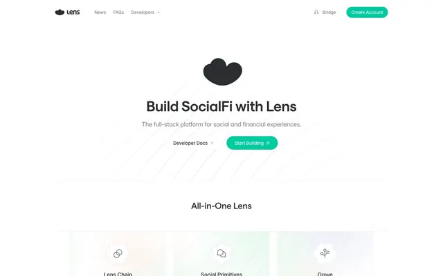
Preview image. Unlock full-res
Cloud-white digital canvas
Color palette
Primary brand accent, interactive elements like buttons and active nav items, highlighting key actions. Its vividness cuts through the subdued neutrals
Decorative fill for SVG icons and illustrations, adding a fresh, energetic touch
Primary text color for headings, body copy, and icons, ensuring high contrast on light backgrounds
Secondary text for subtle descriptions, placeholder text, and borders for ghost buttons and input fields
Main page and card backgrounds, providing a clean, expansive foundation
Muted helper text, delicate dividers, and very subtle icon fills
Hairline borders and very light graphical elements, barely visible against the white
Card backgrounds, almost white but providing a faint distinction from the main canvas without introducing heavy contrast
Typography
- Weights
- 400, 500, 600
- Sizes
- 16px, 21px, 26px, 28px, 46px
- Line height
- 1.2, 1.35, 1.4
- Letter spacing
- 0.0150em
- Fallback
- system-ui
Primary display font for headings and prominent UI elements. Its unique character set ('ss01' feature) provides a distinctive visual signature, maintaining legibility at all sizes with consistent tracking.
- Weights
- 400, 500
- Sizes
- 14px, 15px, 16px, 18px, 20px
- Line height
- 0.88, 1.1, 1.2, 1.29, 1.4, 1.43, 1.45
- Letter spacing
- -0.0250em, -0.0220em, -0.0200em, -0.0170em, -0.0150em, -0.0090em, -0.0060em
- Fallback
- Inter, sans-serif
Workhorse font for body text, navigation, and button labels. Its negative letter spacing at larger sizes gives it a compact, modern feel while ensuring readability at smaller scales, especially with the 'cv11' feature for character variation.
Spacing & shape
Components
backgroundColor=transparent, color=rgba(55,55,55,0.4), borderRadius=0px, padding=0px, font: Inter at 16px, weight 400.
backgroundColor=#00caa0, color=#ffffff, borderRadius=50px, padding=11px 24px, font: Inter at 16px, weight 500. Box shadow: rgba(0, 0, 0, 0.05) 0px 0px 0px 1px.
backgroundColor=transparent, color=#2c2d30, borderRadius=50px, padding=11px 24px, font: Inter at 16px, weight 500. Border: 1px solid #afafaf. Box shadow: rgba(0, 0, 0, 0.05) 0px 0px 0px 1px.
backgroundColor=rgb(251, 251, 251), borderRadius=16px, padding=24px, font: Inter at 16px, weight 400. Box shadow: none.
backgroundColor=rgba(45, 45, 48, 0.02), borderRadius=24px, padding=32px, font: saans at 21px, weight 400. Box shadow: none.
backgroundColor=rgba(40, 211, 107, 0.12), borderRadius=50%.
Guidelines
- Prioritize Charcoal Black (#2c2d30) for all primary text and headings against White Canvas (#ffffff), achieving AAA contrast.
- Use Lens Teal (#00caa0) exclusively for primary interactive elements, brand accents, and active states. Do not use it for passive text or large backgrounds.
- Apply a 50px border-radius to all primary action buttons for a soft, approachable feel.
- Maintain generous internal padding on cards and buttons, using 24px for card content padding and 11px vertical padding for buttons, aligning with a comfortable density.
- Employ the 'saans' font for all headings, leveraging its unique 'ss01' feature and positive letter spacing (0.015em).
- Use subtle, soft shadows (rgba(0,0,0,0.05) 0px 0px 0px 1px) only for interactive elements, not for static cards or surfaces.
- Do not use dark backgrounds for full sections; maintain the light theme with White Canvas (#ffffff) as the dominant background.
- Avoid generic system fonts; always utilize 'saans' for headings and 'Inter' for body text with their specified font features and letter spacing.
- Do not introduce strong, opaque borders on cards or primary layout elements; rely on subtle background differences or soft washes.
- Refrain from using multiple accent colors; Lens Teal (#00caa0) and Mint Green (#00d743) are the only acceptable chromatic accents.
- Do not use a narrow page width; layout should be full-bleed or extend to edge-to-edge, with content typically centered.
- Avoid heavy drop shadows or multiple shadow layers, as the design uses minimal, single-layer outlines.
About this system
ShowHide
Lens employs a bright, airy canvas with subtle surface treatments and an almost-monochrome palette. A vivid teal and soft, playful gradients provide functional accents without overpowering the clean structure. Typography is precise and airy, creating a sense of clarity and modern efficiency. Components are lightweight with generous padding and soft, rounded edges, emphasizing user-friendliness and approachability within a sophisticated technical context.
Reminiscent of Optimism, Arbitrum, Base, Zora.
# Lens — Style Reference
> Cloud-white digital canvas

**Theme:** light

**Site:** https://lens.xyz

Lens employs a bright, airy canvas with subtle surface treatments and an almost-monochrome palette. A vivid teal and soft, playful gradients provide functional accents without overpowering the clean structure. Typography is precise and airy, creating a sense of clarity and modern efficiency. Components are lightweight with generous padding and soft, rounded edges, emphasizing user-friendliness and approachability within a sophisticated technical context.

## Tokens — Colors

| Name | Value | Token | Role |
|------|------|------|------|
| Lens Teal | `#00caa0` | `--color-lens-teal` | Primary brand accent, interactive elements like buttons and active nav items, highlighting key actions. Its vividness cuts through the subdued neutrals |
| Mint Green | `#00d743` | `--color-mint-green` | Decorative fill for SVG icons and illustrations, adding a fresh, energetic touch |
| Charcoal Black | `#2c2d30` | `--color-charcoal-black` | Primary text color for headings, body copy, and icons, ensuring high contrast on light backgrounds |
| Cool Gray | `#afafaf` | `--color-cool-gray` | Secondary text for subtle descriptions, placeholder text, and borders for ghost buttons and input fields |
| White Canvas | `#ffffff` | `--color-white-canvas` | Main page and card backgrounds, providing a clean, expansive foundation |
| Slate Subtle | `#808183` | `--color-slate-subtle` | Muted helper text, delicate dividers, and very subtle icon fills |
| Light Steel | `#c0c0c1` | `--color-light-steel` | Hairline borders and very light graphical elements, barely visible against the white |
| Subtle Card Bkg | `#fbfcff` | `--color-subtle-card-bkg` | Card backgrounds, almost white but providing a faint distinction from the main canvas without introducing heavy contrast |

## Tokens — Typography

### saans
- **Substitute:** system-ui
- **Weights:** 400, 500, 600
- **Sizes:** 16px, 21px, 26px, 28px, 46px
- **Line height:** 1.2, 1.35, 1.4
- **Letter spacing:** 0.0150em
- **Role:** Primary display font for headings and prominent UI elements. Its unique character set ('ss01' feature) provides a distinctive visual signature, maintaining legibility at all sizes with consistent tracking.

### Inter
- **Substitute:** Inter, sans-serif
- **Weights:** 400, 500
- **Sizes:** 14px, 15px, 16px, 18px, 20px
- **Line height:** 0.88, 1.1, 1.2, 1.29, 1.4, 1.43, 1.45
- **Letter spacing:** -0.0250em, -0.0220em, -0.0200em, -0.0170em, -0.0150em, -0.0090em, -0.0060em
- **Role:** Workhorse font for body text, navigation, and button labels. Its negative letter spacing at larger sizes gives it a compact, modern feel while ensuring readability at smaller scales, especially with the 'cv11' feature for character variation.

## Tokens — Type Scale

Major Third (1.25) from 16px base.

| Role | Size | Line height | Letter spacing |
|------|------|------|------|
| caption | 14px | 1.43 | -0.14px |
| body | 16px | 1.4 | 0.24px |
| subheading | 21px | 1.35 | 0.315px |
| heading-sm | 26px | 1.2 | 0.39px |
| heading | 28px | 1.2 | 0.42px |
| display | 46px | 1.2 | 0.69px |

## Tokens — Spacing

- **Section gap:** 48px
- **Card padding:** 24px
- **Element gap:** 16px

## Tokens — Radius

- **Buttons:** 50px
- **Inputs:** 0px
- **Cards:** 16px
- **navItems:** 8px

## Components

### Ghost Nav Link
*Navigation button, text-only*

backgroundColor=transparent, color=rgba(55,55,55,0.4), borderRadius=0px, padding=0px, font: Inter at 16px, weight 400.

### Primary Action Button
*Call to action button*

backgroundColor=#00caa0, color=#ffffff, borderRadius=50px, padding=11px 24px, font: Inter at 16px, weight 500. Box shadow: rgba(0, 0, 0, 0.05) 0px 0px 0px 1px.

### Developer Action Button
*Secondary action button (ghost style)*

backgroundColor=transparent, color=#2c2d30, borderRadius=50px, padding=11px 24px, font: Inter at 16px, weight 500. Border: 1px solid #afafaf. Box shadow: rgba(0, 0, 0, 0.05) 0px 0px 0px 1px.

### Informative Card
*Content container for features or details*

backgroundColor=rgb(251, 251, 251), borderRadius=16px, padding=24px, font: Inter at 16px, weight 400. Box shadow: none.

### Feature Highlight Card
*Highlighted content container with iconography*

backgroundColor=rgba(45, 45, 48, 0.02), borderRadius=24px, padding=32px, font: saans at 21px, weight 400. Box shadow: none.

### Circular Icon Wrapper
*Decorative background for icons*

backgroundColor=rgba(40, 211, 107, 0.12), borderRadius=50%.

## Guidelines

### Do

- Prioritize Charcoal Black (#2c2d30) for all primary text and headings against White Canvas (#ffffff), achieving AAA contrast.
- Use Lens Teal (#00caa0) exclusively for primary interactive elements, brand accents, and active states. Do not use it for passive text or large backgrounds.
- Apply a 50px border-radius to all primary action buttons for a soft, approachable feel.
- Maintain generous internal padding on cards and buttons, using 24px for card content padding and 11px vertical padding for buttons, aligning with a comfortable density.
- Employ the 'saans' font for all headings, leveraging its unique 'ss01' feature and positive letter spacing (0.015em).
- Use subtle, soft shadows (rgba(0,0,0,0.05) 0px 0px 0px 1px) only for interactive elements, not for static cards or surfaces.

### Don't

- Do not use dark backgrounds for full sections; maintain the light theme with White Canvas (#ffffff) as the dominant background.
- Avoid generic system fonts; always utilize 'saans' for headings and 'Inter' for body text with their specified font features and letter spacing.
- Do not introduce strong, opaque borders on cards or primary layout elements; rely on subtle background differences or soft washes.
- Refrain from using multiple accent colors; Lens Teal (#00caa0) and Mint Green (#00d743) are the only acceptable chromatic accents.
- Do not use a narrow page width; layout should be full-bleed or extend to edge-to-edge, with content typically centered.
- Avoid heavy drop shadows or multiple shadow layers, as the design uses minimal, single-layer outlines.

## Agent Prompt Guide

Quick Color Reference:
text: #2c2d30
background: #ffffff
border: #afafaf
accent: #00caa0
primary action: no distinct CTA color

Example Component Prompts:
No distinct primary action color was observed; use the extracted neutral button treatments instead of inventing a filled CTA color.

Create an Informative Card: background rgb(251, 251, 251), 16px border-radius, 24px padding. Headline text (saans weight 500, 26px, Charcoal Black). Body text (Inter weight 400, 16px, Charcoal Black).

Create a Feature Highlight Card: background rgba(45, 45, 48, 0.02), 24px border-radius, 32px padding, no shadow. Include a Circular Icon Wrapper (#00d743 with 12% opacity, 50% border-radius) containing a simple icon (Charcoal Black fill).
More like this







Keep what you find
A free account saves references to boards and can send you a weekly email of picks based on what you save.
To see every result, go Pro.