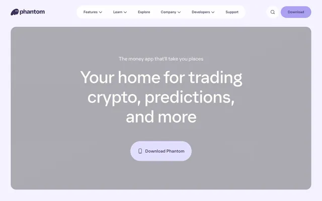
Preview image. Unlock full-res
Muted violet canvas
Color palette
Primary text, interactive element borders, navigation links — deep violet provides a strong anchor for content and interactive states
Primary action button background, providing a soft, pastel contrast to the deep Phantom Violet text and icons
Prominent button backgrounds, decorative SVG fills — a vibrant variant of Phantom Violet for high-signal actions
Page backgrounds, card surfaces, ghost button backgrounds
Secondary text, dark button backgrounds
Muted button backgrounds, subtle dividers
Subtle background sections, hover states
Muted icons, secondary navigation text, inactive elements
Success badges, status indicators
Typography
- Weights
- 350, 400
- Sizes
- 13px, 15px, 16px, 20px, 24px, 30px, 64px, 80px, 96px
- Line height
- 1, 1.1, 1.2, 1.21, 1.25, 1.35, 1.4
- Letter spacing
- -0.025
Body copy, navigation, button text, and smaller headings — a lighter weight maintains an airy feel for content blocks.
- Weights
- 350, 400
- Sizes
- 13px, 15px, 16px, 20px, 24px, 30px, 64px, 80px, 96px
- Line height
- 1, 1.1, 1.2, 1.21, 1.25, 1.35, 1.4
- Letter spacing
- -0.025
Headings and display text — a slightly heavier weight for impact without sacrificing the distinct character of the custom typeface.
Spacing & shape
Elevation
Components
Background: Ghost Button Violet (#e2dffe), Text: Phantom Violet (#3c315b), Border Radius: 32px, Padding: 12px 20px, Shadow: offset (0px 0px 4px 0px) Ghost Button Violet (#e2dffe). Uses Phantom font, weight 350.
Background: Deep Sea (#1c1c1c), Text: Canvas White (#fdfcfe), Border Radius: 24px, Padding: 48px. Uses Phantom font, weight 350.
Background: transparent, Text: Canvas White (#fdfcfe), Border: 1px solid Canvas White (#fdfcfe), Border Radius: 32px, Padding: 16px. Uses Phantom font, weight 350.
Background: Slate Gray (#e9e8ea), Text: Deep Sea (#1c1c1c), Border Radius: 24px, Padding: 48px. Uses Phantom font, weight 350.
Background: Canvas White (#fdfcfe), Border Radius: 24px, No shadow, Padding: 48px. Often contains headings and text in Phantom Violet.
Background: Success Green (#2ec08b), Text: Phantom Violet (#3c315b), Border Radius: 50% (circular), Padding: 0px. Used for small indicators.
Text: Phantom Violet (#3c315b), No background, No border. Uses Phantom font, weight 350. Active state indicated by a bottom border or color change.
Guidelines
- Use Phantom Violet (#3c315b) for all primary text content and interactive element borders to maintain brand consistency.
- Apply a 32px border-radius to all interactive buttons for a consistent soft, approachable feel.
- Structure pages with a base unit of 4px for all spacing measurements, including `row-gap` and `column-gap`.
- Elevate primary action buttons with a subtle 0px 0px 4px 0px box-shadow using Ghost Button Violet (#e2dffe), not harsh black shadows.
- Maintain a clear visual hierarchy by using Canvas White (#fdfcfe) for main page and card backgrounds.
- Employ the Phantom font at weight 350 for body text and navigation, and weight 400 for display headings, always with -0.025em letter-spacing.
- Ensure section gaps default to 32px to create comfortable visual breathing room between content blocks.
- Do not use harsh or high-contrast shadows; only subtle, colored box-shadows are permitted for elevation.
- Avoid using multiple font families; restrict typography to the Phantom typeface in its specified weights.
- Do not deviate from the established border-radius values; always use 32px for buttons and 24px for cards.
- Refrain from introducing new accent colors beyond the defined violet palette, unless for semantic status indicators.
- Do not use generic gray backgrounds for sections; instead, use Soft Fog (#f4f2f4) for subtle visual differentiation.
- Avoid heavy borders or solid dividers; use subtle color changes or text separation instead of explicit lines.
- Do not use letter-spacing values other than -0.025em, as this is a key characteristic of the Phantom typography.
About this system
ShowHide
Phantom uses a confident, muted-violet interface language. Its pages feature a bright canvas with substantial rounded corners, lending a soft, approachable feel to components. Typography is clear and prominent, anchoring sections, while a spectrum of muted and vivid violet tones defines interactive elements and brand accents against a largely achromatic background. Functional elements like buttons feature a subtle, colored box shadow that deepens the visual hierarchy without heavy drop shadows.
The page employs a max-width contained layout rather than full-bleed, with content centered. The hero section often features a large, centered headline and a call to action, with alternating background colors from Canvas White to Phantom Violet or Ghost Button Violet. Sections follow a consistent vertical rhythm with 32px gaps, occasionally featuring two-column layouts where text and UI elements are paired. Card grids are used for features, showcasing components with generous padding and rounded corners. The navigation bar is a sticky header at the top, containing a logo, text links, and a prominent download button, maintaining presence throughout scrolling.
This site predominantly uses a blend of custom illustrations and text to convey its message. Illustrations, specifically the ghost character, are single-color, solid fills, and playful, matching the Phantom Violet color palette. They serve both decorative and explanatory roles without heavy detail, maintaining a flat aesthetic. Photography and complex product screenshots are largely absent, favoring abstract or simplified visual metaphors and focused UI elements. Icons are minimal, outlined, or solid, with stroke weight matching text weight where appropriate. The overall density is balanced, allowing ample negative space around the simple graphic elements.
Reminiscent of Rainbow Wallet, Plaid, Figma, Linear.
# Phantom — Style Reference
> Muted violet canvas

**Theme:** light

**Site:** https://phantom.com

Phantom uses a confident, muted-violet interface language. Its pages feature a bright canvas with substantial rounded corners, lending a soft, approachable feel to components. Typography is clear and prominent, anchoring sections, while a spectrum of muted and vivid violet tones defines interactive elements and brand accents against a largely achromatic background. Functional elements like buttons feature a subtle, colored box shadow that deepens the visual hierarchy without heavy drop shadows.

## Tokens — Colors

| Name | Value | Token | Role |
|------|------|------|------|
| Phantom Violet | `#3c315b` | `--color-phantom-violet` | Primary text, interactive element borders, navigation links — deep violet provides a strong anchor for content and interactive states |
| Ghost Button Violet | `#e2dffe` | `--color-ghost-button-violet` | Primary action button background, providing a soft, pastel contrast to the deep Phantom Violet text and icons |
| Sky Lavender | `#ab9ff2` | `--color-sky-lavender` | Prominent button backgrounds, decorative SVG fills — a vibrant variant of Phantom Violet for high-signal actions |
| Canvas White | `#fdfcfe` | `--color-canvas-white` | Page backgrounds, card surfaces, ghost button backgrounds |
| Deep Sea | `#1c1c1c` | `--color-deep-sea` | Secondary text, dark button backgrounds |
| Slate Gray | `#e9e8ea` | `--color-slate-gray` | Muted button backgrounds, subtle dividers |
| Soft Fog | `#f4f2f4` | `--color-soft-fog` | Subtle background sections, hover states |
| Cool Gray | `#86848d` | `--color-cool-gray` | Muted icons, secondary navigation text, inactive elements |
| Success Green | `#2ec08b` | `--color-success-green` | Success badges, status indicators |

## Tokens — Typography

### Phantom
- **Weights:** 350, 400
- **Sizes:** 13px, 15px, 16px, 20px, 24px, 30px, 64px, 80px, 96px
- **Line height:** 1, 1.1, 1.2, 1.21, 1.25, 1.35, 1.4
- **Letter spacing:** -0.025
- **Role:** Body copy, navigation, button text, and smaller headings — a lighter weight maintains an airy feel for content blocks.

### Phantom
- **Weights:** 350, 400
- **Sizes:** 13px, 15px, 16px, 20px, 24px, 30px, 64px, 80px, 96px
- **Line height:** 1, 1.1, 1.2, 1.21, 1.25, 1.35, 1.4
- **Letter spacing:** -0.025
- **Role:** Headings and display text — a slightly heavier weight for impact without sacrificing the distinct character of the custom typeface.

## Tokens — Type Scale

Perfect Fourth (1.333) from 13px base.

| Role | Size | Line height | Letter spacing |
|------|------|------|------|
| caption | 13px | 1.25 | -0.025em |
| body-sm | 15px | 1.25 | -0.025em |
| subheading | 20px | 1.25 | -0.025em |
| heading-sm | 24px | 1.25 | -0.025em |
| heading | 30px | 1.25 | -0.025em |
| heading-lg | 64px | 1.1 | -0.025em |
| display | 80px | 1.1 | -0.025em |

## Tokens — Spacing

- **Section gap:** 32px
- **Card padding:** 48px
- **Element gap:** 4px

## Tokens — Radius

- **Buttons:** 32px
- **Cards:** 24px
- **header:** 100px
- **largeElements:** 24px
- **smallElements:** 4px

## Tokens — Elevation

- **Primary Action Button:** `0px 0px 4px 0px #e2dffe`

## Layout

The page employs a max-width contained layout rather than full-bleed, with content centered. The hero section often features a large, centered headline and a call to action, with alternating background colors from Canvas White to Phantom Violet or Ghost Button Violet. Sections follow a consistent vertical rhythm with 32px gaps, occasionally featuring two-column layouts where text and UI elements are paired. Card grids are used for features, showcasing components with generous padding and rounded corners. The navigation bar is a sticky header at the top, containing a logo, text links, and a prominent download button, maintaining presence throughout scrolling.

## Imagery

This site predominantly uses a blend of custom illustrations and text to convey its message. Illustrations, specifically the ghost character, are single-color, solid fills, and playful, matching the Phantom Violet color palette. They serve both decorative and explanatory roles without heavy detail, maintaining a flat aesthetic. Photography and complex product screenshots are largely absent, favoring abstract or simplified visual metaphors and focused UI elements. Icons are minimal, outlined, or solid, with stroke weight matching text weight where appropriate. The overall density is balanced, allowing ample negative space around the simple graphic elements.

## Components

### Primary Action Button
*Calls to action, e.g., 'Download Phantom'*

Background: Ghost Button Violet (#e2dffe), Text: Phantom Violet (#3c315b), Border Radius: 32px, Padding: 12px 20px, Shadow: offset (0px 0px 4px 0px) Ghost Button Violet (#e2dffe). Uses Phantom font, weight 350.

### Inverted Dark Button
*Alternative action buttons on darker backgrounds*

Background: Deep Sea (#1c1c1c), Text: Canvas White (#fdfcfe), Border Radius: 24px, Padding: 48px. Uses Phantom font, weight 350.

### Ghost Outline Button
*Subtle secondary actions or links*

Background: transparent, Text: Canvas White (#fdfcfe), Border: 1px solid Canvas White (#fdfcfe), Border Radius: 32px, Padding: 16px. Uses Phantom font, weight 350.

### Muted Button
*Less prominent actions, often within a card or section*

Background: Slate Gray (#e9e8ea), Text: Deep Sea (#1c1c1c), Border Radius: 24px, Padding: 48px. Uses Phantom font, weight 350.

### Content Card
*Information grouping and background for features*

Background: Canvas White (#fdfcfe), Border Radius: 24px, No shadow, Padding: 48px. Often contains headings and text in Phantom Violet.

### Success Status Badge
*Indicates successful status or positive attributes*

Background: Success Green (#2ec08b), Text: Phantom Violet (#3c315b), Border Radius: 50% (circular), Padding: 0px. Used for small indicators.

### Navigation Link
*Primary navigation items in the header*

Text: Phantom Violet (#3c315b), No background, No border. Uses Phantom font, weight 350. Active state indicated by a bottom border or color change.

## Guidelines

### Do

- Use Phantom Violet (#3c315b) for all primary text content and interactive element borders to maintain brand consistency.
- Apply a 32px border-radius to all interactive buttons for a consistent soft, approachable feel.
- Structure pages with a base unit of 4px for all spacing measurements, including `row-gap` and `column-gap`.
- Elevate primary action buttons with a subtle 0px 0px 4px 0px box-shadow using Ghost Button Violet (#e2dffe), not harsh black shadows.
- Maintain a clear visual hierarchy by using Canvas White (#fdfcfe) for main page and card backgrounds.
- Employ the Phantom font at weight 350 for body text and navigation, and weight 400 for display headings, always with -0.025em letter-spacing.
- Ensure section gaps default to 32px to create comfortable visual breathing room between content blocks.

### Don't

- Do not use harsh or high-contrast shadows; only subtle, colored box-shadows are permitted for elevation.
- Avoid using multiple font families; restrict typography to the Phantom typeface in its specified weights.
- Do not deviate from the established border-radius values; always use 32px for buttons and 24px for cards.
- Refrain from introducing new accent colors beyond the defined violet palette, unless for semantic status indicators.
- Do not use generic gray backgrounds for sections; instead, use Soft Fog (#f4f2f4) for subtle visual differentiation.
- Avoid heavy borders or solid dividers; use subtle color changes or text separation instead of explicit lines.
- Do not use letter-spacing values other than -0.025em, as this is a key characteristic of the Phantom typography.

## Agent Prompt Guide

Quick Color Reference:
text: #3c315b
background: #fdfcfe
border: #3c315b
accent: #ab9ff2
primary action: #e2dffe (filled action)

Example Component Prompts:
Create a Primary Action Button: #e2dffe background, #1c1c1c text, 9999px radius, compact pill padding. Use this filled treatment for the main CTA.
Create a feature card: background Canvas White (#fdfcfe), 24px radius, 48px padding. Headline 'Trading tools' at 64px Phantom weight 400, #3c315b, letter-spacing -0.025em. Subtext 'for everyone' at 30px Phantom weight 350, #3c315b, letter-spacing -0.025em. Ghost button 'See more' with transparent background, text Phantom Violet (#3c315b), 1px border Phantom Violet (#3c315b), 32px radius, 16px padding.
Create a navigation bar: background Canvas White (#fdfcfe). Logo on left. Navigation links 'Features', 'Learn', 'Explore' with text Phantom Violet (#3c315b), 4px element gap. Download button 'Download' right-aligned, background Sky Lavender (#ab9ff2), text Canvas White (#fdfcfe), 32px radius, 12px 20px padding.
More like this







Keep what you find
A free account saves references to boards and can send you a weekly email of picks based on what you save.
To see every result, go Pro.