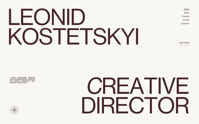
Preview image. Unlock full-res
Type-driven architectural minimalism: a stark, high-contrast typographic landscape on a warm, textured canvas.
Color palette
Primary text, headings, outline borders, and a subtle action indicator. Its deep red-brown provides strong contrast without the harshness of true black, defining the brand's sophisticated warmth
Red outline accent for tags, dividers, and focused UI edges. Use as a supporting accent, not as a status color
Page background; a soft, warm off-white providing an antique paper-like feel to the entire experience
Background for certain interactive states, subtle borders, and an alternative text color on dark backgrounds
Background for dark themed sections, and inverse text color. This color is used sparingly to create visual breaks
Secondary text and outline borders, providing a slightly softer dark tone than Absolute Black
Typography
- Weights
- 300, 400
- Sizes
- 8px, 9px, 11px, 12px, 15px, 18px, 19px, 20px, 21px
- Line height
- 1, 1.1, 1.33, 1.4, 1.6
- Letter spacing
- normal
- Fallback
- system-ui
Primary text for body content, navigational elements, and descriptive links. Its neutrality supports legibility across various UI elements.
- Weights
- 400
- Sizes
- 11px, 12px, 15px, 27px, 135px, 143px, 165px, 188px
- Line height
- 0.86, 1
- Letter spacing
- -0.0250em at large sizes, -0.0200em for smaller headings
- Fallback
- system-ui
Distinctive display font for large headlines and titles. The tight letter-spacing and very large sizes create a strong, imposing, and modern visual statement, prioritizing form over immediate readability at extreme scales.
- Weights
- 400
- Sizes
- 13px
- Line height
- 1.2
- Letter spacing
- normal
- Fallback
- Arial
Used for a specific functional button style, acting as a system fallback or for very minor interface text where a standard sans-serif is preferred.
Spacing & shape
Components
Ghost button with no background or padding. Text color: Cocoa Ink (#472425). Border radius: 0px. Used for subtle, text-based actions.
Background: Absolute Black (#000000). Text color: Absolute Black (#000000). Border: Pure White (#ffffff) 1px. Border radius: 50%. Serves as a visual toggle for theme changes.
Background: Pure White (#ffffff). Text color: Absolute Black (#000000). Border: Pure White (#ffffff) 1px. Border radius: 50%. Complements the dark circular toggle.
Transparent background, text color: Pure White (#ffffff) at 70% opacity. Border: Pure White (#ffffff) at 70% opacity bottom border. Padding: 3px top, 5px bottom, 75px right. Border radius: 0px. Used in dark theme sections.
Transparent background, text color: Cocoa Ink (#472425). Border: Cocoa Ink (#472425) bottom border. Padding: 3px top, 5px bottom, 75px right. Border radius: 0px. Used in light theme sections.
No explicit background color, no border, no shadow, 0px border radius. Content dictates visual form, acting as an implicit card within a larger grid.
Background Pure White (#ffffff), no border, no shadow, 0px border radius. Padding: 0px. Used where a distinct white background is desired against a neutral canvas.
Background Absolute Black (#000000), no border, no shadow, 0px border radius. Padding: 15px top/bottom, 10.5px left/right. Provides a surface for content in dark mode sections.
Guidelines
- Prioritize NeueHaasDisplay for titles and headlines, using large sizes (135px, 188px) with tight letter-spacing (-0.0250em) to create monumental textual elements.
- Maintain a monochromatic base palette using Canvas Parchment (#fdfaf3) for backgrounds and Cocoa Ink (#472425) for primary text and subtle outlined interactions.
- Use no border-radius (0px) for most components, including cards and input fields, to preserve a sharp, architectural aesthetic.
- Indicate interactivity for `Link` and `Button` roles primarily through text color changes or subtle line treatments, avoiding prominent background fills on most buttons.
- Employ generous vertical spacing, specifically a ~200px section gap, to create an airy, uncrowded layout between major content blocks.
- Use Pure White (#ffffff) as the dominant background color for cards and informational blocks within light mode, maintaining visual consistency.
- Apply subtle 1px dashed borders of varying colors (Cocoa Ink, Pure White) to delineate active states or structural elements where a visible separation is needed without heavy lines.
- Avoid using bright, saturated colors unless specifically for semantic feedback (like Alert Crimson #e73737), as they contradict the brand's muted, high-contrast palette.
- Do not introduce rounded corners (e.g., above 0px radius) for primary UI elements like buttons, cards, or inputs, as this clashes with the sharp, angular design language.
- Refrain from heavy drop shadows or complex elevation schemes; the design is flat and relies on color contrast and minimal borders for visual hierarchy.
- Do not use generic system fonts for display elements; stick to NeueHaasDisplay for impact and SFUIDisplay for readability.
- Avoid dense, information-heavy blocks of text; focus on clear, concise copy supported by ample whitespace and strong typography.
- Do not deviate from the established letter-spacing values for NeueHaasDisplay headlines; the tight tracking is a core part of its visual identity.
- Do not add decorative gradients; the system relies on solid colors and text-based visual interest.
About this system
ShowHide
The Leonid Kostetskyi site presents a minimalist, high-contrast aesthetic with an almost architectural use of typography. Its visual identity relies on sharp typographic forms and an extremely limited color palette, dominated by a warm off-white canvas and a deep, muted reddish-brown for primary text and accents. The design emphasizes content through stark clarity and spacious layouts, avoiding decorative elements or heavy component chrome. Interactivity is subtle, often indicated by fine line treatments or inverse color changes rather than overt button styling.
The site's visual language is characterized by an absence of conventional imagery. Instead, it uses typography as its primary visual element, sometimes at extreme scales. When graphical elements appear (like the starburst shape), they are minimal, geometric, and monochrome, serving as abstract decorative accents rather than content-bearing visuals. This creates a text-dominant, almost brutalist aesthetic where the display type itself is the hero image.
Reminiscent of AIGA, Frank Chimero, Dieter Rams Archive, Future Fonts.
# Leonid Kostetskyi — Style Reference
> Type-driven architectural minimalism: a stark, high-contrast typographic landscape on a warm, textured canvas.

**Theme:** light

**Site:** https://leonidkostetskyi.com

The Leonid Kostetskyi site presents a minimalist, high-contrast aesthetic with an almost architectural use of typography. Its visual identity relies on sharp typographic forms and an extremely limited color palette, dominated by a warm off-white canvas and a deep, muted reddish-brown for primary text and accents. The design emphasizes content through stark clarity and spacious layouts, avoiding decorative elements or heavy component chrome. Interactivity is subtle, often indicated by fine line treatments or inverse color changes rather than overt button styling.

## Tokens — Colors

| Name | Value | Token | Role |
|------|------|------|------|
| Cocoa Ink | `#472425` | `--color-cocoa-ink` | Primary text, headings, outline borders, and a subtle action indicator. Its deep red-brown provides strong contrast without the harshness of true black, defining the brand's sophisticated warmth |
| Alert Crimson | `#e73737` | `--color-alert-crimson` | Red outline accent for tags, dividers, and focused UI edges. Use as a supporting accent, not as a status color |
| Canvas Parchment | `#fdfaf3` | `--color-canvas-parchment` | Page background; a soft, warm off-white providing an antique paper-like feel to the entire experience |
| Pure White | `#ffffff` | `--color-pure-white` | Background for certain interactive states, subtle borders, and an alternative text color on dark backgrounds |
| Absolute Black | `#000000` | `--color-absolute-black` | Background for dark themed sections, and inverse text color. This color is used sparingly to create visual breaks |
| Deep Charcoal | `#121212` | `--color-deep-charcoal` | Secondary text and outline borders, providing a slightly softer dark tone than Absolute Black |

## Tokens — Typography

### SFUIDisplay
- **Substitute:** system-ui
- **Weights:** 300, 400
- **Sizes:** 8px, 9px, 11px, 12px, 15px, 18px, 19px, 20px, 21px
- **Line height:** 1, 1.1, 1.33, 1.4, 1.6
- **Letter spacing:** normal
- **Role:** Primary text for body content, navigational elements, and descriptive links. Its neutrality supports legibility across various UI elements.

### NeueHaasDisplay
- **Substitute:** system-ui
- **Weights:** 400
- **Sizes:** 11px, 12px, 15px, 27px, 135px, 143px, 165px, 188px
- **Line height:** 0.86, 1
- **Letter spacing:** -0.0250em at large sizes, -0.0200em for smaller headings
- **Role:** Distinctive display font for large headlines and titles. The tight letter-spacing and very large sizes create a strong, imposing, and modern visual statement, prioritizing form over immediate readability at extreme scales.

### Arial
- **Substitute:** Arial
- **Weights:** 400
- **Sizes:** 13px
- **Line height:** 1.2
- **Letter spacing:** normal
- **Role:** Used for a specific functional button style, acting as a system fallback or for very minor interface text where a standard sans-serif is preferred.

## Tokens — Type Scale

| Role | Size | Line height | Letter spacing |
|------|------|------|------|
| heading | 27px | 1 | -0.54px |
| display-lg | 135px | 0.86 | -3.375px |
| display | 188px | 0.86 | -4.7px |

## Tokens — Spacing

- **Section gap:** 200px
- **Card padding:** 12px
- **Element gap:** 16px

## Tokens — Radius

- **extraLarge:** 9999px
- **none:** 0px

## Imagery

The site's visual language is characterized by an absence of conventional imagery. Instead, it uses typography as its primary visual element, sometimes at extreme scales. When graphical elements appear (like the starburst shape), they are minimal, geometric, and monochrome, serving as abstract decorative accents rather than content-bearing visuals. This creates a text-dominant, almost brutalist aesthetic where the display type itself is the hero image.

## Components

### Text Only Button (Cocoa Ink)
*Interactive navigation and thematic switches.*

Ghost button with no background or padding. Text color: Cocoa Ink (#472425). Border radius: 0px. Used for subtle, text-based actions.

### Circular Toggle Button (Dark)
*Theme switcher.*

Background: Absolute Black (#000000). Text color: Absolute Black (#000000). Border: Pure White (#ffffff) 1px. Border radius: 50%. Serves as a visual toggle for theme changes.

### Circular Toggle Button (Light)
*Theme switcher.*

Background: Pure White (#ffffff). Text color: Absolute Black (#000000). Border: Pure White (#ffffff) 1px. Border radius: 50%. Complements the dark circular toggle.

### Outlined Input Field (Dark Text)
*User input fields.*

Transparent background, text color: Pure White (#ffffff) at 70% opacity. Border: Pure White (#ffffff) at 70% opacity bottom border. Padding: 3px top, 5px bottom, 75px right. Border radius: 0px. Used in dark theme sections.

### Outlined Input Field (Cocoa Ink)
*User input fields.*

Transparent background, text color: Cocoa Ink (#472425). Border: Cocoa Ink (#472425) bottom border. Padding: 3px top, 5px bottom, 75px right. Border radius: 0px. Used in light theme sections.

### Project Card (Implicit)
*Display individual work projects or portfolio items.*

No explicit background color, no border, no shadow, 0px border radius. Content dictates visual form, acting as an implicit card within a larger grid.

### Project Card with Background (White)
*Display individual work projects or portfolio items.*

Background Pure White (#ffffff), no border, no shadow, 0px border radius. Padding: 0px. Used where a distinct white background is desired against a neutral canvas.

### Project Card with Background (Black)
*Display individual work projects or portfolio items for dark themed sections.*

Background Absolute Black (#000000), no border, no shadow, 0px border radius. Padding: 15px top/bottom, 10.5px left/right. Provides a surface for content in dark mode sections.

## Guidelines

### Do

- Prioritize NeueHaasDisplay for titles and headlines, using large sizes (135px, 188px) with tight letter-spacing (-0.0250em) to create monumental textual elements.
- Maintain a monochromatic base palette using Canvas Parchment (#fdfaf3) for backgrounds and Cocoa Ink (#472425) for primary text and subtle outlined interactions.
- Use no border-radius (0px) for most components, including cards and input fields, to preserve a sharp, architectural aesthetic.
- Indicate interactivity for `Link` and `Button` roles primarily through text color changes or subtle line treatments, avoiding prominent background fills on most buttons.
- Employ generous vertical spacing, specifically a ~200px section gap, to create an airy, uncrowded layout between major content blocks.
- Use Pure White (#ffffff) as the dominant background color for cards and informational blocks within light mode, maintaining visual consistency.
- Apply subtle 1px dashed borders of varying colors (Cocoa Ink, Pure White) to delineate active states or structural elements where a visible separation is needed without heavy lines.

### Don't

- Avoid using bright, saturated colors unless specifically for semantic feedback (like Alert Crimson #e73737), as they contradict the brand's muted, high-contrast palette.
- Do not introduce rounded corners (e.g., above 0px radius) for primary UI elements like buttons, cards, or inputs, as this clashes with the sharp, angular design language.
- Refrain from heavy drop shadows or complex elevation schemes; the design is flat and relies on color contrast and minimal borders for visual hierarchy.
- Do not use generic system fonts for display elements; stick to NeueHaasDisplay for impact and SFUIDisplay for readability.
- Avoid dense, information-heavy blocks of text; focus on clear, concise copy supported by ample whitespace and strong typography.
- Do not deviate from the established letter-spacing values for NeueHaasDisplay headlines; the tight tracking is a core part of its visual identity.
- Do not add decorative gradients; the system relies on solid colors and text-based visual interest.

## Agent Prompt Guide

Quick Color Reference:
text: #472425
background: #fdfaf3
border: #472425
accent: #472425
primary action: #472425 (outlined action border)

Example Component Prompts:
1. Create a hero section: Canvas Parchment background (#fdfaf3). Headline 'LEONID KOSTETSKYI' at 188px NeueHaasDisplay weight 400, Cocoa Ink (#472425), letter-spacing -4.7px. Subtext 'CREATIVE DIRECTOR' at 135px NeueHaasDisplay weight 400, Cocoa Ink (#472425), letter-spacing -3.375px. Align all text centrally.
2. Create a navigation menu: List of links: Home, About, Projects, Awards, Contacts. Text color Cocoa Ink (#472425), font SFUIDisplay weight 400, size 12px, line height 1.4. Apply a 1px dashed Cocoa Ink (#472425) bottom border on hover. Right-align in the header.
3. Create a dark theme button: 'DARK THEME' text in SFUIDisplay weight 400, size 12px. Background Absolute Black (#000000), text color Absolute Black (#000000), 1px solid Pure White (#ffffff) circular border (50% radius). No padding.
4. Create a project description paragraph: 'I HELP COMPANIES, BRANDS AND ENTREPRENEURS DEVELOP ANY DIGITAL PRODUCTS AND ACHIEVE THEIR GOALS' in SFUIDisplay weight 400, size 11px, line height 1.33, text color Cocoa Ink (#472425). Apply 16px element gap below it.
5. Create an outlined input field: Placeholder text in SFUIDisplay weight 400, size 12px, Pure White (#ffffff) 70% opacity. Transparent background. 1px solid Pure White (#ffffff) bottom border (70% opacity). Padding 3px top, 5px bottom, 75px right. No border radius.
More like this









Keep what you find
A free account saves references to boards and can send you a weekly email of picks based on what you save.
To see every result, go Pro.