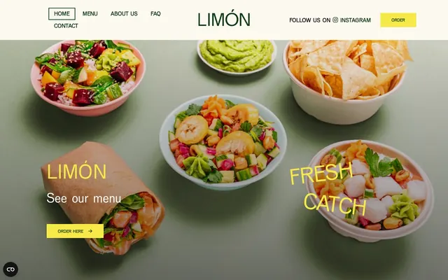
Preview image. Unlock full-res
Earthy vibrancy
Color palette
Primary action buttons, prominent headings, key highlights — a vivid, high-saturation yellow that commands attention and signifies interaction
Primary text, navigation links, overlay backgrounds — grounds the palette with a rich, almost black earth tone
Secondary text, accent borders, decorative elements — provides a subtle, natural green contrast to the deep neutrals
Card backgrounds, section backgrounds, light text (on dark) — a warm off-white that acts as a canvas for most content
Subtle borders, list item separators — a very light, cool gray that defines boundaries without visual weight
Soft icon strokes, subtle dividers, and low-emphasis decorative details. Do not promote it to the primary CTA color
Typography
- Weights
- 300, 400, 500, 600, 700
- Sizes
- 14px, 16px, 19px, 20px, 26px, 30px, 36px, 46px, 54px, 68px, 75px
- Line height
- 1, 1.01, 1.15, 1.2, 1.25, 1.3, 1.35, 1.37, 1.4, 1.45, 1.6
- Letter spacing
- 0.02em, 0.03em, 0.04em, 0.06em
- Fallback
- Montserrat, Open Sans
Primary brand typeface for all text content; its range of weights supports both bold headings and readable body copy, providing consistency across the interface.
- Weights
- 400
- Sizes
- 19px
- Line height
- 1.01
- Letter spacing
- normal
- Fallback
- serif
Decorative lists or specific content blocks where a classic, distinct serif feel is desired to break visual monotony.
- Weights
- 400
- Sizes
- 36px
- Line height
- 1
- Letter spacing
- normal
- Fallback
- Font Awesome 6 Brands
Social media icons and brand-specific iconography, maintaining a consistent vector-based icon style.
- Weights
- 900
- Sizes
- 14px, 16px
- Line height
- 1
- Letter spacing
- 0.04em, 0.06em
- Fallback
- Font Awesome 6 Free
General utility and interface icons, differentiated by a bolder weight and slightly increased letter-spacing for visual punch.
- Weights
- 400
- Sizes
- 15px
- Line height
- 1.5
- Letter spacing
- 0.007em
- Fallback
- Arial, Helvetica Neue
Small functional text, legal disclaimers, or metadata where a highly legible, standard sans-serif is appropriate.
- Weights
- 400
- Sizes
- 19px
- Line height
- 1.01
- Letter spacing
- -0.312em
- Fallback
- Arial, Sans-serif
Specific list items or decorative text requiring tighter tracking for a distinct visual effect, possibly for artistic or brand display needs.
Spacing & shape
Components
Filled button with 'Marigold Zest' (#f7ea48) background, 'Fresh Lime' (#103b15) text, 1px border-radius, and 12px vertical / 34px horizontal padding.
Transparent background, 'Pure White' (#ffffff) text and a 1px solid 'Pure White' (#ffffff) border, 0px border-radius, 12px vertical / 34px horizontal padding (effective padding values after extraction are 0px, so this is likely a text-only button with hover states).
Transparent background, 'Deep Forest' (#1d0b0d) text, 0px border-radius, 12px vertical / 34px horizontal padding (effective padding values after extraction are 0px, so this is likely a text-only button with hover states).
Transparent background, 'Fresh Lime' (#103b15) color, 0px border-radius, 0px padding. Uses Font Awesome 6 Free for icon content.
Background 'Vanilla Cream' (#fcf9f0), primary text 'Deep Forest' (#1d0b0d), secondary text 'Fresh Lime' (#103b15). Features 19px VenusCom for description text and a 1px border-radius. Images within these have a 40px radius.
Transparent background, 'Deep Forest' (#1d0b0d) text at 16px VenusCom weight 400. Horizontal padding 8px left/right, and a 6px margin-left for separation.
Guidelines
- Prioritize 'Marigold Zest' (#f7ea48) for all primary calls to action, ensuring it is the sole vivid accent on pages predominantly using neutral tones.
- Use 'Deep Forest' (#1d0b0d) as the default background for immersive sections and main text color on light backgrounds like 'Vanilla Cream' (#fcf9f0).
- Employ 'Vanilla Cream' (#fcf9f0) for primary content surfaces and background panels, providing a warm, off-white canvas.
- Maintain a comfortable rhythm with '15px' as the standard element gap, extending to '30px' for section separation.
- Apply '1px' border-radius to interactive elements like buttons and body text containers, while using '40px' for imagery crops to introduce softness.
- Use VenusCom with varying weights for all headings and body text; reserve 'Times' and 'FreeSans' for specific decorative list elements if needed.
- Ensure textual elements adhere to the established line heights, particularly longer body text at 1.37 to 1.40 for readability.
- Avoid introducing additional saturated colors beyond 'Marigold Zest' (#f7ea48) for interactive elements.
- Do not use dark text colors on 'Deep Forest' (#1d0b0d) backgrounds; default to 'Pure White' (#ffffff) or 'Vanilla Cream' (#fcf9f0) for contrast.
- Never deviate from the 1px border-radius for buttons and body containers, or 40px for images; these are signature brand attributes.
- Do not use letter-spacing values from Font Awesome or FreeSans on VenusCom body text or headings.
- Avoid dense UI layouts without sufficient '15px' element gaps or '30px' section gaps, as the design relies on comfortable negative space.
- Do not place 'Marigold Zest' (#f7ea48) text against a 'Vanilla Cream' (#fcf9f0) background; the low contrast will hinder legibility.
- Refrain from using 'Soft Mist' (#dbe2dc) as a background color for large sections; its primary role is for subtle dividers and borders.
About this system
ShowHide
Limón projects a warm, vibrant aesthetic through contrasting earthy dark neutrals with a singular, vivid yellow accent. Typography, primarily a custom sans-serif, maintains a clean and approachable feel, while the use of subtle borders and minimal shadows keeps components lightweight. The design balances rich photographic visuals with ample whitespace, creating an inviting yet structured experience.
The layout follows a max-width contained page model for most content, with a centered alignment. The hero section is full-bleed, using a 'Deep Forest' (#1d0b0d) background with food photography and centered text (`Limón`, `See our menu`) often in 'Marigold Zest' (#f7ea48) or 'Pure White' (#ffffff). Section rhythm alternates between full-bleed imagery and content blocks with 'Vanilla Cream' (#fcf9f0) backgrounds. Content is organized into a flexible grid pattern, often featuring 3-column product cards with images above descriptive text and 'Order Now' ghost buttons. Vertical spacing is comfortable, with a '30px' section gap observed. The navigation is a fixed top bar with minimalist links.
The visual language predominantly features high-quality product photography: food items (bowls, wraps) are tightly cropped and displayed in a flat lay, top-down perspective on solid, muted backgrounds (often matching 'Deep Forest' or other earthy tones). Images are typically contained within a rectangular frame but some have a distinct 40px border-radius, giving them a softer edge. Photography serves both decorative and explanatory roles, showcasing the vibrancy of the food. Icons are minimal, using outlined or solid Font Awesome styles primarily for navigation and social links, maintaining a clean distinction from the rich food photography.
Reminiscent of Sweetgreen, Chipotle, Pokeworks, Cava.
# Limón — Style Reference
> Earthy vibrancy

**Theme:** dark

**Site:** https://limonoslo.no

Limón projects a warm, vibrant aesthetic through contrasting earthy dark neutrals with a singular, vivid yellow accent. Typography, primarily a custom sans-serif, maintains a clean and approachable feel, while the use of subtle borders and minimal shadows keeps components lightweight. The design balances rich photographic visuals with ample whitespace, creating an inviting yet structured experience.

## Tokens — Colors

| Name | Value | Token | Role |
|------|------|------|------|
| Marigold Zest | `#f7ea48` | `--color-marigold-zest` | Primary action buttons, prominent headings, key highlights — a vivid, high-saturation yellow that commands attention and signifies interaction |
| Deep Forest | `#1d0b0d` | `--color-deep-forest` | Primary text, navigation links, overlay backgrounds — grounds the palette with a rich, almost black earth tone |
| Fresh Lime | `#103b15` | `--color-fresh-lime` | Secondary text, accent borders, decorative elements — provides a subtle, natural green contrast to the deep neutrals |
| Vanilla Cream | `#fcf9f0` | `--color-vanilla-cream` | Card backgrounds, section backgrounds, light text (on dark) — a warm off-white that acts as a canvas for most content |
| Soft Mist | `#dbe2dc` | `--color-soft-mist` | Subtle borders, list item separators — a very light, cool gray that defines boundaries without visual weight |
| Pure White | `#ffffff` | `--color-pure-white` | Soft icon strokes, subtle dividers, and low-emphasis decorative details. Do not promote it to the primary CTA color |

## Tokens — Typography

### VenusCom
- **Substitute:** Montserrat, Open Sans
- **Weights:** 300, 400, 500, 600, 700
- **Sizes:** 14px, 16px, 19px, 20px, 26px, 30px, 36px, 46px, 54px, 68px, 75px
- **Line height:** 1, 1.01, 1.15, 1.2, 1.25, 1.3, 1.35, 1.37, 1.4, 1.45, 1.6
- **Letter spacing:** 0.02em, 0.03em, 0.04em, 0.06em
- **Role:** Primary brand typeface for all text content; its range of weights supports both bold headings and readable body copy, providing consistency across the interface.

### Times
- **Substitute:** serif
- **Weights:** 400
- **Sizes:** 19px
- **Line height:** 1.01
- **Letter spacing:** normal
- **Role:** Decorative lists or specific content blocks where a classic, distinct serif feel is desired to break visual monotony.

### Font Awesome 6 Brands
- **Substitute:** Font Awesome 6 Brands
- **Weights:** 400
- **Sizes:** 36px
- **Line height:** 1
- **Letter spacing:** normal
- **Role:** Social media icons and brand-specific iconography, maintaining a consistent vector-based icon style.

### Font Awesome 6 Free
- **Substitute:** Font Awesome 6 Free
- **Weights:** 900
- **Sizes:** 14px, 16px
- **Line height:** 1
- **Letter spacing:** 0.04em, 0.06em
- **Role:** General utility and interface icons, differentiated by a bolder weight and slightly increased letter-spacing for visual punch.

### Helvetica
- **Substitute:** Arial, Helvetica Neue
- **Weights:** 400
- **Sizes:** 15px
- **Line height:** 1.5
- **Letter spacing:** 0.007em
- **Role:** Small functional text, legal disclaimers, or metadata where a highly legible, standard sans-serif is appropriate.

### FreeSans
- **Substitute:** Arial, Sans-serif
- **Weights:** 400
- **Sizes:** 19px
- **Line height:** 1.01
- **Letter spacing:** -0.312em
- **Role:** Specific list items or decorative text requiring tighter tracking for a distinct visual effect, possibly for artistic or brand display needs.

## Tokens — Type Scale

Perfect Fourth (1.333) from 14px base.

| Role | Size | Line height | Letter spacing |
|------|------|------|------|
| caption | 14px | 1.45 | 0.02em |
| body-sm | 16px | 1.4 | 0.03em |
| subheading | 20px | 1.35 | — |
| heading-sm | 26px | 1.3 | — |
| heading | 30px | 1.25 | — |
| heading-lg | 36px | 1.2 | — |
| display | 75px | 1 | 0.04em |

## Tokens — Spacing

- **Section gap:** 30px
- **Card padding:** 15px
- **Element gap:** 15px

## Tokens — Radius

- **Buttons:** 1px
- **body:** 1px
- **other:** 40px

## Layout

The layout follows a max-width contained page model for most content, with a centered alignment. The hero section is full-bleed, using a 'Deep Forest' (#1d0b0d) background with food photography and centered text (`Limón`, `See our menu`) often in 'Marigold Zest' (#f7ea48) or 'Pure White' (#ffffff). Section rhythm alternates between full-bleed imagery and content blocks with 'Vanilla Cream' (#fcf9f0) backgrounds. Content is organized into a flexible grid pattern, often featuring 3-column product cards with images above descriptive text and 'Order Now' ghost buttons. Vertical spacing is comfortable, with a '30px' section gap observed. The navigation is a fixed top bar with minimalist links.

## Imagery

The visual language predominantly features high-quality product photography: food items (bowls, wraps) are tightly cropped and displayed in a flat lay, top-down perspective on solid, muted backgrounds (often matching 'Deep Forest' or other earthy tones). Images are typically contained within a rectangular frame but some have a distinct 40px border-radius, giving them a softer edge. Photography serves both decorative and explanatory roles, showcasing the vibrancy of the food. Icons are minimal, using outlined or solid Font Awesome styles primarily for navigation and social links, maintaining a clean distinction from the rich food photography.

## Components

### Primary Action Button
*Call to action*

Filled button with 'Marigold Zest' (#f7ea48) background, 'Fresh Lime' (#103b15) text, 1px border-radius, and 12px vertical / 34px horizontal padding.

### Ghost Action Button (Dark)
*Secondary action on dark backgrounds*

Transparent background, 'Pure White' (#ffffff) text and a 1px solid 'Pure White' (#ffffff) border, 0px border-radius, 12px vertical / 34px horizontal padding (effective padding values after extraction are 0px, so this is likely a text-only button with hover states).

### Ghost Action Button (Light)
*Secondary action on light backgrounds*

Transparent background, 'Deep Forest' (#1d0b0d) text, 0px border-radius, 12px vertical / 34px horizontal padding (effective padding values after extraction are 0px, so this is likely a text-only button with hover states).

### Icon Button
*Standalone decorative or functional icon*

Transparent background, 'Fresh Lime' (#103b15) color, 0px border-radius, 0px padding. Uses Font Awesome 6 Free for icon content.

### Product Description Card
*Displaying individual product details*

Background 'Vanilla Cream' (#fcf9f0), primary text 'Deep Forest' (#1d0b0d), secondary text 'Fresh Lime' (#103b15). Features 19px VenusCom for description text and a 1px border-radius. Images within these have a 40px radius.

### Navigation Link
*Primary navigation elements*

Transparent background, 'Deep Forest' (#1d0b0d) text at 16px VenusCom weight 400. Horizontal padding 8px left/right, and a 6px margin-left for separation.

## Guidelines

### Do

- Prioritize 'Marigold Zest' (#f7ea48) for all primary calls to action, ensuring it is the sole vivid accent on pages predominantly using neutral tones.
- Use 'Deep Forest' (#1d0b0d) as the default background for immersive sections and main text color on light backgrounds like 'Vanilla Cream' (#fcf9f0).
- Employ 'Vanilla Cream' (#fcf9f0) for primary content surfaces and background panels, providing a warm, off-white canvas.
- Maintain a comfortable rhythm with '15px' as the standard element gap, extending to '30px' for section separation.
- Apply '1px' border-radius to interactive elements like buttons and body text containers, while using '40px' for imagery crops to introduce softness.
- Use VenusCom with varying weights for all headings and body text; reserve 'Times' and 'FreeSans' for specific decorative list elements if needed.
- Ensure textual elements adhere to the established line heights, particularly longer body text at 1.37 to 1.40 for readability.

### Don't

- Avoid introducing additional saturated colors beyond 'Marigold Zest' (#f7ea48) for interactive elements.
- Do not use dark text colors on 'Deep Forest' (#1d0b0d) backgrounds; default to 'Pure White' (#ffffff) or 'Vanilla Cream' (#fcf9f0) for contrast.
- Never deviate from the 1px border-radius for buttons and body containers, or 40px for images; these are signature brand attributes.
- Do not use letter-spacing values from Font Awesome or FreeSans on VenusCom body text or headings.
- Avoid dense UI layouts without sufficient '15px' element gaps or '30px' section gaps, as the design relies on comfortable negative space.
- Do not place 'Marigold Zest' (#f7ea48) text against a 'Vanilla Cream' (#fcf9f0) background; the low contrast will hinder legibility.
- Refrain from using 'Soft Mist' (#dbe2dc) as a background color for large sections; its primary role is for subtle dividers and borders.

## Agent Prompt Guide

Quick Color Reference:
text: #1d0b0d
background: #fcf9f0
border: #dbe2dc
accent: #f7ea48
primary action: #f7ea48 (filled action)

Example Component Prompts:
Create a hero section: 'Deep Forest' (#1d0b0d) full-bleed background. Centered headline 'Limón' VenusCom 75px weight 700 'Marigold Zest' (#f7ea48). Subheading 'See our menu' VenusCom 46px weight 400 'Pure White' (#ffffff). Button 'Order here' with background 'Marigold Zest' (#f7ea48), text 'Fresh Lime' (#103b15), 1px border-radius, 12px vertical / 34px horizontal padding.

Create a product card: 'Vanilla Cream' (#fcf9f0) background, 1px border-radius. Image with 40px border-radius. Product name VenusCom 26px weight 600 'Deep Forest' (#1d0b0d). Description VenusCom 19px weight 400 'Deep Forest' (#1d0b0d) with 15px top padding. Ghost 'Order Now' button below with text 'Fresh Lime' (#103b15).

Create a navigation bar: 'Vanilla Cream' (#fcf9f0) background. 'Limón' logo VenusCom 36px weight 700 'Deep Forest' (#1d0b0d). Navigation links 'Home', 'Menu' VenusCom 16px weight 400 'Deep Forest' (#1d0b0d) with 8px horizontal padding and 6px margin-left.
More like this







Keep what you find
A free account saves references to boards and can send you a weekly email of picks based on what you save.
To see every result, go Pro.