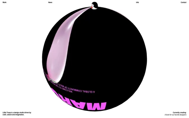
Preview image. Unlock full-res
monochrome playful sculpture
Color palette
Accents, decorative elements, subtle highlights
Supporting palette color for small decorative accents when the core palette needs contrast. Do not promote it to the primary CTA color
Primary text, borders, decorative elements — stark density against the white canvas
Page backgrounds, large content surfaces, negative space
Typography
- Weights
- 400, 700
- Sizes
- 14px, 16px
- Line height
- 0.86, 1, 1.14
- Letter spacing
- normal
- Fallback
- Arial Condensed
Body text, navigation links, secondary headings — provides a utilitarian contrast to display type, prioritizing legibility at smaller scales.
- Weights
- 250
- Sizes
- 76px
- Line height
- 0.79
- Letter spacing
- -0.0660em
- Fallback
- Times New Roman
Dominant display headings where a light, wide, and tightly tracked textual punch is needed, creating a signature high-impact, minimalist statement.
Spacing & shape
Components
Text in Arial Narrow, typically 14px or 16px, color Inkwell (#000000). Hover states might apply a border or color change as suggested by the accent colors. These minimal links maintain the clean negative space without heavy button styles.
A ghost card with transparent background, zero border radius, and no box shadow. Content within has padding of 20px on left/right. The distinct rounded shape and visible content defines the card, not the container properties.
A ghost button, with a transparent background, white text (#ffffff), and a 1px border in Canvas White (#ffffff) on the top. Uses Arial Narrow font. The minimal styling ensures it integrates seamlessly into the content display.
A small circular checkbox with a 1px Inkwell (#000000) border, transparent background, and 50px radius. Checked state implied by color fill from --clr-accent. This rounded shape is a key visual identifier.
Guidelines
- Use Canvas White (#ffffff) as the dominant background for all pages and primary content containers.
- Employ Inkwell (#000000) for all primary text, borders, and main decorative outlines to maintain high contrast.
- Apply a 50px border-radius to any background panels or interactive elements that should appear as distinct, soft-edged shapes.
- Use Arial Narrow for body text and navigation, adjusting line height as needed between 0.86 and 1.14 based on context.
- Reserve Times Now (weight 250, 76px, letter-spacing -0.066em) for impactful display headings, emphasizing its unique character.
- Maintain generous negative space with a 100px section gap between major content blocks to ensure breathing room.
- Introduce Ocean Mist (#8bc3bd) or Sunset Ember (#e78f4e) sparingly for subtle accents or hover states to highlight interaction.
- Avoid introducing additional saturated colors beyond specified accents to preserve the monochrome focus.
- Do not use heavy box shadows or overly complex gradients; the design relies on flat planes and subtle elevation changes.
- Do not vary border-radius for non-container elements; the 50px radius is a signature shape.
- Avoid dense, text-heavy blocks; break content into manageable, visually distinct units.
- Do not use bold or heavy weights for Times Now; its personality comes from its light 250 weight combined with tight tracking.
- Do not use generic system fonts for display text; Times Now defines a core part of the brand's typographic identity.
- Avoid decorative imagery that conflicts with the clean, bold, typography-driven aesthetic; use clear product captures or abstract forms.
About this system
ShowHide
Little Troop sculpts a playful yet authoritative visual identity through stark monochrome contrast and oversized, almost cartoonish, typographic gestures. Surfaces are a crisp white canvas, against which dense, rounded blocks of content float. The system uses a limited color palette to emphasize form and content, with visual interest created through unexpected scale shifts and exaggerated shapes, lending a whimsical but professional feel.
The page maintains a full-bleed layout, using a max-width approach for content containment. The initial hero section often features a distorted or spherical graphic, creating an immediate, abstract visual impact. Content sections are vertically stacked with a consistent 100px gap, using a flexible grid that can accommodate single large hero elements or multiple smaller 'card' items. The Project Index utilizes a dynamic, responsive grid of ghost cards, each implicitly defined by its rounded outline or contained content, rather than explicit borders. Navigation is presented minimally in a fixed header, with a large footer section. The overall density is comfortable, with ample whitespace provided by the Canvas White background.
This system primarily uses product screenshots and brand identity artwork, often presented within rounded, contained shapes or as part of a larger, abstract layout. Imagery is typically high-fidelity and product-focused, rather than lifestyle or stock photography. Icons, when present (e.g., filter checkboxes), are simple, outlined, and monochromatic, aligning with the minimal aesthetic. The role of imagery is to showcase design work or provide functional context, maintaining a text-dominant to image-balanced density, often with images deeply integrated into the layout rather than merely decorative.
Reminiscent of Stripe, Kikkland Design, AIGA Design, The Brand Identity.
# Little Troop — Style Reference
> monochrome playful sculpture

**Theme:** light

**Site:** https://littletroop.com

Little Troop sculpts a playful yet authoritative visual identity through stark monochrome contrast and oversized, almost cartoonish, typographic gestures. Surfaces are a crisp white canvas, against which dense, rounded blocks of content float. The system uses a limited color palette to emphasize form and content, with visual interest created through unexpected scale shifts and exaggerated shapes, lending a whimsical but professional feel.

## Tokens — Colors

| Name | Value | Token | Role |
|------|------|------|------|
| Ocean Mist | `#8bc3bd` | `--color-ocean-mist` | Accents, decorative elements, subtle highlights |
| Sunset Ember | `#e78f40` | `--color-sunset-ember` | Supporting palette color for small decorative accents when the core palette needs contrast. Do not promote it to the primary CTA color |
| Inkwell | `#000000` | `--color-inkwell` | Primary text, borders, decorative elements — stark density against the white canvas |
| Canvas White | `#ffffff` | `--color-canvas-white` | Page backgrounds, large content surfaces, negative space |

## Tokens — Typography

### Arial Narrow
- **Substitute:** Arial Condensed
- **Weights:** 400, 700
- **Sizes:** 14px, 16px
- **Line height:** 0.86, 1, 1.14
- **Letter spacing:** normal
- **Role:** Body text, navigation links, secondary headings — provides a utilitarian contrast to display type, prioritizing legibility at smaller scales.

### Times Now
- **Substitute:** Times New Roman
- **Weights:** 250
- **Sizes:** 76px
- **Line height:** 0.79
- **Letter spacing:** -0.0660em
- **Role:** Dominant display headings where a light, wide, and tightly tracked textual punch is needed, creating a signature high-impact, minimalist statement.

## Tokens — Spacing

- **Section gap:** 100px
- **Card padding:** 20px
- **Element gap:** 20px

## Tokens — Radius

- **shapes:** 50px

## Layout

The page maintains a full-bleed layout, using a max-width approach for content containment. The initial hero section often features a distorted or spherical graphic, creating an immediate, abstract visual impact. Content sections are vertically stacked with a consistent 100px gap, using a flexible grid that can accommodate single large hero elements or multiple smaller 'card' items. The Project Index utilizes a dynamic, responsive grid of ghost cards, each implicitly defined by its rounded outline or contained content, rather than explicit borders. Navigation is presented minimally in a fixed header, with a large footer section. The overall density is comfortable, with ample whitespace provided by the Canvas White background.

## Imagery

This system primarily uses product screenshots and brand identity artwork, often presented within rounded, contained shapes or as part of a larger, abstract layout. Imagery is typically high-fidelity and product-focused, rather than lifestyle or stock photography. Icons, when present (e.g., filter checkboxes), are simple, outlined, and monochromatic, aligning with the minimal aesthetic. The role of imagery is to showcase design work or provide functional context, maintaining a text-dominant to image-balanced density, often with images deeply integrated into the layout rather than merely decorative.

## Components

### Navigation Link
*Header and footer navigation elements, work item links.*

Text in Arial Narrow, typically 14px or 16px, color Inkwell (#000000). Hover states might apply a border or color change as suggested by the accent colors. These minimal links maintain the clean negative space without heavy button styles.

### Project Index Card
*Container for individual work project previews.*

A ghost card with transparent background, zero border radius, and no box shadow. Content within has padding of 20px on left/right. The distinct rounded shape and visible content defines the card, not the container properties.

### Filter Toggle Button
*Used for filtering content, specifically on the Project Index.*

A ghost button, with a transparent background, white text (#ffffff), and a 1px border in Canvas White (#ffffff) on the top. Uses Arial Narrow font. The minimal styling ensures it integrates seamlessly into the content display.

### Filter Checkbox
*Interactive element to select filter criteria.*

A small circular checkbox with a 1px Inkwell (#000000) border, transparent background, and 50px radius. Checked state implied by color fill from --clr-accent. This rounded shape is a key visual identifier.

## Guidelines

### Do

- Use Canvas White (#ffffff) as the dominant background for all pages and primary content containers.
- Employ Inkwell (#000000) for all primary text, borders, and main decorative outlines to maintain high contrast.
- Apply a 50px border-radius to any background panels or interactive elements that should appear as distinct, soft-edged shapes.
- Use Arial Narrow for body text and navigation, adjusting line height as needed between 0.86 and 1.14 based on context.
- Reserve Times Now (weight 250, 76px, letter-spacing -0.066em) for impactful display headings, emphasizing its unique character.
- Maintain generous negative space with a 100px section gap between major content blocks to ensure breathing room.
- Introduce Ocean Mist (#8bc3bd) or Sunset Ember (#e78f4e) sparingly for subtle accents or hover states to highlight interaction.

### Don't

- Avoid introducing additional saturated colors beyond specified accents to preserve the monochrome focus.
- Do not use heavy box shadows or overly complex gradients; the design relies on flat planes and subtle elevation changes.
- Do not vary border-radius for non-container elements; the 50px radius is a signature shape.
- Avoid dense, text-heavy blocks; break content into manageable, visually distinct units.
- Do not use bold or heavy weights for Times Now; its personality comes from its light 250 weight combined with tight tracking.
- Do not use generic system fonts for display text; Times Now defines a core part of the brand's typographic identity.
- Avoid decorative imagery that conflicts with the clean, bold, typography-driven aesthetic; use clear product captures or abstract forms.

## Agent Prompt Guide

Quick Color Reference:
text: #000000
background: #ffffff
border: #000000
accent: #8bc3bd
primary action: no distinct CTA color

Example Component Prompts:
1. Create a header navigation link: Arial Narrow 16px, weight 400, color #000000, 1px Inkwell (#000000) bottom border on hover.
2. Create a project index filter checkbox: Circular shape with 1px Inkwell (#000000) border, 50px radius. When active, fill with Ocean Mist (#8bc3bd).
3. Create a primary display heading: Times Now 76px, weight 250, color #000000, letter-spacing -0.066em, line-height 0.79.
More like this









Keep what you find
A free account saves references to boards and can send you a weekly email of picks based on what you save.
To see every result, go Pro.