Preview image. Unlock full-res
Editorial canvas, bold type
Color palette
Primary text, headings, heavy borders and dividers — creates strong contrast and an authoritative tone
Page backgrounds, content surfaces — provides a clean, expansive canvas
Subtle borders, secondary text that needs less emphasis than primary
Hairline separators for navigation elements — defines divisions without visual weight
Typography
- Weights
- 400
- Sizes
- 18px, 21px, 32px
- Line height
- 1.1, 1.4
- Letter spacing
- normal
- Fallback
- Lora
Headlines and prominent text — its classic serif form lends an editorial, timeless quality.
- Weights
- 400, 700
- Sizes
- 18px, 21px, 23px
- Line height
- 1.2, 1.3, 1.7
- Letter spacing
- normal
- Fallback
- Public Sans
Body copy, navigation links — a modern sans-serif that balances readability with a contemporary feel.
- Weights
- 400
- Sizes
- 15px
- Line height
- 1.65
- Letter spacing
- normal
- Fallback
- system-ui
Small body text, auxiliary information — relies on system fonts for efficiency and broad compatibility.
Spacing & shape
Components
Uses Old Standard 32px, weight 400, color Midnight Ink (#000000), with a line-height of 1.10. Presented with generous white space around it.
Text in GT America 18px, weight 400, color Midnight Ink (#000000). Active and hover states are not explicitly defined, but implied by hover styling on the site, suggesting a border change.
Appears in Old Standard 21px, weight 400, color Midnight Ink (#000000), with a line-height of 1.40. Used for longer descriptive paragraphs.
Uses GT America 21px, weight 400, color Midnight Ink (#000000), with a line-height of 1.30. Positioned directly below project imagery.
Uses -apple-system 15px, weight 400, color Midnight Ink (#000000), with a line-height of 1.65. Provides concise context for each project.
A 1px solid border in Whisper White (#e5e5e5) used to subtly delineate sections, primarily navigation.
Guidelines
- Prioritize Midnight Ink (#000000) for all main text and essential borders to maintain high contrast.
- Use Paper White (#ffffff) as the dominant background color for all content areas.
- Employ Old Standard for all prominent headlines and Old Standard (or similar serif) for longer descriptive text blocks.
- Use GT America (or similar sans-serif) for body text, navigation elements, and shorter descriptions.
- Maintain generous vertical spacing between sections, aiming for a visual 'breathing room' of at least 64px.
- Apply hairline dividers at 1px solid in Whisper White (#e5e5e5) for subtle content separation.
- Ensure all imagery is presented with sharp, unrounded corners, maintaining a crisp edges aesthetic.
- Do not introduce highly saturated or vibrant colors for UI elements; maintain an achromatic palette for structure.
- Avoid using rounded corners on any UI elements or imagery.
- Do not use shadows or elevation effects; the design relies on flat surfaces and strong contrasts for visual hierarchy.
- Do not overcrowd sections; preserve ample white space for a clean, editorial layout.
- Avoid overly bold or decorative typography for body text; prioritize legibility with system or GT America equivalents.
- Do not use gradients in UI backgrounds or overlays; stick to solid colors.
- Do not introduce complex UI components that detract from the visual simplicity and focus on content.
About this system
ShowHide
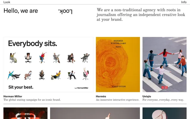
Look.inc embraces a stark, high-contrast aesthetic, juxtaposing crisp black text against a pure white canvas. This foundation emphasizes editorial quality, reinforced by classic serif typography for headlines and clean sans-serif for body text. Thin borders and generous spacing create a sense of spaciousness, drawing focus to the content and imagery with minimal decorative interference. The design system is largely achromatic, relying on strong typographic hierarchy and clean visual separation.
The page maintains a max-width centered layout for its primary content sections, though specific imagery blocks can break out to larger widths or full-bleed. The hero section features a prominent headline and descriptive text, with other content arranged in a clean, consistent grid pattern below. Image-heavy sections often use a 2-column grid. Vertical section rhythm is maintained by generous spacing, with subtle thin lines acting as minimal dividers for navigational links. The navigation is a fixed top bar on a white background, containing minimal links.
The site heavily features photography of product and lifestyle contexts from brand campaigns. Images are high-resolution and displayed without any padding or rounded corners, often spanning full width within their grid containers. They serve primarily as content showcase and product examples, rather than decorative atmosphere. There are subtle visual effects like text overlays on some images, but the focus is on the raw visual impact of the photography. Iconography is minimal and not explicitly visible in its raw form.
Reminiscent of Basic Agency, Red Antler, Gretel.
# Look inc — Style Reference
> Editorial canvas, bold type

**Theme:** light

**Site:** https://look.inc

Look.inc embraces a stark, high-contrast aesthetic, juxtaposing crisp black text against a pure white canvas. This foundation emphasizes editorial quality, reinforced by classic serif typography for headlines and clean sans-serif for body text. Thin borders and generous spacing create a sense of spaciousness, drawing focus to the content and imagery with minimal decorative interference. The design system is largely achromatic, relying on strong typographic hierarchy and clean visual separation.

## Tokens — Colors

| Name | Value | Token | Role |
|------|------|------|------|
| Midnight Ink | `#000000` | `--color-midnight-ink` | Primary text, headings, heavy borders and dividers — creates strong contrast and an authoritative tone |
| Paper White | `#ffffff` | `--color-paper-white` | Page backgrounds, content surfaces — provides a clean, expansive canvas |
| Smoke Grey | `#878787` | `--color-smoke-grey` | Subtle borders, secondary text that needs less emphasis than primary |
| Whisper White | `#e5e5e5` | `--color-whisper-white` | Hairline separators for navigation elements — defines divisions without visual weight |

## Tokens — Typography

### Old Standard
- **Substitute:** Lora
- **Weights:** 400
- **Sizes:** 18px, 21px, 32px
- **Line height:** 1.1, 1.4
- **Letter spacing:** normal
- **Role:** Headlines and prominent text — its classic serif form lends an editorial, timeless quality.

### GT America
- **Substitute:** Public Sans
- **Weights:** 400, 700
- **Sizes:** 18px, 21px, 23px
- **Line height:** 1.2, 1.3, 1.7
- **Letter spacing:** normal
- **Role:** Body copy, navigation links — a modern sans-serif that balances readability with a contemporary feel.

### -apple-system
- **Substitute:** system-ui
- **Weights:** 400
- **Sizes:** 15px
- **Line height:** 1.65
- **Letter spacing:** normal
- **Role:** Small body text, auxiliary information — relies on system fonts for efficiency and broad compatibility.

## Tokens — Type Scale

| Role | Size | Line height | Letter spacing |
|------|------|------|------|
| body-sm | 15px | 1.65 | — |
| body | 18px | 1.7 | — |
| subheading | 21px | 1.4 | — |
| heading | 32px | 1.1 | — |

## Tokens — Spacing

- **Section gap:** 64px
- **Card padding:** 26px
- **Element gap:** 19px

## Tokens — Radius

- **none:** 0px

## Layout

The page maintains a max-width centered layout for its primary content sections, though specific imagery blocks can break out to larger widths or full-bleed. The hero section features a prominent headline and descriptive text, with other content arranged in a clean, consistent grid pattern below. Image-heavy sections often use a 2-column grid. Vertical section rhythm is maintained by generous spacing, with subtle thin lines acting as minimal dividers for navigational links. The navigation is a fixed top bar on a white background, containing minimal links.

## Imagery

The site heavily features photography of product and lifestyle contexts from brand campaigns. Images are high-resolution and displayed without any padding or rounded corners, often spanning full width within their grid containers. They serve primarily as content showcase and product examples, rather than decorative atmosphere. There are subtle visual effects like text overlays on some images, but the focus is on the raw visual impact of the photography. Iconography is minimal and not explicitly visible in its raw form.

## Components

### Hero Headline
*Primary page title*

Uses Old Standard 32px, weight 400, color Midnight Ink (#000000), with a line-height of 1.10. Presented with generous white space around it.

### Navigation Link
*Top navigation item*

Text in GT America 18px, weight 400, color Midnight Ink (#000000). Active and hover states are not explicitly defined, but implied by hover styling on the site, suggesting a border change.

### Info Block Text
*Descriptive text accompanying hero*

Appears in Old Standard 21px, weight 400, color Midnight Ink (#000000), with a line-height of 1.40. Used for longer descriptive paragraphs.

### Project Card Title
*Title for individual portfolio projects*

Uses GT America 21px, weight 400, color Midnight Ink (#000000), with a line-height of 1.30. Positioned directly below project imagery.

### Project Card Description
*Brief description of a portfolio project*

Uses -apple-system 15px, weight 400, color Midnight Ink (#000000), with a line-height of 1.65. Provides concise context for each project.

### Horizontal Divider
*Visual separation between content blocks*

A 1px solid border in Whisper White (#e5e5e5) used to subtly delineate sections, primarily navigation.

## Guidelines

### Do

- Prioritize Midnight Ink (#000000) for all main text and essential borders to maintain high contrast.
- Use Paper White (#ffffff) as the dominant background color for all content areas.
- Employ Old Standard for all prominent headlines and Old Standard (or similar serif) for longer descriptive text blocks.
- Use GT America (or similar sans-serif) for body text, navigation elements, and shorter descriptions.
- Maintain generous vertical spacing between sections, aiming for a visual 'breathing room' of at least 64px.
- Apply hairline dividers at 1px solid in Whisper White (#e5e5e5) for subtle content separation.
- Ensure all imagery is presented with sharp, unrounded corners, maintaining a crisp edges aesthetic.

### Don't

- Do not introduce highly saturated or vibrant colors for UI elements; maintain an achromatic palette for structure.
- Avoid using rounded corners on any UI elements or imagery.
- Do not use shadows or elevation effects; the design relies on flat surfaces and strong contrasts for visual hierarchy.
- Do not overcrowd sections; preserve ample white space for a clean, editorial layout.
- Avoid overly bold or decorative typography for body text; prioritize legibility with system or GT America equivalents.
- Do not use gradients in UI backgrounds or overlays; stick to solid colors.
- Do not introduce complex UI components that detract from the visual simplicity and focus on content.

## Agent Prompt Guide

**Quick Color Reference:**
text: #000000
background: #ffffff
border: #e5e5e5
accent: no distinct accent color
primary action: no distinct CTA color

**3-5 Example Component Prompts:**
1. Create a page hero section: background Paper White, centered headline 'Hello, we are' in Old Standard 32px weight 400 Midnight Ink, followed by 'Look.' (reversed in screenshot, implement as a visual treatment not a text token), and a descriptive paragraph 'We are a non-traditional agency with roots in journalism offering an independent creative look at your brand.' in Old Standard 21px weight 400 Midnight Ink, line-height 1.4.
2. Design a navigation bar: background Paper White, 'Look' and 'Info' links using GT America 18px weight 400 Midnight Ink, with a 1px solid Whisper White (#e5e5e5) horizontal divider underneath.
3. Build a portfolio item card: full-bleed image (placeholder) with no radius, below it 'Herman Miller' as Project Card Title (GT America 21px weight 400 Midnight Ink), and 'The global seating campaign for an iconic brand.' as Project Card Description (-apple-system 15px weight 400 Midnight Ink).
4. Render a full-width section divider: a 1px solid line of Smoke Grey (#878787) spanning the content width and acting as a separator between project rows.
More like this









Keep what you find
A free account saves references to boards and can send you a weekly email of picks based on what you save.
To see every result, go Pro.