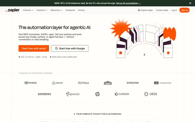
Preview image. Unlock full-res
Warm parchment paper, gently lit.
Color palette
Primary CTA buttons, active navigation indicators, key icons – a vivid beacon against the muted background, demanding attention for critical actions.
Google branding elements – appears only in specific integration iconography, not a general semantic color.
Google branding elements – appears only in specific integration iconography.
Google branding elements – appears only in specific integration iconography.
Google branding elements – appears only in specific integration iconography.
Page backgrounds, card surfaces, primary text on dark elements – this is the foundational canvas, providing a soft, almost tactile base.
Primary text, deep shadows, dark navigation elements – the dominant dark color, offering high contrast and a slightly desaturated feel, preventing harshness.
Tertiary text, less prominent UI elements – further desaturated for lighter informational text.
Light borders, dividers, subtle background textures – its near-gray quality blends with a hint of warmth.
Alternate background sections, subtle surface differentiation – provides visual breaks without stark contrast.
Typography
- Weights
- 300, 400, 500, 600, 700
- Sizes
- 12px, 13px, 14px, 15px, 16px, 18px, 20px, 24px, 28px, 32px, 36px, 48px, 160px
- Line height
- 0.9, 1, 1.03, 1.04, 1.14, 1.2, 1.25, 1.33, 1.43, 1.5, 1.54, 1.71, 1.72, 2.07
- Letter spacing
- -0.0280em (for large sizes), -0.0200em, -0.0180em, -0.0100em, 0.0360em, 0.0420em
- Fallback
- system-ui, sans-serif
Used for all general body text, numerical data, navigation items, and buttons. Its wide range of weights and sizes supports dense information display and provides clarity across all UI elements.
- Weights
- 500, 600
- Sizes
- 14px, 24px, 30px, 40px, 56px, 80px
- Line height
- 0.9, 1, 1.1
- Letter spacing
- 0.0200em, 0.0330em, 0.0420em, 0.0710em
- Fallback
- serif
Primary display font for navigation elements and secondary headlines. Its broad, open counters and slight geometric touch lend a modern yet friendly character, signaling key structural information without being overly formal.
- Weights
- 250, 300
- Sizes
- 40px, 48px
- Line height
- 1.08, 1.2
- Letter spacing
- -0.0400em
- Fallback
- serif
Exclusively used for prominent page headlines. The extremely light weights (250, 300) combined with negative letter spacing create an elegant, almost whispered authority. This deliberate subtlety differentiates it from typical bold headlines, giving a sophisticated, understated feel to key statements.
Spacing & shape
Components
Filled Ember Orange button with Parchment White text, 4px border-radius. Padding: 12px vertical, 24px horizontal. Text is Inter 600.
Transparent background with Slate Gray text and a 1px Slate Gray border, 0px border-radius. Padding: 12px vertical, 16px horizontal. Text is Inter 400.
Transparent background with Ink Black text. No explicit border, 0px border-radius. Padding: 12px. Text is Degular Display 500.
Parchment White background with #0000EE blue text, 5px border-radius. Border is Stone Taupe. Padding: 20-24px vertical, 32px horizontal. Text is Inter 600.
Parchment White background, 4px border-radius, no shadow. Padding: 6px.
Parchment White background, Ink Black text, a 1px Ink Black border, 0px border-radius. No explicit padding mentioned in data but assumed to be present.
Dark background (#201515) with Parchment White text, 0px border-radius. Border is Slate Gray. Used for site-wide announcements at the top of the page.
Transparent background, 0px border-radius, no shadow, no padding explicit. Used for wrapping grid or list items without adding visual weight.
Guidelines
- Prioritize Ember Orange (#ff4f00) for all primary calls to action to ensure consistent visual hierarchy and actionability.
- Use Parchment White (#fffefb) as the dominant background, ensuring visual lightness and breathability across all content.
- Apply GT Alpina (weights 250, 300, letter-spacing -0.0400em) exclusively for main page headlines to achieve an understated, sophisticated impact.
- Employ a 4px border-radius for interactive elements like buttons and cards, creating a consistent, subtly rounded aesthetic.
- Maintain a clear contrast ratio by using Ink Black (#201515) for main body text against Parchment White (#fffefb) backgrounds.
- Utilize the 12px vertical and 24px horizontal padding for primary buttons to ensure a comfortable tap target and visual prominence.
- Avoid using highly saturated colors other than Ember Orange or Google brand accents, to preserve the system's muted aesthetic.
- Do not introduce strong drop shadows; rely on background color changes or subtle borders for element separation.
- Refrain from using GT Alpina for body text or navigation; its delicate weights are reserved for high-impact headlines only.
- Do not deviate from the 4px or 0px border-radius for core interactive components; other radii are for specific functional exceptions.
- Avoid tight line spacing for body text; use Inter's default line heights (e.g., 1.5 for 16px) for optimal readability.
- Do not use generic system fonts when custom fonts are specified; Degular Display and GT Alpina are critical for brand identity.
About this system
ShowHide
This design system prioritizes a muted, approachable aesthetic with a core palette centered around a soft, almost 'parchment' white and black. Accents of vivid orange provide directional guidance and visual energy without overwhelming the understated neutrals. The use of custom typefaces at distinct weights lends a sophisticated, editorial feel to headlines, counterbalancing the otherwise utilitarian Inter for body copy. The overall effect is one of quiet efficiency, welcoming users with soft tones and clear hierarchies.
The page model is primarily max-width contained, with a centered content area on a Parchment White background, giving ample whitespace on the margins. The hero section features a centered headline and CTA over the Parchment White background, paired with a prominent abstract 3D graphic. Section rhythm is managed through consistent vertical spacing (large `sectionGap` likely 48-80px), occasionally punctuated by a subtle background color change to Soft Off-White for visual breaks. Content is often arranged in a split-layout (text-left/image-right or vice versa) or stacked, centered blocks. There's clear usage of 3-column card grids for feature showcases, maintaining consistent internal padding and radii. The navigation is a sticky top bar with a logo, left-aligned standard dropdowns, and right-aligned action buttons.
The visual language for imagery is a mix of abstract 3D renderings and contained product screenshots. Abstract graphics feature organic, almost volumetric shapes in desaturated tones with Ember Orange accents, often appearing to 'flow' or 'connect' as a metaphor for automation, sometimes with a subtle rough texture. Product screenshots are typically tightly cropped and displayed within a contained UI frame (like a browser window), focusing on specific workflows or features rather than a full product interface. There's no use of lifestyle photography or raw edge images; all visuals are either conceptual or explanatory, contributing to a sense of sophisticated, technical utility. Icons are primarily monochromatic outlines contrasting with the background, with occasional filled brand-colored icons for Google-related services.
Reminiscent of Airtable, Notion, Wrike, Asana.
# Zapier — Style Reference
> Warm parchment paper, gently lit.

**Theme:** light

**Site:** https://zapier.com

This design system prioritizes a muted, approachable aesthetic with a core palette centered around a soft, almost 'parchment' white and black. Accents of vivid orange provide directional guidance and visual energy without overwhelming the understated neutrals. The use of custom typefaces at distinct weights lends a sophisticated, editorial feel to headlines, counterbalancing the otherwise utilitarian Inter for body copy. The overall effect is one of quiet efficiency, welcoming users with soft tones and clear hierarchies.

## Tokens — Colors

| Name | Value | Token | Role |
|------|------|------|------|
| Ember Orange | `#ff4f00` | `--color-ember-orange` | Primary CTA buttons, active navigation indicators, key icons – a vivid beacon against the muted background, demanding attention for critical actions. |
| Google Red | `#ea4335` | `--color-google-red` | Google branding elements – appears only in specific integration iconography, not a general semantic color. |
| Google Green | `#34a853` | `--color-google-green` | Google branding elements – appears only in specific integration iconography. |
| Google Blue | `#4285f4` | `--color-google-blue` | Google branding elements – appears only in specific integration iconography. |
| Google Yellow | `#fbbc05` | `--color-google-yellow` | Google branding elements – appears only in specific integration iconography. |
| Parchment White | `#fffefb` | `--color-parchment-white` | Page backgrounds, card surfaces, primary text on dark elements – this is the foundational canvas, providing a soft, almost tactile base. |
| Ink Black | `#201515` | `--color-ink-black` | Primary text, deep shadows, dark navigation elements – the dominant dark color, offering high contrast and a slightly desaturated feel, preventing harshness. |
| Ash Gray | `#413735` | `--color-ash-gray` | Tertiary text, less prominent UI elements – further desaturated for lighter informational text. |
| Stone Taupe | `#c5c0b1` | `--color-stone-taupe` | Light borders, dividers, subtle background textures – its near-gray quality blends with a hint of warmth. |
| Soft Off-White | `#f8f4f0` | `--color-soft-off-white` | Alternate background sections, subtle surface differentiation – provides visual breaks without stark contrast. |

## Tokens — Typography

### Inter
- **Substitute:** system-ui, sans-serif
- **Weights:** 300, 400, 500, 600, 700
- **Sizes:** 12px, 13px, 14px, 15px, 16px, 18px, 20px, 24px, 28px, 32px, 36px, 48px, 160px
- **Line height:** 0.9, 1, 1.03, 1.04, 1.14, 1.2, 1.25, 1.33, 1.43, 1.5, 1.54, 1.71, 1.72, 2.07
- **Letter spacing:** -0.0280em (for large sizes), -0.0200em, -0.0180em, -0.0100em, 0.0360em, 0.0420em
- **Role:** Used for all general body text, numerical data, navigation items, and buttons. Its wide range of weights and sizes supports dense information display and provides clarity across all UI elements.

### Degular Display
- **Substitute:** serif
- **Weights:** 500, 600
- **Sizes:** 14px, 24px, 30px, 40px, 56px, 80px
- **Line height:** 0.9, 1, 1.1
- **Letter spacing:** 0.0200em, 0.0330em, 0.0420em, 0.0710em
- **Role:** Primary display font for navigation elements and secondary headlines. Its broad, open counters and slight geometric touch lend a modern yet friendly character, signaling key structural information without being overly formal.

### GT Alpina
- **Substitute:** serif
- **Weights:** 250, 300
- **Sizes:** 40px, 48px
- **Line height:** 1.08, 1.2
- **Letter spacing:** -0.0400em
- **Role:** Exclusively used for prominent page headlines. The extremely light weights (250, 300) combined with negative letter spacing create an elegant, almost whispered authority. This deliberate subtlety differentiates it from typical bold headlines, giving a sophisticated, understated feel to key statements.

## Tokens — Type Scale

Perfect Fourth (1.333) from 16px base.

| Role | Size | Line height | Letter spacing |
|------|------|------|------|
| caption | 12px | 1.71 | — |
| body | 16px | 1.5 | — |
| subheading | 24px | 1.25 | 0.33px |
| heading | 30px | 1.1 | — |
| heading-lg | 40px | 1.2 | -1.6px |
| display | 56px | 1 | 1.68px |

## Tokens — Spacing

- **Section gap:** 48-80px
- **Card padding:** 6px
- **Element gap:** 4-16px

## Tokens — Radius

- **Default:** 4px
- **Buttons:** 4px
- **input:** 0px
- **pill:** 20px
- **soft:** 8px

## Layout

The page model is primarily max-width contained, with a centered content area on a Parchment White background, giving ample whitespace on the margins. The hero section features a centered headline and CTA over the Parchment White background, paired with a prominent abstract 3D graphic. Section rhythm is managed through consistent vertical spacing (large `sectionGap` likely 48-80px), occasionally punctuated by a subtle background color change to Soft Off-White for visual breaks. Content is often arranged in a split-layout (text-left/image-right or vice versa) or stacked, centered blocks. There's clear usage of 3-column card grids for feature showcases, maintaining consistent internal padding and radii. The navigation is a sticky top bar with a logo, left-aligned standard dropdowns, and right-aligned action buttons.

## Imagery

The visual language for imagery is a mix of abstract 3D renderings and contained product screenshots. Abstract graphics feature organic, almost volumetric shapes in desaturated tones with Ember Orange accents, often appearing to 'flow' or 'connect' as a metaphor for automation, sometimes with a subtle rough texture. Product screenshots are typically tightly cropped and displayed within a contained UI frame (like a browser window), focusing on specific workflows or features rather than a full product interface. There's no use of lifestyle photography or raw edge images; all visuals are either conceptual or explanatory, contributing to a sense of sophisticated, technical utility. Icons are primarily monochromatic outlines contrasting with the background, with occasional filled brand-colored icons for Google-related services.

## Components

### CTA Button Group

### AI Template Cards

### Banner Notification + Badge Pills

### Primary Action Button
*Call to action*

Filled Ember Orange button with Parchment White text, 4px border-radius. Padding: 12px vertical, 24px horizontal. Text is Inter 600.

### Secondary Ghost Button
*Secondary action*

Transparent background with Slate Gray text and a 1px Slate Gray border, 0px border-radius. Padding: 12px vertical, 16px horizontal. Text is Inter 400.

### Navigation Button
*Navigation item*

Transparent background with Ink Black text. No explicit border, 0px border-radius. Padding: 12px. Text is Degular Display 500.

### Google Auth Button
*Authentication*

Parchment White background with #0000EE blue text, 5px border-radius. Border is Stone Taupe. Padding: 20-24px vertical, 32px horizontal. Text is Inter 600.

### Standard Card
*Content grouping*

Parchment White background, 4px border-radius, no shadow. Padding: 6px.

### Input Field
*User input*

Parchment White background, Ink Black text, a 1px Ink Black border, 0px border-radius. No explicit padding mentioned in data but assumed to be present.

### Banner Notification
*Announcements*

Dark background (#201515) with Parchment White text, 0px border-radius. Border is Slate Gray. Used for site-wide announcements at the top of the page.

### Utility Grid Card
*UI element wrapper*

Transparent background, 0px border-radius, no shadow, no padding explicit. Used for wrapping grid or list items without adding visual weight.

## Guidelines

### Do

- Prioritize Ember Orange (#ff4f00) for all primary calls to action to ensure consistent visual hierarchy and actionability.
- Use Parchment White (#fffefb) as the dominant background, ensuring visual lightness and breathability across all content.
- Apply GT Alpina (weights 250, 300, letter-spacing -0.0400em) exclusively for main page headlines to achieve an understated, sophisticated impact.
- Employ a 4px border-radius for interactive elements like buttons and cards, creating a consistent, subtly rounded aesthetic.
- Maintain a clear contrast ratio by using Ink Black (#201515) for main body text against Parchment White (#fffefb) backgrounds.
- Utilize the 12px vertical and 24px horizontal padding for primary buttons to ensure a comfortable tap target and visual prominence.

### Don't

- Avoid using highly saturated colors other than Ember Orange or Google brand accents, to preserve the system's muted aesthetic.
- Do not introduce strong drop shadows; rely on background color changes or subtle borders for element separation.
- Refrain from using GT Alpina for body text or navigation; its delicate weights are reserved for high-impact headlines only.
- Do not deviate from the 4px or 0px border-radius for core interactive components; other radii are for specific functional exceptions.
- Avoid tight line spacing for body text; use Inter's default line heights (e.g., 1.5 for 16px) for optimal readability.
- Do not use generic system fonts when custom fonts are specified; Degular Display and GT Alpina are critical for brand identity.

## Agent Prompt Guide

**Quick Color Reference:**
- Text: #201515 (Ink Black)
- Background: #fffefb (Parchment White)
- CTA: #ff4f00 (Ember Orange)
- Border: #c5c0b1 (Stone Taupe)
- Accent: #ff4f00 (Ember Orange)

**Example Component Prompts:**
1.  Create a Hero section: Parchment White background. Headline 'The automation layer for agentic AI' in GT Alpina 250, 48px, lineHeight 1.08, letterSpacing -1.92px, color Ink Black. Subtext 'One MCP connection. 8,000+ apps.' in Inter 400, 18px, lineHeight 1.5, color Slate Gray. Primary CTA Button: 'Start free with email', Ember Orange background, Parchment White text, 4px radius, 12px vertical 24px horizontal padding. Secondary CTA Button: 'Start free with Google', Parchment White background, #0000EE text, 5px radius, 24px vertical 32px horizontal padding.
2.  Design a Feature Card: Parchment White background, 4px border-radius, no shadow, 6px padding. Title 'AI Workflows' in Inter 600, 20px, Ink Black. Description 'Automate advanced workflows...' in Inter 400, 16px, Slate Gray. Include a small icon aligned top-left. Text for heading should have a 12px bottom margin.
3.  Build a Global Navigation Bar: Ink Black background for the top info banner (#201515, 0px border-radius, Parchment White text, Inter 400, 14px, 12px padding). Main nav on Parchment White background. Logo on left. Navigation links like 'Products', 'Solutions' in Degular Display 500, 16px, Ink Black, 12px padding. Right-aligned 'Log in' link in Ink Black and a 'Sign up' Primary Action Button: Ember Orange background, Parchment White text, 4px radius, 12px vertical 24px horizontal padding.
More like this





Keep what you find
A free account saves references to boards and can send you a weekly email of picks based on what you save.
To see every result, go Pro.