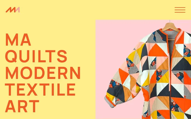
Preview image. Unlock full-res
Joyful Quilted Canvas
Color palette
Orange accent for outlined action borders, linked labels, and lightweight interactive emphasis. Do not promote it to the primary CTA color
Section backgrounds and promotional blocks, providing a soft but clear distinction from white canvases
Footer text, secondary links, and occasional outlined elements, offering deep contrast to light backgrounds
Page and primary surface backgrounds
Primary body text, decorative SVG fills
Secondary text in navigation and supporting content, decorative borders for images
Decorative SVG fills, light background shading
Typography
- Weights
- 200, 400, 700
- Sizes
- 23px, 29px, 30px, 36px, 60px, 68px, 72px, 126px
- Line height
- 1, 1.2, 1.4, 2, 2.4
- Letter spacing
- 0.0600em, 0.1200em
- Fallback
- Inter
Used for all headings, buttons, and primary content. The wide range of weights and sizes with precise letter-spacing controls the visual impact, especially the large, tracked headlines.
- Weights
- 400, 700
- Sizes
- 14px, 18px, 30px
- Line height
- 1.6, 2
- Letter spacing
- normal
- Fallback
- Space Mono
Used for body text, meta-information, and code-like elements where a monospace font conveys technical detail or a distinct voice.
Spacing & shape
Components
Text: Accent Orange, Manrope Bold, 23px. Background: transparent. Border: Accent Orange, 1px solid, 66px radius. Padding: 9px vertical, 46.08px horizontal.
Font: Manrope, weight 700. Size: 126px. Color: Accent Orange. Letter spacing: 0.06em.
Font: Manrope, weight 700. Size: 60px. Color: Accent Orange. Letter spacing: 0.12em. Margin bottom: 35px.
Font: Manrope, weight 700. Size: 23px. Color: Accent Orange. Underlined on hover.
Font: Roboto Mono, weight 400. Size: 14px. Color: Secondary Text Gray. Dashed border for visual separation.
Guidelines
- Use Accent Orange (#f15a24) exclusively for primary interactive elements, major headings, and brand accents.
- Maintain a clear visual hierarchy by employing Manrope for all headings with appropriate letter-spacing, and Roboto Mono for body and supporting text.
- Apply a 66px border-radius to all buttons for a consistent soft, pill-like appearance.
- Implement dashed borders (e.g., 4px dashed) for subtle visual divisions or decorative elements, particularly around image cards.
- Utilize Canvas White (#ffffff) as the dominant background, balanced with Canary Yellow (#ffed8c) for distinct section breaks or focused content blocks.
- Ensure generous spacing around all components; an `elementGap` of 14px is a good default.
- Adopt an uppercase style for all significant headings using Manrope to reinforce the system's bold typographic identity.
- Do not introduce new primary action colors; Accent Orange (#f15a24) serves this role through its outlined usage.
- Avoid using solid background fills for buttons; prefer the outlined style with Accent Orange borders.
- Do not deviate from the Manrope and Roboto Mono font families for text content.
- Avoid tight spacing between elements; maintain adequate `elementGap` and `cardPadding` to prevent a cramped appearance.
- Do not use shadows for elevation; the design system relies on color blocks, borders, and spacing for visual hierarchy instead.
- Do not use generic system fonts; always specify Manrope or Roboto Mono.
- Avoid using full-bleed imagery without surrounding white space; images should feel contained within the layout.
About this system
ShowHide
MA Quilts employs a vibrant, handcrafted aesthetic with a focus on bold typography and a playful, primary color palette. The design balances generous white space with striking color blocks and outlined interactive elements. Typography is confident and uppercase for headlines, creating a distinct visual voice, while subtle dashed borders and high radius buttons add a touch of playful warmth.
The page uses a maximum-width contained layout, with content centered. The hero section is characterized by a two-column split, with a large, bold headline on the left against a Canary Yellow background and a compelling product image on the right. Subsequent sections feature alternating text and visual content, with a clear vertical rhythm. Content is arranged in flexible grids for product displays (3-4 columns) and blog posts (3 columns). The navigation is a minimalist top bar with text links, reinforcing the clean aesthetic.
The site heavily features product photography of textile art (quilts and quilted coats). These images are tightly cropped, showcasing patterns and textures, often against solid, contrasting backgrounds like pale pink. The photography is clean, well-lit, and product-focused, with no lifestyle elements. Icons are minimal, represented by the custom 'MA' logo in the header, suggesting a clean, graphic approach. The overall density is balanced, allowing the product visuals to speak for themselves within a spacious layout.
Reminiscent of Etsy, Blockshop Textiles, Studio Arhoj, Marimekko.
# MA Quilts — Style Reference
> Joyful Quilted Canvas

**Theme:** light

**Site:** https://maquilts.com

MA Quilts employs a vibrant, handcrafted aesthetic with a focus on bold typography and a playful, primary color palette. The design balances generous white space with striking color blocks and outlined interactive elements. Typography is confident and uppercase for headlines, creating a distinct visual voice, while subtle dashed borders and high radius buttons add a touch of playful warmth.

## Tokens — Colors

| Name | Value | Token | Role |
|------|------|------|------|
| Accent Orange | `#f15a24` | `--color-accent-orange` | Orange accent for outlined action borders, linked labels, and lightweight interactive emphasis. Do not promote it to the primary CTA color |
| Canary Yellow | `#ffed8c` | `--color-canary-yellow` | Section backgrounds and promotional blocks, providing a soft but clear distinction from white canvases |
| Midnight Ink | `#050133` | `--color-midnight-ink` | Footer text, secondary links, and occasional outlined elements, offering deep contrast to light backgrounds |
| Canvas White | `#ffffff` | `--color-canvas-white` | Page and primary surface backgrounds |
| Text Black | `#000000` | `--color-text-black` | Primary body text, decorative SVG fills |
| Secondary Text Gray | `#333333` | `--color-secondary-text-gray` | Secondary text in navigation and supporting content, decorative borders for images |
| Utility Gray | `#cce1e2` | `--color-utility-gray` | Decorative SVG fills, light background shading |

## Tokens — Typography

### Manrope
- **Substitute:** Inter
- **Weights:** 200, 400, 700
- **Sizes:** 23px, 29px, 30px, 36px, 60px, 68px, 72px, 126px
- **Line height:** 1, 1.2, 1.4, 2, 2.4
- **Letter spacing:** 0.0600em, 0.1200em
- **Role:** Used for all headings, buttons, and primary content. The wide range of weights and sizes with precise letter-spacing controls the visual impact, especially the large, tracked headlines.

### Roboto Mono
- **Substitute:** Space Mono
- **Weights:** 400, 700
- **Sizes:** 14px, 18px, 30px
- **Line height:** 1.6, 2
- **Letter spacing:** normal
- **Role:** Used for body text, meta-information, and code-like elements where a monospace font conveys technical detail or a distinct voice.

## Tokens — Type Scale

Augmented Fourth (1.414) from 18px base.

| Role | Size | Line height | Letter spacing |
|------|------|------|------|
| caption | 14px | 1.6 | — |
| body | 18px | 2 | — |
| button | 23px | 1.2 | 0.06em |
| subheading | 29px | 1.2 | — |
| heading | 36px | 1.2 | — |
| heading-lg | 60px | 1.2 | 0.12px |
| display | 126px | 1 | 0.06em |

## Tokens — Spacing

- **Section gap:** 54px
- **Card padding:** 46px
- **Element gap:** 14px

## Tokens — Radius

- **Buttons:** 66px

## Layout

The page uses a maximum-width contained layout, with content centered. The hero section is characterized by a two-column split, with a large, bold headline on the left against a Canary Yellow background and a compelling product image on the right. Subsequent sections feature alternating text and visual content, with a clear vertical rhythm. Content is arranged in flexible grids for product displays (3-4 columns) and blog posts (3 columns). The navigation is a minimalist top bar with text links, reinforcing the clean aesthetic.

## Imagery

The site heavily features product photography of textile art (quilts and quilted coats). These images are tightly cropped, showcasing patterns and textures, often against solid, contrasting backgrounds like pale pink. The photography is clean, well-lit, and product-focused, with no lifestyle elements. Icons are minimal, represented by the custom 'MA' logo in the header, suggesting a clean, graphic approach. The overall density is balanced, allowing the product visuals to speak for themselves within a spacious layout.

## Components

### Primary Outlined Button
*Call to action button*

Text: Accent Orange, Manrope Bold, 23px. Background: transparent. Border: Accent Orange, 1px solid, 66px radius. Padding: 9px vertical, 46.08px horizontal.

### Hero Headline
*Largest display text*

Font: Manrope, weight 700. Size: 126px. Color: Accent Orange. Letter spacing: 0.06em.

### Section Headline
*Major section titles*

Font: Manrope, weight 700. Size: 60px. Color: Accent Orange. Letter spacing: 0.12em. Margin bottom: 35px.

### Nav Link
*Main navigation item*

Font: Manrope, weight 700. Size: 23px. Color: Accent Orange. Underlined on hover.

### Image Card Footer
*Caption for product or blog post image*

Font: Roboto Mono, weight 400. Size: 14px. Color: Secondary Text Gray. Dashed border for visual separation.

## Guidelines

### Do

- Use Accent Orange (#f15a24) exclusively for primary interactive elements, major headings, and brand accents.
- Maintain a clear visual hierarchy by employing Manrope for all headings with appropriate letter-spacing, and Roboto Mono for body and supporting text.
- Apply a 66px border-radius to all buttons for a consistent soft, pill-like appearance.
- Implement dashed borders (e.g., 4px dashed) for subtle visual divisions or decorative elements, particularly around image cards.
- Utilize Canvas White (#ffffff) as the dominant background, balanced with Canary Yellow (#ffed8c) for distinct section breaks or focused content blocks.
- Ensure generous spacing around all components; an `elementGap` of 14px is a good default.
- Adopt an uppercase style for all significant headings using Manrope to reinforce the system's bold typographic identity.

### Don't

- Do not introduce new primary action colors; Accent Orange (#f15a24) serves this role through its outlined usage.
- Avoid using solid background fills for buttons; prefer the outlined style with Accent Orange borders.
- Do not deviate from the Manrope and Roboto Mono font families for text content.
- Avoid tight spacing between elements; maintain adequate `elementGap` and `cardPadding` to prevent a cramped appearance.
- Do not use shadows for elevation; the design system relies on color blocks, borders, and spacing for visual hierarchy instead.
- Do not use generic system fonts; always specify Manrope or Roboto Mono.
- Avoid using full-bleed imagery without surrounding white space; images should feel contained within the layout.

## Agent Prompt Guide

Quick Color Reference:
text: #000000
background: #ffffff
border: #f15a24
accent: #f15a24
primary action: #f15a24 (outlined action border)

Example Component Prompts:
1. Create a header navigation link: Font Manrope, weight 700, 23px, Accent Orange (#f15a24) color, no background, no border.
2. Create a primary call-to-action button: Text 'See all quilts', Manrope, weight 700, 23px, Accent Orange (#f15a24) color. Background transparent. Border 1px solid Accent Orange (#f15a24), 66px radius. Padding 9px vertical, 46.08px horizontal.
3. Create a section headline: Text 'Bold And Geometric', Manrope, weight 700, 60px, Accent Orange (#f15a24) color, letter-spacing 0.12em, margin-bottom 35px.
More like this









Keep what you find
A free account saves references to boards and can send you a weekly email of picks based on what you save.
To see every result, go Pro.