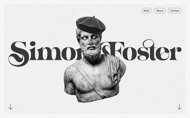
Preview image. Unlock full-res
Sculptural Monochrome Canvas
Color palette
Accent backgrounds for specific cards or callouts, drawing immediate attention
Page backgrounds, card surfaces, primary text on dark backgrounds
Primary text, outline button borders, primary content on light backgrounds
Decorative borders or subtle dividers
Strong accents, footer borders, potential secondary text or icons
Typography
- Weights
- 400
- Sizes
- 16px, 19px, 20px, 24px, 26px, 55px, 61px, 73px, 92px
- Line height
- 1.04, 1.1, 1.18, 1.19, 1.42, 1.49, 1.56, 2.75
- Letter spacing
- 0.0050em
- Fallback
- Inter
The sole typeface, used for all content from headlines to body text; its clean sans-serif quality provides a modern counterpoint to the site's classical imagery, maintaining clarity across varied scales.
Spacing & shape
Components
Transparent background with a Charcoal Text (#393737) 1px border and text. Rounded with a 48px radius. Padding is 16px vertical, 32px horizontal. Promotes interaction without visual clutter.
Transparent background, no border, no shadow, with 0px corner radius. Padding of 0px top, 32px right, 32px bottom, 32px left for text content.
Transparent background with a 20px corner radius, no border or shadow. Content takes full width and height with no internal padding.
Solid background of Charcoal Text (#393737) or Canvas White (#ffffff) with a 20px corner radius, no border or shadow. Content takes full width and height with no internal padding.
Background color of Highlight Yellow (#ffed8b). No border, no shadow, with 0px corner radius. Used for single instances to draw attention.
Guidelines
- Use Charcoal Text (#393737) for all primary body and heading text.
- Apply Canvas White (#ffffff) as the dominant page and surface background color.
- Implement a 48px border-radius for all interactive elements like buttons and navigation items.
- Maintain a spacious rhythm with 43px vertical gaps between major content sections.
- Utilize ghost buttons with `transparent` background and Charcoal Text (#393737) outline for all calls to action.
- Employ a 20px border-radius for all non-interactive card surfaces.
- Ensure all typography uses 'Neue Montreal Regular' with its specified weights and letter-spacing of 0.0050em across all sizes.
- Avoid solid, filled CTA buttons; interactions should be ghosted or subtly outlined.
- Do not introduce new typefaces; 'Neue Montreal Regular' is the only approved font.
- Refrain from using hard shadows; the design relies on subtle texture and contrast for depth.
- Do not deviate from the specified spacing units; maintain 6px for element gaps and 32px for card internal padding.
- Avoid excessive use of the Highlight Yellow (#ffed8b); reserve it for impactful, single-instance accents.
About this system
ShowHide
Simon Foster's portfolio design emphasizes an artistic, editorial feel through high-contrast monochrome typography and striking, playful imagery. The layout prioritizes ample whitespace and subtle textural backgrounds, allowing the curated content to breathe. Interactions are minimal and ghosted, retaining a refined, understated aesthetic that directs focus to the work rather than the interface itself.
The page maintains a centered max-width content area for text and most sections, but the hero image can be full-bleed. The hero features a large, dramatic image of a classical bust with a large, decorative brand name centered over it, setting a distinct artistic tone. Subsequent sections follow a consistent vertical rhythm with ample whitespace created by section gaps. Content is arranged in alternating image-left/text-right or text-left/image-right patterns, often using a 2-column grid. A 3-column card grid is used for portfolio items. The navigation is a minimalist top-right cluster of ghost buttons, while a prominent scroll-down indicator is centered at the bottom of the hero.
The site uses a striking combination of classical sculpture, contemporary product screenshots, and playful, minimalist single-color illustrations. Photography (for products) is high-key with tight crops, showcasing the object against neutral or slight pastel backgrounds, indicating a focus on product detail rather than lifestyle. Illustrations are abstract, flat, and often monochromatic or use a single accent color (like pink), treated with organic shapes, adding a whimsical, artistic touch. Icons are minimal, outlined, and utilize the primary text color. Imagery plays a dual role: product showcasing and atmospheric decoration, maintaining a text-dominant, high-impact visual density.
Reminiscent of Awwwards-style portfolio sites, Manylabs.ai, Garden.io, Braid.io.
# Simon Foster — Style Reference
> Sculptural Monochrome Canvas

**Theme:** light

**Site:** https://www.simonfosters.website

Simon Foster's portfolio design emphasizes an artistic, editorial feel through high-contrast monochrome typography and striking, playful imagery. The layout prioritizes ample whitespace and subtle textural backgrounds, allowing the curated content to breathe. Interactions are minimal and ghosted, retaining a refined, understated aesthetic that directs focus to the work rather than the interface itself.

## Tokens — Colors

| Name | Value | Token | Role |
|------|------|------|------|
| Highlight Yellow | `#ffed8b` | `--color-highlight-yellow` | Accent backgrounds for specific cards or callouts, drawing immediate attention |
| Canvas White | `#ffffff` | `--color-canvas-white` | Page backgrounds, card surfaces, primary text on dark backgrounds |
| Charcoal Text | `#393737` | `--color-charcoal-text` | Primary text, outline button borders, primary content on light backgrounds |
| Subtle Gray | `#e7e5e5` | `--color-subtle-gray` | Decorative borders or subtle dividers |
| Pitch Black | `#000000` | `--color-pitch-black` | Strong accents, footer borders, potential secondary text or icons |

## Tokens — Typography

### Neue Montreal Regular
- **Substitute:** Inter
- **Weights:** 400
- **Sizes:** 16px, 19px, 20px, 24px, 26px, 55px, 61px, 73px, 92px
- **Line height:** 1.04, 1.1, 1.18, 1.19, 1.42, 1.49, 1.56, 2.75
- **Letter spacing:** 0.0050em
- **Role:** The sole typeface, used for all content from headlines to body text; its clean sans-serif quality provides a modern counterpoint to the site's classical imagery, maintaining clarity across varied scales.

## Tokens — Type Scale

| Role | Size | Line height | Letter spacing |
|------|------|------|------|
| body | 16px | 1.56 | 0.005em |
| heading-sm | 19px | 1.49 | 0.005em |
| heading | 24px | 1.42 | 0.005em |
| heading-lg | 55px | 1.19 | 0.005em |
| display | 92px | 1.04 | 0.005em |

## Tokens — Spacing

- **Section gap:** 43px
- **Card padding:** 32px
- **Element gap:** 6px

## Tokens — Radius

- **Buttons:** 48px
- **Cards:** 20px
- **navigation:** 48px

## Layout

The page maintains a centered max-width content area for text and most sections, but the hero image can be full-bleed. The hero features a large, dramatic image of a classical bust with a large, decorative brand name centered over it, setting a distinct artistic tone. Subsequent sections follow a consistent vertical rhythm with ample whitespace created by section gaps. Content is arranged in alternating image-left/text-right or text-left/image-right patterns, often using a 2-column grid. A 3-column card grid is used for portfolio items. The navigation is a minimalist top-right cluster of ghost buttons, while a prominent scroll-down indicator is centered at the bottom of the hero.

## Imagery

The site uses a striking combination of classical sculpture, contemporary product screenshots, and playful, minimalist single-color illustrations. Photography (for products) is high-key with tight crops, showcasing the object against neutral or slight pastel backgrounds, indicating a focus on product detail rather than lifestyle. Illustrations are abstract, flat, and often monochromatic or use a single accent color (like pink), treated with organic shapes, adding a whimsical, artistic touch. Icons are minimal, outlined, and utilize the primary text color. Imagery plays a dual role: product showcasing and atmospheric decoration, maintaining a text-dominant, high-impact visual density.

## Components

### Ghost Outline Button
*Call to action, navigation items*

Transparent background with a Charcoal Text (#393737) 1px border and text. Rounded with a 48px radius. Padding is 16px vertical, 32px horizontal. Promotes interaction without visual clutter.

### Work Showcase Card
*Portfolio item display*

Transparent background, no border, no shadow, with 0px corner radius. Padding of 0px top, 32px right, 32px bottom, 32px left for text content.

### Featured Project Card
*Highlighting specific projects*

Transparent background with a 20px corner radius, no border or shadow. Content takes full width and height with no internal padding.

### Solid Background Card
*Alternative background for cards*

Solid background of Charcoal Text (#393737) or Canvas White (#ffffff) with a 20px corner radius, no border or shadow. Content takes full width and height with no internal padding.

### Highlight Card
*Prominent information blocks*

Background color of Highlight Yellow (#ffed8b). No border, no shadow, with 0px corner radius. Used for single instances to draw attention.

## Guidelines

### Do

- Use Charcoal Text (#393737) for all primary body and heading text.
- Apply Canvas White (#ffffff) as the dominant page and surface background color.
- Implement a 48px border-radius for all interactive elements like buttons and navigation items.
- Maintain a spacious rhythm with 43px vertical gaps between major content sections.
- Utilize ghost buttons with `transparent` background and Charcoal Text (#393737) outline for all calls to action.
- Employ a 20px border-radius for all non-interactive card surfaces.
- Ensure all typography uses 'Neue Montreal Regular' with its specified weights and letter-spacing of 0.0050em across all sizes.

### Don't

- Avoid solid, filled CTA buttons; interactions should be ghosted or subtly outlined.
- Do not introduce new typefaces; 'Neue Montreal Regular' is the only approved font.
- Refrain from using hard shadows; the design relies on subtle texture and contrast for depth.
- Do not deviate from the specified spacing units; maintain 6px for element gaps and 32px for card internal padding.
- Avoid excessive use of the Highlight Yellow (#ffed8b); reserve it for impactful, single-instance accents.

## Agent Prompt Guide

Quick Color Reference:
text: #393737
background: #ffffff
border: #393737
accent: #ffed8b
primary action: no distinct CTA color

Example Component Prompts:
1. Create a ghost button styled for navigation: transparent background, #393737 text, #393737 1px border, 48px radius, 16px vertical padding, 32px horizontal padding, 'Neue Montreal Regular' font at 16px, 0.005em letter-spacing.
2. Design a portfolio card showing a project: transparent background, 20px radius, no border/shadow. Project title is 'Neue Montreal Regular' 24px, #393737, 0.005em letter-spacing. Description text is 'Neue Montreal Regular' 16px, #393737. The card padding for text content is 0px top, 32px right, 32px bottom, 32px left.
3. Implement a page section gap: vertical spacing of 43px between content blocks, maintaining a spacious layout.
4. Create a hero headline: 'Neue Montreal Regular' font, 92px size, #393737 color, 1.04 line height, 0.005em letter-spacing, centered on the page.
More like this









Keep what you find
A free account saves references to boards and can send you a weekly email of picks based on what you save.
To see every result, go Pro.