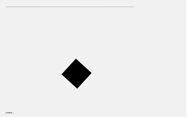
Preview image. Unlock full-res
Blueprint in Motion – a stark, interactive canvas where giant letterforms are the only dynamic elements.
Color palette
Primary page background, elevated card surfaces
Primary text color, bold headlines, core interactive elements like the central diamond
Secondary background, subtle dividers, supporting text
General body text, default text contrast on light backgrounds
Subtle card outlines, placeholder text
Typography
- Weights
- 400
- Sizes
- 10px, 14px, 31px, 86px, 264px
- Line height
- 1.1, 1.14, 1.21, 1.3, 1.62, 1.64, 1.7
- Letter spacing
- -0.0420em, -0.0380em, -0.0100em, -0.0070em, -0.0060em, -0.0020em
Primary display font for all headings and large interactive text elements. Its geometric structure and varying letter-spacing contribute to the architectural, dynamic feel of the site. Critical for large, animating text.
- Weights
- 400
- Sizes
- 16px
- Line height
- 1
- Letter spacing
- normal
- Fallback
- system-ui
Fallback and utilitarian text for smaller labels and descriptive copy, ensuring readability despite the highly stylized main display font.
Spacing & shape
Elevation
Components
Background is Canvas White (#ffffff). Features a subtle shadow: rgba(0, 0, 0, 0.24) 0px 1px 2px 0px. Border radius is 0px. Padding is not applied directly to the card itself (0px) but content layers within.
Text 'Loading...' uses custom_40538 font at 10px, Graphite Black (#010101).
Composed of individual letters or words using custom_40538 at sizes ranging from 31px up to 264px, with Graphite Black (#010101) or Charcoal Text (#282828). Features dynamic letter-spacing (e.g., -0.0420em) and animation capabilities.
Uses -apple-system (system-ui) font at 16px, Charcoal Text (#282828).
Guidelines
- Use Canvas White (#ffffff) for all primary page and card backgrounds to maintain a stark, clean canvas aesthetic.
- Apply Graphite Black (#010101) for all main headlines and significant text elements, emphasizing strong contrast.
- Utilize custom_40538 for all headings and large textual components, embracing its geometric forms and dynamic letter-spacing for visual impact.
- Employ a 0px border radius for all cards and containers to enforce a sharp, angular aesthetic.
- Introduce depth only through subtle box-shadows like rgba(0, 0, 0, 0.24) 0px 1px 2px 0px for cards, avoiding heavy or colored shadows.
- Prioritize text as the main visual and interactive element, especially large, animated letterforms.
- Maintain generous spacing, with section gaps of 40px and dynamic element spacing derived from the base unit of 4px.
- Do not use highly saturated or chromatic colors for any UI elements; maintain a strict monochrome palette.
- Avoid rounded corners on any primary UI components; the design language relies on sharp angles and geometric precision.
- Do not introduce complex gradients or background images; surfaces should be solid colors.
- Do not use heavy or numerous drop shadows, as subtle elevation is preferred.
- Avoid decorative icons or illustrations that are not integral to content; focus on typographic and geometric forms.
- Do not deviate from the distinct letter-spacing values provided for custom_40538, as they are crucial to its visual identity.
- Do not introduce highly varied font weights; stick to the specified 400 weight for custom_40538 and -apple-system.
About this system
ShowHide
Grids' visual style evokes the precision of an architectural drawing coming to life, with dynamic motion shaping static typography. The aesthetic is stark, relying on a monochrome palette and sharp geometric forms. Giant, highly tracked letterforms transform into interactive elements, giving the impression of blueprints being manipulated in real-time. Subtle shadows provide the only depth in an otherwise flat, canvas-like environment.
The page operates on a full-bleed model, without a fixed max-width, allowing elements to extend to the viewport edges. The hero section is dominated by large, interactive text elements and geometric shapes (e.g., the rotating diamond) appearing floating on the Canvas White background. Sections have a spacious rhythm, with alternating white and light gray backgrounds indicated by the 'Concrete Gray' and 'Canvas White' surfaces, creating visual breaks. Content is arranged with a strong emphasis on horizontal and vertical lines, reminiscent of a technical drawing grid, and features large, often animated, typography. The navigation appears to be a minimal top bar, possibly a single line indicating progress or sections, reinforcing the technical blueprint aesthetic. The overall density is spacious, giving elements ample room to breathe and animate.
The design predominantly uses typography as its core visual element, with a strong focus on large, animated letterforms. There are no traditional photographs, illustrations, or product screenshots. Icons are minimal, represented by simple geometric shapes (like the central rotating black diamond) or basic system icons. The visual language is purely abstract and interactive, using text and simple forms to convey meaning and create a dynamic experience. Imagery is effectively replaced by animated, oversized text that functions as both content and decorative element.
Reminiscent of Awwwards, Future Fonts, Locomotive, Bruno Simon's Portfolio.
# Grids — Style Reference
> Blueprint in Motion – a stark, interactive canvas where giant letterforms are the only dynamic elements.

**Theme:** light

**Site:** https://grids.obys.agency

Grids' visual style evokes the precision of an architectural drawing coming to life, with dynamic motion shaping static typography. The aesthetic is stark, relying on a monochrome palette and sharp geometric forms. Giant, highly tracked letterforms transform into interactive elements, giving the impression of blueprints being manipulated in real-time. Subtle shadows provide the only depth in an otherwise flat, canvas-like environment.

## Tokens — Colors

| Name | Value | Token | Role |
|------|------|------|------|
| Canvas White | `#ffffff` | `--color-canvas-white` | Primary page background, elevated card surfaces |
| Graphite Black | `#010101` | `--color-graphite-black` | Primary text color, bold headlines, core interactive elements like the central diamond |
| Concrete Gray | `#f1f1f1` | `--color-concrete-gray` | Secondary background, subtle dividers, supporting text |
| Charcoal Text | `#282828` | `--color-charcoal-text` | General body text, default text contrast on light backgrounds |
| Smoke Border | `#c2c2c2` | `--color-smoke-border` | Subtle card outlines, placeholder text |

## Tokens — Typography

### custom_40538
- **Weights:** 400
- **Sizes:** 10px, 14px, 31px, 86px, 264px
- **Line height:** 1.1, 1.14, 1.21, 1.3, 1.62, 1.64, 1.7
- **Letter spacing:** -0.0420em, -0.0380em, -0.0100em, -0.0070em, -0.0060em, -0.0020em
- **Role:** Primary display font for all headings and large interactive text elements. Its geometric structure and varying letter-spacing contribute to the architectural, dynamic feel of the site. Critical for large, animating text.

### -apple-system
- **Substitute:** system-ui
- **Weights:** 400
- **Sizes:** 16px
- **Line height:** 1
- **Letter spacing:** normal
- **Role:** Fallback and utilitarian text for smaller labels and descriptive copy, ensuring readability despite the highly stylized main display font.

## Tokens — Type Scale

| Role | Size | Line height | Letter spacing |
|------|------|------|------|
| caption | 10px | 1.7 | -0.42px |
| body-sm | 14px | 1.64 | -0.42px |
| body | 16px | 1 | — |
| subheading | 31px | 1.21 | -0.31px |
| heading | 86px | 1.14 | -3.27px |
| display | 264px | 1.1 | -10.56px |

## Tokens — Spacing

- **Section gap:** 40px
- **Card padding:** 0px
- **Element gap:** 7px

## Tokens — Radius

- **Cards:** 0px

## Tokens — Elevation

- **Card:** `rgba(0, 0, 0, 0.24) 0px 1px 2px 0px`

## Layout

The page operates on a full-bleed model, without a fixed max-width, allowing elements to extend to the viewport edges. The hero section is dominated by large, interactive text elements and geometric shapes (e.g., the rotating diamond) appearing floating on the Canvas White background. Sections have a spacious rhythm, with alternating white and light gray backgrounds indicated by the 'Concrete Gray' and 'Canvas White' surfaces, creating visual breaks. Content is arranged with a strong emphasis on horizontal and vertical lines, reminiscent of a technical drawing grid, and features large, often animated, typography. The navigation appears to be a minimal top bar, possibly a single line indicating progress or sections, reinforcing the technical blueprint aesthetic. The overall density is spacious, giving elements ample room to breathe and animate.

## Imagery

The design predominantly uses typography as its core visual element, with a strong focus on large, animated letterforms. There are no traditional photographs, illustrations, or product screenshots. Icons are minimal, represented by simple geometric shapes (like the central rotating black diamond) or basic system icons. The visual language is purely abstract and interactive, using text and simple forms to convey meaning and create a dynamic experience. Imagery is effectively replaced by animated, oversized text that functions as both content and decorative element.

## Components

### Standard Card
*Container for content, appearing as an overlay or distinct element.*

Background is Canvas White (#ffffff). Features a subtle shadow: rgba(0, 0, 0, 0.24) 0px 1px 2px 0px. Border radius is 0px. Padding is not applied directly to the card itself (0px) but content layers within.

### Loading Indicator
*Visual cue for content loading states.*

Text 'Loading...' uses custom_40538 font at 10px, Graphite Black (#010101).

### Primary Display Text
*Large, interactive headings and key messages.*

Composed of individual letters or words using custom_40538 at sizes ranging from 31px up to 264px, with Graphite Black (#010101) or Charcoal Text (#282828). Features dynamic letter-spacing (e.g., -0.0420em) and animation capabilities.

### Utility Text
*Informational text like copyrights or small labels.*

Uses -apple-system (system-ui) font at 16px, Charcoal Text (#282828).

## Guidelines

### Do

- Use Canvas White (#ffffff) for all primary page and card backgrounds to maintain a stark, clean canvas aesthetic.
- Apply Graphite Black (#010101) for all main headlines and significant text elements, emphasizing strong contrast.
- Utilize custom_40538 for all headings and large textual components, embracing its geometric forms and dynamic letter-spacing for visual impact.
- Employ a 0px border radius for all cards and containers to enforce a sharp, angular aesthetic.
- Introduce depth only through subtle box-shadows like rgba(0, 0, 0, 0.24) 0px 1px 2px 0px for cards, avoiding heavy or colored shadows.
- Prioritize text as the main visual and interactive element, especially large, animated letterforms.
- Maintain generous spacing, with section gaps of 40px and dynamic element spacing derived from the base unit of 4px.

### Don't

- Do not use highly saturated or chromatic colors for any UI elements; maintain a strict monochrome palette.
- Avoid rounded corners on any primary UI components; the design language relies on sharp angles and geometric precision.
- Do not introduce complex gradients or background images; surfaces should be solid colors.
- Do not use heavy or numerous drop shadows, as subtle elevation is preferred.
- Avoid decorative icons or illustrations that are not integral to content; focus on typographic and geometric forms.
- Do not deviate from the distinct letter-spacing values provided for custom_40538, as they are crucial to its visual identity.
- Do not introduce highly varied font weights; stick to the specified 400 weight for custom_40538 and -apple-system.

## Motion Philosophy

Motion is intrinsic to the Grids system, transforming static elements into interactive experiences. Transitions predominantly use an 'ease' timing function over 0.2s for subtle interactions, while larger, more dramatic transformations (like those affecting major type elements) utilize extended durations up to 8.4s. The core animation strategy focuses on 'opacity' and 'transform' properties, specifically to animate text and geometric shapes, reflecting the idea of components assembling or disassembling on a digital blueprint. Named animations, such as 'animation_1_1', suggest a highly choreographed and deliberate use of motion across the site.

## Agent Prompt Guide

**Quick Color Reference:**
- Text: #010101 (Graphite Black)
- Background: #ffffff (Canvas White)
- Secondary Background: #f1f1f1 (Concrete Gray)
- Body Text: #282828 (Charcoal Text)
- Card Shadow: rgba(0, 0, 0, 0.24)

**3-5 Example Component Prompts:**
1. Create a large hero heading for 'GRIDS'. Each letter should be a separate animated element, using custom_40538 font at 264px size, weight 400, color Graphite Black (#010101), with letter-spacing -10.56px. The overall background should be Canvas White (#ffffff).
2. Build a footer section with the text 'Obys Agency ©2021'. Use -apple-system font at 16px, weight 400, color Charcoal Text (#282828). The background of this section should be Concrete Gray (#f1f1f1).
3. Design a content card. It should have a Canvas White (#ffffff) background, 0px border-radius, and a box-shadow of rgba(0, 0, 0, 0.24) 0px 1px 2px 0px. Ensure no internal padding, allowing content to manage its own spacing.
4. Implement a loading indicator with the text 'Loading...' using custom_40538 font at 10px, weight 400, Graphite Black (#010101), positioned at the bottom left of the viewport.
More like this









Keep what you find
A free account saves references to boards and can send you a weekly email of picks based on what you save.
To see every result, go Pro.