Preview image. Unlock full-res
Color palette
Violet wash for highlight backgrounds, decorative bands, and soft emphasis behind content. Do not promote it to the primary CTA color
Page backgrounds, large canvas areas — a warm, inviting neutral that feels aged
Primary text, borders, iconography, and subtle surface fills — providing sharp contrast against Parchment
Typography
- Weights
- 400
- Sizes
- 28px
- Line height
- 1.2
- Fallback
- EB Garamond
Headlines and emphasis text — a classic serif that establishes a refined, traditional tone.
- Weights
- 400
- Sizes
- 9px, 10px
- Line height
- 1.5
- Fallback
- Tiempos Text
Body text and less prominent content — a custom serif that contributes to the literary journal aesthetic with its elegant letterforms.
- Weights
- 400
- Sizes
- 14px
- Line height
- 1.2
- Letter spacing
- 0.15em
- Fallback
- IBM Plex Mono
Monospaced text, navigation links, and functional labels — a custom monospace typeface for a technical, precise counterpoint to the serifs.
Spacing & shape
Components
Text in Midnight Ink (#000000) on a transparent background, with no border and no discernable padding. Typography uses ABCDiatypeMono at 14px, 0.15em letter-spacing. Interaction is indicated by text color or underline, not a filled background.
Centered 'The Browser Company' logo in Midnight Ink (#000000), using custom icon and typography. It's often flanked by a main headline.
Guidelines
- Prioritize generous vertical spacing, using values like 40px and 50px for section and large element separation.
- Use EB Garamond at 28px for primary headlines to convey a classic and composed tone.
- Apply ABCDiatypeMono 14px with 0.15em letter-spacing for all navigation and functional labels, maintaining distinct visual separation from body text.
- Employ Parchment (#eeeee7) as the dominant background color for most page areas and surfaces.
- Use Midnight Ink (#000000) for all primary text, borders, and iconography.
- Reserve Internet Blue (#0c50ff) for subtle accentuation of interactive elements or as a background for specific content blocks.
- Maintain a consistent 0px border-radius for all interactive and structural elements, favoring sharp, defined edges.
- Avoid using multiple colors for text; primary text should consistently be Midnight Ink (#000000).
- Do not introduce heavy shadows or overt elevation; rely on spacing and typography for hierarchy.
- Do not deviate from the specified serif (EB Garamond, IvarText) and monospace (ABCDiatypeMono) font families; avoid sans-serif fonts.
- Do not apply large, rounded corners to any components; maintain the consistent 0px radius.
- Avoid dense information blocks; instead, use ample whitespace and conservative element spacing.
- Do not use Internet Blue (#0c50ff) as a primary button background; it is an accent, not a filled CTA.
- Do not use default browser link colors; all links should conform to Midnight Ink (#000000) with ABCDiatypeMono typography.
About this system
ShowHide
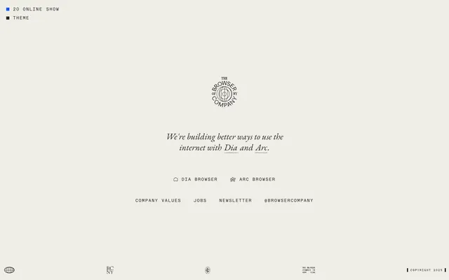
The Browser Company's design system evokes a classic, literary feel through its sparse composition and refined typography. A warm, off-white canvas provides a tranquil backdrop for minimal, precisely placed text elements. The visual identity relies heavily on the nuanced interplay of diverse typefaces, with a primary blue accent reserved for subtle interactive cues.
The page implements a max-width contained layout with centered content. The hero area features a centered branding logo and headline. Sections below maintain consistent vertical spacing, often showcasing a centered stack of textual content and navigation. The overall density is spacious, providing significant breathing room between blocks of information. Navigation is minimal, presented as inline links or a simple ghost button structure.
The site favors an 'icons-only' approach for symbolic elements like browser logos, rendered with a clean, outlined style in Midnight Ink. No photography or complex illustrations are present; the visual focus is entirely on typography and minimal graphic elements. Imagery is sparse, serving primarily as identifiers rather than decorative or explanatory content.
Reminiscent of Arc Browser, Readwise, Substack.
# The Browser Company — Style Reference
> Vintage literary journal

**Theme:** light

**Site:** https://thebrowser.company

The Browser Company's design system evokes a classic, literary feel through its sparse composition and refined typography. A warm, off-white canvas provides a tranquil backdrop for minimal, precisely placed text elements. The visual identity relies heavily on the nuanced interplay of diverse typefaces, with a primary blue accent reserved for subtle interactive cues.

## Tokens — Colors

| Name | Value | Token | Role |
|------|------|------|------|
| Internet Blue | `#0c50ff` | `--color-internet-blue` | Violet wash for highlight backgrounds, decorative bands, and soft emphasis behind content. Do not promote it to the primary CTA color |
| Parchment | `#eeeee7` | `--color-parchment` | Page backgrounds, large canvas areas — a warm, inviting neutral that feels aged |
| Midnight Ink | `#000000` | `--color-midnight-ink` | Primary text, borders, iconography, and subtle surface fills — providing sharp contrast against Parchment |

## Tokens — Typography

### EB Garamond
- **Substitute:** EB Garamond
- **Weights:** 400
- **Sizes:** 28px
- **Line height:** 1.2
- **Role:** Headlines and emphasis text — a classic serif that establishes a refined, traditional tone.

### IvarText
- **Substitute:** Tiempos Text
- **Weights:** 400
- **Sizes:** 9px, 10px
- **Line height:** 1.5
- **Role:** Body text and less prominent content — a custom serif that contributes to the literary journal aesthetic with its elegant letterforms.

### ABCDiatypeMono
- **Substitute:** IBM Plex Mono
- **Weights:** 400
- **Sizes:** 14px
- **Line height:** 1.2
- **Letter spacing:** 0.15em
- **Role:** Monospaced text, navigation links, and functional labels — a custom monospace typeface for a technical, precise counterpoint to the serifs.

## Tokens — Type Scale

| Role | Size | Line height | Letter spacing |
|------|------|------|------|
| body | 14px | 1.2 | 1.5px |
| heading | 28px | 1.2 | — |

## Tokens — Spacing

- **Section gap:** 40px
- **Card padding:** 10px
- **Element gap:** 12px

## Tokens — Radius

- **Default:** 0px
- **Buttons:** 0px

## Layout

The page implements a max-width contained layout with centered content. The hero area features a centered branding logo and headline. Sections below maintain consistent vertical spacing, often showcasing a centered stack of textual content and navigation. The overall density is spacious, providing significant breathing room between blocks of information. Navigation is minimal, presented as inline links or a simple ghost button structure.

## Imagery

The site favors an 'icons-only' approach for symbolic elements like browser logos, rendered with a clean, outlined style in Midnight Ink. No photography or complex illustrations are present; the visual focus is entirely on typography and minimal graphic elements. Imagery is sparse, serving primarily as identifiers rather than decorative or explanatory content.

## Components

### Ghost Button
*Interactive element (e.g., navigation links, secondary actions)*

Text in Midnight Ink (#000000) on a transparent background, with no border and no discernable padding. Typography uses ABCDiatypeMono at 14px, 0.15em letter-spacing. Interaction is indicated by text color or underline, not a filled background.

### Header Branding
*Primary brand identity display*

Centered 'The Browser Company' logo in Midnight Ink (#000000), using custom icon and typography. It's often flanked by a main headline.

## Guidelines

### Do

- Prioritize generous vertical spacing, using values like 40px and 50px for section and large element separation.
- Use EB Garamond at 28px for primary headlines to convey a classic and composed tone.
- Apply ABCDiatypeMono 14px with 0.15em letter-spacing for all navigation and functional labels, maintaining distinct visual separation from body text.
- Employ Parchment (#eeeee7) as the dominant background color for most page areas and surfaces.
- Use Midnight Ink (#000000) for all primary text, borders, and iconography.
- Reserve Internet Blue (#0c50ff) for subtle accentuation of interactive elements or as a background for specific content blocks.
- Maintain a consistent 0px border-radius for all interactive and structural elements, favoring sharp, defined edges.

### Don't

- Avoid using multiple colors for text; primary text should consistently be Midnight Ink (#000000).
- Do not introduce heavy shadows or overt elevation; rely on spacing and typography for hierarchy.
- Do not deviate from the specified serif (EB Garamond, IvarText) and monospace (ABCDiatypeMono) font families; avoid sans-serif fonts.
- Do not apply large, rounded corners to any components; maintain the consistent 0px radius.
- Avoid dense information blocks; instead, use ample whitespace and conservative element spacing.
- Do not use Internet Blue (#0c50ff) as a primary button background; it is an accent, not a filled CTA.
- Do not use default browser link colors; all links should conform to Midnight Ink (#000000) with ABCDiatypeMono typography.

## Agent Prompt Guide

### Quick Color Reference
text: #000000
background: #eeeee7
border: #000000
accent: #0c50ff
primary action: no distinct CTA color

### 3-5 Example Component Prompts
1. Create a page hero section: background Parchment (#eeeee7). Centered logo, followed by a heading 'We're building better ways to use the internet with Dia and Arc.' using EB Garamond 28px #000000 and two ghost buttons 'Dia Browser' and 'Arc Browser' below, using ABCDiatypeMono 14px #000000 with 0.15em letter-spacing.
2. Create a navigation bar: links 'Company Values', 'Jobs', 'Newsletter', '@browsercompany' using ABCDiatypeMono 14px #000000 with 0.15em letter-spacing, separated by 12px elementGap. Background Parchment (#eeeee7).
3. Create a footer section: background Parchment (#eeeee7). Text 'COPYRIGHT 2025' in IvarText 9px #000000 on the right, global icon in Midnight Ink (#000000) on the left.
More like this








Keep what you find
A free account saves references to boards and can send you a weekly email of picks based on what you save.
To see every result, go Pro.