Preview image. Unlock full-res
Typographic Precision on an Open Canvas
Color palette
Primary background for the entire site, providing an expansive, airy feel
Background for project preview cards, lending a subtle, muted backdrop that hints at content within without distraction
Dark borders and separators for elevated surfaces and inverted UI. Do not promote it to the primary CTA color
Delicate borders or dividers, used sparsely to delineate sections or elements without imposing heavy visual weight
Typography
- Weights
- 400
- Sizes
- 16px, 19px, 32px
- Line height
- 1.2, 1.3
- Letter spacing
- -0.031
GTF — detected in extracted data but not described by AI
- Weights
- 400
- Letter spacing
- -0.031em
- Fallback
- Inter
The singular typeface for all textual content, from headings to body text and links. Its slightly condensed and precisely tracked appearance defines the site's restrained and sophisticated voice. The consistent use of a single weight across sizes emphasizes content over typographic theatrics.
Spacing & shape
Components
Large project card with a background of Project Card (#ebeeff) and a very large border-radius of 64px. The project title uses Ink Black (#111111) at 32px, GTF weight 400 with -0.031em letter spacing. Padding around content is implied by 'cardPadding' (40px).
Text link using Ink Black (#111111), GTF weight 400, 16px size, with -0.031em letter spacing. Features a hairline border in Ink Black (#111111) on hover/active states, and a left margin of 32px (except the first).
Long-form or secondary text using Ink Black (#111111), GTF weight 400, 16px size, -0.031em letter spacing, often paired with project title via a 24px element gap.
Guidelines
- Prioritize GT America Extended (or Inter) at weight 400 for all textual content.
- Apply -0.031em letter-spacing to all text to maintain the clean, precise feel.
- Use Canvas White (#ffffff) as the default page background for an open, airy canvas.
- Employ consistent 64px border-radius for all image and card containers.
- Use Ink Black (#111111) for all main text and subtle border outlines.
- Maintain generous section gaps of 128px between major content blocks.
- Use Project Card (#ebeeff) as a subtle background for content areas within the main canvas.
- Avoid using bold or heavy weights; the entire system relies on weight 400 for its understated character.
- Do not introduce new typefaces; the single typeface defines the brand's typographic identity.
- Do not use highly saturated or vivid accent colors; the palette is deliberately achromatic with subtle tints.
- Avoid heavy shadows or gradient backgrounds; the system favors flat surfaces and clear typographic hierarchy.
- Do not use small, tight spacing. Embrace spacious layouts and generous whitespace.
- Refrain from complex component styling; components should be lightweight, with minimal borders and no superfluous decoration.
About this system
ShowHide
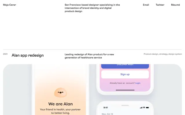
Maja Cerar's online portfolio conveys a meticulous, understated elegance through a spacious achromatic canvas, where project visuals are presented as large, clean blocks. Typography is the primary conveyor of information and hierarchy, using a single signature typeface with subtle negative letter-spacing for a refined, almost whispered presence. The design is highly content-centric, relying on generous whitespace and a minimalist approach to define structure and visual flow without relying on heavy borders, shadows, or vivid accent colors.
The page employs a full-bleed layout for its overall structure, but content within project sections is often visually contained. The hero section features the designer's name and bio, framed by generous whitespace. Project sections follow a consistent vertical rhythm, with each project presented as a large block comprising a year, project title, descriptive text, and a large visual preview. These sections are separated by very large vertical gaps (128px), creating distinct visual pauses. Content within sections tends to align left, with ample horizontal spacing. The navigation is a minimalist top bar with text links, maintaining a light footprint. There's no complex grid system, but rather a sequential stacking of distinct content blocks.
This design system primarily uses actual product screenshots and UI renders to showcase work. Imagery is consistently presented within large, softly rounded (64px radius) containers, often acting as the main visual element of a project card. There's an absence of lifestyle photography or complex illustrations; instead, the focus is on direct, unadorned visual evidence of product design. Icons, when present, are minimal and likely outlined, aligning with the overall lightweight aesthetic. Imagery serves to explain and demonstrate, taking a significant visual space relative to text.
Reminiscent of Simon V. Design, Piotr Chudzinski Portfolio, Kacper Chyliński Portfolio.
# Maja Cerar — Style Reference
> Typographic Precision on an Open Canvas

**Theme:** light

**Site:** https://www.majacerar.design

Maja Cerar's online portfolio conveys a meticulous, understated elegance through a spacious achromatic canvas, where project visuals are presented as large, clean blocks. Typography is the primary conveyor of information and hierarchy, using a single signature typeface with subtle negative letter-spacing for a refined, almost whispered presence. The design is highly content-centric, relying on generous whitespace and a minimalist approach to define structure and visual flow without relying on heavy borders, shadows, or vivid accent colors.

## Tokens — Colors

| Name | Value | Token | Role |
|------|------|------|------|
| Canvas White | `#ffffff` | `--color-canvas-white` | Primary background for the entire site, providing an expansive, airy feel |
| Project Card | `#ebeeff` | `--color-project-card` | Background for project preview cards, lending a subtle, muted backdrop that hints at content within without distraction |
| Ink Black | `#111111` | `--color-ink-black` | Dark borders and separators for elevated surfaces and inverted UI. Do not promote it to the primary CTA color |
| Subtle Gray Border | `#bbbbbb` | `--color-subtle-gray-border` | Delicate borders or dividers, used sparsely to delineate sections or elements without imposing heavy visual weight |

## Tokens — Typography

### GTF
- **Weights:** 400
- **Sizes:** 16px, 19px, 32px
- **Line height:** 1.2, 1.3
- **Letter spacing:** -0.031
- **Role:** GTF — detected in extracted data but not described by AI

### GT America Extended
- **Substitute:** Inter
- **Weights:** 400
- **Letter spacing:** -0.031em
- **Role:** The singular typeface for all textual content, from headings to body text and links. Its slightly condensed and precisely tracked appearance defines the site's restrained and sophisticated voice. The consistent use of a single weight across sizes emphasizes content over typographic theatrics.

## Tokens — Type Scale

Augmented Fourth (1.414) from 16px base.

| Role | Size | Line height | Letter spacing |
|------|------|------|------|
| body | 16px | 1.3 | — |
| subheading | 19px | 1.25 | — |
| heading | 32px | 1.2 | — |

## Tokens — Spacing

- **Section gap:** 128px
- **Card padding:** 40px
- **Element gap:** 24px

## Tokens — Radius

- **Cards:** 64px
- **Images:** 64px

## Layout

The page employs a full-bleed layout for its overall structure, but content within project sections is often visually contained. The hero section features the designer's name and bio, framed by generous whitespace. Project sections follow a consistent vertical rhythm, with each project presented as a large block comprising a year, project title, descriptive text, and a large visual preview. These sections are separated by very large vertical gaps (128px), creating distinct visual pauses. Content within sections tends to align left, with ample horizontal spacing. The navigation is a minimalist top bar with text links, maintaining a light footprint. There's no complex grid system, but rather a sequential stacking of distinct content blocks.

## Imagery

This design system primarily uses actual product screenshots and UI renders to showcase work. Imagery is consistently presented within large, softly rounded (64px radius) containers, often acting as the main visual element of a project card. There's an absence of lifestyle photography or complex illustrations; instead, the focus is on direct, unadorned visual evidence of product design. Icons, when present, are minimal and likely outlined, aligning with the overall lightweight aesthetic. Imagery serves to explain and demonstrate, taking a significant visual space relative to text.

## Components

### Project Card
*Container for individual project previews.*

Large project card with a background of Project Card (#ebeeff) and a very large border-radius of 64px. The project title uses Ink Black (#111111) at 32px, GTF weight 400 with -0.031em letter spacing. Padding around content is implied by 'cardPadding' (40px).

### Navigation Link
*Top-level navigation items and contact links.*

Text link using Ink Black (#111111), GTF weight 400, 16px size, with -0.031em letter spacing. Features a hairline border in Ink Black (#111111) on hover/active states, and a left margin of 32px (except the first).

### Descriptive Text Block
*Text blocks accompanying project entries.*

Long-form or secondary text using Ink Black (#111111), GTF weight 400, 16px size, -0.031em letter spacing, often paired with project title via a 24px element gap.

## Guidelines

### Do

- Prioritize GT America Extended (or Inter) at weight 400 for all textual content.
- Apply -0.031em letter-spacing to all text to maintain the clean, precise feel.
- Use Canvas White (#ffffff) as the default page background for an open, airy canvas.
- Employ consistent 64px border-radius for all image and card containers.
- Use Ink Black (#111111) for all main text and subtle border outlines.
- Maintain generous section gaps of 128px between major content blocks.
- Use Project Card (#ebeeff) as a subtle background for content areas within the main canvas.

### Don't

- Avoid using bold or heavy weights; the entire system relies on weight 400 for its understated character.
- Do not introduce new typefaces; the single typeface defines the brand's typographic identity.
- Do not use highly saturated or vivid accent colors; the palette is deliberately achromatic with subtle tints.
- Avoid heavy shadows or gradient backgrounds; the system favors flat surfaces and clear typographic hierarchy.
- Do not use small, tight spacing. Embrace spacious layouts and generous whitespace.
- Refrain from complex component styling; components should be lightweight, with minimal borders and no superfluous decoration.

## Agent Prompt Guide

Quick Color Reference:
text: #111111
background: #ffffff
border: #111111
accent: no distinct accent color
primary action: no distinct CTA color

Example Component Prompts:
1. Create a top navigation bar: Canvas White (#ffffff) background, containing three Navigation Links. Each link uses Ink Black (#111111), GTF weight 400, 16px size. The first link is 'Email', the second 'Twitter', the third 'Résumé'. Each link has a 32px left margin, except the first.
2. Design a project header for 'Alan app redesign': Ink Black (#111111) text, GTF weight 400, 32px size, -0.031em letter spacing. Position it after a 128px section gap. Below it, add a descriptive text block: 'Leading redesign of Alan product for a new generation of healthcare service' in Ink Black (#111111), GTF weight 400, 16px size, -0.031em letter spacing, with a 24px gap.
3. Create a project image card: Project Card (#ebeeff) background, 64px border-radius, width approximately 80% of page content, centered. Inside, place a product screenshot that also follows the 64px border-radius. Ensure it has a subtle bottom padding of 40px.
More like this









Keep what you find
A free account saves references to boards and can send you a weekly email of picks based on what you save.
To see every result, go Pro.