Preview image. Unlock full-res
Vibrant canvas, graphic stories
Color palette
Dominant background for product showcases and bold visual sections. Creates high energy and impact
Background for visual sections, secondary accent. Adds a soft yet vibrant touch
Background for visual sections, secondary accent. Provides a cool, cheerful tone
Background for visual sections, tertiary accent for softer visual breaks
Background for visual sections, and occasionally as a link background, adding a bright, almost neon pop
Background for visual sections, offering a fresh, energetic accent
Background for visual sections, providing a light and airy accent
Page backgrounds, default surface color, supporting element borders
Primary text, headings, button backgrounds, primary borders, icon fills. Provides high contrast against light surfaces
Secondary text, muted links, subtle borders. Offers a softer contrast than Ink Black
Typography
- Weights
- 400, 600
- Sizes
- 12px, 16px, 20px, 22px, 40px
- Line height
- 0.8, 1, 1.2, 1.25, 1.35, 1.38, 1.5
- Letter spacing
- 0.042, 0.031, 0.023
- Fallback
- Arial
Primary typeface for all text content including headings, body text, links, and navigation. Its clean lines provide a structured counterpoint to the graphic imagery.
- Weights
- 400
- Sizes
- 12px
- Line height
- 1.5
- Letter spacing
- 0.042
- Fallback
- Inter
Secondary display typeface, used sparingly for specific content or branding elements to add a distinct, custom feel.
Spacing & shape
Components
Filled button with Ink Black background, Canvas White text. Rounded corners at 8px. Padding is 8px top, 9px bottom, 30px left/right. Font is Helvetica Now, weight 400.
Ghost button with 5% Ink Black background, Ink Black icon/text. Perfectly circular with 50% border radius. No explicit padding, acts as a container for an icon.
Centered client logo with 15px padding on all sides, often rendered in Ink Black against Canvas White. Grouped in a grid with 15px element gaps.
Full-bleed imagery within a dynamic grid. Background colors will be one of the brand's vibrant palette colors (#ff0000, #ffbbff, #72c2f2, #f7b2de, #ffa3fe, #32c24d, #96d6ff). No explicit border or radius, imagery fills the card area.
Text link using Helvetica Now, weight 400, 16px size, Ink Black color, with 10px right padding between items. Underlines on hover or active state.
Guidelines
- Prioritize vibrant, full-bleed imagery and color blocks for main content areas.
- Use Canvas White (#ffffff) as the dominant page background to ensure art stands out.
- Apply Ink Black (#000000) for all primary text and calls to action for high legibility.
- Maintain a clear hierarchy with Helvetica Now; use lighter weights for body, heavier for titles.
- Keep interactive elements like buttons and navigation visually minimal to not detract from artwork.
- Use 8px border-radius for all interactive buttons for a consistent, soft touch.
- Employ a base unit of 8px for all spacing measurements, defaulting to 15px for element and card gaps, and 33px for section breaks.
- Do not introduce gradients or complex shadows; maintain a flat, graphic aesthetic.
- Avoid decorative borders on content elements or cards; let color blocks define sections.
- Do not use subtle color variations for background elements; embrace bold, distinct color blocks.
- Refrain from using more than two font families; Helvetica Now and GTStandard-M cover all typographic needs.
- Do not add excessive padding to images; allow them to fill their containers for visual impact.
- Avoid using additional system blues/reds/greens; stick to the established brand palette for accent colors.
About this system
ShowHide
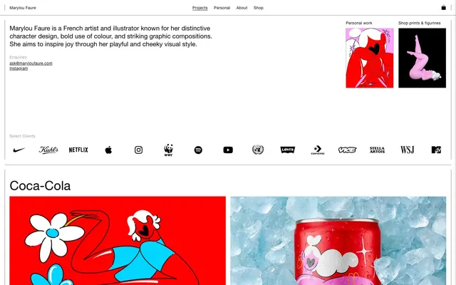
Marylou Faure's design system embraces a vibrant, playful energy through a stark white canvas punctuated by bold, flat blocks of color. Typography is functional and direct, primarily in black, grounding the energetic visuals. The system relies on prominent imagery, often full-bleed, to convey its character-rich, graphic-heavy style, with UI elements remaining minimal and secondary to the artwork.
The page primarily uses a max-width contained layout for text-heavy sections, but extensively leverages full-bleed, edge-to-edge imagery and color blocks for portfolio items. The hero section introduces the brand with a text block and small artwork, followed by a grid of client logos. Subsequent sections are visually driven, presenting large, alternating full-width image blocks. Vertical rhythm is consistent with substantial section gaps (33px), creating clear visual separation between content blocks. Navigation is a minimal top bar, featuring brand name and simple textual links.
The visual language is dominantly illustration-based, featuring bold, organic character designs with strong outlines and flat fills. Photography, when present (e.g., product shots), is tightly cropped and focused on vibrant objects, often with a stark, single-color background or simple ice texture. Icons are filled with a medium stroke weight. Imagery plays a central role in conveying content and atmosphere, often occupying large, full-bleed areas, demonstrating a high density of visuals relative to text.
Reminiscent of Jiaqi Wang, Malika Favre, Studio Airport, Blinkist (illustration style).
# Marylou Faure — Style Reference
> Vibrant canvas, graphic stories

**Theme:** light

**Site:** https://maryloufaure.com

Marylou Faure's design system embraces a vibrant, playful energy through a stark white canvas punctuated by bold, flat blocks of color. Typography is functional and direct, primarily in black, grounding the energetic visuals. The system relies on prominent imagery, often full-bleed, to convey its character-rich, graphic-heavy style, with UI elements remaining minimal and secondary to the artwork.

## Tokens — Colors

| Name | Value | Token | Role |
|------|------|------|------|
| Illustrative Red | `#ff0000` | `--color-illustrative-red` | Dominant background for product showcases and bold visual sections. Creates high energy and impact |
| Playful Pink | `#ffbbff` | `--color-playful-pink` | Background for visual sections, secondary accent. Adds a soft yet vibrant touch |
| Sky Blue | `#72c2f2` | `--color-sky-blue` | Background for visual sections, secondary accent. Provides a cool, cheerful tone |
| Blush Pink | `#f7b2de` | `--color-blush-pink` | Background for visual sections, tertiary accent for softer visual breaks |
| Vivid Pink | `#ffa3fe` | `--color-vivid-pink` | Background for visual sections, and occasionally as a link background, adding a bright, almost neon pop |
| Lime Green | `#32c24d` | `--color-lime-green` | Background for visual sections, offering a fresh, energetic accent |
| Cyan Blue | `#96d6ff` | `--color-cyan-blue` | Background for visual sections, providing a light and airy accent |
| Canvas White | `#ffffff` | `--color-canvas-white` | Page backgrounds, default surface color, supporting element borders |
| Ink Black | `#000000` | `--color-ink-black` | Primary text, headings, button backgrounds, primary borders, icon fills. Provides high contrast against light surfaces |
| Charcoal Gray | `#737373` | `--color-charcoal-gray` | Secondary text, muted links, subtle borders. Offers a softer contrast than Ink Black |

## Tokens — Typography

### Helvetica Now
- **Substitute:** Arial
- **Weights:** 400, 600
- **Sizes:** 12px, 16px, 20px, 22px, 40px
- **Line height:** 0.8, 1, 1.2, 1.25, 1.35, 1.38, 1.5
- **Letter spacing:** 0.042, 0.031, 0.023
- **Role:** Primary typeface for all text content including headings, body text, links, and navigation. Its clean lines provide a structured counterpoint to the graphic imagery.

### GTStandard-M
- **Substitute:** Inter
- **Weights:** 400
- **Sizes:** 12px
- **Line height:** 1.5
- **Letter spacing:** 0.042
- **Role:** Secondary display typeface, used sparingly for specific content or branding elements to add a distinct, custom feel.

## Tokens — Type Scale

Perfect Fourth (1.333) from 16px base.

| Role | Size | Line height | Letter spacing |
|------|------|------|------|
| caption | 12px | 1.5 | 0.042em |
| body | 16px | 1.5 | 0.031em |
| subheading | 20px | 1.25 | — |
| heading | 22px | 1.2 | — |
| display | 40px | 1 | 0.023em |

## Tokens — Spacing

- **Section gap:** 33px
- **Card padding:** 15px
- **Element gap:** 15px

## Tokens — Radius

- **Buttons:** 8px

## Layout

The page primarily uses a max-width contained layout for text-heavy sections, but extensively leverages full-bleed, edge-to-edge imagery and color blocks for portfolio items. The hero section introduces the brand with a text block and small artwork, followed by a grid of client logos. Subsequent sections are visually driven, presenting large, alternating full-width image blocks. Vertical rhythm is consistent with substantial section gaps (33px), creating clear visual separation between content blocks. Navigation is a minimal top bar, featuring brand name and simple textual links.

## Imagery

The visual language is dominantly illustration-based, featuring bold, organic character designs with strong outlines and flat fills. Photography, when present (e.g., product shots), is tightly cropped and focused on vibrant objects, often with a stark, single-color background or simple ice texture. Icons are filled with a medium stroke weight. Imagery plays a central role in conveying content and atmosphere, often occupying large, full-bleed areas, demonstrating a high density of visuals relative to text.

## Components

### Primary Action Button
*Interactive element for key calls to action.*

Filled button with Ink Black background, Canvas White text. Rounded corners at 8px. Padding is 8px top, 9px bottom, 30px left/right. Font is Helvetica Now, weight 400.

### Ghost Circular Icon Button
*Minimal interactive element, typically for navigation or utility icons.*

Ghost button with 5% Ink Black background, Ink Black icon/text. Perfectly circular with 50% border radius. No explicit padding, acts as a container for an icon.

### Client Logo Grid Item
*Display individual client logos.*

Centered client logo with 15px padding on all sides, often rendered in Ink Black against Canvas White. Grouped in a grid with 15px element gaps.

### Project Thumbnail Card
*Visually rich preview for portfolio projects.*

Full-bleed imagery within a dynamic grid. Background colors will be one of the brand's vibrant palette colors (#ff0000, #ffbbff, #72c2f2, #f7b2de, #ffa3fe, #32c24d, #96d6ff). No explicit border or radius, imagery fills the card area.

### Top Navigation Link
*Primary navigation items in the header.*

Text link using Helvetica Now, weight 400, 16px size, Ink Black color, with 10px right padding between items. Underlines on hover or active state.

## Guidelines

### Do

- Prioritize vibrant, full-bleed imagery and color blocks for main content areas.
- Use Canvas White (#ffffff) as the dominant page background to ensure art stands out.
- Apply Ink Black (#000000) for all primary text and calls to action for high legibility.
- Maintain a clear hierarchy with Helvetica Now; use lighter weights for body, heavier for titles.
- Keep interactive elements like buttons and navigation visually minimal to not detract from artwork.
- Use 8px border-radius for all interactive buttons for a consistent, soft touch.
- Employ a base unit of 8px for all spacing measurements, defaulting to 15px for element and card gaps, and 33px for section breaks.

### Don't

- Do not introduce gradients or complex shadows; maintain a flat, graphic aesthetic.
- Avoid decorative borders on content elements or cards; let color blocks define sections.
- Do not use subtle color variations for background elements; embrace bold, distinct color blocks.
- Refrain from using more than two font families; Helvetica Now and GTStandard-M cover all typographic needs.
- Do not add excessive padding to images; allow them to fill their containers for visual impact.
- Avoid using additional system blues/reds/greens; stick to the established brand palette for accent colors.

## Agent Prompt Guide

Quick Color Reference:
text: #000000
background: #ffffff
border: #000000
accent: #ff0000
primary action: no distinct CTA color

Example Component Prompts:
No distinct primary action color was observed; use the extracted neutral button treatments instead of inventing a filled CTA color.
2. Create a top navigation link: Text 'Projects' in Ink Black (#000000), Helvetica Now, weight 400, 16px size. Provide 10px right padding.
3. Create a hero intro text block: 'Marylou Faure is a French artist and illustrator...' in Ink Black (#000000), Helvetica Now, weight 400, 16px size, line-height 1.5. Place on Canvas White (#ffffff) background.
4. Create a project thumbnail card: Large square block with an Illustrative Red (#ff0000) background. No explicit border or radius.
More like this









Keep what you find
A free account saves references to boards and can send you a weekly email of picks based on what you save.
To see every result, go Pro.