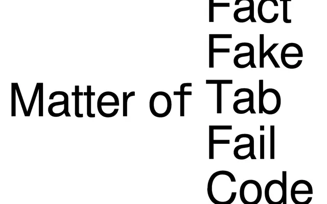
Preview image. Unlock full-res
Monochrome typographic canvas
Color palette
Page backgrounds, primary surface for all content
Dark borders and separators for elevated surfaces and inverted UI. Do not promote it to the primary CTA color
Typography
- Weights
- 400
- Sizes
- 23px, 36px, 202px
- Line height
- 1, 1.2
- Letter spacing
- normal
- Fallback
- Arial
All textual content, from primary navigation to very large display headlines. Its mono-weight adherence to 400 emphasizes consistency and directness.
Spacing & shape
Components
Text link using FreeSans, weight 400, color Midnight Ink (#000000). Padding of 6px applied to individual items and 18px on the right and bottom for broader clickable areas.
Large text using FreeSans, weight 400, color Midnight Ink (#000000), at 202px size with 1.0 line height for impactful, dense typography.
Guidelines
- Prioritize text as the primary visual element; minimize other decorative components.
- Maintain a strict achromatic color palette using only Canvas White (#ffffff) for backgrounds and Midnight Ink (#000000) for foreground elements.
- Use FreeSans weight 400 for all typography, ensuring a consistent and direct tone.
- Apply 84px vertical spacing between major page sections to create clear visual breaks.
- Ensure all interactive elements are defined by Midnight Ink (#000000) borders or text, with no background fills.
- Do not introduce any chromatic colors; the palette is strictly monochrome.
- Avoid decorative images or illustrations that would distract from the typography.
- Do not use multiple font weights or families; FreeSans 400 is the only typeface.
- Refrain from using shadows or gradients; rely on contrast and typography for visual hierarchy.
- Do not break the 900px max-width constraint for main content areas.
About this system
ShowHide
Matter of Fact operates on a stark, high-contrast visual system: pure black text on a clean white canvas. Typography, primarily large and commanding, is the dominant visual element, with minimal use of color or complex components. The design maintains an austere, type-driven aesthetic, emphasizing direct communication and clarity through its monochrome palette.
The page model is contained, with a max-width of 900px and content generally centered. The hero pattern is a massive, attention-grabbing centered headline over a pure white background. Sections maintain a consistent vertical rhythm with 84px spacing. Content is arranged in simple, centered stacks, with no apparent grid usage for features or cards. The navigation is a top bar, minimal and text-based, likely sticky given the interactive elements.
The site uses no imagery or embedded graphics, focusing entirely on a pure typographic and monochrome UI. The visual language is defined by the stark absence of visuals, making text itself the primary graphic element.
Reminiscent of Savvy Studio, Anagram Paris, Bureau for Visual Affairs.
# Matter of Fact — Style Reference
> Monochrome typographic canvas

**Theme:** light

**Site:** https://matteroffact.fr

Matter of Fact operates on a stark, high-contrast visual system: pure black text on a clean white canvas. Typography, primarily large and commanding, is the dominant visual element, with minimal use of color or complex components. The design maintains an austere, type-driven aesthetic, emphasizing direct communication and clarity through its monochrome palette.

## Tokens — Colors

| Name | Value | Token | Role |
|------|------|------|------|
| Canvas White | `#ffffff` | `--color-canvas-white` | Page backgrounds, primary surface for all content |
| Midnight Ink | `#000000` | `--color-midnight-ink` | Dark borders and separators for elevated surfaces and inverted UI. Do not promote it to the primary CTA color |

## Tokens — Typography

### FreeSans
- **Substitute:** Arial
- **Weights:** 400
- **Sizes:** 23px, 36px, 202px
- **Line height:** 1, 1.2
- **Letter spacing:** normal
- **Role:** All textual content, from primary navigation to very large display headlines. Its mono-weight adherence to 400 emphasizes consistency and directness.

## Tokens — Type Scale

| Role | Size | Line height | Letter spacing |
|------|------|------|------|
| caption | 23px | 1.2 | — |
| subheading | 36px | 1.2 | — |
| display | 202px | 1 | — |

## Tokens — Spacing

- **Max width:** 900px
- **Section gap:** 84px
- **Card padding:** 18px
- **Element gap:** 6px

## Tokens — Radius

- **none:** 0px

## Layout

The page model is contained, with a max-width of 900px and content generally centered. The hero pattern is a massive, attention-grabbing centered headline over a pure white background. Sections maintain a consistent vertical rhythm with 84px spacing. Content is arranged in simple, centered stacks, with no apparent grid usage for features or cards. The navigation is a top bar, minimal and text-based, likely sticky given the interactive elements.

## Imagery

The site uses no imagery or embedded graphics, focusing entirely on a pure typographic and monochrome UI. The visual language is defined by the stark absence of visuals, making text itself the primary graphic element.

## Components

### Minimal Navigation Link
*Interactive text link within navigation*

Text link using FreeSans, weight 400, color Midnight Ink (#000000). Padding of 6px applied to individual items and 18px on the right and bottom for broader clickable areas.

### Headline Display Text
*Dominant page headlines*

Large text using FreeSans, weight 400, color Midnight Ink (#000000), at 202px size with 1.0 line height for impactful, dense typography.

## Guidelines

### Do

- Prioritize text as the primary visual element; minimize other decorative components.
- Maintain a strict achromatic color palette using only Canvas White (#ffffff) for backgrounds and Midnight Ink (#000000) for foreground elements.
- Use FreeSans weight 400 for all typography, ensuring a consistent and direct tone.
- Apply 84px vertical spacing between major page sections to create clear visual breaks.
- Ensure all interactive elements are defined by Midnight Ink (#000000) borders or text, with no background fills.

### Don't

- Do not introduce any chromatic colors; the palette is strictly monochrome.
- Avoid decorative images or illustrations that would distract from the typography.
- Do not use multiple font weights or families; FreeSans 400 is the only typeface.
- Refrain from using shadows or gradients; rely on contrast and typography for visual hierarchy.
- Do not break the 900px max-width constraint for main content areas.

## Agent Prompt Guide

Quick Color Reference:
text: #000000
background: #ffffff
border: #000000
accent: no distinct accent color
primary action: no distinct CTA color

Example Component Prompts:
1. Create a page with a main headline: white background. Headline 'Matter of Fact' in FreeSans weight 400, 202px, line height 1.0, color #000000, centered on the page.
2. Create a navigation bar: white background, max-width 900px, centered. Include a text link 'Fact' in FreeSans weight 400, 23px, color #000000, with 6px padding.
3. Create a secondary content section: white background, separated from the previous section by 84px of vertical space. Include a subheading 'Matter of Tab' in FreeSans weight 400, 36px, line height 1.2, color #000000, left-aligned.
More like this









Keep what you find
A free account saves references to boards and can send you a weekly email of picks based on what you save.
To see every result, go Pro.