Preview image. Unlock full-res
Typewritten document on crisp paper.
Color palette
Page backgrounds, card surfaces, element borders, ghost button text (inactive states)
Dark borders and separators for elevated surfaces and inverted UI. Do not promote it to the primary CTA color
Dark borders and separators for elevated surfaces and inverted UI. Do not promote it to the primary CTA color
Section headings, muted body text, secondary information
Tertiary text, descriptive labels, very subtle accents
Spacing & shape
Components
Background transparent (rgba(0,0,0,0)), text is Canvas White (#fdfdfd), border is Canvas White (#fdfdfd). Padding is 0px all around. This button appears as pure text and only activates visually on hover/focus.
Background is Canvas White (#fdfdfd), no shadow, border-radius 0px. Internal padding of 36px on the left and right. Text within uses Ink Black (#16161d).
Text in Ink Black (#16161d). Features 1px padding top/bottom and 4px column gap for internal spacing. Borders appear on interaction, defined by Ink Black.
Guidelines
- Prioritize text content with a high contrast ratio of Ink Black (#16161d) on Canvas White (#fdfdfd) for primary information.
- Use Subtle Gray (#737377) for all categorical section headings (e.g., 'Work', 'Skills', 'Clients').
- Employ a 'ghost' button style with transparent background and Canvas White (#fdfdfd) text/border for all interactive controls that should blend into the background.
- Maintain a strict 0px border-radius across all UI elements to reinforce the austere, document-like aesthetic.
- Structure content in distinct, vertically stacked sections, each beginning with a Subtle Gray (#737377) heading.
- Use 4px as the primary horizontal and vertical gap between related inline elements.
- Pad content cards with 36px on the left and right, ensuring a consistent internal margin for list items and data.
- Avoid using any colored backgrounds or gradients; maintain the crisp white canvas.
- Do not introduce any drop shadows or complex elevation; surfaces should remain flat.
- Never use rounded corners on any UI element; all corners must be sharp.
- Do not deviate from the specified gray palette for text; avoid vibrant or saturated colors for content.
- Do not add any additional padding to ghost buttons; they should appear as raw text until interacted with.
About this system
ShowHide
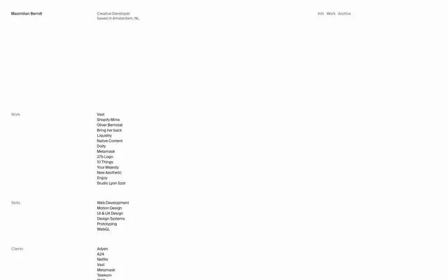
Maximilian Berndt's site presents an austere, high-contrast textual experience, reminiscent of a command-line interface or a minimalist resume. The design prioritizes content and readability with a stark black on white palette, punctuated only by subtle gray for secondary information. Components are invisible until interacted with or until a clear function is needed, maintaining a paper-like simplicity.
The page follows a minimalist, single-column document-style layout. Content is centered within an implied maximum width, though no explicit pageMaxWidth is set, creating the impression of content floating on an infinite white canvas. The hero section displays the name and title, followed by distinct sections for 'Work', 'Skills', and 'Clients', each marked with a muted gray heading. Navigation is extremely sparse, consisting only of a few links in the header and footer. Vertical rhythm is established through consistent spacing between content blocks and list items.
No imagery is present on the site. The visual system relies entirely on typography and structured text to convey information and establish hierarchy. There are no icons or illustrative elements.
Reminiscent of Are.na, Superlist, Read.cv, Linear.
# Maximilian Berndt — Style Reference
> Typewritten document on crisp paper.

**Theme:** light

**Site:** https://maximilianberndt.com

Maximilian Berndt's site presents an austere, high-contrast textual experience, reminiscent of a command-line interface or a minimalist resume. The design prioritizes content and readability with a stark black on white palette, punctuated only by subtle gray for secondary information. Components are invisible until interacted with or until a clear function is needed, maintaining a paper-like simplicity.

## Tokens — Colors

| Name | Value | Token | Role |
|------|------|------|------|
| Canvas White | `#fdfdfd` | `--color-canvas-white` | Page backgrounds, card surfaces, element borders, ghost button text (inactive states) |
| Ink Black | `#16161d` | `--color-ink-black` | Dark borders and separators for elevated surfaces and inverted UI. Do not promote it to the primary CTA color |
| Absolute Black | `#000000` | `--color-absolute-black` | Dark borders and separators for elevated surfaces and inverted UI. Do not promote it to the primary CTA color |
| Subtle Gray | `#737377` | `--color-subtle-gray` | Section headings, muted body text, secondary information |
| Whisper Gray | `#a1a1a3` | `--color-whisper-gray` | Tertiary text, descriptive labels, very subtle accents |

## Tokens — Spacing

- **Section gap:** 48px
- **Card padding:** 36px
- **Element gap:** 4px

## Tokens — Radius

- **all:** 0px

## Layout

The page follows a minimalist, single-column document-style layout. Content is centered within an implied maximum width, though no explicit pageMaxWidth is set, creating the impression of content floating on an infinite white canvas. The hero section displays the name and title, followed by distinct sections for 'Work', 'Skills', and 'Clients', each marked with a muted gray heading. Navigation is extremely sparse, consisting only of a few links in the header and footer. Vertical rhythm is established through consistent spacing between content blocks and list items.

## Imagery

No imagery is present on the site. The visual system relies entirely on typography and structured text to convey information and establish hierarchy. There are no icons or illustrative elements.

## Components

### Ghost Text Button
*Invisible until hover, text-only navigation and informational buttons.*

Background transparent (rgba(0,0,0,0)), text is Canvas White (#fdfdfd), border is Canvas White (#fdfdfd). Padding is 0px all around. This button appears as pure text and only activates visually on hover/focus.

### Content Card
*Container for lists of work, skills, or clients.*

Background is Canvas White (#fdfdfd), no shadow, border-radius 0px. Internal padding of 36px on the left and right. Text within uses Ink Black (#16161d).

### Interactive List Item
*Styled list items that highlight on interaction, typically links.*

Text in Ink Black (#16161d). Features 1px padding top/bottom and 4px column gap for internal spacing. Borders appear on interaction, defined by Ink Black.

## Guidelines

### Do

- Prioritize text content with a high contrast ratio of Ink Black (#16161d) on Canvas White (#fdfdfd) for primary information.
- Use Subtle Gray (#737377) for all categorical section headings (e.g., 'Work', 'Skills', 'Clients').
- Employ a 'ghost' button style with transparent background and Canvas White (#fdfdfd) text/border for all interactive controls that should blend into the background.
- Maintain a strict 0px border-radius across all UI elements to reinforce the austere, document-like aesthetic.
- Structure content in distinct, vertically stacked sections, each beginning with a Subtle Gray (#737377) heading.
- Use 4px as the primary horizontal and vertical gap between related inline elements.
- Pad content cards with 36px on the left and right, ensuring a consistent internal margin for list items and data.

### Don't

- Avoid using any colored backgrounds or gradients; maintain the crisp white canvas.
- Do not introduce any drop shadows or complex elevation; surfaces should remain flat.
- Never use rounded corners on any UI element; all corners must be sharp.
- Do not deviate from the specified gray palette for text; avoid vibrant or saturated colors for content.
- Do not add any additional padding to ghost buttons; they should appear as raw text until interacted with.

## Agent Prompt Guide

Quick Color Reference:
text: #16161d
background: #fdfdfd
border: #fdfdfd (ghost), #16161d (interactive element borders)
accent: no distinct accent color
primary action: no distinct CTA color

Example Component Prompts:
1. Create a section heading: 'Clients' in Subtle Gray (#737377).
2. Create a ghost navigation button: 'Info' with text color Canvas White (#fdfdfd) and border color Canvas White (#fdfdfd), no padding, 0px radius.
3. Create an interactive list item for a project: 'Vast' in Ink Black (#16161d), 1px vertical padding, with a border (Ink Black, #16161d) appearing on hover/focus, 0px radius.
More like this









Keep what you find
A free account saves references to boards and can send you a weekly email of picks based on what you save.
To see every result, go Pro.