Preview image. Unlock full-res
Literary Cafe, Digital Ink on Vellum.
Color palette
Brand accent for illustrative elements and visual flair, marking the creative, organic aspect of the brand.
Page background, primary canvas.
Secondary background for minor UI elements against warmer canvas.
Primary text for headings and bold interactive elements like buttons.
Standard body text color, dark but slightly softer than charcoal black for readability.
Main body text, general text accents, and borders.
Secondary or muted text, such as footer links and captions.
Typography
- Weights
- 400
- Sizes
- 16px
- Line height
- 1.2
- Letter spacing
- 0
Content body text, designed for extended reading passages. Its custom nature likely provides specific readability optimizations.
- Weights
- 400
- Sizes
- 120px
- Line height
- 0.83
- Letter spacing
- -0.055
Display headlines and primary page titles. The wide letter-spacing creates a sense of gravitas and classic editorial style.
- Weights
- 400
- Sizes
- 13px, 14px, 20px, 22px
- Line height
- 1.27, 1.4, 1.43, 1.54
- Letter spacing
- 0
Body text, navigation links, and button labels. Its clean sans-serif nature provides high readability for continuous reading.
- Weights
- 400
- Sizes
- 16px
- Line height
- 1.2
Times — detected in extracted data but not described by AI
Spacing & shape
Components
Filled with Charcoal Black (#191919), text in Parchment White (#ffffff). Rounded corners set extremely high at 1386px for a pill shape. Padding is 8px vertical, 16px horizontal.
Filled with Charcoal Black (#191919), text in Parchment White (#ffffff). Features significantly higher rounded corners at 1980px, creating a distinct pill shape. Padding is 8px vertical, 20px horizontal.
Uses Inkwell Black (#242424) text, font family 'sohne' weight 400, size 14px, line height 1.40. No specific padding but follows element spacing of 16px.
Uses Muted Text Gray (#6b6b6b) text, font family 'sohne' weight 400, size 13px, line height 1.27. Organized with element gaps.
Guidelines
- Do use Vellum Background (#f7f4ed) as the primary page background to maintain the soft, inviting tone.
- Do apply gt-super for headlines at weight 400 with 'lnum' and 'pnum' font features enabled for distinct editorial typography.
- Do use Charcoal Black (#191919) for primary interactive elements like buttons and primary text, and Inkwell Black (#242424) for standard body text.
- Do use a generous horizontal padding of 16px or 20px for buttons to emphasize their pill shape.
- Do rely on a minimal set of neutral colors for UI elements, reserving Story Green (#50B33A) exclusively for brand illustrations and impactful visuals.
- Do maintain element gaps of 16px between most inline UI elements to ensure comfortable density.
- Don't use strong, saturated colors for backgrounds or text, which would disrupt the subtle and content-focused aesthetic.
- Don't add shadows or heavy borders to UI components; design should feel flat and integrated with the canvas.
- Don't deviate from the established pill shapes for buttons; all interactive buttons should have extremely high border radii.
- Don't introduce additional serif fonts; the contrast between gt-super and sohne (or medium-content-sans-serif-font) is a core part of the identity.
- Don't animate UI elements with excessive complexity or duration beyond the 'ease' timing and 0.3s duration for subtle transitions.
- Don't use dense layouts; ensure comfortable spacing with a base unit of 8px and larger gaps for sections.
About this system
ShowHide
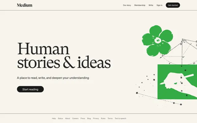
Medium's design evokes the feeling of a refined, minimalist literary journal, emphasizing content over chrome. The dominant use of a warm off-white background (#f7f4ed) creates a soft, inviting canvas for the high-contrast text. Typography is the cornerstone, with a stately serif font for headlines paired with a clean sans-serif for body text, creating a classic yet accessible reading experience. Accent colors are deliberately minimal, primarily using deep black for interactive elements to draw clear focus and a vibrant green for specific illustrative brand moments.
The layout is predominantly content-focused, utilizing a maximum width for readability while allowing key elements like the hero illustration to span wider. The hero section features a large, centered headline (`gt-super` 120px) under a sticky top navigation bar. Content is arranged with clear vertical separation between sections (64px `sectionGap`), often with text blocks and illustrative elements in a balanced composition. The footer is minimalistic, presenting links in a compact horizontal arrangement. The overall impression is spacious and breathable, prioritizing legibility and a calm reading experience.
The site uses a combination of abstract, illustrative graphics and highly stylized conceptual visuals. The key pieces include a hand drawing with a pen, geometric patterns (possibly related to design or mathematics), and a bold, illustrative flower in Story Green (#50B33A). Imagery is used decoratively, providing visual metaphors for 'stories & ideas' rather than literal representations, enhancing the brand's creative and thoughtful atmosphere. Icons are minimal, primarily functional, and likely monochrome.
Reminiscent of The New York Times, Farnam Street Blog, Substack, WordPress.com.
# Medium — Style Reference
> Literary Cafe, Digital Ink on Vellum.

**Theme:** light

**Site:** https://medium.com

Medium's design evokes the feeling of a refined, minimalist literary journal, emphasizing content over chrome. The dominant use of a warm off-white background (#f7f4ed) creates a soft, inviting canvas for the high-contrast text. Typography is the cornerstone, with a stately serif font for headlines paired with a clean sans-serif for body text, creating a classic yet accessible reading experience. Accent colors are deliberately minimal, primarily using deep black for interactive elements to draw clear focus and a vibrant green for specific illustrative brand moments.

## Tokens — Colors

| Name | Value | Token | Role |
|------|------|------|------|
| Story Green | `#50B33A` | `--color-story-green` | Brand accent for illustrative elements and visual flair, marking the creative, organic aspect of the brand. |
| Vellum Background | `#f7f4ed` | `--color-vellum-background` | Page background, primary canvas. |
| Parchment White | `#ffffff` | `--color-parchment-white` | Secondary background for minor UI elements against warmer canvas. |
| Charcoal Black | `#191919` | `--color-charcoal-black` | Primary text for headings and bold interactive elements like buttons. |
| Inkwell Black | `#242424` | `--color-inkwell-black` | Standard body text color, dark but slightly softer than charcoal black for readability. |
| Book Text Gray | `#333333` | `--color-book-text-gray` | Main body text, general text accents, and borders. |
| Muted Text Gray | `#6b6b6b` | `--color-muted-text-gray` | Secondary or muted text, such as footer links and captions. |

## Tokens — Typography

### medium-content-sans-serif-font
- **Weights:** 400
- **Sizes:** 16px
- **Line height:** 1.2
- **Letter spacing:** 0
- **Role:** Content body text, designed for extended reading passages. Its custom nature likely provides specific readability optimizations.

### gt-super
- **Weights:** 400
- **Sizes:** 120px
- **Line height:** 0.83
- **Letter spacing:** -0.055
- **Role:** Display headlines and primary page titles. The wide letter-spacing creates a sense of gravitas and classic editorial style.

### sohne
- **Weights:** 400
- **Sizes:** 13px, 14px, 20px, 22px
- **Line height:** 1.27, 1.4, 1.43, 1.54
- **Letter spacing:** 0
- **Role:** Body text, navigation links, and button labels. Its clean sans-serif nature provides high readability for continuous reading.

### Times
- **Weights:** 400
- **Sizes:** 16px
- **Line height:** 1.2
- **Role:** Times — detected in extracted data but not described by AI

## Tokens — Type Scale

| Role | Size | Line height | Letter spacing |
|------|------|------|------|
| caption | 13px | 1.27 | — |
| body | 16px | 1.2 | — |
| subheading | 20px | 1.43 | — |
| heading-sm | 22px | 1.54 | — |
| display | 120px | 0.83 | -6.6px |

## Tokens — Spacing

- **Section gap:** 64px
- **Card padding:** 16px
- **Element gap:** 16px

## Tokens — Radius

- **Buttons:** 1386px
- **pillButtons:** 1980px

## Layout

The layout is predominantly content-focused, utilizing a maximum width for readability while allowing key elements like the hero illustration to span wider. The hero section features a large, centered headline (`gt-super` 120px) under a sticky top navigation bar. Content is arranged with clear vertical separation between sections (64px `sectionGap`), often with text blocks and illustrative elements in a balanced composition. The footer is minimalistic, presenting links in a compact horizontal arrangement. The overall impression is spacious and breathable, prioritizing legibility and a calm reading experience.

## Imagery

The site uses a combination of abstract, illustrative graphics and highly stylized conceptual visuals. The key pieces include a hand drawing with a pen, geometric patterns (possibly related to design or mathematics), and a bold, illustrative flower in Story Green (#50B33A). Imagery is used decoratively, providing visual metaphors for 'stories & ideas' rather than literal representations, enhancing the brand's creative and thoughtful atmosphere. Icons are minimal, primarily functional, and likely monochrome.

## Components

### Primary Filled Button
*Call to action button for primary actions.*

Filled with Charcoal Black (#191919), text in Parchment White (#ffffff). Rounded corners set extremely high at 1386px for a pill shape. Padding is 8px vertical, 16px horizontal.

### Pill Accent Button
*Secondary call to action button, used primarily in navigation.*

Filled with Charcoal Black (#191919), text in Parchment White (#ffffff). Features significantly higher rounded corners at 1980px, creating a distinct pill shape. Padding is 8px vertical, 20px horizontal.

### Header Navigation Link
*Standard text link within the header.*

Uses Inkwell Black (#242424) text, font family 'sohne' weight 400, size 14px, line height 1.40. No specific padding but follows element spacing of 16px.

### Footer Navigation Link
*Muted text links in the footer.*

Uses Muted Text Gray (#6b6b6b) text, font family 'sohne' weight 400, size 13px, line height 1.27. Organized with element gaps.

## Guidelines

### Do

- Do use Vellum Background (#f7f4ed) as the primary page background to maintain the soft, inviting tone.
- Do apply gt-super for headlines at weight 400 with 'lnum' and 'pnum' font features enabled for distinct editorial typography.
- Do use Charcoal Black (#191919) for primary interactive elements like buttons and primary text, and Inkwell Black (#242424) for standard body text.
- Do use a generous horizontal padding of 16px or 20px for buttons to emphasize their pill shape.
- Do rely on a minimal set of neutral colors for UI elements, reserving Story Green (#50B33A) exclusively for brand illustrations and impactful visuals.
- Do maintain element gaps of 16px between most inline UI elements to ensure comfortable density.

### Don't

- Don't use strong, saturated colors for backgrounds or text, which would disrupt the subtle and content-focused aesthetic.
- Don't add shadows or heavy borders to UI components; design should feel flat and integrated with the canvas.
- Don't deviate from the established pill shapes for buttons; all interactive buttons should have extremely high border radii.
- Don't introduce additional serif fonts; the contrast between gt-super and sohne (or medium-content-sans-serif-font) is a core part of the identity.
- Don't animate UI elements with excessive complexity or duration beyond the 'ease' timing and 0.3s duration for subtle transitions.
- Don't use dense layouts; ensure comfortable spacing with a base unit of 8px and larger gaps for sections.

## Agent Prompt Guide

### Quick Color Reference
- **Text (Headings):** #191919 (Charcoal Black)
- **Text (Body):** #242424 (Inkwell Black)
- **Background (Page):** #f7f4ed (Vellum Background)
- **Button Background:** #191919 (Charcoal Black)
- **Button Text:** #ffffff (Parchment White)
- **Accent (Illustration):** #50B33A (Story Green)

### 3-5 Example Component Prompts
1. **Create a hero section:** Vellum Background (#f7f4ed). Main headline: 'Human stories & ideas' using gt-super weight 400, size 120px, Inkwell Black (#242424), letter-spacing -0.0550em. Subtitle: 'A place to read, write, and deepen your understanding' using sohne weight 400, size 22px, Inkwell Black (#242424), line height 1.54. Include a Primary Filled Button 'Start reading'.
2. **Generate a header navigation bar:** Vellum Background (#f7f4ed) and a thin 1px border-bottom in Book Text Gray (#333333). Include a 'Medium' logo as text using Charcoal Black (#191919), sohne weight 400, size 20px. On the right, include Header Navigation Links 'Our story', 'Membership', 'Write', 'Sign in' (all Inkwell Black (#242424), sohne weight 400, size 14px) and a Pill Accent Button 'Get started'.
3. **Design a content block with a footer:** Use a section gap of 64px. Place a block of body text using medium-content-sans-serif-font weight 400, size 16px, Book Text Gray (#333333). Below this, add a footer section with a 1px top border in Book Text Gray (#333333) and a muted background if desired (Parchment White), featuring Footer Navigation Links in Muted Text Gray (#6b6b6b), sohne weight 400, size 13px, separated by element gaps of 16px.
More like this







Keep what you find
A free account saves references to boards and can send you a weekly email of picks based on what you save.
To see every result, go Pro.