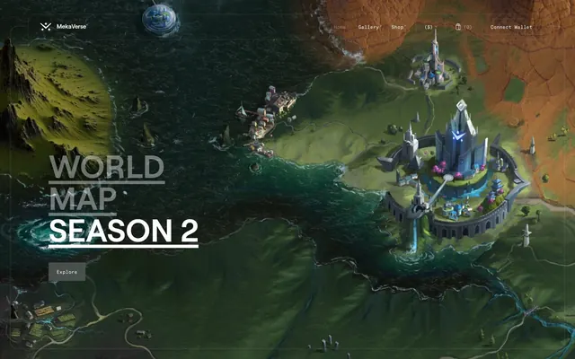
Preview image. Unlock full-res
Deep-space holographic command center.
Color palette
Supporting palette color for small decorative accents when the core palette needs contrast. Do not promote it to the primary CTA color
Supporting palette color for small decorative accents when the core palette needs contrast. Do not promote it to the primary CTA color
Tertiary accent, decorative highlights
Lightest blue accent for contrast or subtle detailing
Softest cool-toned neutral, for backgrounds or textural elements
Page backgrounds, primary text, dark element borders, deep surface contrast
Primary text, ghost button borders, selected navigation items, light accents
Subtle background panels, muted surface treatment
Decorative borders, divider lines, secondary UI outlines
Solid button backgrounds, interactive elements requiring more visual weight
Typography
- Weights
- 400
- Sizes
- 26px, 30px, 80px
- Line height
- 0.78, 1, 1.15
- Letter spacing
- normal
- Fallback
- Montserrat
Primary display font for headings, impactful statements, and key navigation items. Its large sizes establish a bold, assertive presence, while 'normal' letter spacing keeps it legible at scale.
- Weights
- 400
- Sizes
- 10px, 12px
- Line height
- 1, 1.3
- Letter spacing
- -0.02em
- Fallback
- Roboto Mono
Monospaced font for detailed body text, navigational sub-items, and information-dense areas. The subtle negative letter-spacing creates a compact, technical feel.
Spacing & shape
Components
Background: rgba(255, 255, 255, 0.2), Text: Cloud White (#ffffff), Border: 1px solid Cloud White (#ffffff), Radius: 2px, Padding: 0px vertical, 20px horizontal. This button prioritizes minimal visual footprint.
Background: transparent (rgba(0, 0, 0, 0)), Text: Cloud White (#ffffff), No border, No radius, Padding: 0px. Used for subtle navigation or secondary actions.
Background: Void Black (#000000), Text: Cloud White (#ffffff), Border: 1px solid Void Black (#000000), Radius: 2px, Padding: 0px vertical, 20px horizontal. Provides a solid, yet subdued, interactive target.
Background: Control Gray (#444345), Text: Cloud White (#ffffff), Border: 1px solid Control Gray (#444345), Radius: 2px, Padding: 0px vertical, 20px horizontal. Offers moderate visual weight while maintaining a dark aesthetic.
Background: transparent, Text: Cloud White (#ffffff), Underline Border: 1px solid Cloud White (#ffffff) on hover/active, often without visible border otherwise. Radius: 2px for active states. Features Roobert font.
Background: transparent (rgb(0,0,0,0)), Text: Void Black (#000000) or Cloud White (#ffffff) depending on context, Border: 1px solid Cloud White (#ffffff) or Void Black (#000000), Radius: 0px. Used for secondary nav elements.
Background: Often transparent or very dark, Border: Hairline outlines in Ghost Gray (#e2e2e2) or Cloud White (#ffffff), Radius: 10px. Padding is typically 20px for internal content.
Guidelines
- Use Void Black (#000000) as the dominant background for all major sections to maintain a deep, immersive feel.
- Apply Cloud White (#ffffff) for primary text and headings to ensure high contrast and legibility.
- Utilize Roobert font for all headings (26px, 30px, 80px) and large display text to establish a strong visual hierarchy.
- Employ GT America Mono Regular for all body and detailed text (10px, 12px), applying a consistent -0.02em letter-spacing.
- Maintain a clear visual distinction for interactive elements, favoring ghost buttons with Cloud White (#ffffff) borders for primary actions and Control Gray (#444345) for filled secondary actions.
- Use a base unit of 4px for all spacing measurements, translating to element gaps of 20px and section gaps of 40px.
- Apply 2px border radius for interactive elements like buttons and navigation, and 10px or 20px for larger content containers to soften their appearance minimally.
- Avoid using bright or overly saturated colors as primary backgrounds; the default is a dark, immersive canvas.
- Do not deviate from the specified font families and letter-spacing values, as they are central to the brand's technical and assertive tone.
- Refrain from heavy drop shadows or excessive elevation; the system prefers subtle layering and transparency.
- Do not use generic button styles; stick to the defined ghost, text, and solid dark button variants.
- Avoid large amounts of un-contained white space on dark backgrounds; content should feel integrated into the visual field.
- Do not use more than 2px radius for buttons or nav items; larger radii are reserved for content containers (10px, 20px).
- Do not use more than a single accent color per section; maintain focus and clarity against the dark canvas.
About this system
ShowHide
MekaVerse employs a deep, immersive dark theme, reminiscent of a futuristic console interface against expansive, detailed world maps. The design emphasizes content through large, impactful typography, with subtle interactive elements appearing as focused accents. UI components are lightweight and minimalist, often using transparent or ghost styles to keep the focus on the rich background visuals. A strong sense of digital artistry is conveyed through custom fonts and the deliberate use of high-contrast text against dark, natural environments.
The site uses a full-bleed page model, where background imagery stretches across the entire viewport. The hero section is characterized by a full-viewport image with large, centered headlines overlayed. Section rhythm is often seamless, with background imagery transitioning or layering, maintained through consistent vertical spacing of 40px between major content blocks. Content arrangement frequently features centered stacks of headlines, subtext, and ghost buttons. There are instances of alternating text-left/image-right or multi-column card grids for features, all within the immersive background. The overall density is spacious between sections, but content blocks themselves can be information-rich. Navigation is handled by a transparent sticky top bar with minimalist links.
This site features highly detailed, immersive 3D rendered world maps and abstract graphic elements. Imagery primarily serves as a full-bleed atmospheric background or contained within specific content blocks. When photography is used, it often shows product-focused shots of the Mekas themselves. Illustrations are dimensional and highly detailed with a sci-fi/fantasy aesthetic. Icons are minimalist and outlined, typically in white against dark backgrounds, maintaining a clean yet functional appearance. Imagery is dense and dominant, often taking up large portions of the screen to create an immersive experience, with text overlayed directly onto it.
Reminiscent of Star Atlas, Cyberpunk 2077 Website, Immutable X, Decentraland.
# MekaVerse — Style Reference
> Deep-space holographic command center.

**Theme:** dark

**Site:** https://themekaverse.com

MekaVerse employs a deep, immersive dark theme, reminiscent of a futuristic console interface against expansive, detailed world maps. The design emphasizes content through large, impactful typography, with subtle interactive elements appearing as focused accents. UI components are lightweight and minimalist, often using transparent or ghost styles to keep the focus on the rich background visuals. A strong sense of digital artistry is conveyed through custom fonts and the deliberate use of high-contrast text against dark, natural environments.

## Tokens — Colors

| Name | Value | Token | Role |
|------|------|------|------|
| Page Blue | `#2e9ec3` | `--color-page-blue` | Supporting palette color for small decorative accents when the core palette needs contrast. Do not promote it to the primary CTA color |
| Page Red | `#bc1010` | `--color-page-red` | Supporting palette color for small decorative accents when the core palette needs contrast. Do not promote it to the primary CTA color |
| Page Pink | `#d69dbb` | `--color-page-pink` | Tertiary accent, decorative highlights |
| Page Light Blue | `#20b0d7` | `--color-page-light-blue` | Lightest blue accent for contrast or subtle detailing |
| Page Blue Grey | `#9faac0` | `--color-page-blue-grey` | Softest cool-toned neutral, for backgrounds or textural elements |
| Void Black | `#000000` | `--color-void-black` | Page backgrounds, primary text, dark element borders, deep surface contrast |
| Cloud White | `#ffffff` | `--color-cloud-white` | Primary text, ghost button borders, selected navigation items, light accents |
| Light Mist | `#b8bab9` | `--color-light-mist` | Subtle background panels, muted surface treatment |
| Ghost Gray | `#e2e2e2` | `--color-ghost-gray` | Decorative borders, divider lines, secondary UI outlines |
| Control Gray | `#444345` | `--color-control-gray` | Solid button backgrounds, interactive elements requiring more visual weight |

## Tokens — Typography

### Roobert
- **Substitute:** Montserrat
- **Weights:** 400
- **Sizes:** 26px, 30px, 80px
- **Line height:** 0.78, 1, 1.15
- **Letter spacing:** normal
- **Role:** Primary display font for headings, impactful statements, and key navigation items. Its large sizes establish a bold, assertive presence, while 'normal' letter spacing keeps it legible at scale.

### GT America Mono Regular
- **Substitute:** Roboto Mono
- **Weights:** 400
- **Sizes:** 10px, 12px
- **Line height:** 1, 1.3
- **Letter spacing:** -0.02em
- **Role:** Monospaced font for detailed body text, navigational sub-items, and information-dense areas. The subtle negative letter-spacing creates a compact, technical feel.

## Tokens — Type Scale

| Role | Size | Line height | Letter spacing |
|------|------|------|------|
| heading-sm | 26px | 1.15 | — |
| heading | 30px | 1 | — |
| display | 80px | 0.78 | — |

## Tokens — Spacing

- **Section gap:** 40px
- **Card padding:** 20px
- **Element gap:** 20px

## Tokens — Radius

- **Buttons:** 2px
- **Cards:** 10px
- **containers:** 20px
- **navItems:** 2px

## Layout

The site uses a full-bleed page model, where background imagery stretches across the entire viewport. The hero section is characterized by a full-viewport image with large, centered headlines overlayed. Section rhythm is often seamless, with background imagery transitioning or layering, maintained through consistent vertical spacing of 40px between major content blocks. Content arrangement frequently features centered stacks of headlines, subtext, and ghost buttons. There are instances of alternating text-left/image-right or multi-column card grids for features, all within the immersive background. The overall density is spacious between sections, but content blocks themselves can be information-rich. Navigation is handled by a transparent sticky top bar with minimalist links.

## Imagery

This site features highly detailed, immersive 3D rendered world maps and abstract graphic elements. Imagery primarily serves as a full-bleed atmospheric background or contained within specific content blocks. When photography is used, it often shows product-focused shots of the Mekas themselves. Illustrations are dimensional and highly detailed with a sci-fi/fantasy aesthetic. Icons are minimalist and outlined, typically in white against dark backgrounds, maintaining a clean yet functional appearance. Imagery is dense and dominant, often taking up large portions of the screen to create an immersive experience, with text overlayed directly onto it.

## Components

### Primary Ghost Button
*Interactive element for key actions, appearing as a transparent rectangular outline.*

Background: rgba(255, 255, 255, 0.2), Text: Cloud White (#ffffff), Border: 1px solid Cloud White (#ffffff), Radius: 2px, Padding: 0px vertical, 20px horizontal. This button prioritizes minimal visual footprint.

### Text Link Button
*Minimal interactive element, purely text-based without background or visible border.*

Background: transparent (rgba(0, 0, 0, 0)), Text: Cloud White (#ffffff), No border, No radius, Padding: 0px. Used for subtle navigation or secondary actions.

### Dark Filled Button
*Standard button for actions that require slightly more visual emphasis.*

Background: Void Black (#000000), Text: Cloud White (#ffffff), Border: 1px solid Void Black (#000000), Radius: 2px, Padding: 0px vertical, 20px horizontal. Provides a solid, yet subdued, interactive target.

### Muted Action Button
*Less prominent action button, typically for secondary or tertiary functions.*

Background: Control Gray (#444345), Text: Cloud White (#ffffff), Border: 1px solid Control Gray (#444345), Radius: 2px, Padding: 0px vertical, 20px horizontal. Offers moderate visual weight while maintaining a dark aesthetic.

### Navigation Item
*Individual items within the main navigation, with subtle interactive styling.*

Background: transparent, Text: Cloud White (#ffffff), Underline Border: 1px solid Cloud White (#ffffff) on hover/active, often without visible border otherwise. Radius: 2px for active states. Features Roobert font.

### Outlined Nav Item
*Navigation items that appear as an outline without a fill.*

Background: transparent (rgb(0,0,0,0)), Text: Void Black (#000000) or Cloud White (#ffffff) depending on context, Border: 1px solid Cloud White (#ffffff) or Void Black (#000000), Radius: 0px. Used for secondary nav elements.

### Content Card
*Container for information or features, with slightly rounded corners.*

Background: Often transparent or very dark, Border: Hairline outlines in Ghost Gray (#e2e2e2) or Cloud White (#ffffff), Radius: 10px. Padding is typically 20px for internal content.

## Guidelines

### Do

- Use Void Black (#000000) as the dominant background for all major sections to maintain a deep, immersive feel.
- Apply Cloud White (#ffffff) for primary text and headings to ensure high contrast and legibility.
- Utilize Roobert font for all headings (26px, 30px, 80px) and large display text to establish a strong visual hierarchy.
- Employ GT America Mono Regular for all body and detailed text (10px, 12px), applying a consistent -0.02em letter-spacing.
- Maintain a clear visual distinction for interactive elements, favoring ghost buttons with Cloud White (#ffffff) borders for primary actions and Control Gray (#444345) for filled secondary actions.
- Use a base unit of 4px for all spacing measurements, translating to element gaps of 20px and section gaps of 40px.
- Apply 2px border radius for interactive elements like buttons and navigation, and 10px or 20px for larger content containers to soften their appearance minimally.

### Don't

- Avoid using bright or overly saturated colors as primary backgrounds; the default is a dark, immersive canvas.
- Do not deviate from the specified font families and letter-spacing values, as they are central to the brand's technical and assertive tone.
- Refrain from heavy drop shadows or excessive elevation; the system prefers subtle layering and transparency.
- Do not use generic button styles; stick to the defined ghost, text, and solid dark button variants.
- Avoid large amounts of un-contained white space on dark backgrounds; content should feel integrated into the visual field.
- Do not use more than 2px radius for buttons or nav items; larger radii are reserved for content containers (10px, 20px).
- Do not use more than a single accent color per section; maintain focus and clarity against the dark canvas.

## Agent Prompt Guide

Quick Color Reference:
- text: #ffffff
- background: #000000
- border: #ffffff
- accent: #2e9ec3
- primary action: #444345 (filled action)

Example Component Prompts:
- Create a Primary Action Button: #444345 background, #ffffff text, 9999px radius, compact pill padding. Use this filled treatment for the main CTA.
- Create a Navigation Bar: Void Black (#000000) background, with a `Home` link and `Gallery` link using Cloud White (#ffffff) text, Roobert font (size 26px for main items, 12px for sub-items). Maintain 20px elementGap between items. Use an Outlined Nav Item for a 'Connect Wallet' button with Cloud White (#ffffff) text and border, no background, 0px radius, 0px padding.
- Create a Content Card: background transparent, with a 1px solid Ghost Gray (#e2e2e2) border, 10px radius, and 20px internal padding. Inside, use a Roobert 30px Cloud White (#ffffff) heading and GT America Mono Regular 12px text in Cloud White (#ffffff) with -0.02em letter-spacing.
More like this







Keep what you find
A free account saves references to boards and can send you a weekly email of picks based on what you save.
To see every result, go Pro.