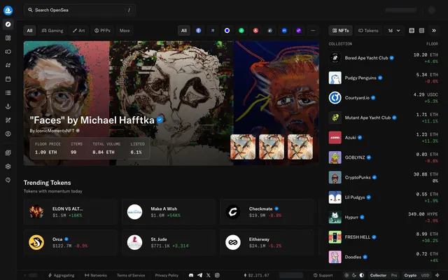
Preview image. Unlock full-res
Midnight data console
Color palette
Emphasis elements, borders for active states, interactive links, providing clear focal points
Green outline accent for tags, dividers, and focused UI edges. Use as a supporting accent, not as a status color
Red outline accent for tags, dividers, and focused UI edges. Use as a supporting accent, not as a status color
Page backgrounds, underlying canvas
Main canvas surface, navigation backgrounds, elevated panels
Card backgrounds, section separators, creating distinct content blocks
Subtle borders, dividers, ghost button outlines, providing structure without harsh lines
Dark borders and separators for elevated surfaces and inverted UI. Do not promote it to the primary CTA color
Mid-tone panel surface for subdued dark UI layers and secondary containers. Do not promote it to the primary CTA color
Primary text, headings, icons, strong surface accents, ensuring readability against dark backgrounds
Secondary text, muted links, subtle element borders, providing complementary descriptive information
Typography
- Weights
- 400, 500
- Sizes
- 12px, 14px, 16px, 20px, 32px
- Line height
- 1.25, 1.5
- Letter spacing
- normal
- Fallback
- Inter
Primary brand typeface for all headings, body text, and UI elements. Its confident, sans-serif structure maintains clarity even at smaller sizes in a data-dense environment.
- Weights
- 400, 500
- Sizes
- 12px, 14px, 16px
- Line height
- 1, 1.25, 1.5
- Letter spacing
- normal
- Fallback
- JetBrains Mono
Monospaced typeface used for displaying technical data, prices, and code-like information, providing a precise, aligned read.
Spacing & shape
Components
Text: Silver Whisper (#acadae), Background: transparent, Border: Steel Border (#34353c), Radius: 6px, Padding: 8px. Creates a lightweight, subtle interactive element.
Text: Silver Whisper (#acadae), Background: rgba(255, 255, 255, 0.02), Border: rgba(255, 255, 255, 0.08), Radius: 6px, Padding: 0px 10px. Provides a subtle dark fill for less prominent actions.
Text: White Canvas (#ffffff), Background: transparent, Border: White Canvas (#ffffff), Radius: 6px, Padding: 0px 12px. Offers a high-contrast ghost button for critical but non-primary actions.
Background: Slate Card (#1b1d1f), Border: rgba(255, 255, 255, 0.08) 1px inset, Radius: 8px. Provides a subtle internal border, giving a clean, contained look without strong external shadows.
Background: rgba(255, 255, 255, 0.02), Radius: 8px, Shadow: rgba(0, 0, 0, 0.03) 0px 1px 2px 0px. Used for subtle elevation with a very soft shadow for content blocks.
Text: White Canvas (#ffffff) or Silver Whisper (#acadae). Active state border: Electric Blue (#83c3ff) under the active element. Padding: 0px 12px 0px 12px (vertical padding implicitly adjusts with text size).
Guidelines
- Prioritize Midnight Ink (#080809) as the base background, shifting to Deep Graphite (#141415) for main interactive surfaces and Slate Card (#1b1d1f) for isolated content blocks.
- Use White Canvas (#ffffff) strictly for primary text, headings, and high-contrast UI elements to maximize readability on dark backgrounds.
- Apply Electric Blue (#83c3ff) as the sole accent color for interactive link text, active states, and focus indicators to create clear points of interaction.
- Employ the gtAmericaMono font family only for numerical data, cryptocurrency values, and technical readouts to maintain a consistent data display aesthetic.
- Structure layouts using a max-width of 1325px, with consistent 48px vertical section gaps to ensure a balanced, spacious content presentation.
- Utilize a default border radius of 4px for most interactive elements like buttons, and 8px for cards, to maintain a consistent soft edge treatment throughout the UI.
- Use `rgba(255, 255, 255, 0.08) 0px 0px 0px 1px inset` as the internal card border for primary content cards, avoiding external box shadows for these elements.
- Do not introduce additional chromatic colors beyond Electric Blue, Success Green, and Error Red; maintain a largely monochromatic palette otherwise.
- Avoid heavy drop shadows or strong elevation effects for cards; instead, use subtle internal borders or minimal 1px 2px soft shadows if elevation is strictly necessary.
- Do not use generic system fonts; always specify gtAmerica or gtAmericaMono to preserve brand typography.
- Do not vary letter-spacing for standard text; keep it 'normal' unless specifically defined otherwise for display typography roles.
- Avoid large, impactful imagery beyond content display; images should be contained within card structures or relevant content areas rather than full bleeding or overpowering hero sections.
- Do not use `padding: 0` for any card variant without also defining minimum internal spacing for text and content, typically 12px or 16px.
- Avoid using White Canvas (#ffffff) for borders or backgrounds for ghost buttons, unless it is for an 'active' state, deferring to Steel Border (#26272d) for inactive/default elements.
About this system
ShowHide
OpenSea leverages a vibrant dark mode experience contrasting deep, cool grays with a brilliant, singular blue accent. The interface is characterized by highly structured layouts, subtle internal card borders, and ghost buttons, prioritizing content over heavy UI chrome. Typography is compact and precise, maintaining readability on dark surfaces, with a focus on displaying data and digital assets clearly. The overall aesthetic is one of a digital marketplace, emphasizing data density and functional clarity.
Reminiscent of Rarible, Uniswap, Coinbase, Etherscan.
# OpenSea — Style Reference
> Midnight data console

**Theme:** dark

**Site:** https://opensea.io

OpenSea leverages a vibrant dark mode experience contrasting deep, cool grays with a brilliant, singular blue accent. The interface is characterized by highly structured layouts, subtle internal card borders, and ghost buttons, prioritizing content over heavy UI chrome. Typography is compact and precise, maintaining readability on dark surfaces, with a focus on displaying data and digital assets clearly. The overall aesthetic is one of a digital marketplace, emphasizing data density and functional clarity.

## Tokens — Colors

| Name | Value | Token | Role |
|------|------|------|------|
| Electric Blue | `#83c3ff` | `--color-electric-blue` | Emphasis elements, borders for active states, interactive links, providing clear focal points |
| Success Green | `#47bb64` | `--color-success-green` | Green outline accent for tags, dividers, and focused UI edges. Use as a supporting accent, not as a status color |
| Error Red | `#e24756` | `--color-error-red` | Red outline accent for tags, dividers, and focused UI edges. Use as a supporting accent, not as a status color |
| Midnight Ink | `#080809` | `--color-midnight-ink` | Page backgrounds, underlying canvas |
| Deep Graphite | `#141415` | `--color-deep-graphite` | Main canvas surface, navigation backgrounds, elevated panels |
| Slate Card | `#1b1d1f` | `--color-slate-card` | Card backgrounds, section separators, creating distinct content blocks |
| Steel Border | `#26272d` | `--color-steel-border` | Subtle borders, dividers, ghost button outlines, providing structure without harsh lines |
| Soft Stone | `#34353c` | `--color-soft-stone` | Dark borders and separators for elevated surfaces and inverted UI. Do not promote it to the primary CTA color |
| Ghost Fill | `#3c3d40` | `--color-ghost-fill` | Mid-tone panel surface for subdued dark UI layers and secondary containers. Do not promote it to the primary CTA color |
| White Canvas | `#ffffff` | `--color-white-canvas` | Primary text, headings, icons, strong surface accents, ensuring readability against dark backgrounds |
| Silver Whisper | `#acadae` | `--color-silver-whisper` | Secondary text, muted links, subtle element borders, providing complementary descriptive information |

## Tokens — Typography

### gtAmerica
- **Substitute:** Inter
- **Weights:** 400, 500
- **Sizes:** 12px, 14px, 16px, 20px, 32px
- **Line height:** 1.25, 1.5
- **Letter spacing:** normal
- **Role:** Primary brand typeface for all headings, body text, and UI elements. Its confident, sans-serif structure maintains clarity even at smaller sizes in a data-dense environment.

### gtAmericaMono
- **Substitute:** JetBrains Mono
- **Weights:** 400, 500
- **Sizes:** 12px, 14px, 16px
- **Line height:** 1, 1.25, 1.5
- **Letter spacing:** normal
- **Role:** Monospaced typeface used for displaying technical data, prices, and code-like information, providing a precise, aligned read.

## Tokens — Type Scale

Major Third (1.25) from 16px base.

| Role | Size | Line height | Letter spacing |
|------|------|------|------|
| caption | 12px | 1.5 | — |
| body-sm | 14px | 1.5 | — |
| body | 16px | 1.5 | — |
| heading-sm | 20px | 1.25 | — |
| display | 32px | 1.25 | — |

## Tokens — Spacing

- **Max width:** 1325px
- **Section gap:** 48px
- **Card padding:** 12px
- **Element gap:** 8px

## Tokens — Radius

- **Default:** 4px
- **Buttons:** 4px
- **Cards:** 8px

## Components

### Ghost Button
*Interactive elements for secondary actions or navigation.*

Text: Silver Whisper (#acadae), Background: transparent, Border: Steel Border (#34353c), Radius: 6px, Padding: 8px. Creates a lightweight, subtle interactive element.

### Filled Neutral Button
*Tertiary actions or category filters.*

Text: Silver Whisper (#acadae), Background: rgba(255, 255, 255, 0.02), Border: rgba(255, 255, 255, 0.08), Radius: 6px, Padding: 0px 10px. Provides a subtle dark fill for less prominent actions.

### White Text Button (Ghost)
*Prominent ghost actions or tab activators.*

Text: White Canvas (#ffffff), Background: transparent, Border: White Canvas (#ffffff), Radius: 6px, Padding: 0px 12px. Offers a high-contrast ghost button for critical but non-primary actions.

### Inset Border Card
*Collection or asset display cards.*

Background: Slate Card (#1b1d1f), Border: rgba(255, 255, 255, 0.08) 1px inset, Radius: 8px. Provides a subtle internal border, giving a clean, contained look without strong external shadows.

### Shadowed Card
*Elevated information or interactive cards.*

Background: rgba(255, 255, 255, 0.02), Radius: 8px, Shadow: rgba(0, 0, 0, 0.03) 0px 1px 2px 0px. Used for subtle elevation with a very soft shadow for content blocks.

### Navigation Tab
*Top-level navigation items or filters.*

Text: White Canvas (#ffffff) or Silver Whisper (#acadae). Active state border: Electric Blue (#83c3ff) under the active element. Padding: 0px 12px 0px 12px (vertical padding implicitly adjusts with text size).

## Guidelines

### Do

- Prioritize Midnight Ink (#080809) as the base background, shifting to Deep Graphite (#141415) for main interactive surfaces and Slate Card (#1b1d1f) for isolated content blocks.
- Use White Canvas (#ffffff) strictly for primary text, headings, and high-contrast UI elements to maximize readability on dark backgrounds.
- Apply Electric Blue (#83c3ff) as the sole accent color for interactive link text, active states, and focus indicators to create clear points of interaction.
- Employ the gtAmericaMono font family only for numerical data, cryptocurrency values, and technical readouts to maintain a consistent data display aesthetic.
- Structure layouts using a max-width of 1325px, with consistent 48px vertical section gaps to ensure a balanced, spacious content presentation.
- Utilize a default border radius of 4px for most interactive elements like buttons, and 8px for cards, to maintain a consistent soft edge treatment throughout the UI.
- Use `rgba(255, 255, 255, 0.08) 0px 0px 0px 1px inset` as the internal card border for primary content cards, avoiding external box shadows for these elements.

### Don't

- Do not introduce additional chromatic colors beyond Electric Blue, Success Green, and Error Red; maintain a largely monochromatic palette otherwise.
- Avoid heavy drop shadows or strong elevation effects for cards; instead, use subtle internal borders or minimal 1px 2px soft shadows if elevation is strictly necessary.
- Do not use generic system fonts; always specify gtAmerica or gtAmericaMono to preserve brand typography.
- Do not vary letter-spacing for standard text; keep it 'normal' unless specifically defined otherwise for display typography roles.
- Avoid large, impactful imagery beyond content display; images should be contained within card structures or relevant content areas rather than full bleeding or overpowering hero sections.
- Do not use `padding: 0` for any card variant without also defining minimum internal spacing for text and content, typically 12px or 16px.
- Avoid using White Canvas (#ffffff) for borders or backgrounds for ghost buttons, unless it is for an 'active' state, deferring to Steel Border (#26272d) for inactive/default elements.

## Agent Prompt Guide

### Quick Color Reference
- Text: #ffffff
- Background: #080809
- Border: #26272d
- Accent: #83c3ff
- primary action: #83c3ff (outlined action border)

### 3-5 Example Component Prompts
1. Create a `Hero Spotlight Card`: Use `Slate Card` (#1b1d1f) background, `8px` radius. Showcase an `NFT image`. Below the image, add a `body` sized `gtAmerica` `weight 500` title in `White Canvas` (#ffffff). Include `body-sm` sized `gtAmerica` `weight 400` data labels in `Silver Whisper` (#acadae), paired with `gtAmericaMono` `weight 400` values, also in `White Canvas` (#ffffff). Internal padding should be `16px` vertically and horizontally.
2. Design a `Navigation Tab` for an active state: `gtAmerica` `weight 500` text in `White Canvas` (#ffffff), with an `Electric Blue` (#83c3ff) bottom border. The tab should have `0px` vertical padding and `12px` horizontal padding. The inactive state uses `Silver Whisper` (#acadae) text and no border.
3. Implement a `Ghost Button`: Display `gtAmerica` `weight 400` text in `Silver Whisper` (#acadae). The button should have a `transparent` background, `6px` radius, and a `1px` `Steel Border` (#34353c) outline. Apply `8px` padding around the text.
4. Create a `Trending Item Card`: Use `rgba(255, 255, 255, 0.02)` background, `8px` radius, and a `rgba(0, 0, 0, 0.03) 0px 1px 2px 0px` box-shadow. Inside, feature a small icon and `gtAmerica` `weight 500` title in `White Canvas` (#ffffff), followed by `gtAmericaMono` `weight 400` price data in `White Canvas` (#ffffff) and `Success Green` (#47bb64) for positive change indicators. Use `12px` internal padding.
5. Assemble a `Collection List Item` for the sidebar: Use `Deep Graphite` (#141415) as the background. Display `gtAmerica` `weight 400` text in `White Canvas` (#ffffff) for the collection name and `gtAmericaMono` `weight 400` value in `Silver Whisper` (#acadae) for its floor price. Include a small circular image or avatar. Use `8px` vertical and horizontal internal padding.
More like this







Keep what you find
A free account saves references to boards and can send you a weekly email of picks based on what you save.
To see every result, go Pro.