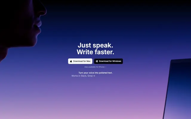
Preview image. Unlock full-res
Celestial Command Center: A dark, gradient-infused UI where sharp, functional elements glow with purpose against an expansive, cosmic void.
Color palette
Interactive elements, primary CTA hover/accent, key information highlights. The leading accent color for interactive states.
Highlighting key words or prices, secondary accent details that demand attention.
Subtle background for specific card types, often paired with dark text to signify importance.
Accent background for unique cards or sections, typically showcasing a specific feature.
Special feature highlights, decorative accents in illustrations.
Text accents, interactive elements, drawing attention to specific information.
Link color for embedded text that needs clear differentiation from body text.
Large background sections, visually distinct hero banners. Creates an expansive, cosmic feel.
Alternative hero background, suggesting a deeper, more profound sense of space.
Page background, primary surface for elevated components, core text color for light UI elements. The canvas upon which all other elements are built.
Secondary surface background, subtly darker than Midnight Eclipse, providing a slight depth for cards and sections.
Muted text, subtle icons, border color for low-contrast elements.
High-contrast text on dark backgrounds, primary UI element borders, input outlines. Also used for accent text that needs strong readability.
Alternative dark background for specific cards, adding depth with a cool blue undertone. Often paired with lighter text.
Primary text color against dark backgrounds, essential UI backgrounds (e.g., active navigation items, badges), and high-visibility icons.
Discreet shadows for subtle elevation, secondary text on light backgrounds.
Placeholder text in inputs, tertiary text details, inactive icon fills.
Muted text for descriptive elements, secondary links, and less prominent icons.
Divider lines, subtle text hints, disabled state elements.
Subtle UI element borders on lighter surfaces, secondary text on dark background.
Success states, positive indicators, and secondary interactive elements. A vibrant contrast to the dark theme.
Warning states, secondary highlights for attention-grabbing text or icons.
Error states, destructive actions, or critical warnings.
Typography
- Weights
- 300, 400, 500, 600, 700
- Sizes
- 8px, 9px, 10px, 11px, 12px, 13px, 14px, 15px, 16px, 18px, 20px, 24px, 30px, 31px, 48px, 60px
- Line height
- 1, 1.06, 1.07, 1.2, 1.25, 1.33, 1.4, 1.43, 1.45, 1.5, 1.56, 1.6, 1.63, 1.71
- Letter spacing
- -0.057, -0.05, -0.04, -0.037, -0.025, -0.01, 0.01
- Fallback
- system-ui
Primary typeface for all UI elements, headings, and body text. Its clean, geometric forms maintain readability across sizes and weights, providing a digital-native but approachable feel. The precise letter-spacing at larger sizes contributes to the sharp, modern aesthetic.
- Weights
- 300, 400
- Sizes
- 11px
- Line height
- 1, 1.3, 1.5
- Letter spacing
- normal
- Fallback
- monospace
Used sparingly for technical details, code snippets, or monospace display, offering a precise, fixed-width contrast to Inter.
- Weights
- 500
- Sizes
- 9px, 10px
- Line height
- 1.6, 1.78
- Letter spacing
- normal
- Fallback
- system-ui
System fallback, or for specific native OS-like UI elements, ensuring consistent rendering on Apple devices.
- Weights
- 400
- Sizes
- 14px, 16px
- Line height
- 1.43, 1.5
- Letter spacing
- normal
- Fallback
- system-ui
A decorative, custom typeface used for unique design accents, probably within illustrations or specific brand callouts. Its circular nature adds a playful, organic touch contrasting the overall sharp UI.
Spacing & shape
Elevation
Components
Ghost button with `Frost` text on a transparent background, `Ghostly Gray` border, `9999px` border-radius, and `10px` vertical, `16px` horizontal padding typically used for primary actions within dark immersive sections.
Button with `Frost` text on a `rgba(228, 232, 239, 0.1)` background, `9999px` border-radius. Padding is inherited from text/icon size, creating a tight pill shape. Used for software downloads, often includes a platform icon.
Button with `Frost` text on a `Midnight Eclipse` background, `9999px` border-radius. Padding is inherited from text/icon size. Used for software downloads, providing higher contrast on lighter elements.
Text link with `Frost` color on transparent background, no radius, `8px` padding. Appears in the top navigation bar.
Card with `24px` border-radius, `24px` padding, and a `Nebula Horizon` gradient background. Often used for showcasing key features with an immersive visual.
Card with `Frost` background, `24px` border-radius, `24px` padding, and subtle shadow (`rgba(0, 0, 0, 0.25) 0px 1px 4px 0px, rgba(0, 0, 0, 0.1) 0px 4px 59px 0px`). Used for detailed content sections, creating a light mode within the dark theme.
Badge with `Vivid Green` background, `24px` top/bottom `10px` side border-radius, `16px` vertical, `24px` horizontal padding. Used for highlighting positive status or 'top choice' labels.
Badge with `Goldenrod` background, `24px` top/bottom `10px` side border-radius, `16px` vertical, `24px` horizontal padding. Used for highlighting warnings or special offers.
Input field with `rgba(255, 255, 255, 0.1)` background, `Frost` text, `9px` border-radius, `8px` vertical, `12px` left, `100px` right padding. Provides a semi-transparent, subtle input style.
Button with `Frost` background, `Midnight Eclipse` text, `9999px` border-radius. Used in the header navigation for primary downloads. Padding for a clear, compact pill shape, often containing an icon.
Guidelines
- Prioritize `Midnight Eclipse` (#000000) for all page backgrounds when not using gradients, to maintain the dark theme.
- Use `Frost` (#FFFFFF) for all primary text on dark backgrounds and `Ghostly Gray` (#E5E7EB) for secondary text and borders.
- Apply `9px` border-radius as the default for most UI elements, especially interactive components and containers, and `9999px` for all pill-shaped buttons and tags.
- Utilize `Electric Blue` (#0088FF) as the primary accent color for all interactive states, active indicators, and prominent CTAs.
- Maintain `16px` as the default `elementGap` between closely related UI components and `32px` for `sectionGap` between distinct content blocks.
- Employ the Inter font family for all textual content, leveraging its range of weights from 300 to 700 to establish clear typographic hierarchy.
- When incorporating vivid gradients like `Nebula Horizon`, ensure text overlay is `Frost` (#FFFFFF) for optimal contrast and readability.
- Avoid using `Electric Blue` (#0088FF) as a primary background color; reserve it strictly for accents and interactive elements.
- Do not introduce sharp corners on interactive elements; maintain `9px` or `9999px` radius for consistency.
- Refrain from using light backgrounds or `Frost` (#FFFFFF) as the default page canvas; it should only appear on purposefully elevated cards or specific content sections.
- Do not deviate from the Inter font family for headings and body text, unless for decorative elements using 'Flow Circular' as specified.
- Avoid generic, full-bleed images without context; imagery must be contained or integrate seamlessly into the gradient backgrounds.
- Do not use subtle shadows on dark backgrounds; if elevation needs a shadow, ensure it's a prominent, dark `rgba(0, 0, 0, 0.25)` or an inset white shadow to define edges.
About this system
ShowHide
This design system evokes a 'celestial command center' feel, achieved through deep, gradient-rich dark backgrounds and high-contrast white typography. Vivid, almost neon-like accent colors emerge sparingly against the darkness, providing critical points of focus and interactivity. The primary visual tension arises from the interplay of vast, ethereal gradients and sharp, contained UI elements with precise 9px rounded corners and optional pill shapes for actions.
The page primarily uses a max-width contained layout, likely centered, against a full-bleed dark background or gradient. The hero section features a full-bleed gradient (`Nebula Horizon` or `Twilight Gradient`) with a large, centered headline and aligned call-to-action buttons. Content sections alternate between these deep gradient backgrounds and occasional `Frost` (#FFFFFF) cards, creating a rhythmic dark/light contrast. Information is often arranged in centered stacks or alternating 2-column text + image layouts. Feature sets are presented in grid structures, potentially 3 or 4 columns, with distinct card backgrounds. Spacing is comfortable, allowing elements to breathe. The navigation is a sticky top bar with left-aligned links and a prominent 'Download' button, maintaining presence across scrolls.
The visual language is characterized by abstract, ethereal gradient backgrounds that suggest cosmic or digital expanses. Interspersed are realistic or subtly stylized product screenshots (laptops, phones) which are often cropped and contained, emphasizing the software's integration into devices. Photography of people is minimal and high-contrast, using silhouettes against dark backgrounds to represent the user. Icons are primarily monochromatic, either `Frost` or `Ghostly Gray` fills with slight `Ghostly Gray` strokes, occasionally accented with `Electric Blue` or other brand colors. They appear mostly outlined, with a moderate stroke weight, and follow a general system icon style. Imagery serves both decorative atmosphere and explicit product demonstration, with a lower density of visual content than text-heavy sites but used strategically for impact. Visuals are typically contained, not full-bleed, and often integrate with the subtle blur/gloss effects.
Reminiscent of Linear, Stripe, Notion, Raycast.
# Superwhisper — Style Reference
> Celestial Command Center: A dark, gradient-infused UI where sharp, functional elements glow with purpose against an expansive, cosmic void.

**Theme:** dark

**Site:** https://superwhisper.com

This design system evokes a 'celestial command center' feel, achieved through deep, gradient-rich dark backgrounds and high-contrast white typography. Vivid, almost neon-like accent colors emerge sparingly against the darkness, providing critical points of focus and interactivity. The primary visual tension arises from the interplay of vast, ethereal gradients and sharp, contained UI elements with precise 9px rounded corners and optional pill shapes for actions.

## Tokens — Colors

| Name | Value | Token | Role |
|------|------|------|------|
| Electric Blue | `#0088FF` | `--color-electric-blue` | Interactive elements, primary CTA hover/accent, key information highlights. The leading accent color for interactive states. |
| Sunset Orange | `#E6714F` | `--color-sunset-orange` | Highlighting key words or prices, secondary accent details that demand attention. |
| Goldenrod | `#FFB764` | `--color-goldenrod` | Subtle background for specific card types, often paired with dark text to signify importance. |
| Magenta Burst | `#B855E7` | `--color-magenta-burst` | Accent background for unique cards or sections, typically showcasing a specific feature. |
| Teal Glow | `#1CECBb` | `--color-teal-glow` | Special feature highlights, decorative accents in illustrations. |
| Fuchsia Flare | `#DD55e7` | `--color-fuchsia-flare` | Text accents, interactive elements, drawing attention to specific information. |
| Sky Blue | `#60A5FA` | `--color-sky-blue` | Link color for embedded text that needs clear differentiation from body text. |
| Twilight Gradient | `#000000` | `--color-twilight-gradient` | Large background sections, visually distinct hero banners. Creates an expansive, cosmic feel. |
| Nebula Horizon | `#000000` | `--color-nebula-horizon` | Alternative hero background, suggesting a deeper, more profound sense of space. |
| Midnight Eclipse | `#000000` | `--color-midnight-eclipse` | Page background, primary surface for elevated components, core text color for light UI elements. The canvas upon which all other elements are built. |
| Starless Night | `#030719` | `--color-starless-night` | Secondary surface background, subtly darker than Midnight Eclipse, providing a slight depth for cards and sections. |
| Twilight Ink | `#1C1D1F` | `--color-twilight-ink` | Muted text, subtle icons, border color for low-contrast elements. |
| Ghostly Gray | `#E5E7EB` | `--color-ghostly-gray` | High-contrast text on dark backgrounds, primary UI element borders, input outlines. Also used for accent text that needs strong readability. |
| Deep Ocean | `#001B33` | `--color-deep-ocean` | Alternative dark background for specific cards, adding depth with a cool blue undertone. Often paired with lighter text. |
| Frost | `#FFFFFF` | `--color-frost` | Primary text color against dark backgrounds, essential UI backgrounds (e.g., active navigation items, badges), and high-visibility icons. |
| Ash Gray | `#333333` | `--color-ash-gray` | Discreet shadows for subtle elevation, secondary text on light backgrounds. |
| Iron Gray | `#666666` | `--color-iron-gray` | Placeholder text in inputs, tertiary text details, inactive icon fills. |
| Slate Gray | `#70757C` | `--color-slate-gray` | Muted text for descriptive elements, secondary links, and less prominent icons. |
| Pewter | `#999999` | `--color-pewter` | Divider lines, subtle text hints, disabled state elements. |
| Cloud | `#CCCCCC` | `--color-cloud` | Subtle UI element borders on lighter surfaces, secondary text on dark background. |
| Vivid Green | `#16C253` | `--color-vivid-green` | Success states, positive indicators, and secondary interactive elements. A vibrant contrast to the dark theme. |
| Sunshine Yellow | `#FFDD00` | `--color-sunshine-yellow` | Warning states, secondary highlights for attention-grabbing text or icons. |
| Crimson Red | `#FF5252` | `--color-crimson-red` | Error states, destructive actions, or critical warnings. |

## Tokens — Typography

### Inter
- **Substitute:** system-ui
- **Weights:** 300, 400, 500, 600, 700
- **Sizes:** 8px, 9px, 10px, 11px, 12px, 13px, 14px, 15px, 16px, 18px, 20px, 24px, 30px, 31px, 48px, 60px
- **Line height:** 1, 1.06, 1.07, 1.2, 1.25, 1.33, 1.4, 1.43, 1.45, 1.5, 1.56, 1.6, 1.63, 1.71
- **Letter spacing:** -0.057, -0.05, -0.04, -0.037, -0.025, -0.01, 0.01
- **Role:** Primary typeface for all UI elements, headings, and body text. Its clean, geometric forms maintain readability across sizes and weights, providing a digital-native but approachable feel. The precise letter-spacing at larger sizes contributes to the sharp, modern aesthetic.

### ui-monospace
- **Substitute:** monospace
- **Weights:** 300, 400
- **Sizes:** 11px
- **Line height:** 1, 1.3, 1.5
- **Letter spacing:** normal
- **Role:** Used sparingly for technical details, code snippets, or monospace display, offering a precise, fixed-width contrast to Inter.

### -apple-system
- **Substitute:** system-ui
- **Weights:** 500
- **Sizes:** 9px, 10px
- **Line height:** 1.6, 1.78
- **Letter spacing:** normal
- **Role:** System fallback, or for specific native OS-like UI elements, ensuring consistent rendering on Apple devices.

### Flow Circular
- **Substitute:** system-ui
- **Weights:** 400
- **Sizes:** 14px, 16px
- **Line height:** 1.43, 1.5
- **Letter spacing:** normal
- **Role:** A decorative, custom typeface used for unique design accents, probably within illustrations or specific brand callouts. Its circular nature adds a playful, organic touch contrasting the overall sharp UI.

## Tokens — Type Scale

Perfect Fourth (1.333) from 14px base.

| Role | Size | Line height | Letter spacing |
|------|------|------|------|
| body | 14px | 1.43 | 0.01em |
| subheading | 18px | 1.5 | -0.01em |
| heading-sm | 24px | 1.25 | -0.025em |
| heading | 31px | 1.2 | -0.037em |
| heading-lg | 48px | 1.07 | -0.05em |
| display | 60px | 1.06 | -0.057em |

## Tokens — Spacing

- **Section gap:** 32px
- **Card padding:** 24px
- **Element gap:** 16px

## Tokens — Radius

- **Default:** 9px
- **button:** 4px
- **card:** 24px
- **image:** 24px
- **pill:** 9999px

## Tokens — Elevation

- **Standard Card (White BG):** `rgba(0, 0, 0, 0.25) 0px 1px 4px 0px, rgba(0, 0, 0, 0.1) 0px 4px 59px 0px`
- **Icon (hover/active):** `rgba(255, 255, 255, 0.2) 0px 0px 0px 2px inset`

## Layout

The page primarily uses a max-width contained layout, likely centered, against a full-bleed dark background or gradient. The hero section features a full-bleed gradient (`Nebula Horizon` or `Twilight Gradient`) with a large, centered headline and aligned call-to-action buttons. Content sections alternate between these deep gradient backgrounds and occasional `Frost` (#FFFFFF) cards, creating a rhythmic dark/light contrast. Information is often arranged in centered stacks or alternating 2-column text + image layouts. Feature sets are presented in grid structures, potentially 3 or 4 columns, with distinct card backgrounds. Spacing is comfortable, allowing elements to breathe. The navigation is a sticky top bar with left-aligned links and a prominent 'Download' button, maintaining presence across scrolls.

## Imagery

The visual language is characterized by abstract, ethereal gradient backgrounds that suggest cosmic or digital expanses. Interspersed are realistic or subtly stylized product screenshots (laptops, phones) which are often cropped and contained, emphasizing the software's integration into devices. Photography of people is minimal and high-contrast, using silhouettes against dark backgrounds to represent the user. Icons are primarily monochromatic, either `Frost` or `Ghostly Gray` fills with slight `Ghostly Gray` strokes, occasionally accented with `Electric Blue` or other brand colors. They appear mostly outlined, with a moderate stroke weight, and follow a general system icon style. Imagery serves both decorative atmosphere and explicit product demonstration, with a lower density of visual content than text-heavy sites but used strategically for impact. Visuals are typically contained, not full-bleed, and often integrate with the subtle blur/gloss effects.

## Components

### Primary Ghost Button
*Call to action*

Ghost button with `Frost` text on a transparent background, `Ghostly Gray` border, `9999px` border-radius, and `10px` vertical, `16px` horizontal padding typically used for primary actions within dark immersive sections.

### Pill Download Button (Light)
*Download action*

Button with `Frost` text on a `rgba(228, 232, 239, 0.1)` background, `9999px` border-radius. Padding is inherited from text/icon size, creating a tight pill shape. Used for software downloads, often includes a platform icon.

### Pill Download Button (Dark)
*Download action*

Button with `Frost` text on a `Midnight Eclipse` background, `9999px` border-radius. Padding is inherited from text/icon size. Used for software downloads, providing higher contrast on lighter elements.

### Navigation Link
*Navigation element*

Text link with `Frost` color on transparent background, no radius, `8px` padding. Appears in the top navigation bar.

### Feature Card (Gradient BG)
*Content display*

Card with `24px` border-radius, `24px` padding, and a `Nebula Horizon` gradient background. Often used for showcasing key features with an immersive visual.

### Standard Card (White BG)
*Content display*

Card with `Frost` background, `24px` border-radius, `24px` padding, and subtle shadow (`rgba(0, 0, 0, 0.25) 0px 1px 4px 0px, rgba(0, 0, 0, 0.1) 0px 4px 59px 0px`). Used for detailed content sections, creating a light mode within the dark theme.

### Success Badge
*Status indicator*

Badge with `Vivid Green` background, `24px` top/bottom `10px` side border-radius, `16px` vertical, `24px` horizontal padding. Used for highlighting positive status or 'top choice' labels.

### Warning Badge
*Status indicator*

Badge with `Goldenrod` background, `24px` top/bottom `10px` side border-radius, `16px` vertical, `24px` horizontal padding. Used for highlighting warnings or special offers.

### Form Input
*Data entry*

Input field with `rgba(255, 255, 255, 0.1)` background, `Frost` text, `9px` border-radius, `8px` vertical, `12px` left, `100px` right padding. Provides a semi-transparent, subtle input style.

### Header Download Button
*Primary Navigation CTA*

Button with `Frost` background, `Midnight Eclipse` text, `9999px` border-radius. Used in the header navigation for primary downloads. Padding for a clear, compact pill shape, often containing an icon.

## Guidelines

### Do

- Prioritize `Midnight Eclipse` (#000000) for all page backgrounds when not using gradients, to maintain the dark theme.
- Use `Frost` (#FFFFFF) for all primary text on dark backgrounds and `Ghostly Gray` (#E5E7EB) for secondary text and borders.
- Apply `9px` border-radius as the default for most UI elements, especially interactive components and containers, and `9999px` for all pill-shaped buttons and tags.
- Utilize `Electric Blue` (#0088FF) as the primary accent color for all interactive states, active indicators, and prominent CTAs.
- Maintain `16px` as the default `elementGap` between closely related UI components and `32px` for `sectionGap` between distinct content blocks.
- Employ the Inter font family for all textual content, leveraging its range of weights from 300 to 700 to establish clear typographic hierarchy.
- When incorporating vivid gradients like `Nebula Horizon`, ensure text overlay is `Frost` (#FFFFFF) for optimal contrast and readability.

### Don't

- Avoid using `Electric Blue` (#0088FF) as a primary background color; reserve it strictly for accents and interactive elements.
- Do not introduce sharp corners on interactive elements; maintain `9px` or `9999px` radius for consistency.
- Refrain from using light backgrounds or `Frost` (#FFFFFF) as the default page canvas; it should only appear on purposefully elevated cards or specific content sections.
- Do not deviate from the Inter font family for headings and body text, unless for decorative elements using 'Flow Circular' as specified.
- Avoid generic, full-bleed images without context; imagery must be contained or integrate seamlessly into the gradient backgrounds.
- Do not use subtle shadows on dark backgrounds; if elevation needs a shadow, ensure it's a prominent, dark `rgba(0, 0, 0, 0.25)` or an inset white shadow to define edges.

## Agent Prompt Guide

### Quick Color Reference
- **Text Primary:** #FFFFFF (Frost)
- **Background Primary:** #000000 (Midnight Eclipse)
- **CTA Accent:** #0088FF (Electric Blue)
- **Border Default:** #E5E7EB (Ghostly Gray)
- **Card Background (Elevated):** #FFFFFF (Frost)

### 3-5 Example Component Prompts
1. **Create a Hero Section:** Full-bleed background using `Nebula Horizon` gradient. Centered `display` headline in `Inter` weight `700`, `Frost` text. Below, two `Pill Download Button (Light)` components side-by-side with 16px elementGap.
2. **Design a Feature Card:** Use `Starless Night` (#030719) as the background. Apply `24px` border-radius. Inside, a `heading-sm` text in `Frost`, followed by `body` text in `Ghostly Gray`, with `16px` vertical and horizontal `cardPadding`.
3. **Build a Navigation Bar:** Fixed at the top, `Midnight Eclipse` background. Left-aligned links using `Navigation Link` components with `Frost` text. Right-aligned `Header Download Button`.
More like this





Keep what you find
A free account saves references to boards and can send you a weekly email of picks based on what you save.
To see every result, go Pro.