Preview image. Unlock full-res
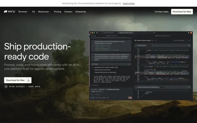
Dark mode precision workbench. An engineering tool's UI where every element is intentional and optimized for information density under low-light conditions.
Color palette
Specific text highlights or code block comments, hinting at syntax highlighting patterns.
Keyword highlighting in code examples, drawing attention to critical terms.
Used sparingly for interactive states or specific highlights, drawing focus. The glowing shadow for the terminal window is also this hue, tying it into the brand.
Primary page background, deep surface layers.
Card backgrounds, elevated UI elements, providing subtle visual separation from Midnight Base.
Navigation backgrounds, overlay surfaces – a slightly lighter dark to suggest interaction.
Body text, secondary information, providing a muted contrast against dark backgrounds.
Primary headings, important labels, providing crisp readability.
Less dominant headings, body text, a slightly softer white for readability without harshness.
Button backgrounds for interactive elements.
Indicators of success or completion.
Typography
- Weights
- 400, 500
- Sizes
- 16px, 19px
- Line height
- 0.91, 1, 1.2
- Letter spacing
- -0.03em at 68px/56px, -0.02em at 48px/40px, -0.01em at 32px, 0.01em at 14px, 0.02em at 12px, 0.1em at 11px, 0.2em at 11px
- Fallback
- Inter
Primary typeface for all headings and most body text. The wide range of weights and negative letter-spacing for larger sizes creates a unique crispness, making even large type feel precise and controlled, not boisterous.
- Weights
- 400, 500
- Sizes
- 14px, 16px
- Line height
- 1, 1.38
- Letter spacing
- -0.014em at 14px, -0.012em at 16px
- Fallback
- system-ui
Used for specific body text and headings, likely for additional utility or contrast in information architecture. The slight negative letter spacing on smaller sizes helps maintain information density on dark backgrounds.
- Weights
- 400
- Sizes
- 16px
- Line height
- 1
- Letter spacing
- normal
- Fallback
- Roboto Mono
Monospace font used for code snippets and button labels where exact character alignment is key, reinforcing the developer tool identity.
Spacing & shape
Components
Background: rgb(47, 47, 47), Text: #000000 (though often overridden by white based on context analysis), Border: #000000, Corner Radius: 4px, Padding: 8px vertical, 12px horizontal. This button style appears to be the most common interactive element, though its text color is often overwritten from the inferred default.
Background: rgb(53, 53, 52), Text: rgb(175, 174, 172), Border: rgb(175, 174, 172), Corner Radius: 50px (fully rounded), Padding: 10px all sides. Used for less prominent actions or to denote status, its pill shape distinguishes it visually.
Background: rgba(255, 255, 255, 0.16), Text: #000000, Border: #000000, Corner Radius: 6px, Padding: 1px vertical, 6px horizontal. A highly transparent white background suggests a subtle, non-intrusive action, like a small tag or filter.
Background: rgba(255, 255, 255, 0.04), Text: #000000 (though often overridden by white based on context analysis), Border: #000000, Corner Radius: 4px, Padding: 8px vertical, 12px horizontal. Very similar to the Primary Action Button but with a much lighter background alpha, indicating a secondary or less emphasized action.
Text color: #868684 (Ash Text) on #40403F (Dark Overlay) background, Font: Matter Medium size 16px, weight 500. This combination creates a readable but not overtly prominent link, blending into the dark chrome.
Rounded corners (8px radius, with some elements using 14px), subtle glow shadow: rgba(33, 126, 255, 0.5) 0px 0px 32px 10px, dark background surfaces. This is the visual heart of the product, presented as a clickable, interactive element, even in static form.
Guidelines
- Prioritize the Matter font family for all display and primary text to maintain the precise, technical aesthetic.
- Use Midnight Base (#121212) as the consistent page background color for all dark-themed sections.
- Apply Graphite Surface (#1E1E1D) for card and internal panel backgrounds to create subtle layering and depth without relying on shadows.
- Ensure all primary action buttons use a 4px `radius` for button edges.
- Utilize Negative letter-spacing, such as -0.03em for 68px Matter headlines, to maintain a tight, professional typographic rhythm.
- Employ Ash Text (#868684) for secondary body copy and supportive text to provide readability without overwhelming contrast.
- Incorporate Geist Mono font for all code blocks or technical references to ensure monospace clarity.
- Avoid using bright or overly saturated colors for background elements; stick to the achromatic and near-achromatic scale.
- Do not use generic system fonts when Matter or Inter are specified, as they dilute the brand's distinct typographic voice.
- Refrain from heavy, multi-directional drop shadows, as the site uses a single, subtle blue glow for focus.
- Do not vary border radius widely; stick to 4px for most interactive elements and 8px for larger containers.
- Avoid large line-heights for headlines, as the system favors compact, information-dense display (e.g., 0.91 for 68px).
- Do not introduce unnecessary visual distractions; the design relies on precise typography and subtle color shifts for hierarchy.
- Never use the default browser link color #0000EE; use brand-aligned colors for interactive text elements.
About this system
ShowHide
This design system evokes a 'professional toolkit' aesthetic, combining the stark clarity of a dark-mode development environment with subtle, almost invisible layering. The primary visual choice is the use of a dark, near-achromatic palette for backgrounds and text, creating a serious, focused atmosphere. Carefully selected custom fonts, particularly the Matter family, give headlines and key information a distinctive, understated technical feel. Strategic use of tight letter spacing and specific line heights for different text sizes contributes to a dense but precise information display, echoing code editor interfaces.
The page primarily uses a full-bleed dark background for visual continuity, with content sections appearing to be centrally aligned without a strict maximum width, though text blocks are contained. The hero section is a prominent full-bleed dark background with a large, centered headline and a key product screenshot. Subsequent sections alternate between dark and slightly darker surface backgrounds, creating a subtle rhythm. Content is arranged in flexible patterns, including centered text blocks for headlines and descriptive copy, and a notable two-column layout in the body where text typically accompanies a product screenshot or code example. Vertical spacing between sections is comfortable, contributing to a spacious feel despite the information density. Navigation is primarily a top bar, sticky header visible, with distinct download and contact CTAs.
The site's imagery strategy is dominated by product screenshots, specifically showcasing the Warp terminal interface. These are treated with soft 8px and 14px rounded corners and often presented within a visual frame that includes a subtle blue glowing shadow (rgba(33, 126, 255, 0.5) 0px 0px 32px 10px) to highlight their interactive nature. Beyond product shots, subtle abstract background illustrations, like the faint tree in the hero, are used decoratively to add atmosphere without distracting from the UI. Iconography is minimal and functional, typically monochrome and integrated into UI elements. The emphasis is on showing the product in action rather than using lifestyle or conceptual photography, reinforcing its utility for developers.
Reminiscent of GitHub, VS Code, Linear, Supabase.
# Warp — Style Reference
> Dark mode precision workbench. An engineering tool's UI where every element is intentional and optimized for information density under low-light conditions.

**Theme:** dark

**Site:** https://warp.dev/code

This design system evokes a 'professional toolkit' aesthetic, combining the stark clarity of a dark-mode development environment with subtle, almost invisible layering. The primary visual choice is the use of a dark, near-achromatic palette for backgrounds and text, creating a serious, focused atmosphere. Carefully selected custom fonts, particularly the Matter family, give headlines and key information a distinctive, understated technical feel. Strategic use of tight letter spacing and specific line heights for different text sizes contributes to a dense but precise information display, echoing code editor interfaces.

## Tokens — Colors

| Name | Value | Token | Role |
|------|------|------|------|
| Code Comment Gray | `#6F839F` | `--color-code-comment-gray` | Specific text highlights or code block comments, hinting at syntax highlighting patterns. |
| Code Keyword Gold | `#BD9F65` | `--color-code-keyword-gold` | Keyword highlighting in code examples, drawing attention to critical terms. |
| Accent Blue | `#217EFF` | `--color-accent-blue` | Used sparingly for interactive states or specific highlights, drawing focus. The glowing shadow for the terminal window is also this hue, tying it into the brand. |
| Midnight Base | `#121212` | `--color-midnight-base` | Primary page background, deep surface layers. |
| Graphite Surface | `#1E1E1D` | `--color-graphite-surface` | Card backgrounds, elevated UI elements, providing subtle visual separation from Midnight Base. |
| Dark Overlay | `#40403f` | `--color-dark-overlay` | Navigation backgrounds, overlay surfaces – a slightly lighter dark to suggest interaction. |
| Ash Text | `#868684` | `--color-ash-text` | Body text, secondary information, providing a muted contrast against dark backgrounds. |
| Highlight White | `#FFFFFF` | `--color-highlight-white` | Primary headings, important labels, providing crisp readability. |
| Subtle Cream | `#FAFAFA` | `--color-subtle-cream` | Less dominant headings, body text, a slightly softer white for readability without harshness. |
| Interactive Teal | `#2f2f2f` | `--color-interactive-teal` | Button backgrounds for interactive elements. |
| Success Green | `#2ECC71` | `--color-success-green` | Indicators of success or completion. |

## Tokens — Typography

### Matter
- **Substitute:** Inter
- **Weights:** 400, 500
- **Sizes:** 16px, 19px
- **Line height:** 0.91, 1, 1.2
- **Letter spacing:** -0.03em at 68px/56px, -0.02em at 48px/40px, -0.01em at 32px, 0.01em at 14px, 0.02em at 12px, 0.1em at 11px, 0.2em at 11px
- **Role:** Primary typeface for all headings and most body text. The wide range of weights and negative letter-spacing for larger sizes creates a unique crispness, making even large type feel precise and controlled, not boisterous.

### Inter
- **Substitute:** system-ui
- **Weights:** 400, 500
- **Sizes:** 14px, 16px
- **Line height:** 1, 1.38
- **Letter spacing:** -0.014em at 14px, -0.012em at 16px
- **Role:** Used for specific body text and headings, likely for additional utility or contrast in information architecture. The slight negative letter spacing on smaller sizes helps maintain information density on dark backgrounds.

### Geist Mono
- **Substitute:** Roboto Mono
- **Weights:** 400
- **Sizes:** 16px
- **Line height:** 1
- **Letter spacing:** normal
- **Role:** Monospace font used for code snippets and button labels where exact character alignment is key, reinforcing the developer tool identity.

## Tokens — Type Scale

Major Third (1.25) from 16px base.

| Role | Size | Line height | Letter spacing |
|------|------|------|------|
| caption | 11px | 1.2 | — |
| body-sm | 14px | 1.2 | — |
| body | 16px | 1.2 | — |
| body-lg | 19px | 1.2 | — |
| heading-sm | 22px | 1.2 | — |
| heading | 24px | 1.2 | — |
| heading-lg | 40px | 1.2 | — |
| display-sm | 48px | 1.2 | — |
| display | 68px | 1.2 | — |

## Tokens — Radius

- **Default:** 4px
- **Buttons:** 4px
- **Images:** 8px
- **large-elements:** 20px
- **prominent-buttons:** 50px

## Layout

The page primarily uses a full-bleed dark background for visual continuity, with content sections appearing to be centrally aligned without a strict maximum width, though text blocks are contained. The hero section is a prominent full-bleed dark background with a large, centered headline and a key product screenshot. Subsequent sections alternate between dark and slightly darker surface backgrounds, creating a subtle rhythm. Content is arranged in flexible patterns, including centered text blocks for headlines and descriptive copy, and a notable two-column layout in the body where text typically accompanies a product screenshot or code example. Vertical spacing between sections is comfortable, contributing to a spacious feel despite the information density. Navigation is primarily a top bar, sticky header visible, with distinct download and contact CTAs.

## Imagery

The site's imagery strategy is dominated by product screenshots, specifically showcasing the Warp terminal interface. These are treated with soft 8px and 14px rounded corners and often presented within a visual frame that includes a subtle blue glowing shadow (rgba(33, 126, 255, 0.5) 0px 0px 32px 10px) to highlight their interactive nature. Beyond product shots, subtle abstract background illustrations, like the faint tree in the hero, are used decoratively to add atmosphere without distracting from the UI. Iconography is minimal and functional, typically monochrome and integrated into UI elements. The emphasis is on showing the product in action rather than using lifestyle or conceptual photography, reinforcing its utility for developers.

## Components

### Announcement Banner

### Hero CTA Buttons + CLI Command

### Tasks Panel Card

### Primary Action Button (Dark)
*Call to action button (darker variant)*

Background: rgb(47, 47, 47), Text: #000000 (though often overridden by white based on context analysis), Border: #000000, Corner Radius: 4px, Padding: 8px vertical, 12px horizontal. This button style appears to be the most common interactive element, though its text color is often overwritten from the inferred default.

### Pill Button (Secondary)
*Secondary action or tag button*

Background: rgb(53, 53, 52), Text: rgb(175, 174, 172), Border: rgb(175, 174, 172), Corner Radius: 50px (fully rounded), Padding: 10px all sides. Used for less prominent actions or to denote status, its pill shape distinguishes it visually.

### Ghost Button (Light Alpha)
*Informational or subtle action button*

Background: rgba(255, 255, 255, 0.16), Text: #000000, Border: #000000, Corner Radius: 6px, Padding: 1px vertical, 6px horizontal. A highly transparent white background suggests a subtle, non-intrusive action, like a small tag or filter.

### Ghost Button (Dark Alpha)
*Action button with dark alpha background*

Background: rgba(255, 255, 255, 0.04), Text: #000000 (though often overridden by white based on context analysis), Border: #000000, Corner Radius: 4px, Padding: 8px vertical, 12px horizontal. Very similar to the Primary Action Button but with a much lighter background alpha, indicating a secondary or less emphasized action.

### Page Header Nav Link
*Primary navigation links*

Text color: #868684 (Ash Text) on #40403F (Dark Overlay) background, Font: Matter Medium size 16px, weight 500. This combination creates a readable but not overtly prominent link, blending into the dark chrome.

### Terminal Window Container
*Prominent interactive terminal or code display section*

Rounded corners (8px radius, with some elements using 14px), subtle glow shadow: rgba(33, 126, 255, 0.5) 0px 0px 32px 10px, dark background surfaces. This is the visual heart of the product, presented as a clickable, interactive element, even in static form.

## Guidelines

### Do

- Prioritize the Matter font family for all display and primary text to maintain the precise, technical aesthetic.
- Use Midnight Base (#121212) as the consistent page background color for all dark-themed sections.
- Apply Graphite Surface (#1E1E1D) for card and internal panel backgrounds to create subtle layering and depth without relying on shadows.
- Ensure all primary action buttons use a 4px `radius` for button edges.
- Utilize Negative letter-spacing, such as -0.03em for 68px Matter headlines, to maintain a tight, professional typographic rhythm.
- Employ Ash Text (#868684) for secondary body copy and supportive text to provide readability without overwhelming contrast.
- Incorporate Geist Mono font for all code blocks or technical references to ensure monospace clarity.

### Don't

- Avoid using bright or overly saturated colors for background elements; stick to the achromatic and near-achromatic scale.
- Do not use generic system fonts when Matter or Inter are specified, as they dilute the brand's distinct typographic voice.
- Refrain from heavy, multi-directional drop shadows, as the site uses a single, subtle blue glow for focus.
- Do not vary border radius widely; stick to 4px for most interactive elements and 8px for larger containers.
- Avoid large line-heights for headlines, as the system favors compact, information-dense display (e.g., 0.91 for 68px).
- Do not introduce unnecessary visual distractions; the design relies on precise typography and subtle color shifts for hierarchy.
- Never use the default browser link color #0000EE; use brand-aligned colors for interactive text elements.

## Agent Prompt Guide

### Quick Color Reference
- **Text (Primary):** #FFFFFF
- **Text (Secondary):** #868684
- **Background (Page):** #121212
- **Background (Card):** #1E1E1D
- **Accent (Blue):** #217EFF
- **Button (Primary Dark BG):** rgb(47, 47, 47)

### Example Component Prompts
1. **Create a Hero Section:** Full-bleed #121212 background. Centered headline 'Ship production-ready code' using Matter font, 68px, weight 400, #FFFFFF, letter-spacing -0.03em, line-height 0.91. Below, a body text 'Prompt, code...' using Matter, 20px, weight 400, #868684, line-height 1.35. Include a 'Download for Mac' button with background rgb(47, 47, 47), 4px radius, 8px vertical 12px horizontal padding, and a prominent terminal window screenshot (8px border-radius) with rgba(33, 126, 255, 0.5) 0px 0px 32px 10px shadow.
2. **Generate a Product Feature Card:** Background #1E1E1D, 8px border-radius. Headline 'Coding Tools' using Matter, 48px, weight 400, #FFFFFF, letter-spacing -0.02em, line-height 1.15. Body text 'Agents, at your command' using Matter, 40px, weight 400, #FFFFFF, letter-spacing -0.02em, line-height 1.19, followed by a smaller descriptive paragraph in #868684, Matter 18px.
3. **Design a Pill Tag/Button:** Background rgb(53, 53, 52), border rgb(175, 174, 172), text rgb(175, 174, 172), 50px border-radius, 10px padding all sides. Use Geist Mono font, 16px, weight 400, 'normal' letter spacing.
4. **Create a Navigation Link:** Text 'Resources' using Matter Medium, 16px, weight 500, #868684, letter-spacing 0.001em, line-height 1.2. On hover, change text color to #FFFFFF.
More like this





Keep what you find
A free account saves references to boards and can send you a weekly email of picks based on what you save.
To see every result, go Pro.