Preview image. Unlock full-res
Gallery grit, monochromatic precision.
Color palette
Neutral form states, badge text, and quiet UI feedback where color should stay understated. Do not promote it to the primary CTA color
Dark borders and separators for elevated surfaces and inverted UI. Do not promote it to the primary CTA color
Primary text on dark backgrounds, active states, emphasized labels, and element borders for high contrast
Typography
- Weights
- 400
- Sizes
- 14px, 16px, 18px, 23px, 27px, 32px, 50px, 77px
- Line height
- 0.9, 1, 1.2, 1.43
- Letter spacing
- -0.0560em, -0.0440em, -0.0370em, -0.0320em, -0.0290em, -0.0200em
- Fallback
- Inter
The sole typeface for all text elements. Its geometric forms provide a modern, technical feel, and its consistent weight but varied letter-spacing across sizes is a signature trait.
Spacing & shape
Components
Uses PolySans at 14px, Graphite text color and a bottom border of 1px Void Black. On hover/active, text color is Parchment White and border changes to Parchment White.
Large text, typically PolySans up to 77px, Parchment White, with tight letter-spacing of -0.056em for dramatic impact on dark backgrounds.
A square or rectangular block with an image or graphic. Text consists of PolySans at various sizes, Parchment White for titles, and Graphite for metadata. Minimal padding and a border outline in Void Black or Parchment White when interactive. Corner radius is 4.5px.
Transparent background with Parchment White text (PolySans), no padding or border, used for labels like 'EDITORIAL' or 'PREMIERE'.
Transparent background with Parchment White text (PolySans), 4.5px padding (vertical: 4.5px, horizontal: 6.3px), and a 4.5px border radius. Used for 'EDITORIAL' or 'PREMIERE' but with a clear visual boundary.
Graphite text on a transparent background, with a 1px solid Void Black bottom border. Padding of 18px on top and 4.5px at the bottom. No explicit border radius on the input itself.
Guidelines
- Prioritize Void Black (#000000) for all significant backgrounds and borders to maintain the dark, structured aesthetic.
- Use Parchment White (#ffffff) exclusively for primary text and high-contrast interactive states against dark backgrounds.
- Apply precise letter-spacing values to PolySans as defined in the typography section, ensuring appropriate visual density for each text size.
- Utilize Graphite (#5a5a5a) for secondary information, input text, and subtle background differentiation on interactive elements.
- Maintain a subtle, comfortable density in layouts, especially between interactive elements, using `elementGap: 14px` and `sectionGap: 144px`.
- Incorporate a consistent border radius of 4.5px for all card-like elements, badges, and interactive components.
- Define interactive states with border changes and text color shifts using Parchment White, rather than introducing new chromatic colors.
- Avoid introducing saturated colors; the palette is strictly achromatic, with any color appearing only as part of content imagery.
- Do not use heavy shadows or gradients for elevation; rely on subtle background color shifts (e.g., Void Black to Graphite) and crisp borders.
- Do not use generic font sizes or letter-spacing values; adhere to the specific PolySans scale and letter-spacing definitions.
- Avoid large, rounded button styles; interactive elements should favor minimal borders, subtle background changes, or smaller radii like 4.5px.
- Do not break the grid alignment; maintain strict vertical and horizontal rhythm with defined spacing tokens.
- Refrain from using bold or heavier font weights; PolySans 400 is the only weight available, focusing on form and spacing for emphasis.
- Avoid overly complex layouts or decorative flourishes; maintain the 'gallery grit' aesthetic with clear, functional arrangements.
About this system
ShowHide
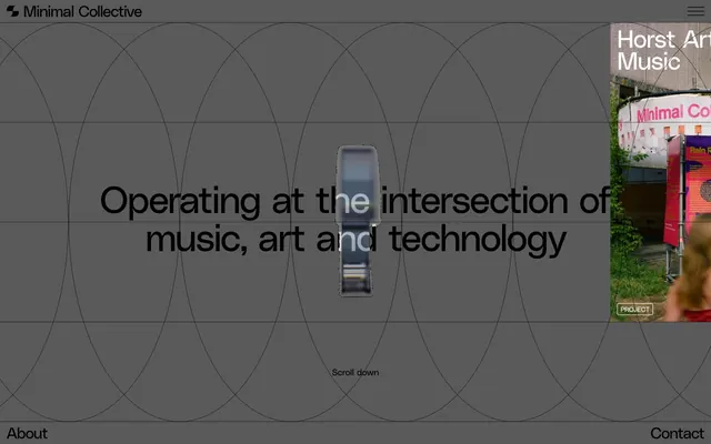
Minimal Collective employs a muted, structured dark-mode aesthetic, reminiscent of an underground art gallery's concrete walls at dusk. The design prioritizes clear information hierarchy over visual flair, using a restricted achromatic palette with stark black as the dominant background and white for primary text. Typography is a focal point, with a custom geometric sans-serif font exhibiting varied, precise letter-spacing to create distinct visual rhythm. Layout is ordered and grid-constrained, with interactions subtly defined by slight shifts in background depth and crisp borders rather than vibrant color accents.
The page primarily uses a full-bleed layout, particularly for the hero section with a centered headline against a dark background overlaid with geometric grid lines. Content sections often appear in distinct vertical bands, though seamless transitions are common. A prominent pattern is the division into two main columns, often featuring text on one side and an image or content block on the other, or a symmetric grid of project cards. Navigation is handled by a minimal fixed header bar at the top, a hamburger menu for mobile/secondary nav items, and a persistent footer at the bottom. The section rhythm is largely consistent, with ample vertical spacing like `sectionGap: 144px` creating breathing room between major content blocks.
This site features a blend of photography and abstract graphics. Photography is often presented as raw crops or within defined boundaries, sometimes with a desaturated or muted color treatment to blend with the achromatic theme. Abstract graphics primarily consist of geometric patterns, often line-based like the large overlapping arcs in the hero section, contributing to a technical, structured feel. Icons, if present, are minimal outlined versions. Imagery serves primarily to set atmospheric mood or to showcase specific content (e.g., album art, event photos) within a structured grid, rather than for decorative excess. The density is image-heavy within content modules, but the overall page avoids full-bleed hero images, favoring a structured UI.
Reminiscent of A24, The Fader, Resident Advisor.
# Minimal Collective — Style Reference
> Gallery grit, monochromatic precision.

**Theme:** dark

**Site:** https://minimalcollective.digital

Minimal Collective employs a muted, structured dark-mode aesthetic, reminiscent of an underground art gallery's concrete walls at dusk. The design prioritizes clear information hierarchy over visual flair, using a restricted achromatic palette with stark black as the dominant background and white for primary text. Typography is a focal point, with a custom geometric sans-serif font exhibiting varied, precise letter-spacing to create distinct visual rhythm. Layout is ordered and grid-constrained, with interactions subtly defined by slight shifts in background depth and crisp borders rather than vibrant color accents.

## Tokens — Colors

| Name | Value | Token | Role |
|------|------|------|------|
| Void Black | `#000000` | `--color-void-black` | Neutral form states, badge text, and quiet UI feedback where color should stay understated. Do not promote it to the primary CTA color |
| Graphite | `#5a5a5a` | `--color-graphite` | Dark borders and separators for elevated surfaces and inverted UI. Do not promote it to the primary CTA color |
| Parchment White | `#ffffff` | `--color-parchment-white` | Primary text on dark backgrounds, active states, emphasized labels, and element borders for high contrast |

## Tokens — Typography

### PolySans
- **Substitute:** Inter
- **Weights:** 400
- **Sizes:** 14px, 16px, 18px, 23px, 27px, 32px, 50px, 77px
- **Line height:** 0.9, 1, 1.2, 1.43
- **Letter spacing:** -0.0560em, -0.0440em, -0.0370em, -0.0320em, -0.0290em, -0.0200em
- **Role:** The sole typeface for all text elements. Its geometric forms provide a modern, technical feel, and its consistent weight but varied letter-spacing across sizes is a signature trait.

## Tokens — Type Scale

Perfect Fourth (1.333) from 16px base.

| Role | Size | Line height | Letter spacing |
|------|------|------|------|
| caption | 14px | 1.43 | -0.02em |
| body | 16px | 1.43 | -0.029em |
| subheading | 18px | 1.2 | -0.032em |
| heading-sm | 23px | 1.2 | -0.037em |
| heading | 27px | 1.2 | -0.044em |
| heading-lg | 32px | 1 | -0.044em |
| display | 77px | 0.9 | -0.056em |

## Tokens — Spacing

- **Section gap:** 144px
- **Card padding:** 18px
- **Element gap:** 14px

## Tokens — Radius

- **Default:** 4.5px
- **badges:** 4.5px

## Layout

The page primarily uses a full-bleed layout, particularly for the hero section with a centered headline against a dark background overlaid with geometric grid lines. Content sections often appear in distinct vertical bands, though seamless transitions are common. A prominent pattern is the division into two main columns, often featuring text on one side and an image or content block on the other, or a symmetric grid of project cards. Navigation is handled by a minimal fixed header bar at the top, a hamburger menu for mobile/secondary nav items, and a persistent footer at the bottom. The section rhythm is largely consistent, with ample vertical spacing like `sectionGap: 144px` creating breathing room between major content blocks.

## Imagery

This site features a blend of photography and abstract graphics. Photography is often presented as raw crops or within defined boundaries, sometimes with a desaturated or muted color treatment to blend with the achromatic theme. Abstract graphics primarily consist of geometric patterns, often line-based like the large overlapping arcs in the hero section, contributing to a technical, structured feel. Icons, if present, are minimal outlined versions. Imagery serves primarily to set atmospheric mood or to showcase specific content (e.g., album art, event photos) within a structured grid, rather than for decorative excess. The density is image-heavy within content modules, but the overall page avoids full-bleed hero images, favoring a structured UI.

## Components

### Header Navigation Link
*Primary navigation links*

Uses PolySans at 14px, Graphite text color and a bottom border of 1px Void Black. On hover/active, text color is Parchment White and border changes to Parchment White.

### Main Heading
*Hero and major section titles*

Large text, typically PolySans up to 77px, Parchment White, with tight letter-spacing of -0.056em for dramatic impact on dark backgrounds.

### Project Card Link
*Interactive content blocks for projects/articles*

A square or rectangular block with an image or graphic. Text consists of PolySans at various sizes, Parchment White for titles, and Graphite for metadata. Minimal padding and a border outline in Void Black or Parchment White when interactive. Corner radius is 4.5px.

### Badge (Text Only)
*Categorization and metadata labels within content*

Transparent background with Parchment White text (PolySans), no padding or border, used for labels like 'EDITORIAL' or 'PREMIERE'.

### Badge (Outlined)
*Categorization and metadata labels with visual distinction*

Transparent background with Parchment White text (PolySans), 4.5px padding (vertical: 4.5px, horizontal: 6.3px), and a 4.5px border radius. Used for 'EDITORIAL' or 'PREMIERE' but with a clear visual boundary.

### Text Input (Underlined)
*Capturing user input*

Graphite text on a transparent background, with a 1px solid Void Black bottom border. Padding of 18px on top and 4.5px at the bottom. No explicit border radius on the input itself.

## Guidelines

### Do

- Prioritize Void Black (#000000) for all significant backgrounds and borders to maintain the dark, structured aesthetic.
- Use Parchment White (#ffffff) exclusively for primary text and high-contrast interactive states against dark backgrounds.
- Apply precise letter-spacing values to PolySans as defined in the typography section, ensuring appropriate visual density for each text size.
- Utilize Graphite (#5a5a5a) for secondary information, input text, and subtle background differentiation on interactive elements.
- Maintain a subtle, comfortable density in layouts, especially between interactive elements, using `elementGap: 14px` and `sectionGap: 144px`.
- Incorporate a consistent border radius of 4.5px for all card-like elements, badges, and interactive components.
- Define interactive states with border changes and text color shifts using Parchment White, rather than introducing new chromatic colors.

### Don't

- Avoid introducing saturated colors; the palette is strictly achromatic, with any color appearing only as part of content imagery.
- Do not use heavy shadows or gradients for elevation; rely on subtle background color shifts (e.g., Void Black to Graphite) and crisp borders.
- Do not use generic font sizes or letter-spacing values; adhere to the specific PolySans scale and letter-spacing definitions.
- Avoid large, rounded button styles; interactive elements should favor minimal borders, subtle background changes, or smaller radii like 4.5px.
- Do not break the grid alignment; maintain strict vertical and horizontal rhythm with defined spacing tokens.
- Refrain from using bold or heavier font weights; PolySans 400 is the only weight available, focusing on form and spacing for emphasis.
- Avoid overly complex layouts or decorative flourishes; maintain the 'gallery grit' aesthetic with clear, functional arrangements.

## Agent Prompt Guide

Quick Color Reference:
text: #ffffff
background: #000000
border: #000000
accent: none observed
primary action: no distinct CTA color

Example Component Prompts:
1. Create a Hero Headline: 'Operating at the intersection of music, art and technology' with Parchment White (#ffffff) text, PolySans 77px, line height 0.9, letter-spacing -0.056em, centered on a Void Black (#000000) background that features a subtle geometric line grid overlay.
2. Design a Project Card Link: Use Void Black (#000000) as background, border all sides 1px Void Black. Inside, place an image, then a title in Parchment White (#ffffff) with PolySans 23px and line height 1.2, letter-spacing -0.037em. Add a Badge (Outlined) with 'EDITORIAL' in Parchment White (#ffffff) PolySans 14px, 4.5px padding, and 4.5px border radius. Ensure card padding is 18px.
3. Implement a Header Navigation Link: 'Editorial' using Graphite (#5a5a5a) PolySans 14px text, line height 1.43, letter-spacing -0.020em. Apply a 1px solid Void Black (#000000) bottom border. On hover, change text to Parchment White (#ffffff) and bottom border to 1px solid Parchment White.
More like this





Keep what you find
A free account saves references to boards and can send you a weekly email of picks based on what you save.
To see every result, go Pro.