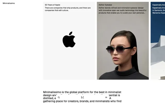
Preview image. Unlock full-res
White gallery canvas.
Color palette
Primary text, core UI elements, strong borders, icon fills. Provides high contrast
Dominant page and section backgrounds, giving a clean, expansive base
Medium-contrast borders, control outlines, and structural separators. Do not promote it to the primary CTA color
Component backgrounds within sections, elevated surfaces. Provides internal contrast against Canvas
Neutral form states, badge text, and quiet UI feedback where color should stay understated. Do not promote it to the primary CTA color
Tertiary body text, informational text, less prominent details
Background for subtle interactive elements like inputs and ghost buttons, providing a slight visual lift
Typography
- Weights
- 400
- Sizes
- 12px, 14px, 16px, 24px
- Line height
- 1.1, 1.3, 1.4, 1.43, 1.5
- Letter spacing
- normal
- Fallback
- Inter, Arial, sans-serif
The sole typeface for all text content, from body to headings. Its compact, neutral quality maintains the minimalist aesthetic. A single weight ensures consistency and relies on size for hierarchy.
Spacing & shape
Components
Text-only button for secondary actions or navigation, e.g. 'Subscribe' button in the footer. Uses Inkwell text (#000000) and has no background or border in its default state, appearing as plain text.
A low-contrast button with Whisper White background (#efefef), Inkwell text (#000000), Pale Ash border (#e0e0e0) and 4px border-radius. Primarily used for actions like 'Subscribe' or form controls.
Text links in content sections, such as article titles or photo captions. Uses Inkwell text (#000000) and no underline by default. There are subtle variations with borders around the text, often in Sterling (#999999).
Input fields have a Whisper White background (#efefef) with a 4px border-radius and a subtle Pale Ash border (#e0e0e0) when active. Text uses Inkwell (#000000).
Cards for displaying images and titles in a grid layout. They have no visible border or background, relying on the Canvas (#f5f5f5) page background for separation. Text is Inkwell (#000000).
Guidelines
- Use GeistSans 400 for all typographic elements, varying only size for hierarchy.
- Maintain high contrast text with Inkwell (#000000) on Canvas (#f5f5f5) or Porcelain (#ffffff) backgrounds.
- Apply a 4px border-radius to all interactive elements like buttons and input fields.
- When a button is not a primary action, render it as text-only with Inkwell (#000000) for a ghost-like appearance.
- Utilize Whisper White (#efefef) sparingly, primarily for subtle input backgrounds or very soft button fills.
- Separate content sections with ample vertical spacing, defaulting to sectionGap (96px) where appropriate.
- Prioritize photography and crisp typography as primary visual elements, minimizing decorative UI.
- Avoid using any chromatic colors; maintain a purely achromatic palette.
- Do not introduce heavy borders, drop shadows, or strong gradients that would detract from the content.
- Refrain from using multiple font families or font weights other than 400 for GeistSans.
- Do not clutter layouts with excessive UI elements; focus on functional minimalism.
- Avoid large, attention-grabbing primary action buttons; keep interactive elements understated.
- Do not apply padding or visible backgrounds to image grid items; let them float on the Canvas background.
- Do not use underlines for links unless absolutely necessary for clarity in dense text blocks.
About this system
ShowHide
Minimalissimo embodies a restrained, almost stark aesthetic where content is paramount. It utilizes an achromatic palette with crisp contrasts, creating an open and airy feel. Typography is compact and precise, driving hierarchy and focus without visual flourish. Components maintain a ghost-like presence, subtly hinting at interaction rather than demanding attention, ensuring images and text are the primary visual experience.
The site uses a full-bleed layout for its main content carousels and image galleries, allowing visuals to dominate the viewport. The page content itself is largely max-width constrained in some sections, with a centered composition for text blocks. The hero section often presents a large visual or a collection of content cards. Section rhythm is driven by substantial vertical gaps, creating clear visual breaks without explicit dividers. Content arrangement frequently uses large, impactful images or image grids where elements are often isolated. Navigation is minimal, likely restricted to a top bar menu.
The imagery leans heavily on high-quality product photography and architectural shots, often featuring single, isolated subjects against a clean, white, or light gray background. There's a strong emphasis on form, texture, and object design. Photography is typically high-key, well-lit, and product-focused, with minimal lifestyle context. Illustrations are non-existent. Iconography is minimalist, using simple outlines or solid fills in Inkwell to blend with the text, serving purely functional roles without decorative flair. Imagery is dense, often occupying large portions of the screen, acting as content rather than mere decoration.
Reminiscent of AIGA Eye on Design, The Brand Identity, Wallpaper*, Dezeen.
# Minimalissimo — Style Reference
> White gallery canvas.

**Theme:** light

**Site:** https://minimalissimo.com

Minimalissimo embodies a restrained, almost stark aesthetic where content is paramount. It utilizes an achromatic palette with crisp contrasts, creating an open and airy feel. Typography is compact and precise, driving hierarchy and focus without visual flourish. Components maintain a ghost-like presence, subtly hinting at interaction rather than demanding attention, ensuring images and text are the primary visual experience.

## Tokens — Colors

| Name | Value | Token | Role |
|------|------|------|------|
| Inkwell | `#000000` | `--color-inkwell` | Primary text, core UI elements, strong borders, icon fills. Provides high contrast |
| Canvas | `#f5f5f5` | `--color-canvas` | Dominant page and section backgrounds, giving a clean, expansive base |
| Sterling | `#999999` | `--color-sterling` | Medium-contrast borders, control outlines, and structural separators. Do not promote it to the primary CTA color |
| Porcelain | `#ffffff` | `--color-porcelain` | Component backgrounds within sections, elevated surfaces. Provides internal contrast against Canvas |
| Pale Ash | `#e0e0e0` | `--color-pale-ash` | Neutral form states, badge text, and quiet UI feedback where color should stay understated. Do not promote it to the primary CTA color |
| Storm Gray | `#a1a1a1` | `--color-storm-gray` | Tertiary body text, informational text, less prominent details |
| Whisper White | `#efefef` | `--color-whisper-white` | Background for subtle interactive elements like inputs and ghost buttons, providing a slight visual lift |

## Tokens — Typography

### GeistSans
- **Substitute:** Inter, Arial, sans-serif
- **Weights:** 400
- **Sizes:** 12px, 14px, 16px, 24px
- **Line height:** 1.1, 1.3, 1.4, 1.43, 1.5
- **Letter spacing:** normal
- **Role:** The sole typeface for all text content, from body to headings. Its compact, neutral quality maintains the minimalist aesthetic. A single weight ensures consistency and relies on size for hierarchy.

## Tokens — Type Scale

Major Third (1.25) from 16px base.

| Role | Size | Line height | Letter spacing |
|------|------|------|------|
| caption | 12px | 1.5 | — |
| body-sm | 14px | 1.43 | — |
| body | 16px | 1.4 | — |
| heading | 24px | 1.3 | — |

## Tokens — Spacing

- **Section gap:** 96px
- **Card padding:** 16px
- **Element gap:** 16px

## Tokens — Radius

- **Buttons:** 4px
- **Inputs:** 4px
- **Cards:** 8px
- **links:** 4px

## Layout

The site uses a full-bleed layout for its main content carousels and image galleries, allowing visuals to dominate the viewport. The page content itself is largely max-width constrained in some sections, with a centered composition for text blocks. The hero section often presents a large visual or a collection of content cards. Section rhythm is driven by substantial vertical gaps, creating clear visual breaks without explicit dividers. Content arrangement frequently uses large, impactful images or image grids where elements are often isolated. Navigation is minimal, likely restricted to a top bar menu.

## Imagery

The imagery leans heavily on high-quality product photography and architectural shots, often featuring single, isolated subjects against a clean, white, or light gray background. There's a strong emphasis on form, texture, and object design. Photography is typically high-key, well-lit, and product-focused, with minimal lifestyle context. Illustrations are non-existent. Iconography is minimalist, using simple outlines or solid fills in Inkwell to blend with the text, serving purely functional roles without decorative flair. Imagery is dense, often occupying large portions of the screen, acting as content rather than mere decoration.

## Components

### Ghost Button
*Minimalist interactive element*

Text-only button for secondary actions or navigation, e.g. 'Subscribe' button in the footer. Uses Inkwell text (#000000) and has no background or border in its default state, appearing as plain text.

### Subtle Filled Button
*Call to action or form submission*

A low-contrast button with Whisper White background (#efefef), Inkwell text (#000000), Pale Ash border (#e0e0e0) and 4px border-radius. Primarily used for actions like 'Subscribe' or form controls.

### Text Link Item
*Navigation and content linking*

Text links in content sections, such as article titles or photo captions. Uses Inkwell text (#000000) and no underline by default. There are subtle variations with borders around the text, often in Sterling (#999999).

### Minimal Input Field
*User input for forms*

Input fields have a Whisper White background (#efefef) with a 4px border-radius and a subtle Pale Ash border (#e0e0e0) when active. Text uses Inkwell (#000000).

### Image Grid Card
*Displaying content previews in a grid*

Cards for displaying images and titles in a grid layout. They have no visible border or background, relying on the Canvas (#f5f5f5) page background for separation. Text is Inkwell (#000000).

## Guidelines

### Do

- Use GeistSans 400 for all typographic elements, varying only size for hierarchy.
- Maintain high contrast text with Inkwell (#000000) on Canvas (#f5f5f5) or Porcelain (#ffffff) backgrounds.
- Apply a 4px border-radius to all interactive elements like buttons and input fields.
- When a button is not a primary action, render it as text-only with Inkwell (#000000) for a ghost-like appearance.
- Utilize Whisper White (#efefef) sparingly, primarily for subtle input backgrounds or very soft button fills.
- Separate content sections with ample vertical spacing, defaulting to sectionGap (96px) where appropriate.
- Prioritize photography and crisp typography as primary visual elements, minimizing decorative UI.

### Don't

- Avoid using any chromatic colors; maintain a purely achromatic palette.
- Do not introduce heavy borders, drop shadows, or strong gradients that would detract from the content.
- Refrain from using multiple font families or font weights other than 400 for GeistSans.
- Do not clutter layouts with excessive UI elements; focus on functional minimalism.
- Avoid large, attention-grabbing primary action buttons; keep interactive elements understated.
- Do not apply padding or visible backgrounds to image grid items; let them float on the Canvas background.
- Do not use underlines for links unless absolutely necessary for clarity in dense text blocks.

## Agent Prompt Guide

### Quick Color Reference
text: #000000
background: #f5f5f5
border: #e0e0e0
accent: no distinct accent color
primary action: no distinct CTA color

### Example Component Prompts
1. Create a `Minimal Input Field`: Whisper White background (#efefef), Pale Ash border (#e0e0e0), 4px border-radius. Placeholder text in Sterling (#999999), 16px GeistSans 400. Left and right padding 16px, top and bottom padding 16px.
2. Design a `Subtle Filled Button`: Whisper White background (#efefef), Inkwell text (#000000), 4px border-radius. Border in Pale Ash (#e0e0e0). Padding 16px horizontal, 16px vertical.
3. Implement a `Ghost Button`: No background, no border. Inkwell text (#000000), 16px GeistSans 400. Padding 0px.
4. Build an `Image Grid Card`: No background, no visible border. Image fills the available space. Caption text in Inkwell (#000000), 14px GeistSans 400.
5. Create a `Content Section` with Canvas background (#f5f5f5) and a primary heading `Minimalist Principles` in Inkwell (#000000), 24px GeistSans 400, followed by a body paragraph in Inkwell (#000000), 16px GeistSans 400, with a `Text Link Item` 'Learn More' in Sterling (#999999).
More like this









Keep what you find
A free account saves references to boards and can send you a weekly email of picks based on what you save.
To see every result, go Pro.