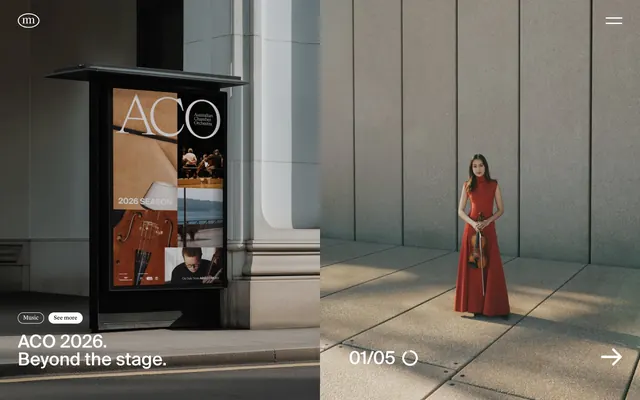
Preview image. Unlock full-res
monochrome gallery canvas
Color palette
Page backgrounds, elevated card surfaces, clean sections that emphasize content
Primary text, strong headlines, button backgrounds, borders, and interactive elements. Establishes high contrast
Subtle background for secondary sections, creating visual segmentation without strong contrast
Dark borders and separators for elevated surfaces and inverted UI. Do not promote it to the primary CTA color
Muted text, helper text, and decorative strokes where minimal contrast is desired
Fine borders and subtle dividers, providing structural separation
Typography
- Weights
- 400, 500, 600
- Sizes
- 12px, 16px, 22px, 24px, 40px
- Line height
- 1, 1.13, 1.17, 1.2, 1.25, 1.33, 1.39, 2
- Letter spacing
- normal
- Fallback
- Helvetica Neue, Arial
Primary sans-serif for all UI text, headings, and body copy. Its range of weights and sizes supports a hierarchical information architecture, from compact labels to prominent titles.
- Weights
- 100
- Sizes
- 13px
- Line height
- 1
- Letter spacing
- normal
- Fallback
- Georgia, serif
Specialized light-weight serif for small text elements, such as metadata, captions, or callouts. Its delicacy provides a visual counterpoint to the more robust Suisse.
Spacing & shape
Components
White background, Ink Black text, 50px border-radius, 11px horizontal padding, 0px vertical padding. Used for secondary actions and tags.
Ink Black background, Canvas White text, 50px border-radius, 11px horizontal padding, 0px vertical padding. Used for primary actions and prominent tags.
Transparent background, Ink Black text, no border-radius or padding. Appears as pure text, often with an implicit interactive area.
Transparent background, Stone Gray text, no border-radius or padding. Used for tertiary actions or less prominent links that fade into the background.
Transparent background, 0px border-radius, no box shadow, 0px internal padding. Content within defines its visual boundaries.
Transparent background, Canvas White text, Canvas White 1px border, 0px border-radius, no padding. Minimalist input field for forms.
Guidelines
- Prioritize high contrast between Ink Black (#000000) and Canvas White (#ffffff) for primary text and backgrounds.
- Use Fog Gray (#f5f5f5) as a subtle background for sections to create soft visual transitions, not strong divisions.
- Apply 50px border-radius for all interactive buttons and tags to maintain the distinct pill shape.
- Employ the Suisse font family for all functional text elements, varying weight to establish hierarchy.
- Maintain generous negative space around content blocks, ensuring a breathable and uncrowded layout.
- Use 0px radius for content cards and inputs, ensuring a sharp, modern appearance.
- Ensure borders, when present, are 1px solid using Divider Gray (#d8d8da) or Ink Black (#000000) for clean definition.
- Do not introduce any saturated colors; resist the urge to add color for emphasis.
- Avoid using box shadows; prefer flat, stacked surfaces or subtle background color changes for depth.
- Do not use generic button styles; all primary and secondary buttons must adhere to the 50px pill-shape radius.
- Do not add unnecessary padding or borders to cards; keep them visually lightweight and integrated with the canvas.
- Avoid heavy or complex gradients; prefer solid colors or the natural gradients of photography.
- Do not use letter-spacing other than 'normal' for Suisse and Lyon fonts.
- Do not deviate from the specified font families; avoid system defaults or other creative typographies.
About this system
ShowHide
Moffitt.Moffitt. evokes a gallery-like atmosphere, pairing high-contrast monochrome with ample negative space to emphasize content over interface. Its visual language relies on stark black and white, subtly textured neutrals, and a complete absence of vibrant accents. Typography is the primary vehicle for detail, with a focus on distinct display and body faces. Components are minimal and often borderless, blending into the canvas to allow imagery and strong type to command attention.
The page model is largely full-bleed, but with a strong emphasis on horizontal centering and comfortable negative space. Hero sections often feature large, impactful imagery alongside concise, high-contrast typography. Section rhythm is created through alternating Canvas White and Fog Gray backgrounds, providing clear visual breaks. Content arrangement frequently uses large, single-column blocks for impactful statements, or balanced two-column layouts pairing imagery with text. Navigation is minimal, typically a subtle sticky header with a hamburger menu icon. The overall density is spacious, allowing each element to breathe and resonate.
The visual language is characterized by high-quality photography, often depicting architectural spaces, product shots, or stylized portraits. Images generally have a muted, almost desaturated color palette, aligning with the overall monochrome aesthetic. They are often full-bleed or large format, acting as primary visual content. For iconography, a minimalist, outlined style is preferred, typically in Ink Black or Stone Gray, maintaining a delicate and unobtrusive presence. Imagery serves to establish atmosphere, showcase projects, and provide a sophisticated backdrop, rather than acting as purely decorative elements.
Reminiscent of Stripe, Apple, B&O (Bang & Olufsen), Linear.
# Moffitt.Moffitt. - — Style Reference
> monochrome gallery canvas

**Theme:** light

**Site:** https://moffittmoffitt.com

Moffitt.Moffitt. evokes a gallery-like atmosphere, pairing high-contrast monochrome with ample negative space to emphasize content over interface. Its visual language relies on stark black and white, subtly textured neutrals, and a complete absence of vibrant accents. Typography is the primary vehicle for detail, with a focus on distinct display and body faces. Components are minimal and often borderless, blending into the canvas to allow imagery and strong type to command attention.

## Tokens — Colors

| Name | Value | Token | Role |
|------|------|------|------|
| Canvas White | `#ffffff` | `--color-canvas-white` | Page backgrounds, elevated card surfaces, clean sections that emphasize content |
| Ink Black | `#000000` | `--color-ink-black` | Primary text, strong headlines, button backgrounds, borders, and interactive elements. Establishes high contrast |
| Fog Gray | `#f5f5f5` | `--color-fog-gray` | Subtle background for secondary sections, creating visual segmentation without strong contrast |
| Charcoal Gray | `#595b60` | `--color-charcoal-gray` | Dark borders and separators for elevated surfaces and inverted UI. Do not promote it to the primary CTA color |
| Stone Gray | `#888888` | `--color-stone-gray` | Muted text, helper text, and decorative strokes where minimal contrast is desired |
| Divider Gray | `#d8d8da` | `--color-divider-gray` | Fine borders and subtle dividers, providing structural separation |

## Tokens — Typography

### Suisse
- **Substitute:** Helvetica Neue, Arial
- **Weights:** 400, 500, 600
- **Sizes:** 12px, 16px, 22px, 24px, 40px
- **Line height:** 1, 1.13, 1.17, 1.2, 1.25, 1.33, 1.39, 2
- **Letter spacing:** normal
- **Role:** Primary sans-serif for all UI text, headings, and body copy. Its range of weights and sizes supports a hierarchical information architecture, from compact labels to prominent titles.

### Lyon
- **Substitute:** Georgia, serif
- **Weights:** 100
- **Sizes:** 13px
- **Line height:** 1
- **Letter spacing:** normal
- **Role:** Specialized light-weight serif for small text elements, such as metadata, captions, or callouts. Its delicacy provides a visual counterpoint to the more robust Suisse.

## Tokens — Type Scale

Perfect Fourth (1.333) from 16px base.

| Role | Size | Line height | Letter spacing |
|------|------|------|------|
| caption | 12px | 1.33 | — |
| body | 16px | 1.25 | — |
| subheading | 22px | 1.13 | — |
| heading | 24px | 1.17 | — |
| display | 40px | 1.2 | — |

## Tokens — Spacing

- **Section gap:** 40px
- **Card padding:** 20px
- **Element gap:** 10px

## Tokens — Radius

- **Buttons:** 50px
- **Inputs:** 0px
- **Cards:** 0px
- **Images:** 5px
- **tags:** 50px

## Layout

The page model is largely full-bleed, but with a strong emphasis on horizontal centering and comfortable negative space. Hero sections often feature large, impactful imagery alongside concise, high-contrast typography. Section rhythm is created through alternating Canvas White and Fog Gray backgrounds, providing clear visual breaks. Content arrangement frequently uses large, single-column blocks for impactful statements, or balanced two-column layouts pairing imagery with text. Navigation is minimal, typically a subtle sticky header with a hamburger menu icon. The overall density is spacious, allowing each element to breathe and resonate.

## Imagery

The visual language is characterized by high-quality photography, often depicting architectural spaces, product shots, or stylized portraits. Images generally have a muted, almost desaturated color palette, aligning with the overall monochrome aesthetic. They are often full-bleed or large format, acting as primary visual content. For iconography, a minimalist, outlined style is preferred, typically in Ink Black or Stone Gray, maintaining a delicate and unobtrusive presence. Imagery serves to establish atmosphere, showcase projects, and provide a sophisticated backdrop, rather than acting as purely decorative elements.

## Components

### Pill Button - Light
*Interactive element (button).*

White background, Ink Black text, 50px border-radius, 11px horizontal padding, 0px vertical padding. Used for secondary actions and tags.

### Pill Button - Dark
*Interactive element (button).*

Ink Black background, Canvas White text, 50px border-radius, 11px horizontal padding, 0px vertical padding. Used for primary actions and prominent tags.

### Ghost Link
*Interactive text link/button.*

Transparent background, Ink Black text, no border-radius or padding. Appears as pure text, often with an implicit interactive area.

### Muted Ghost Link
*Interactive text link/button (muted).*

Transparent background, Stone Gray text, no border-radius or padding. Used for tertiary actions or less prominent links that fade into the background.

### Content Card
*Container for content.*

Transparent background, 0px border-radius, no box shadow, 0px internal padding. Content within defines its visual boundaries.

### Form Input
*User input field.*

Transparent background, Canvas White text, Canvas White 1px border, 0px border-radius, no padding. Minimalist input field for forms.

## Guidelines

### Do

- Prioritize high contrast between Ink Black (#000000) and Canvas White (#ffffff) for primary text and backgrounds.
- Use Fog Gray (#f5f5f5) as a subtle background for sections to create soft visual transitions, not strong divisions.
- Apply 50px border-radius for all interactive buttons and tags to maintain the distinct pill shape.
- Employ the Suisse font family for all functional text elements, varying weight to establish hierarchy.
- Maintain generous negative space around content blocks, ensuring a breathable and uncrowded layout.
- Use 0px radius for content cards and inputs, ensuring a sharp, modern appearance.
- Ensure borders, when present, are 1px solid using Divider Gray (#d8d8da) or Ink Black (#000000) for clean definition.

### Don't

- Do not introduce any saturated colors; resist the urge to add color for emphasis.
- Avoid using box shadows; prefer flat, stacked surfaces or subtle background color changes for depth.
- Do not use generic button styles; all primary and secondary buttons must adhere to the 50px pill-shape radius.
- Do not add unnecessary padding or borders to cards; keep them visually lightweight and integrated with the canvas.
- Avoid heavy or complex gradients; prefer solid colors or the natural gradients of photography.
- Do not use letter-spacing other than 'normal' for Suisse and Lyon fonts.
- Do not deviate from the specified font families; avoid system defaults or other creative typographies.

## Agent Prompt Guide

Quick Color Reference:
text: #000000
background: #ffffff
border: #d8d8da
accent: no distinct accent color
primary action: #000000 (filled action)

Example Component Prompts:
Create a primary navigation link: text 'Projects' in Suisse weight 400 at 16px, color Ink Black (#000000), no underline. When hovered, text color subtly changes to Charcoal Gray (#595b60).
Create a Pill Button for an important action: Ink Black (#000000) background, Canvas White (#ffffff) text 'Submit' in Suisse weight 400 at 16px, 50px border-radius, 11px horizontal padding, 0px vertical padding.
Create a secondary section heading: text 'Feed' in Suisse weight 400 at 40px, color Ink Black (#000000).
Create a ghost text button for a filter: text 'Music' in Suisse weight 400 at 16px, color Ink Black (#000000), transparent background, no border, no padding. When active, background is Ink Black (#000000) and text is Canvas White (#ffffff).
Create a content card with an image: 0px border-radius, transparent background, containing an image with 5px border-radius and a caption below in Lyon weight 100 at 13px, color Stone Gray (#888888).
More like this









Keep what you find
A free account saves references to boards and can send you a weekly email of picks based on what you save.
To see every result, go Pro.